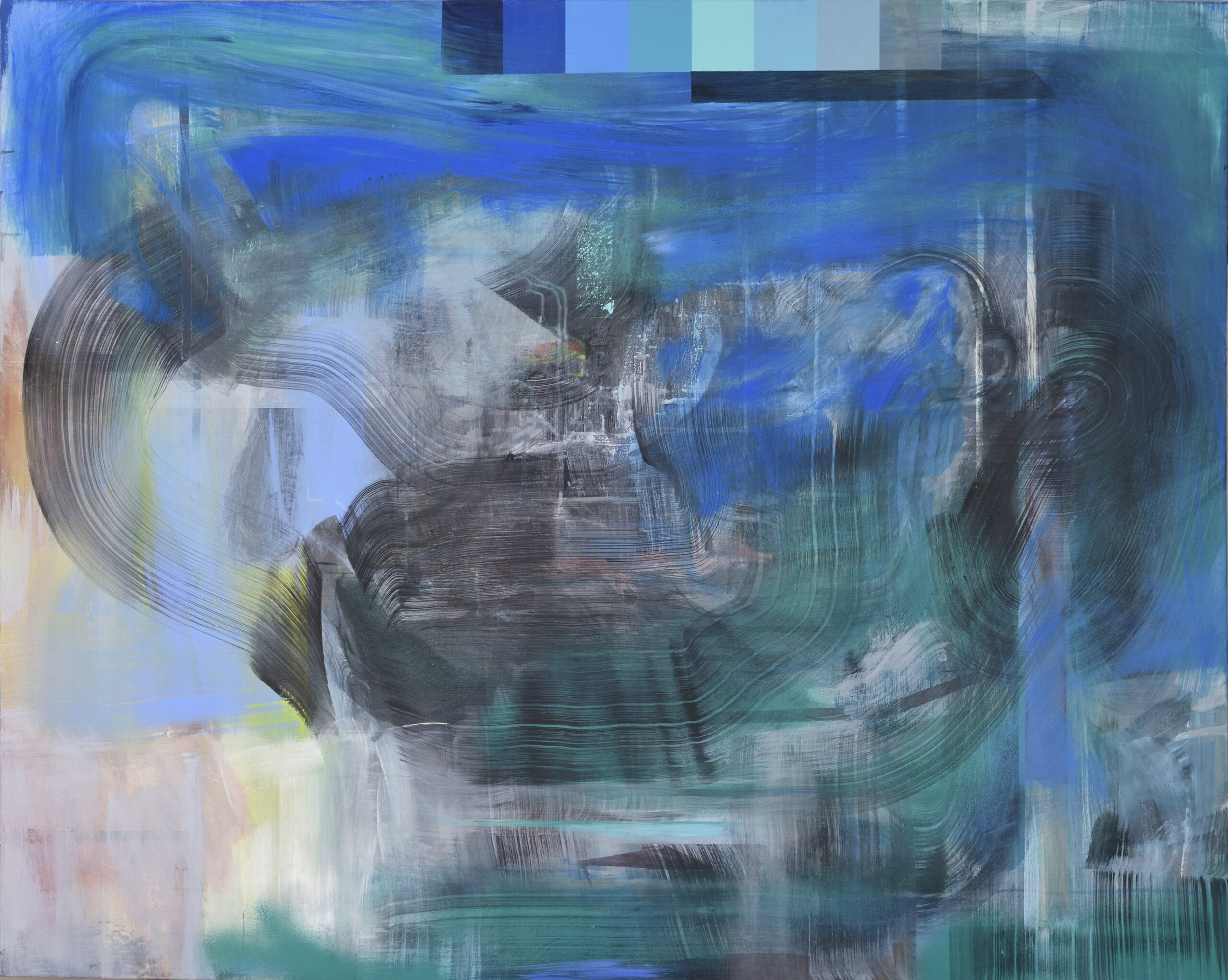
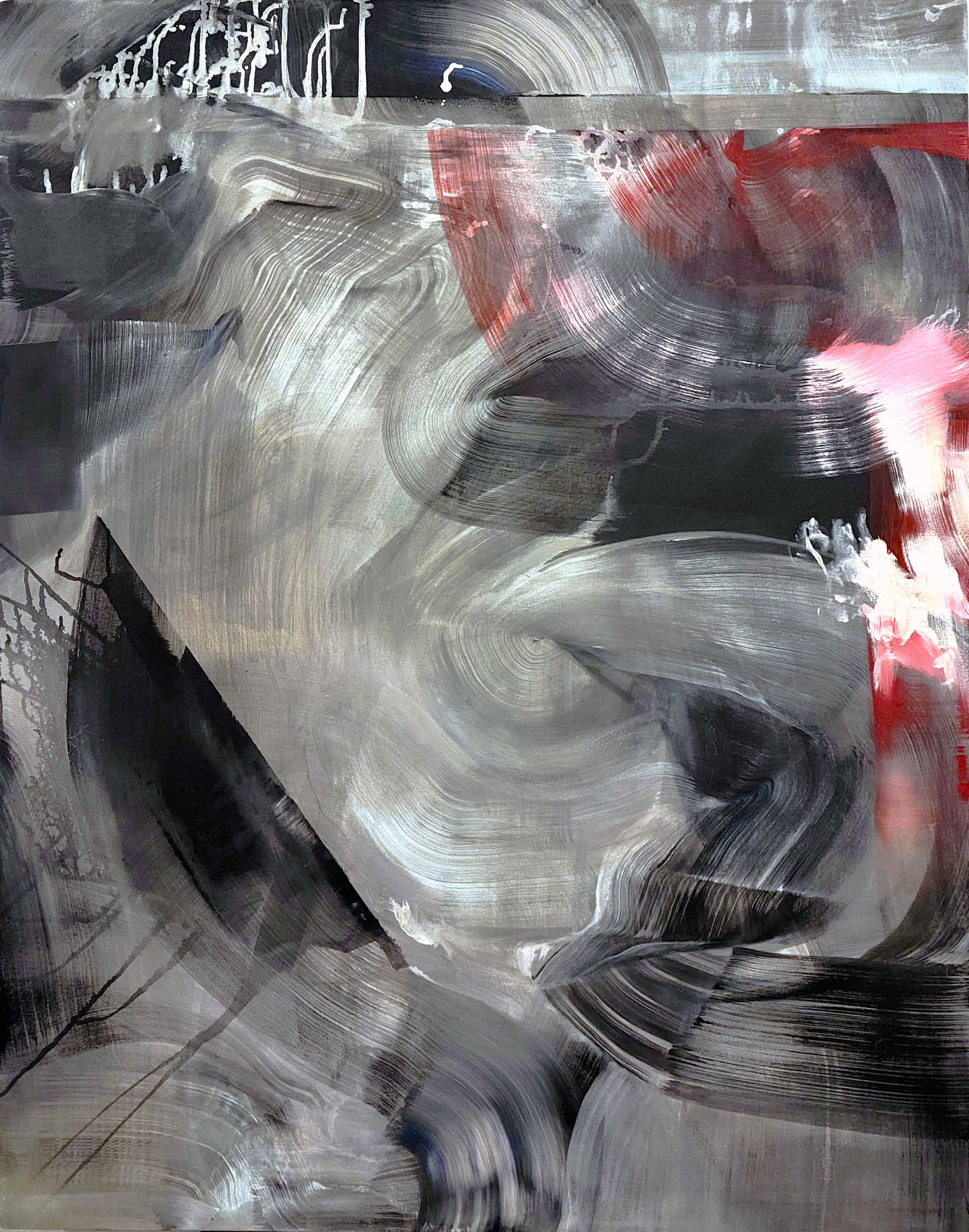
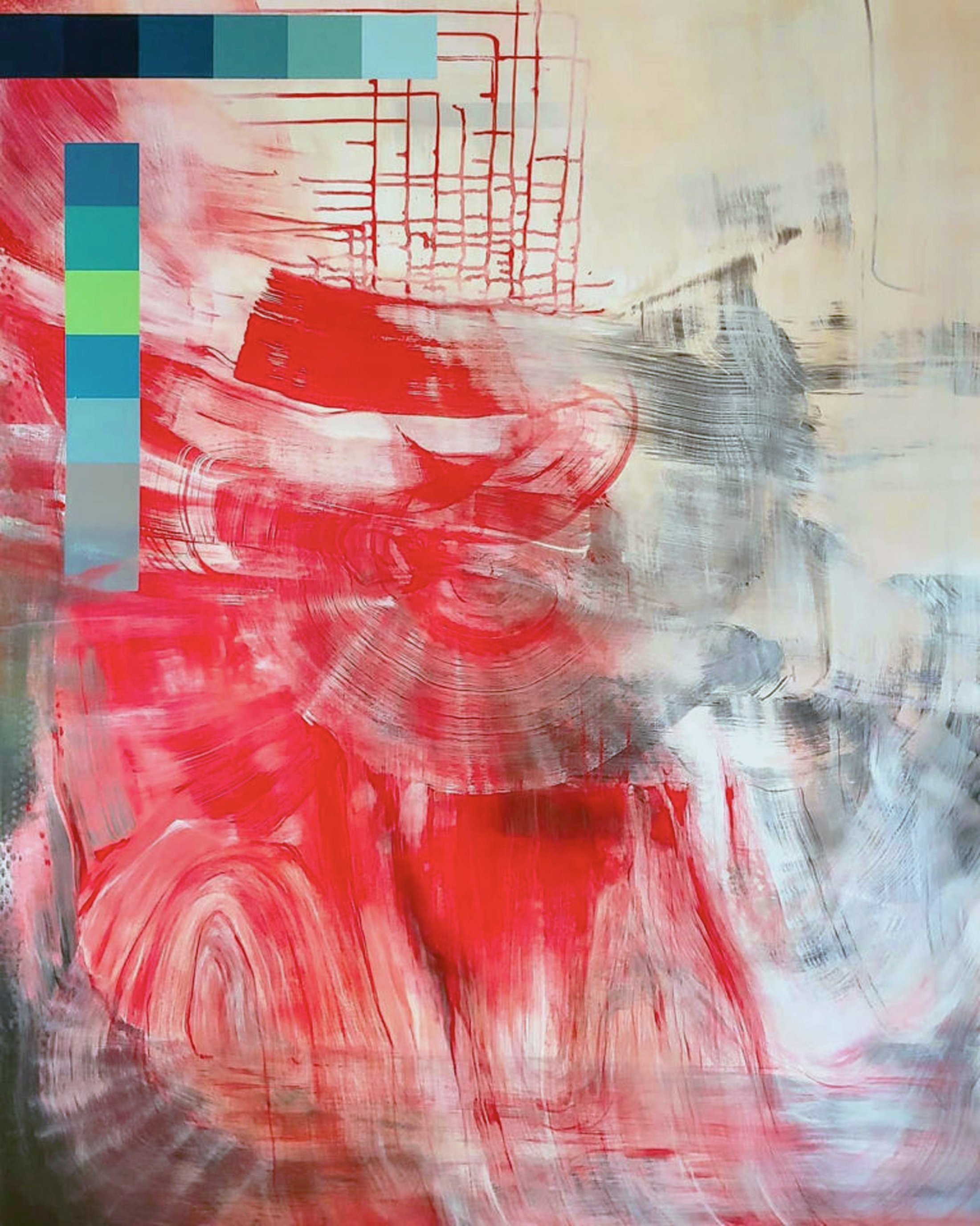
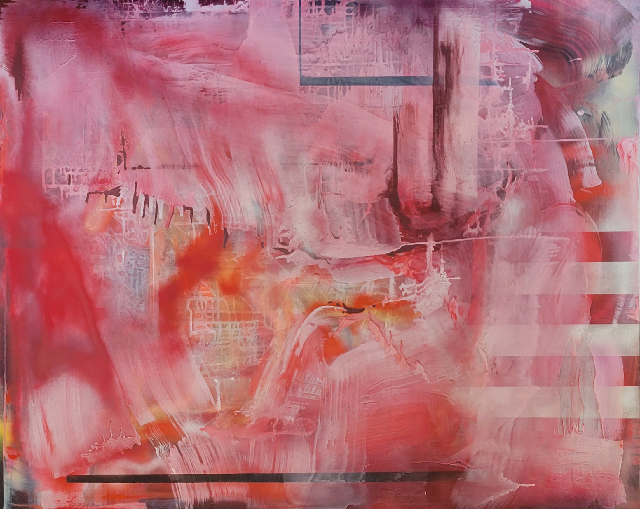
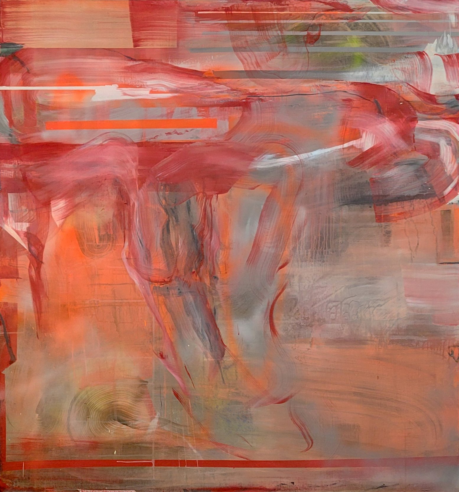
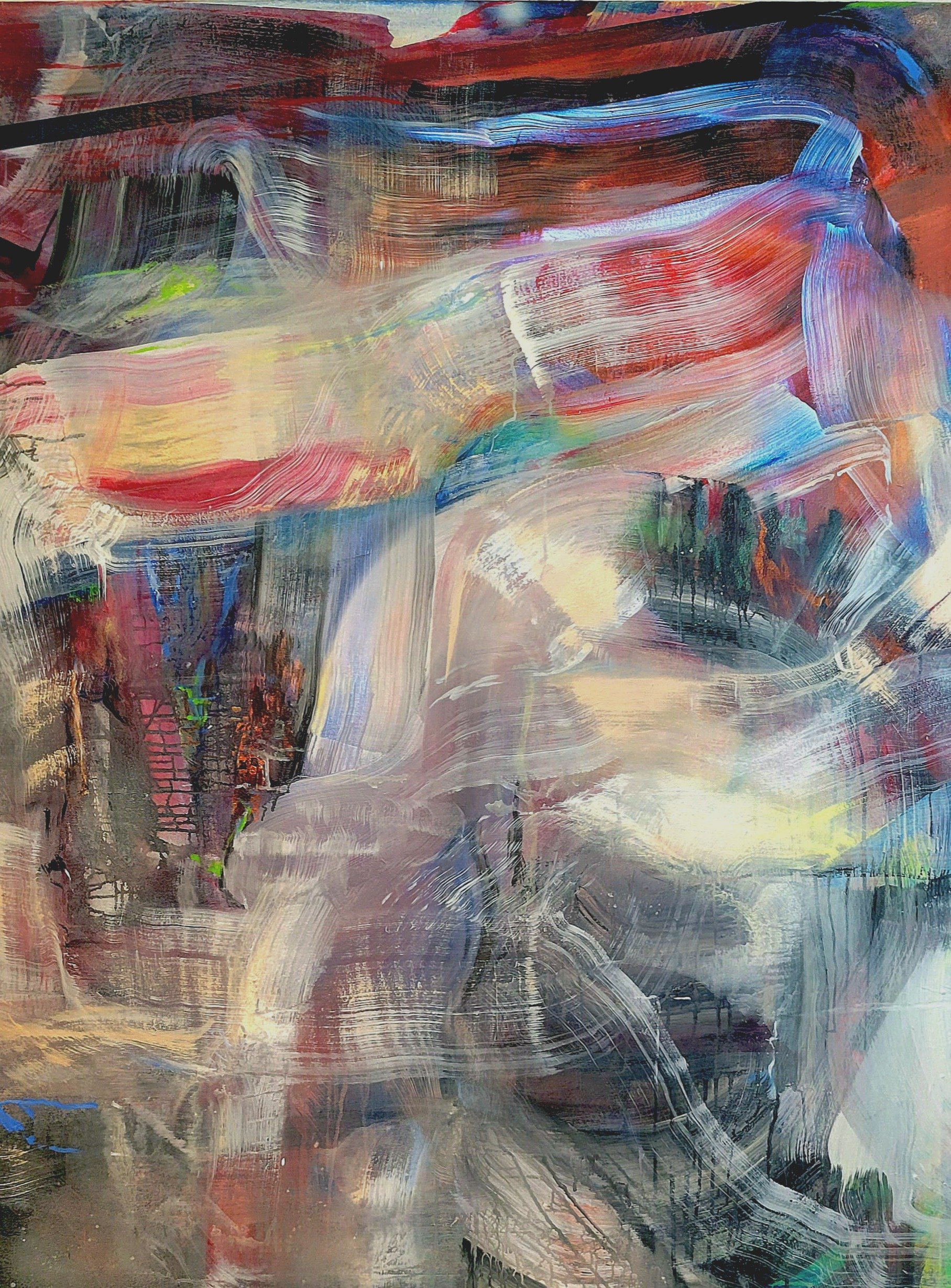
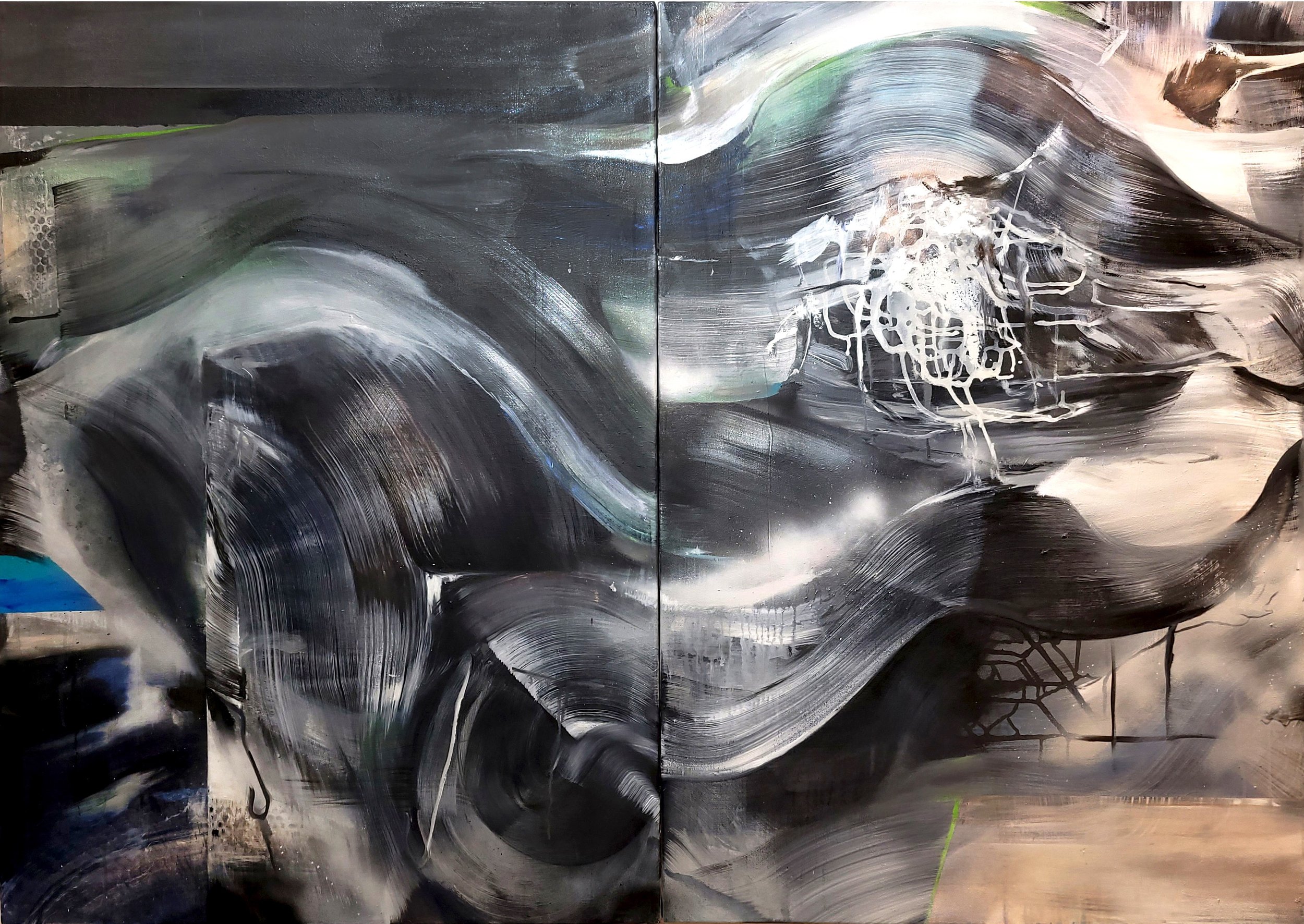
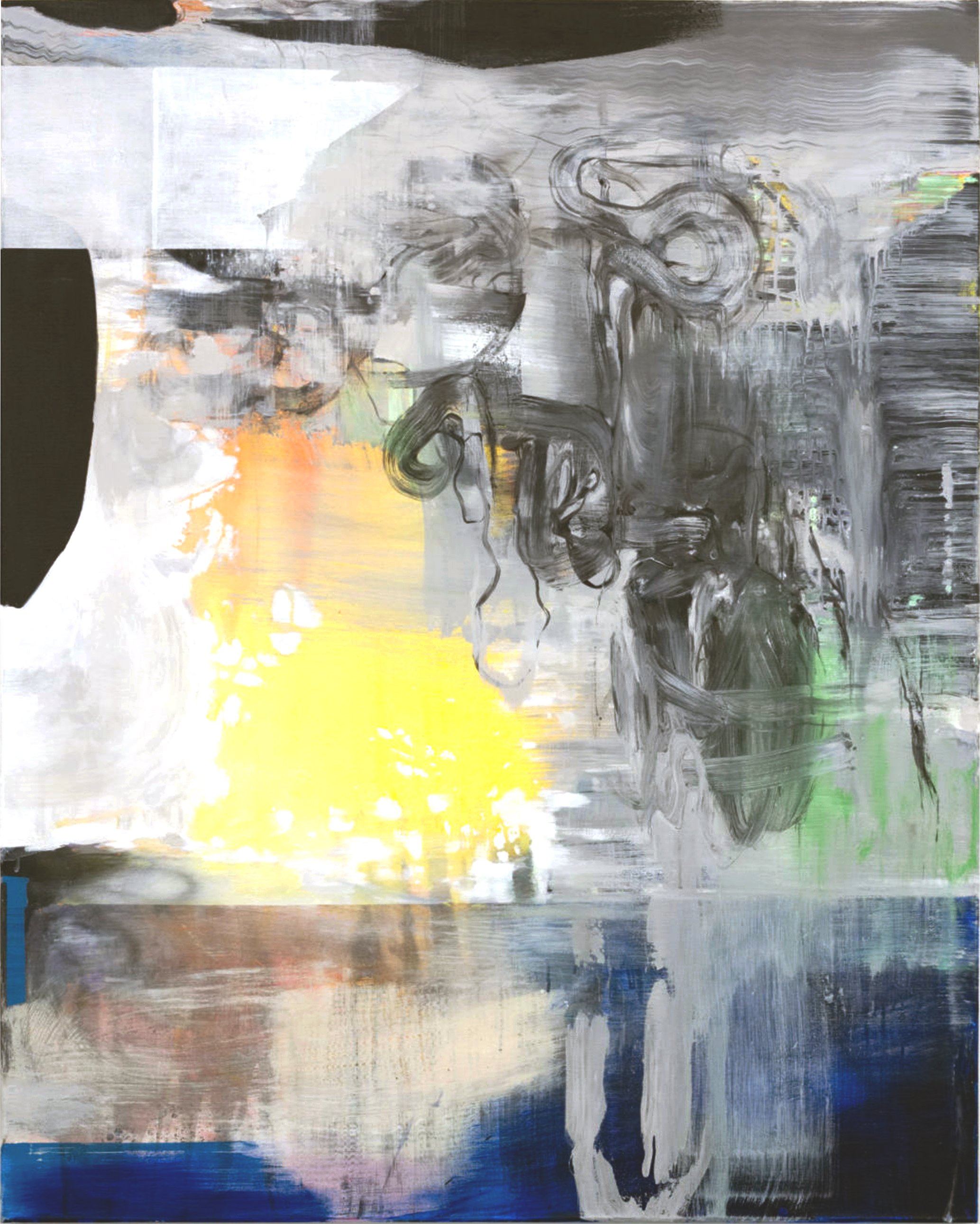
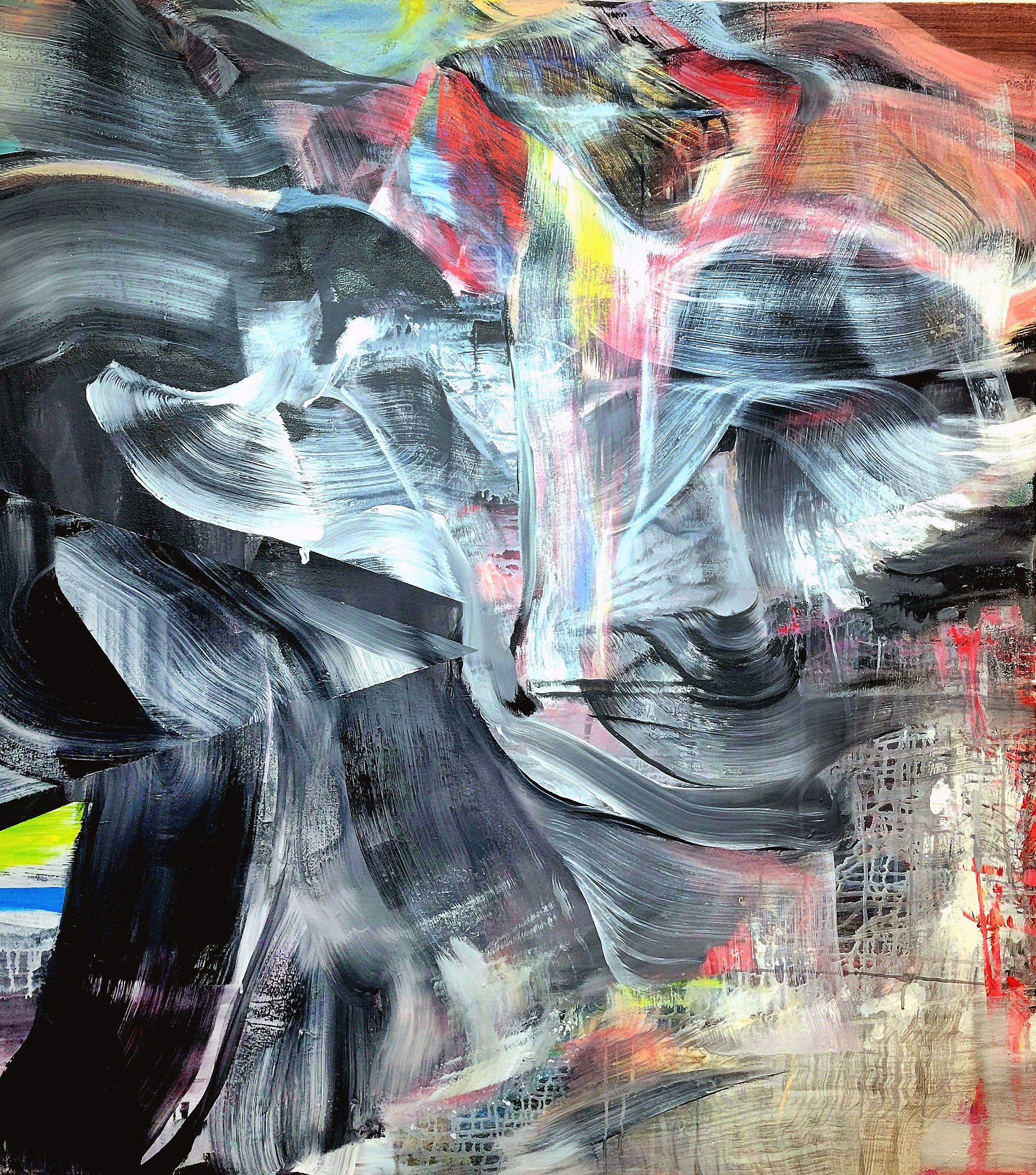
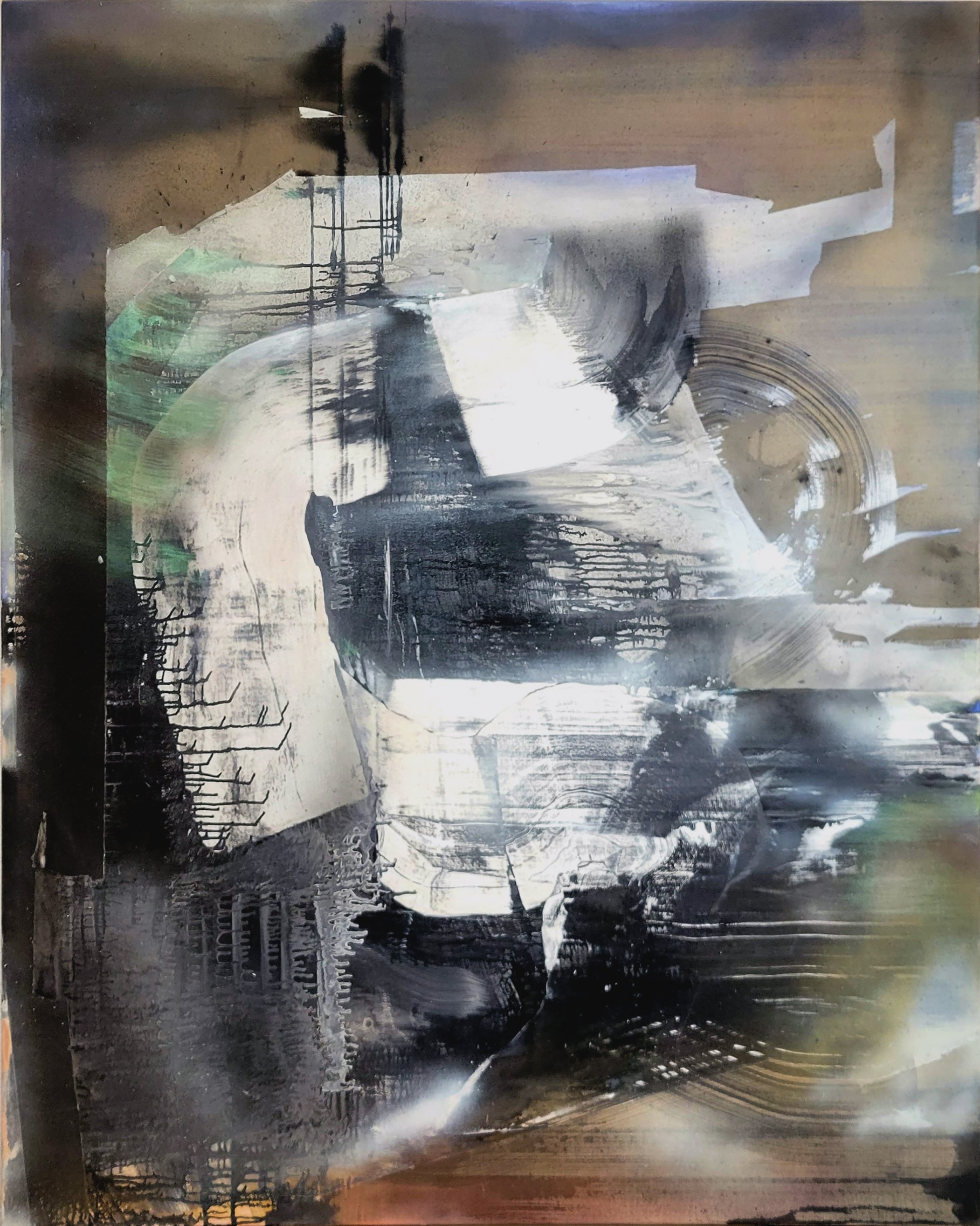
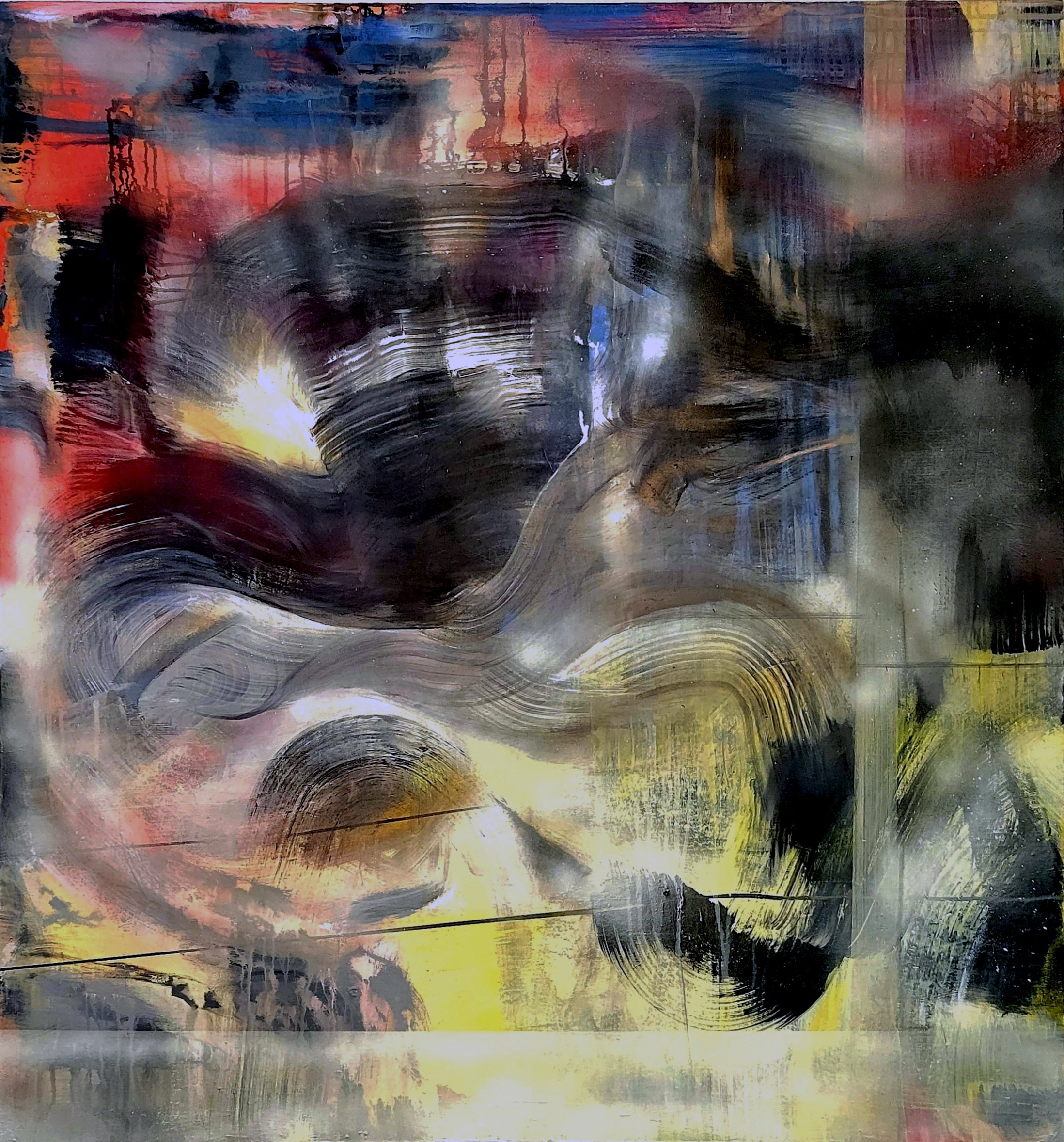
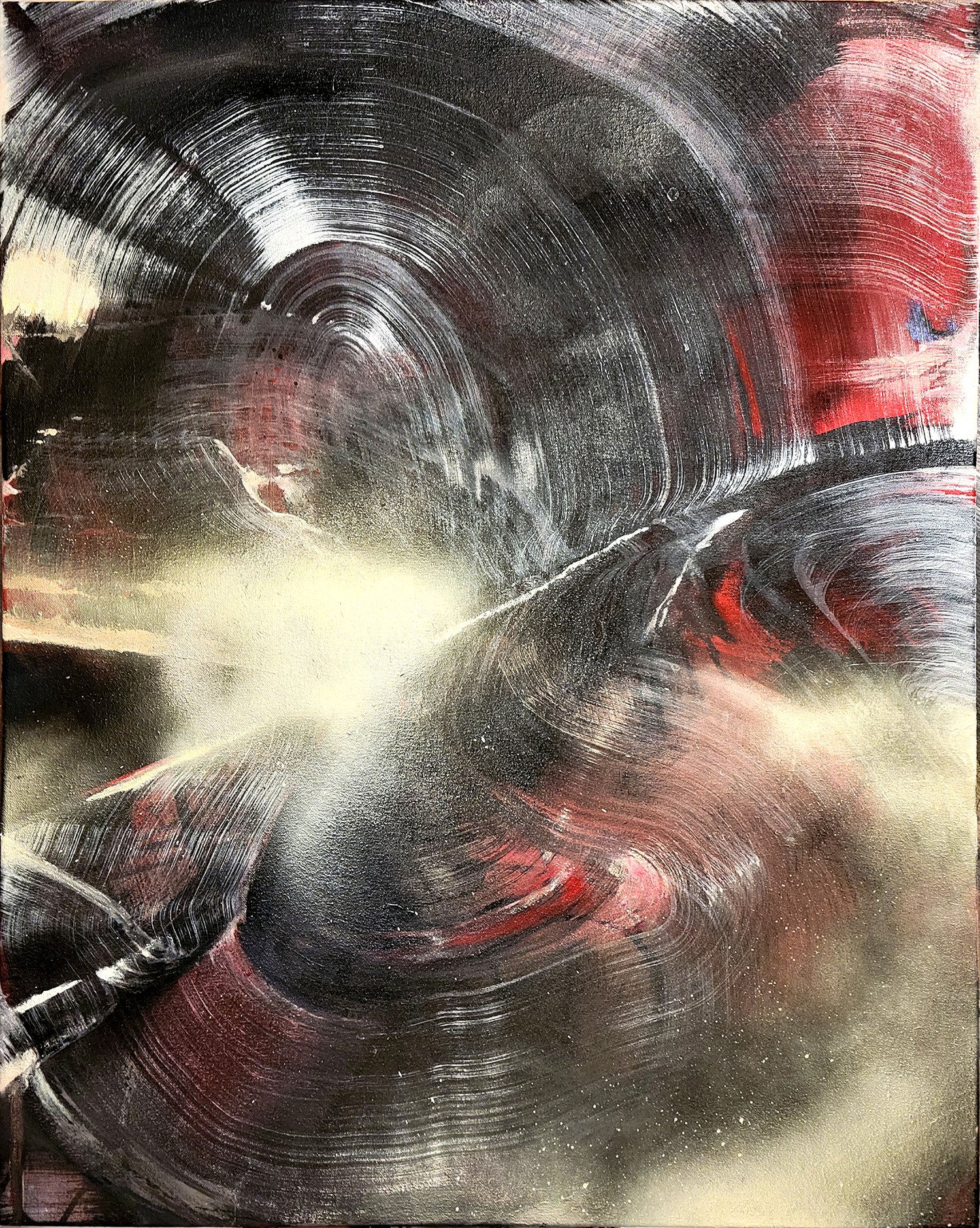
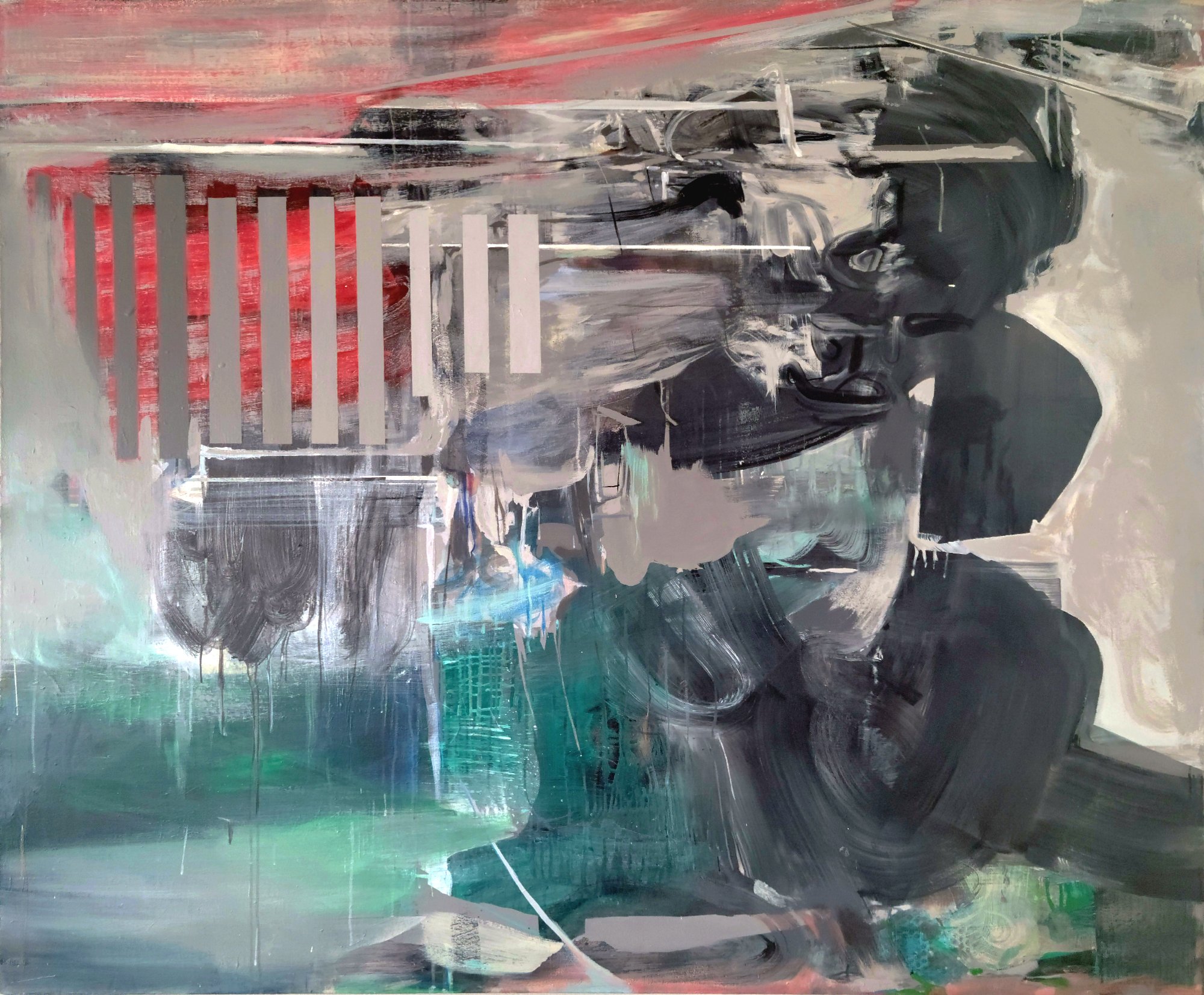
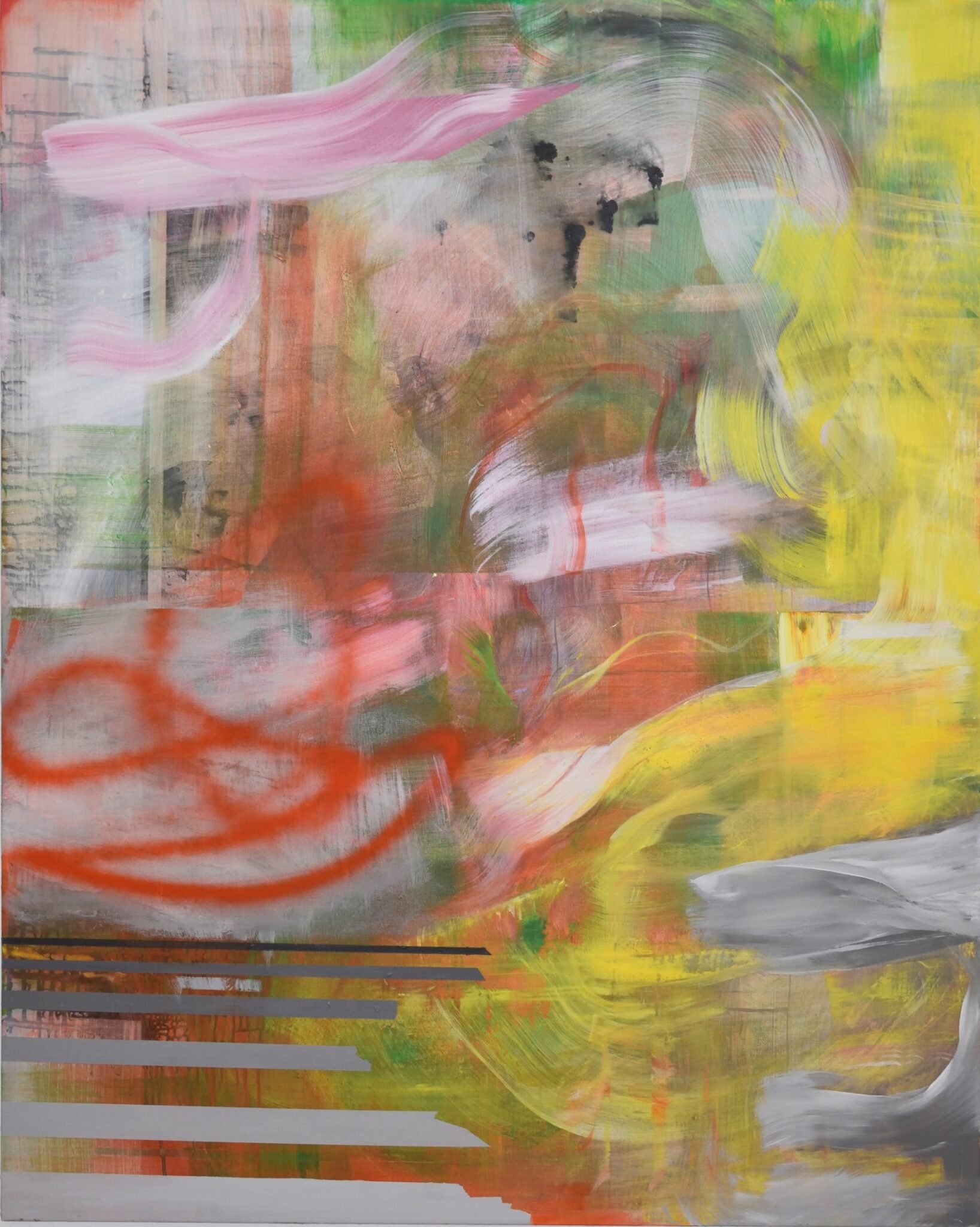
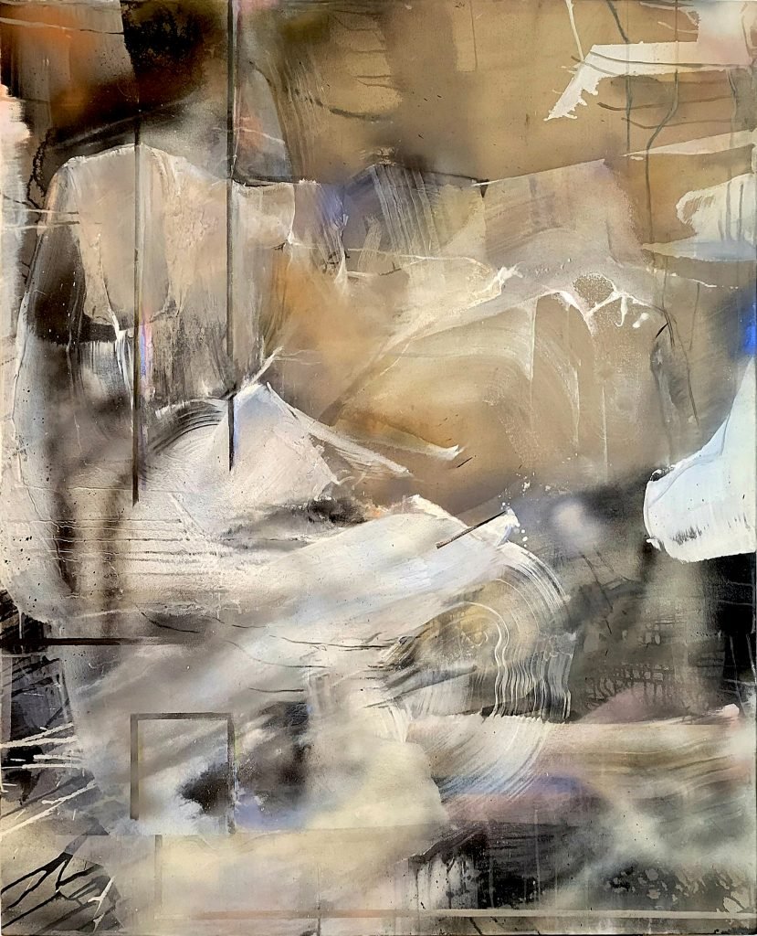
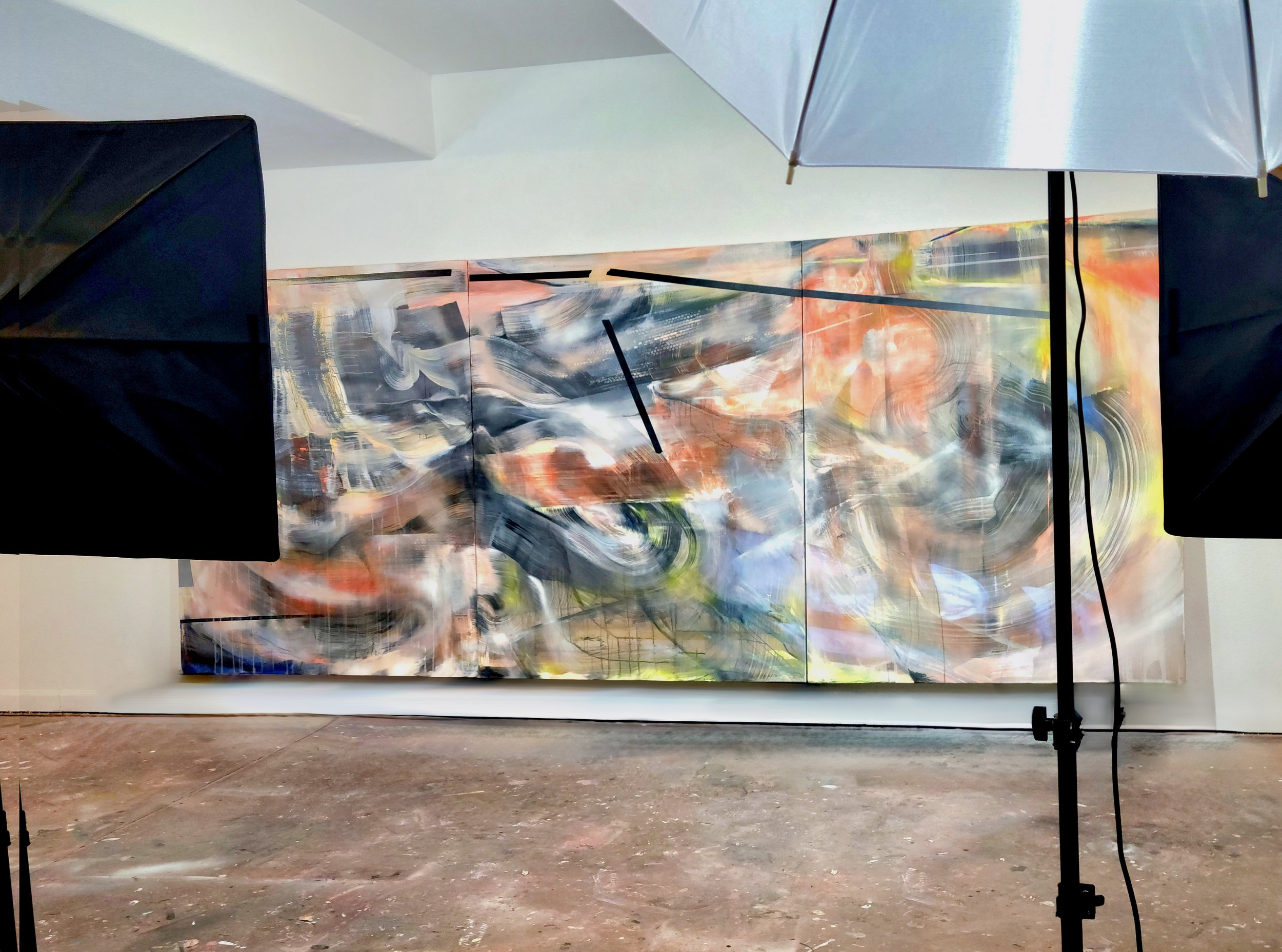
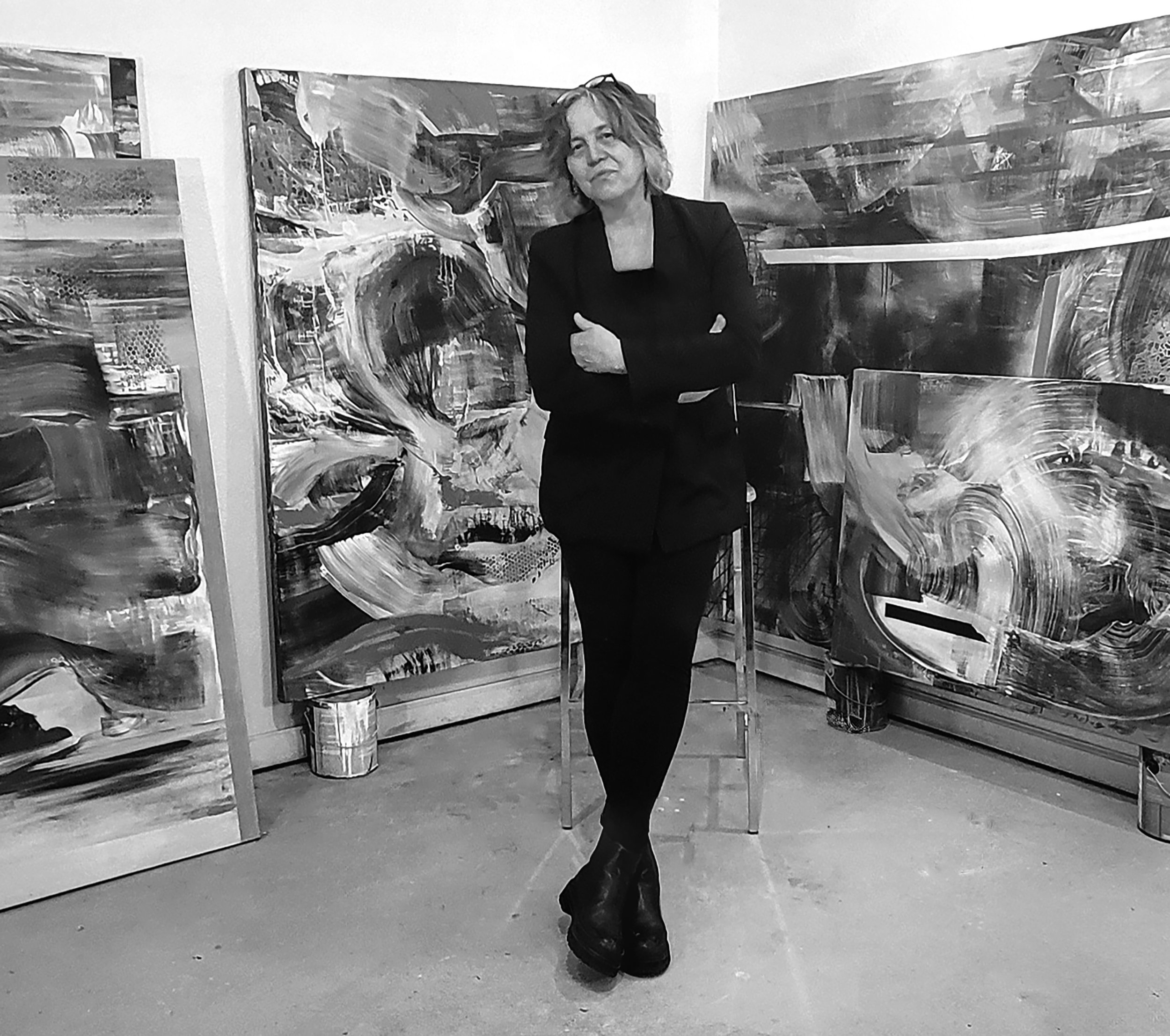
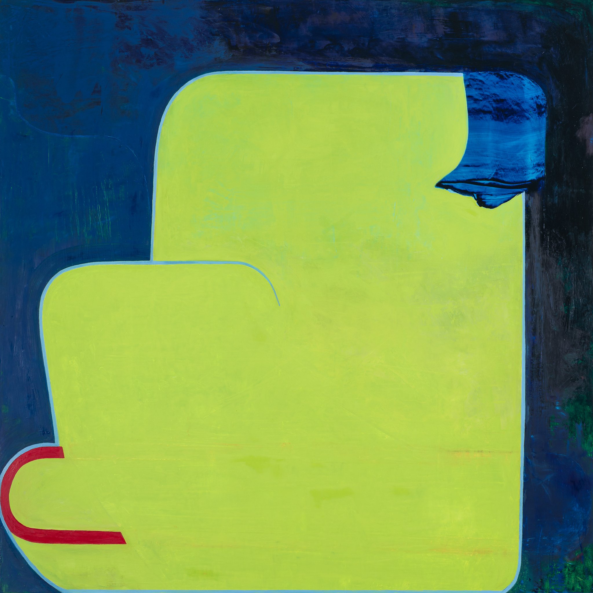
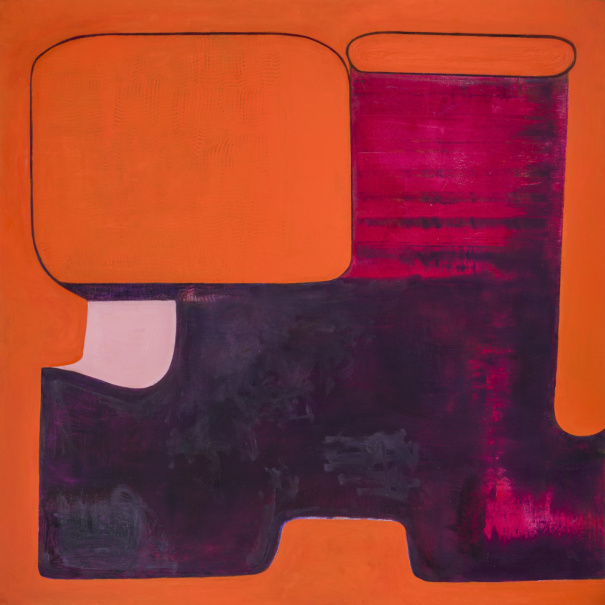
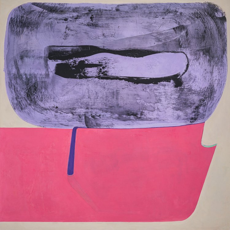
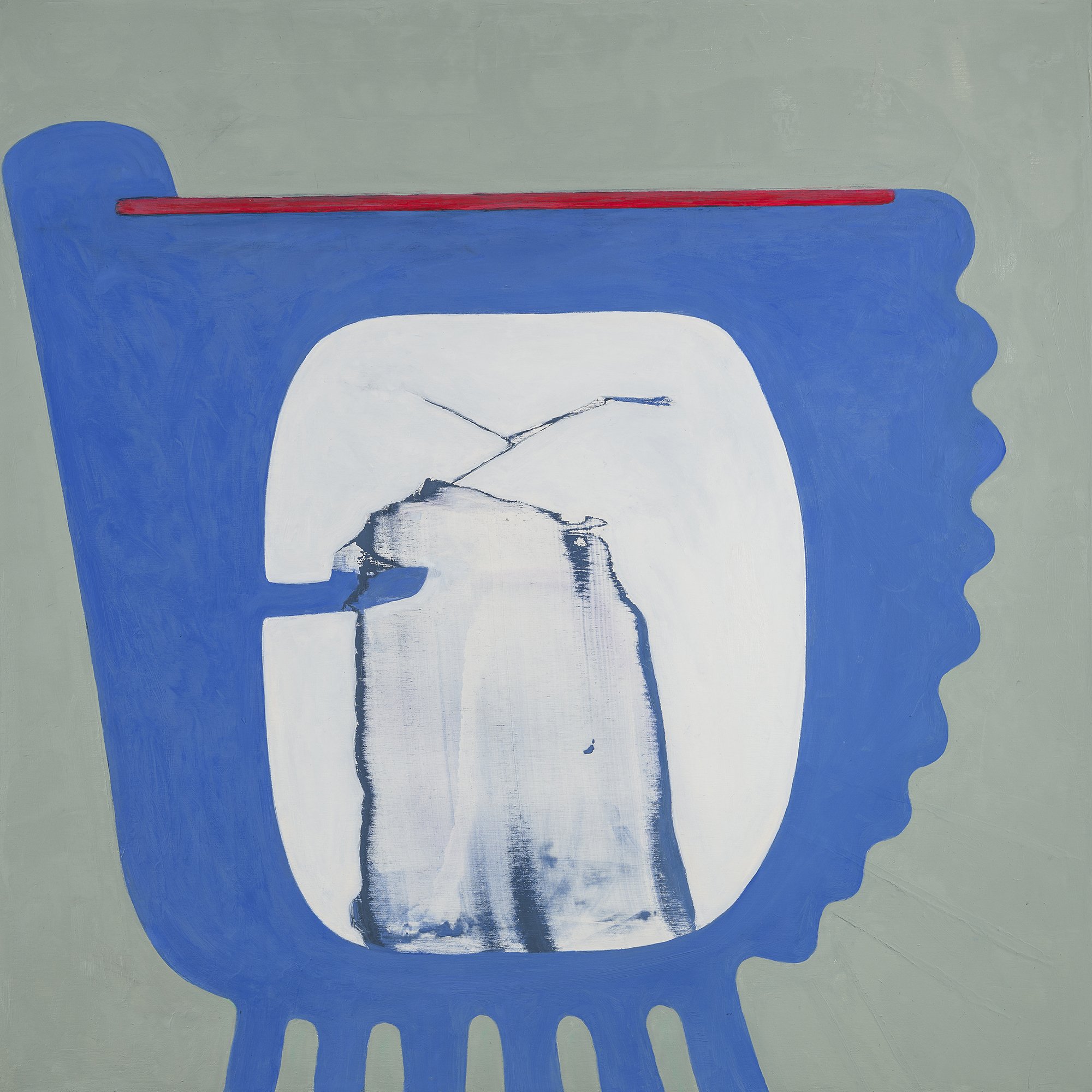
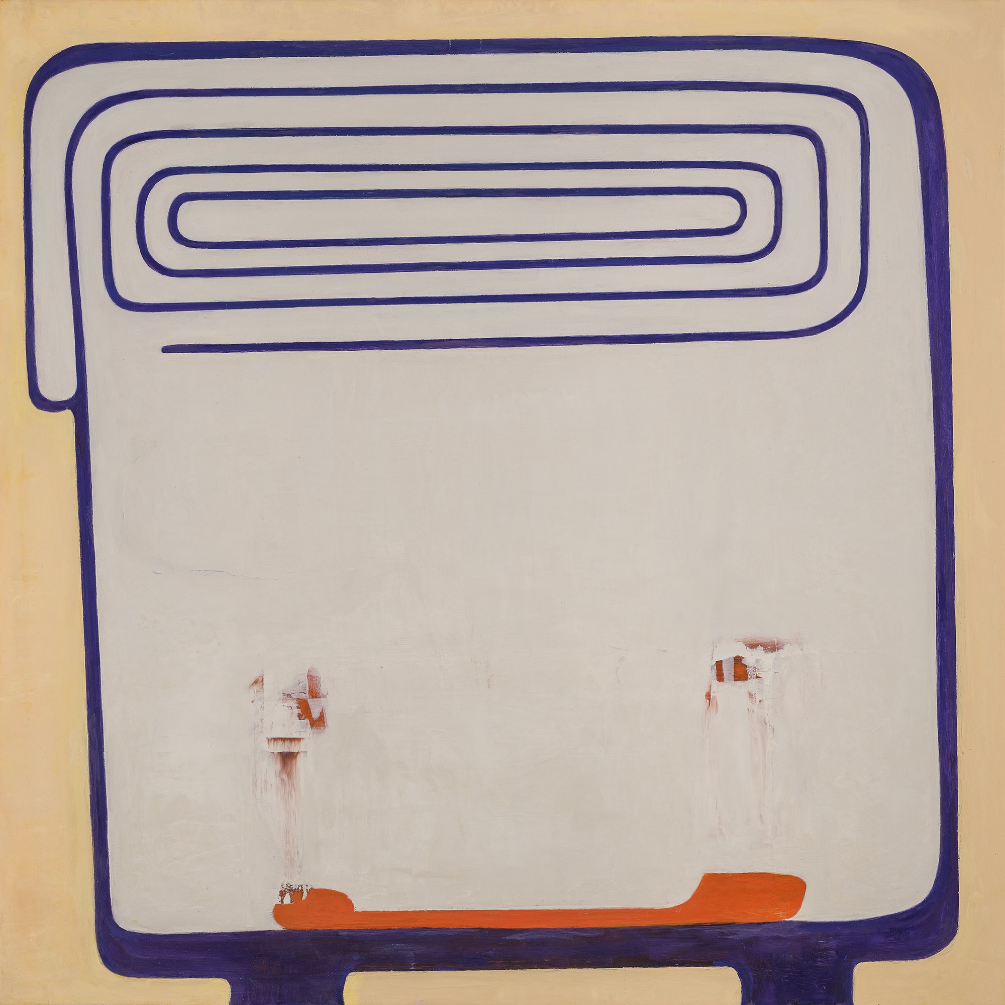
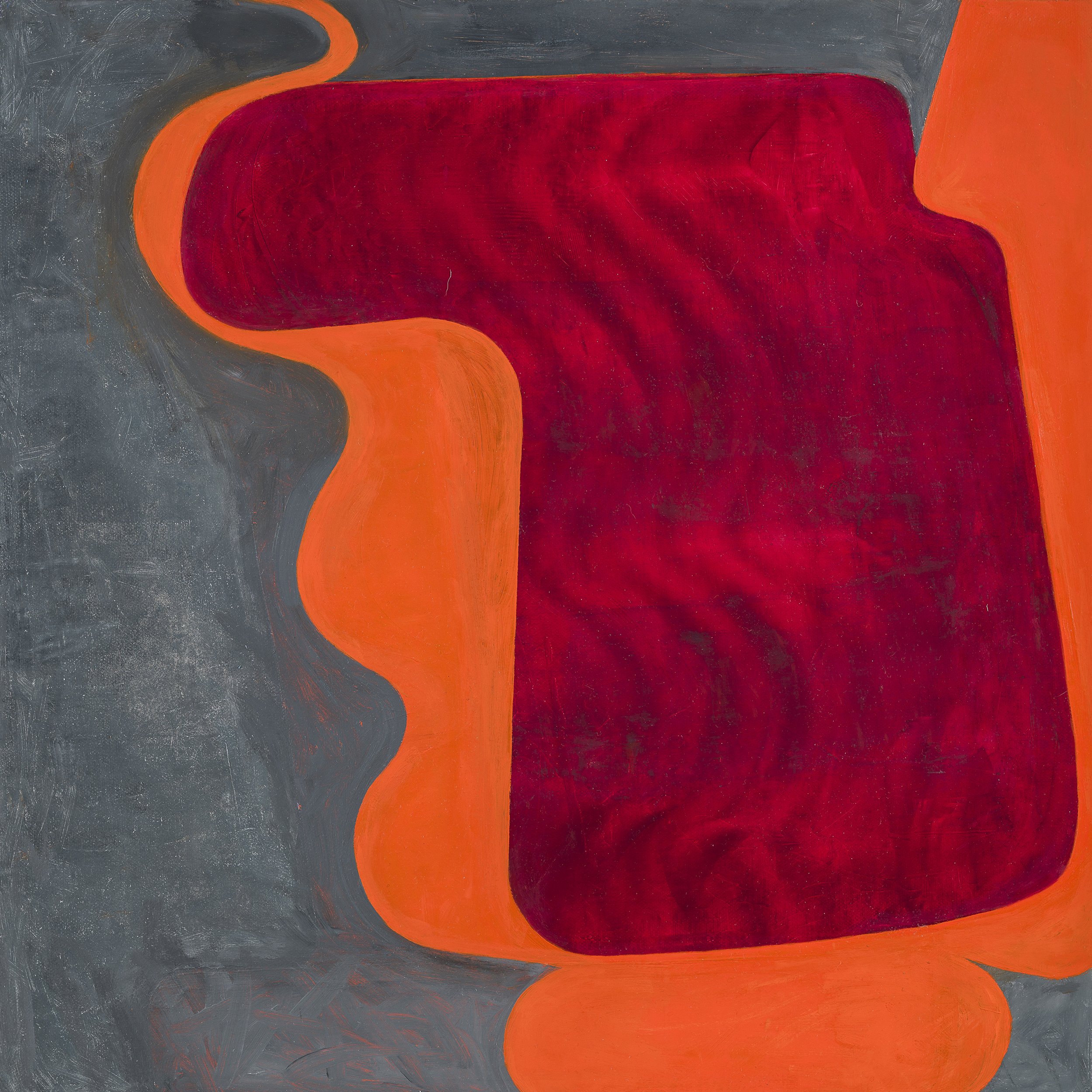
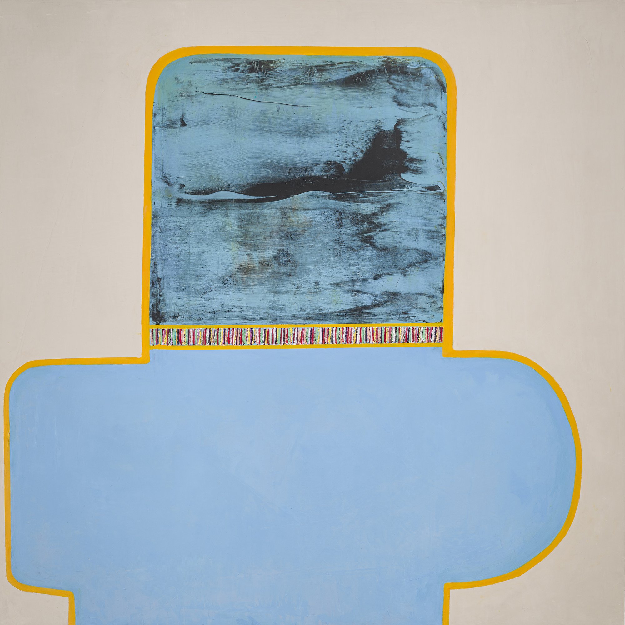
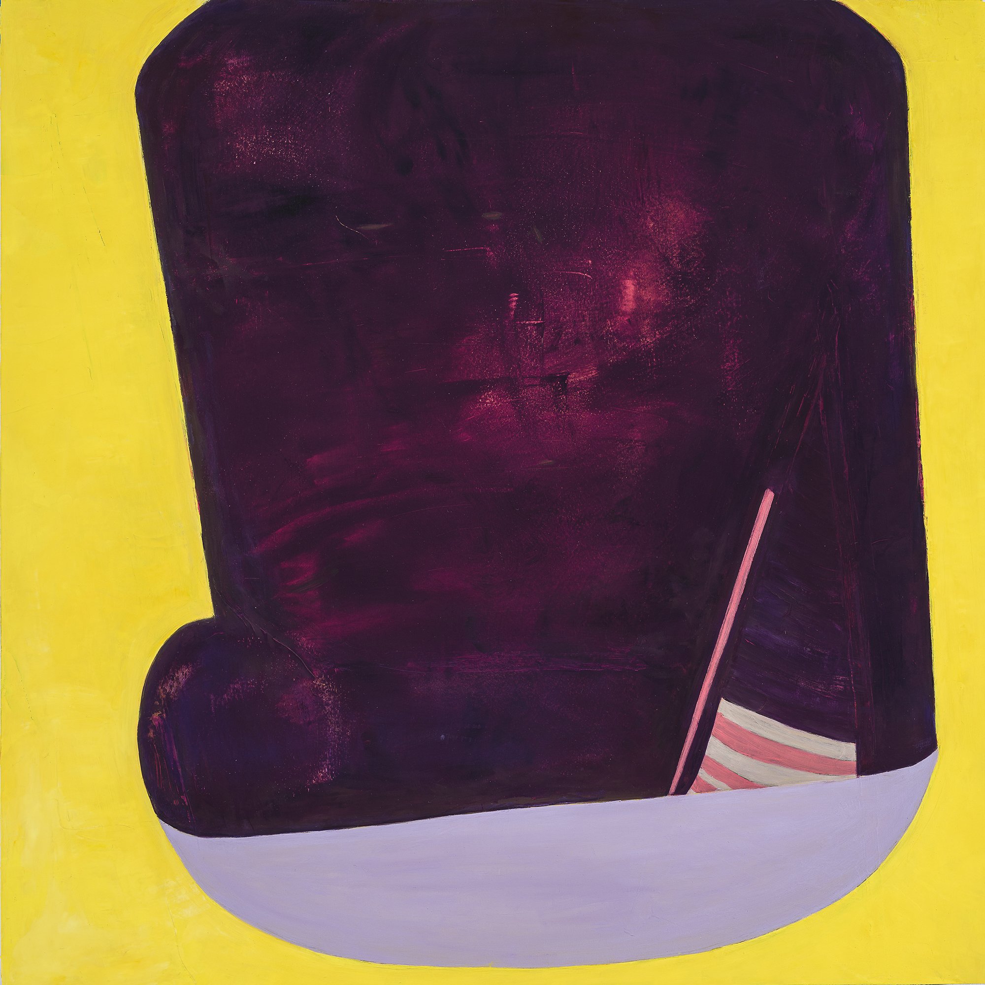
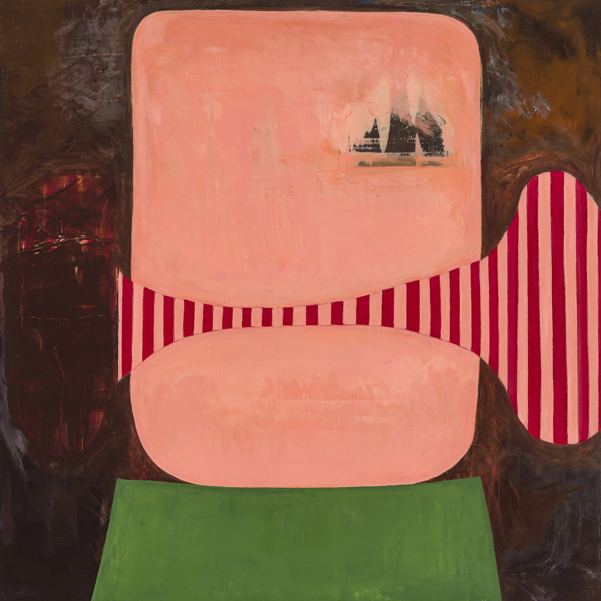
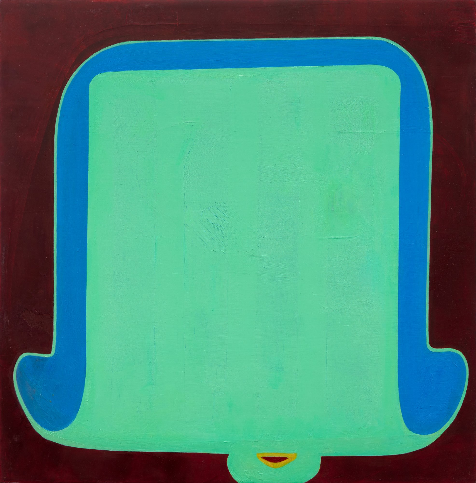
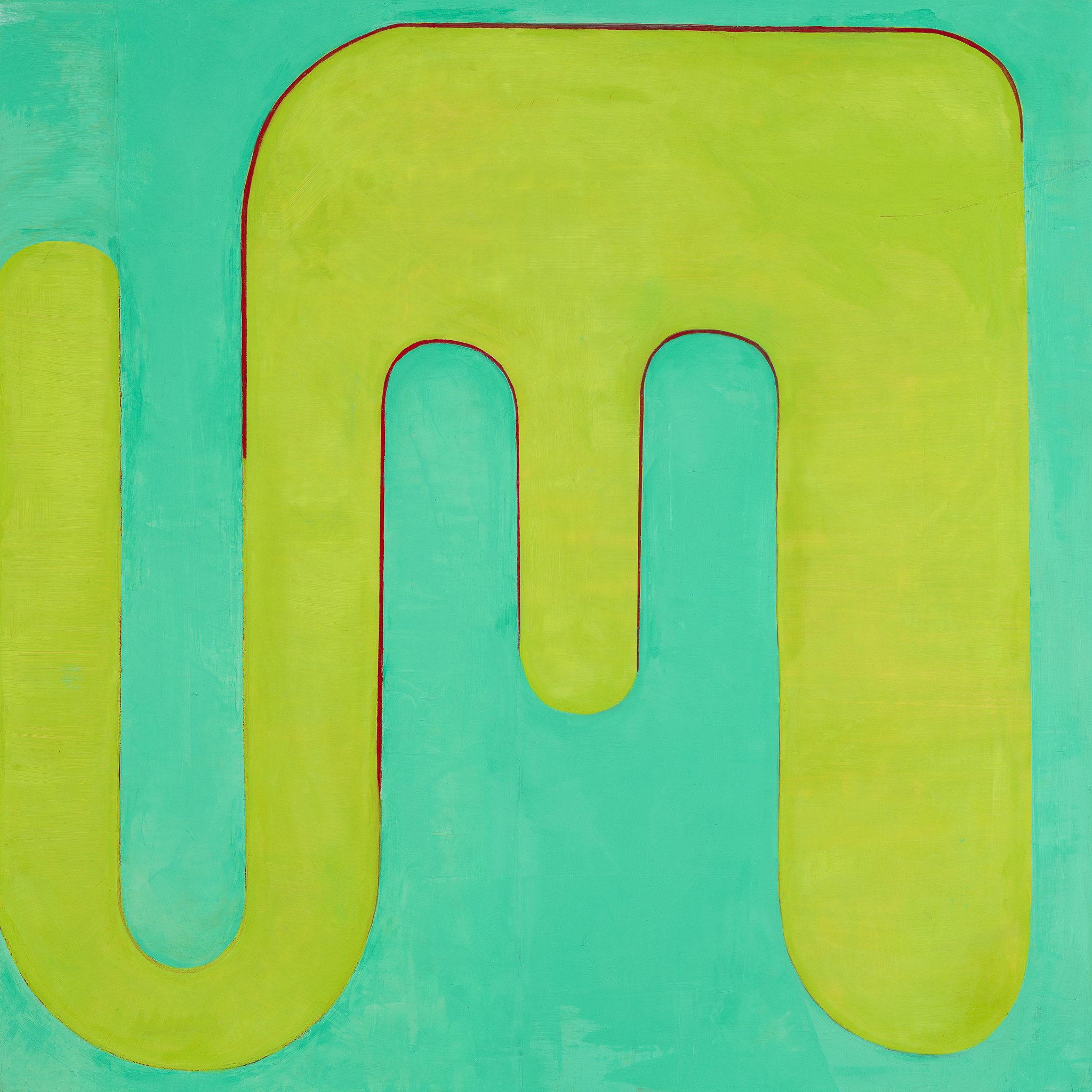
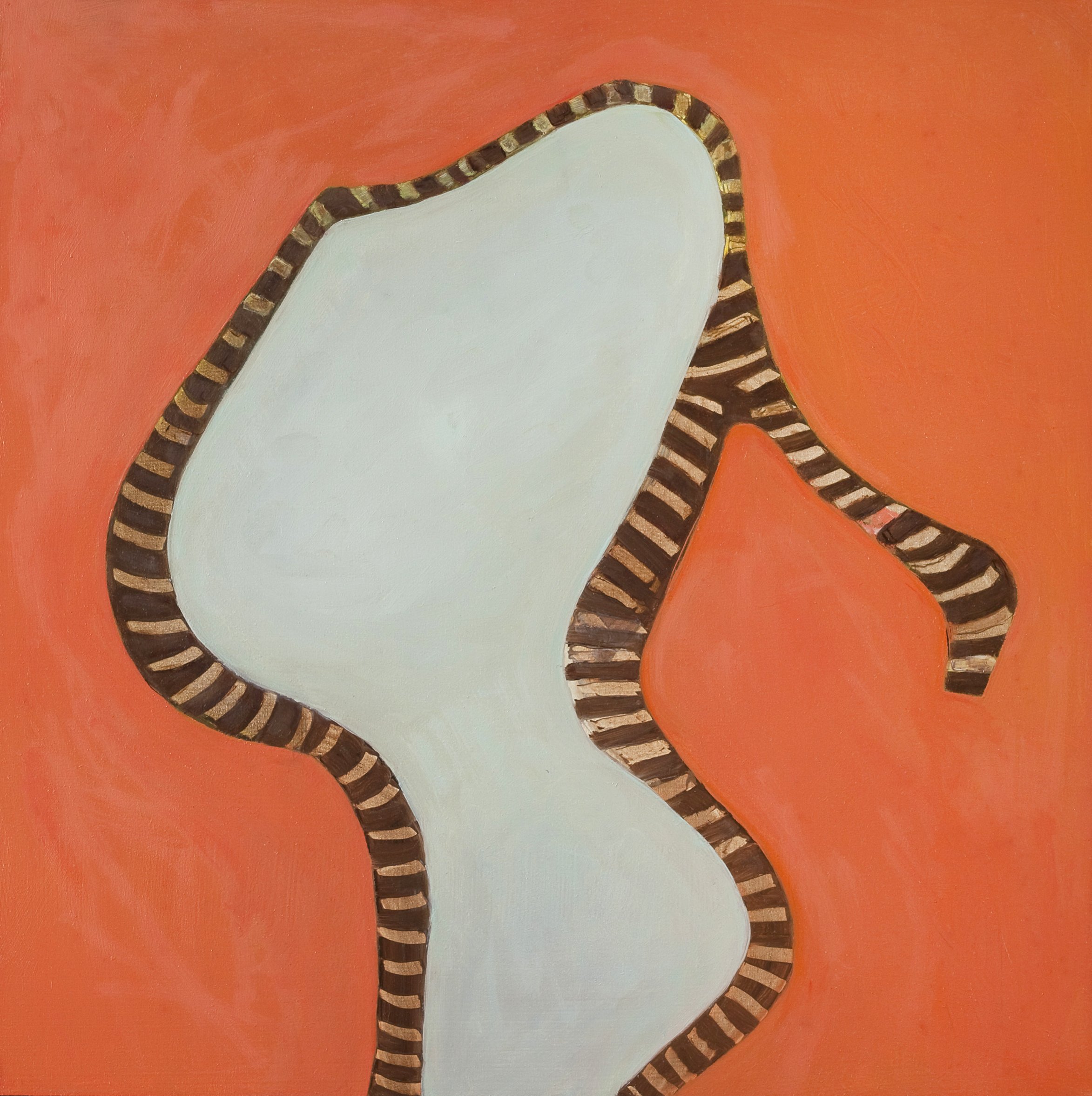
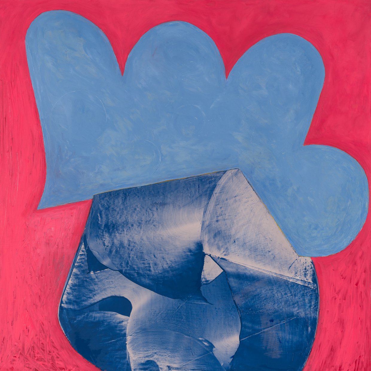
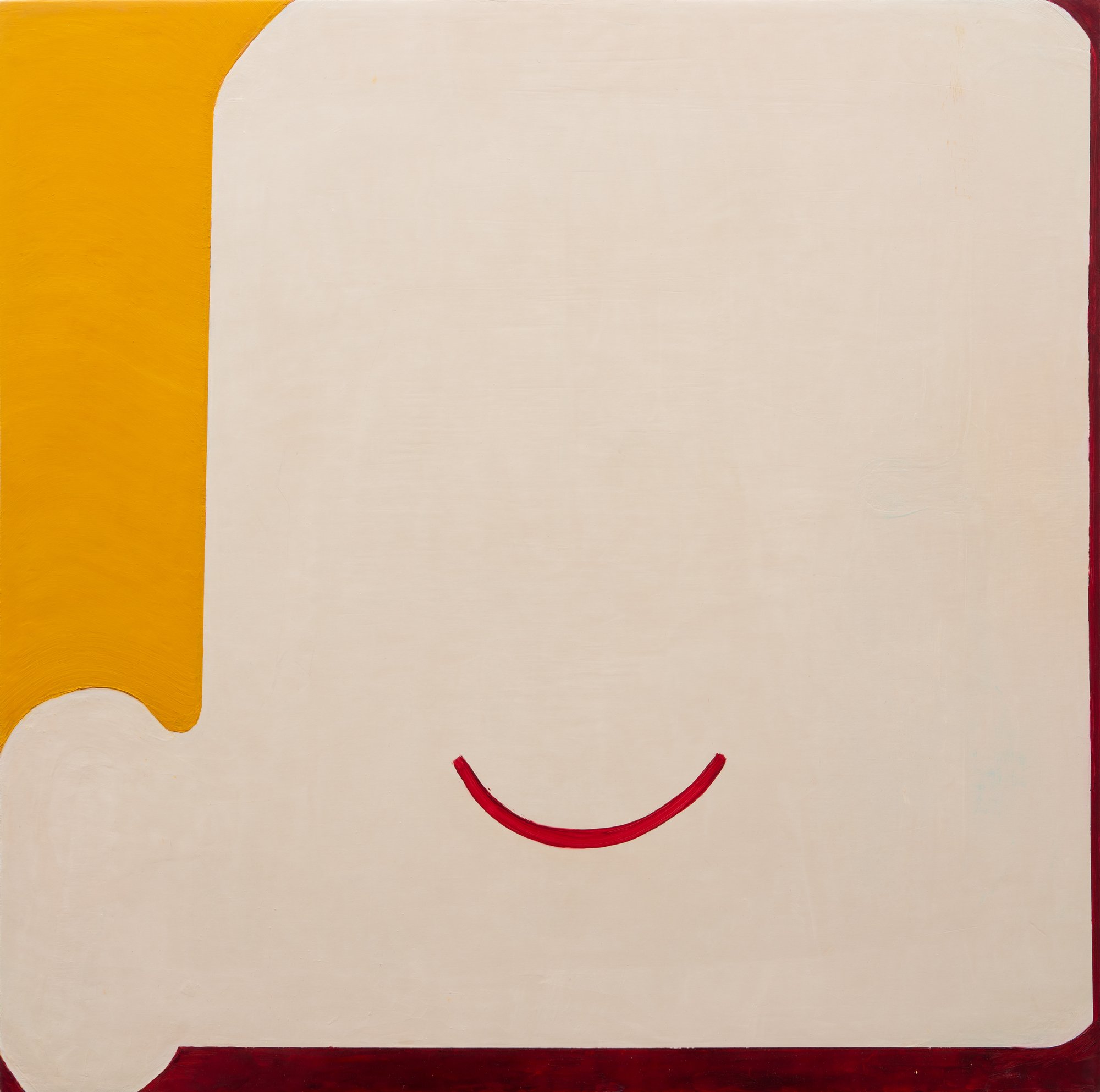
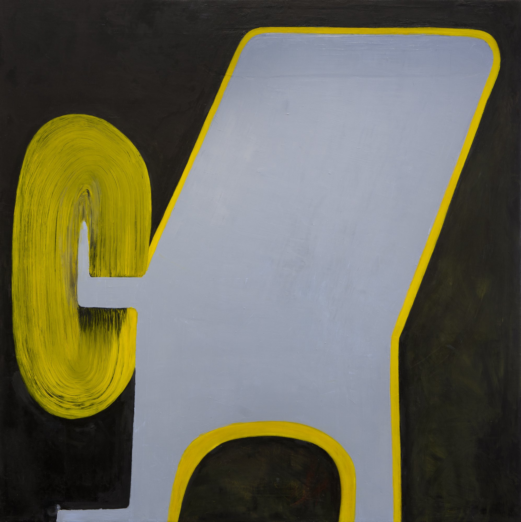
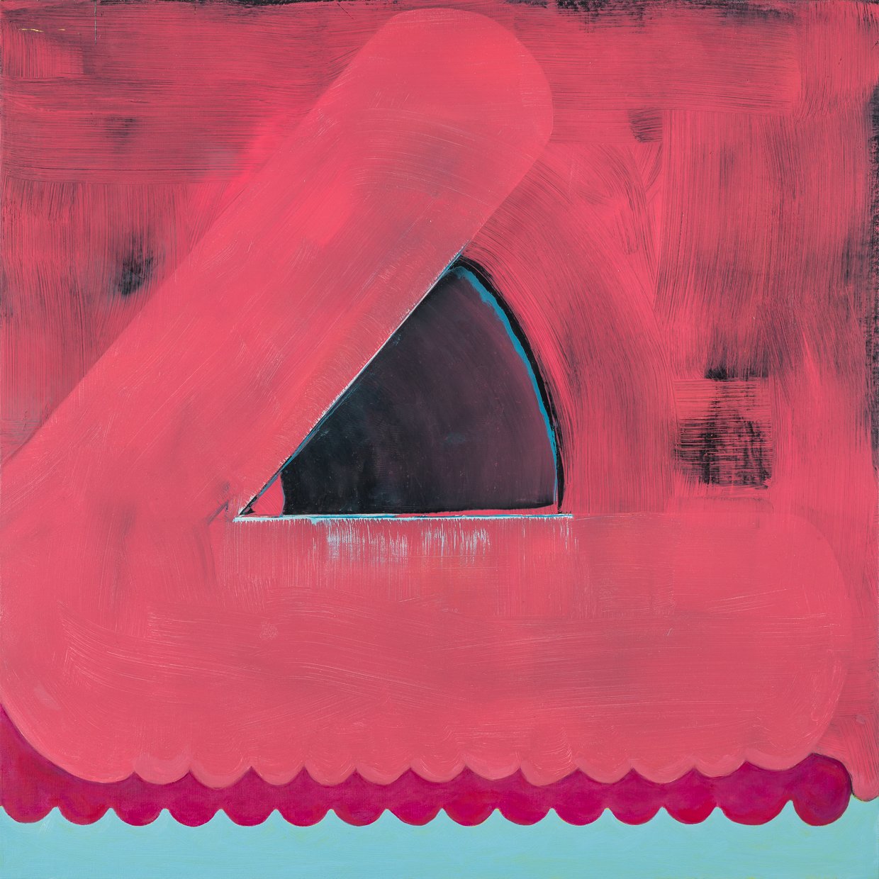
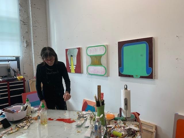
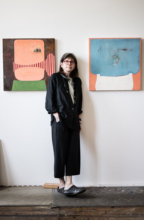
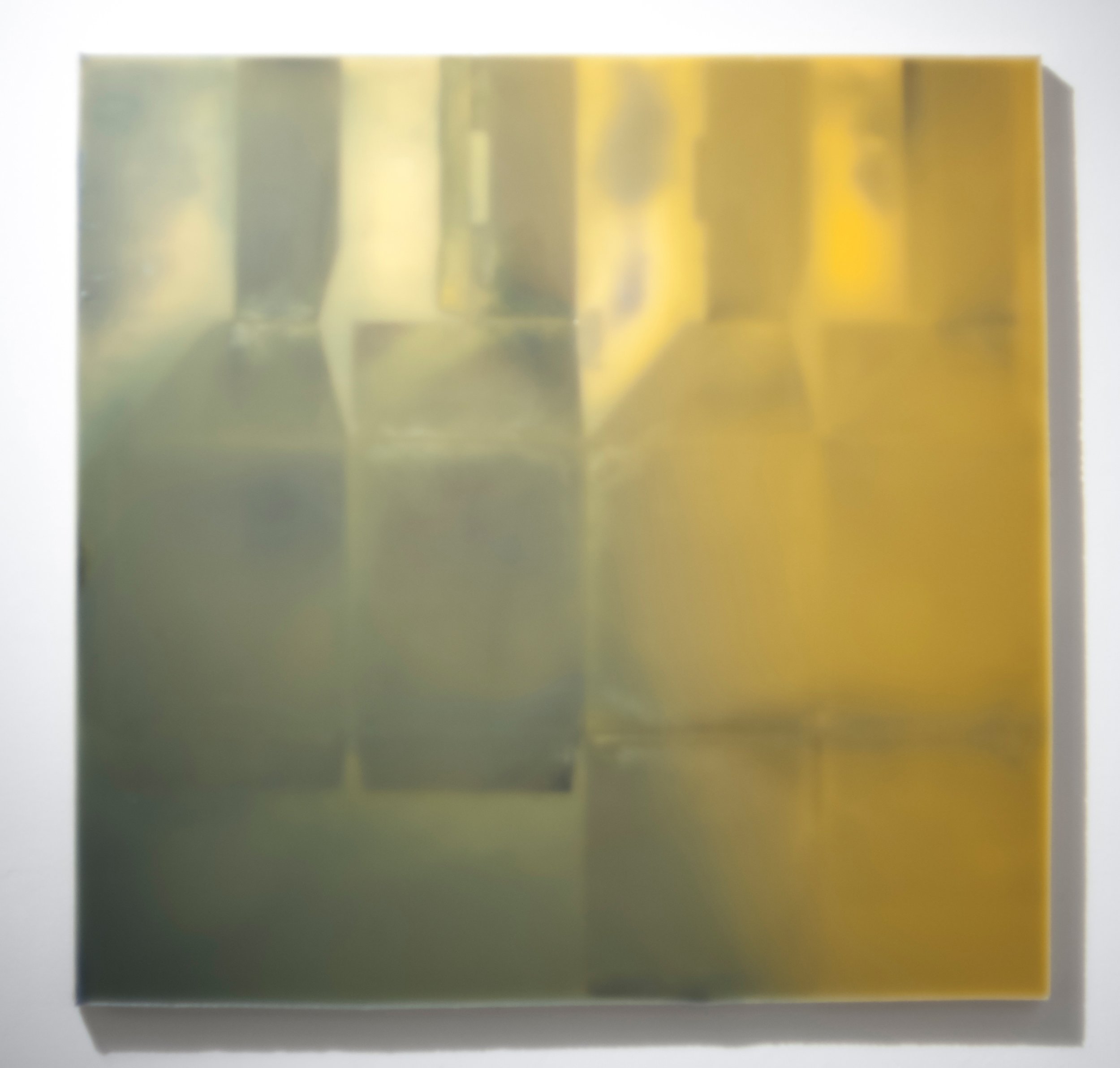
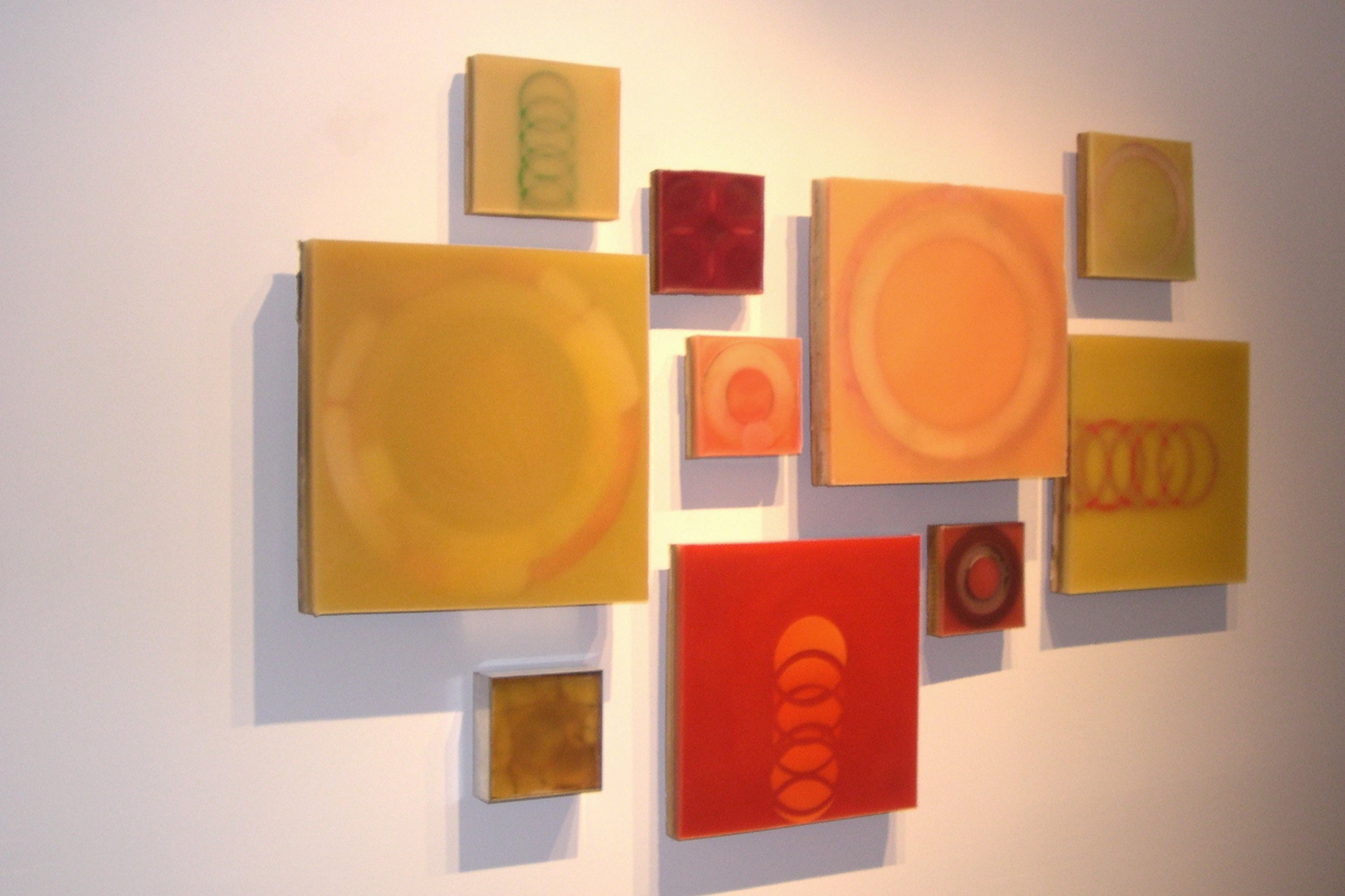
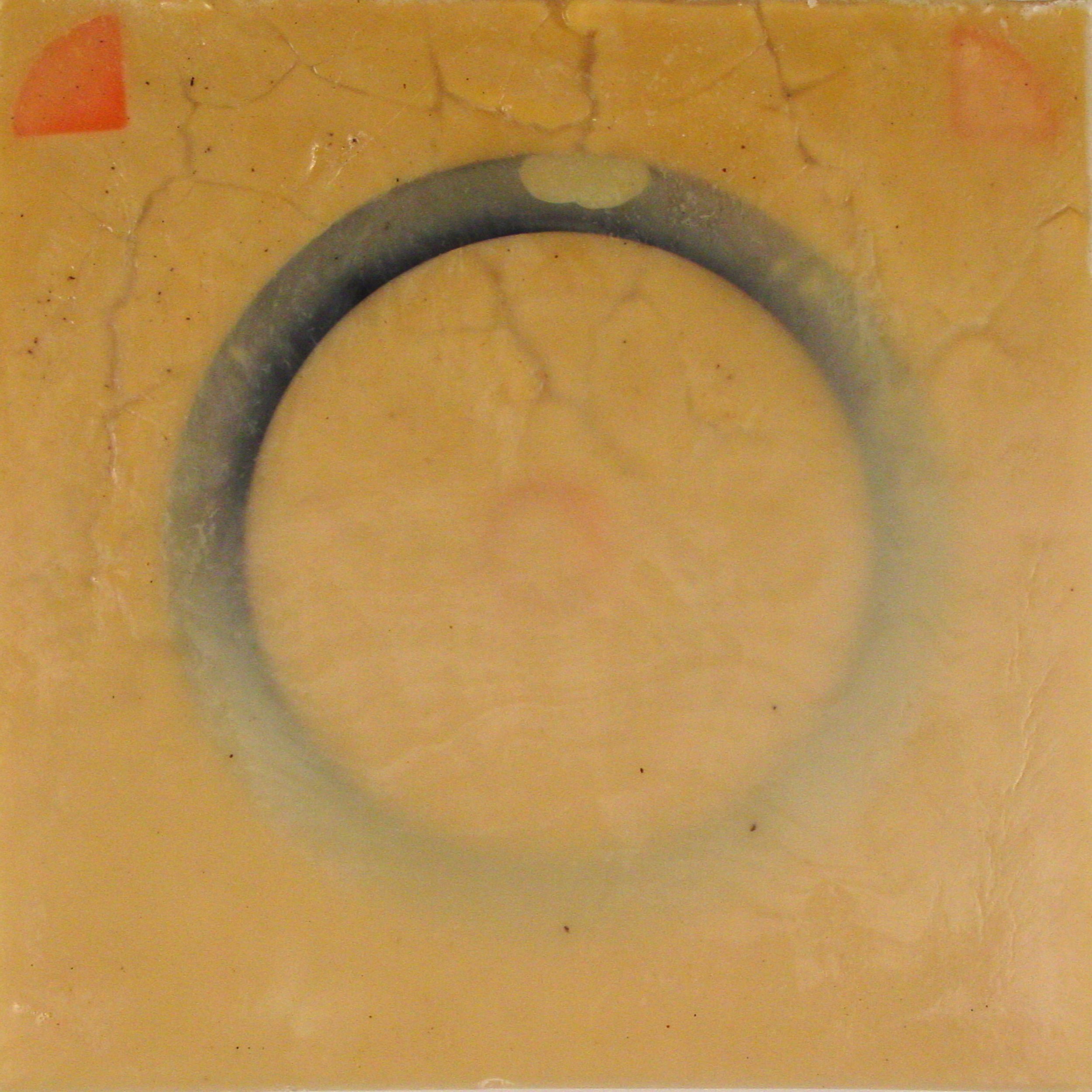
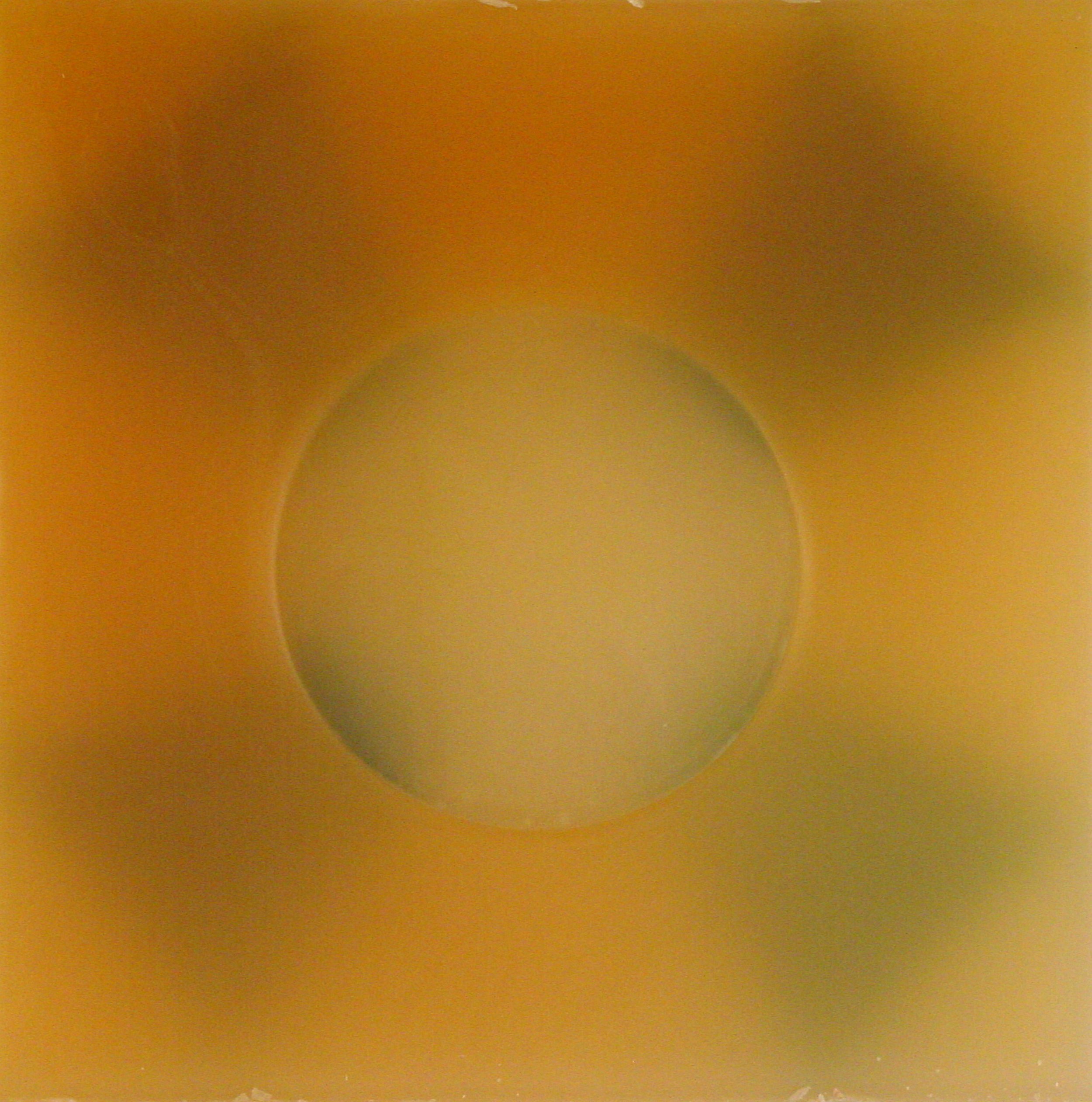
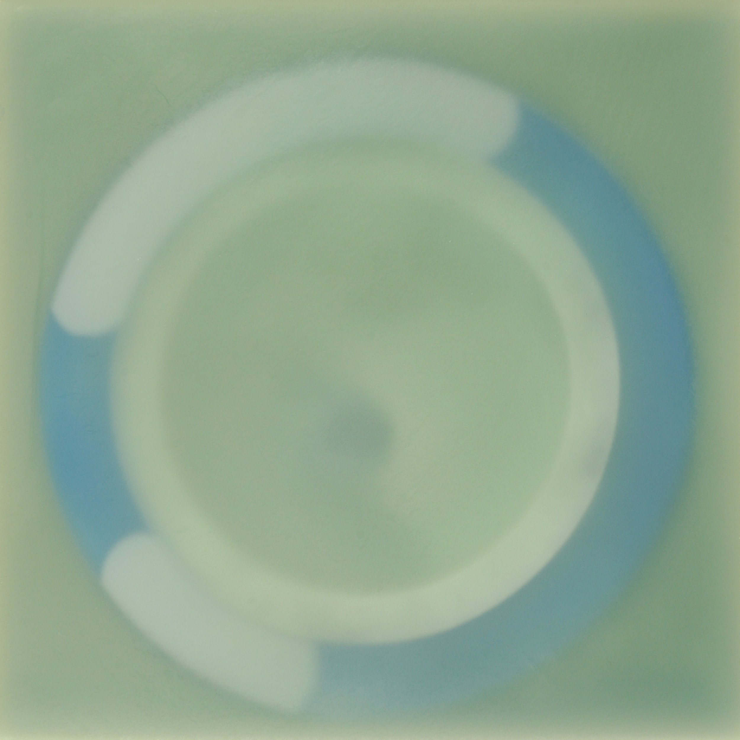
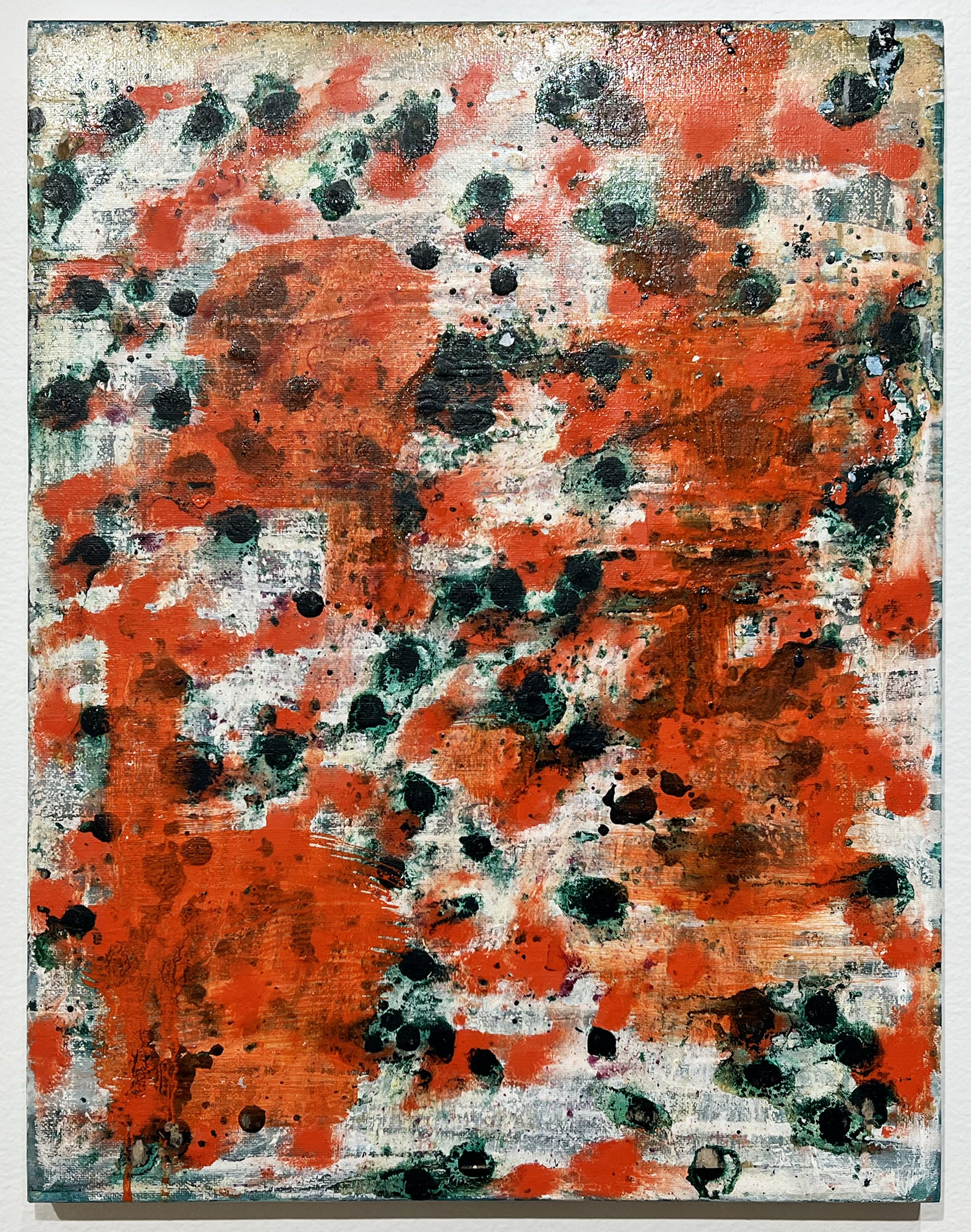
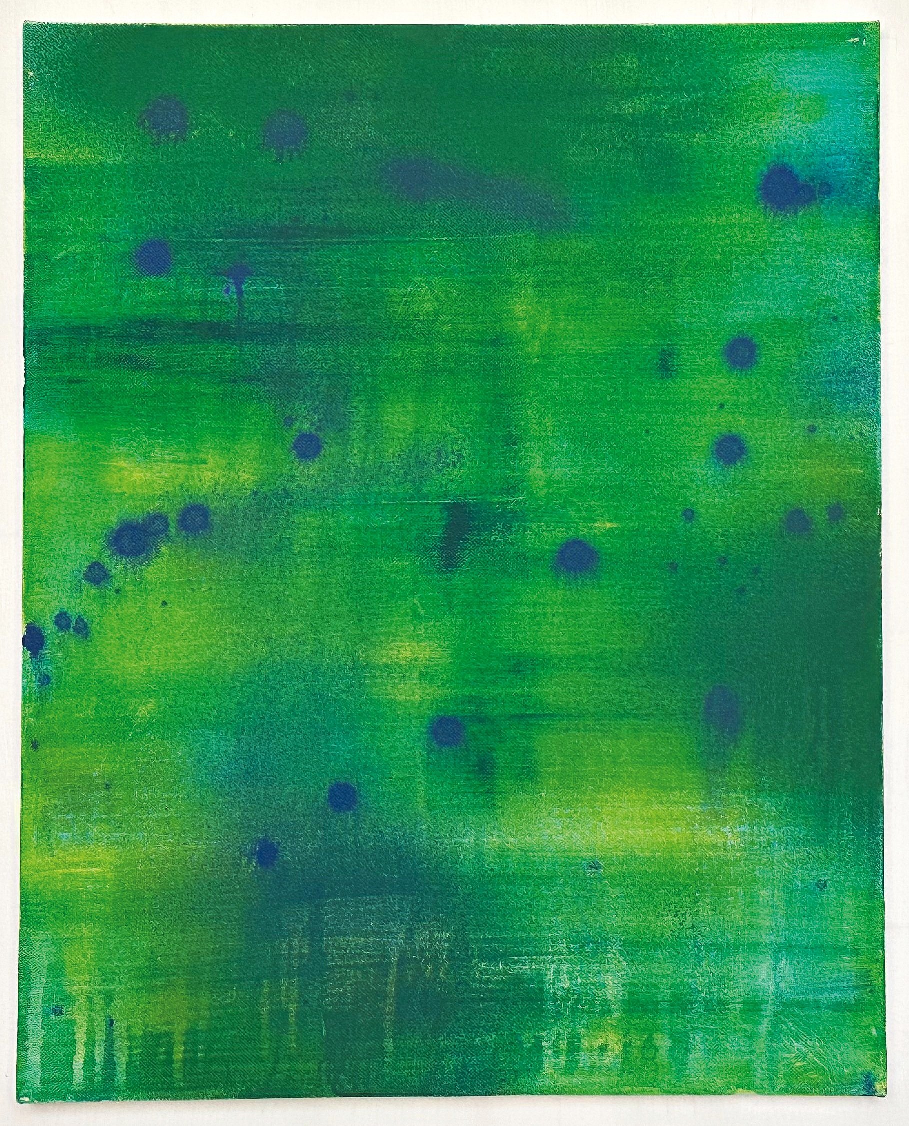
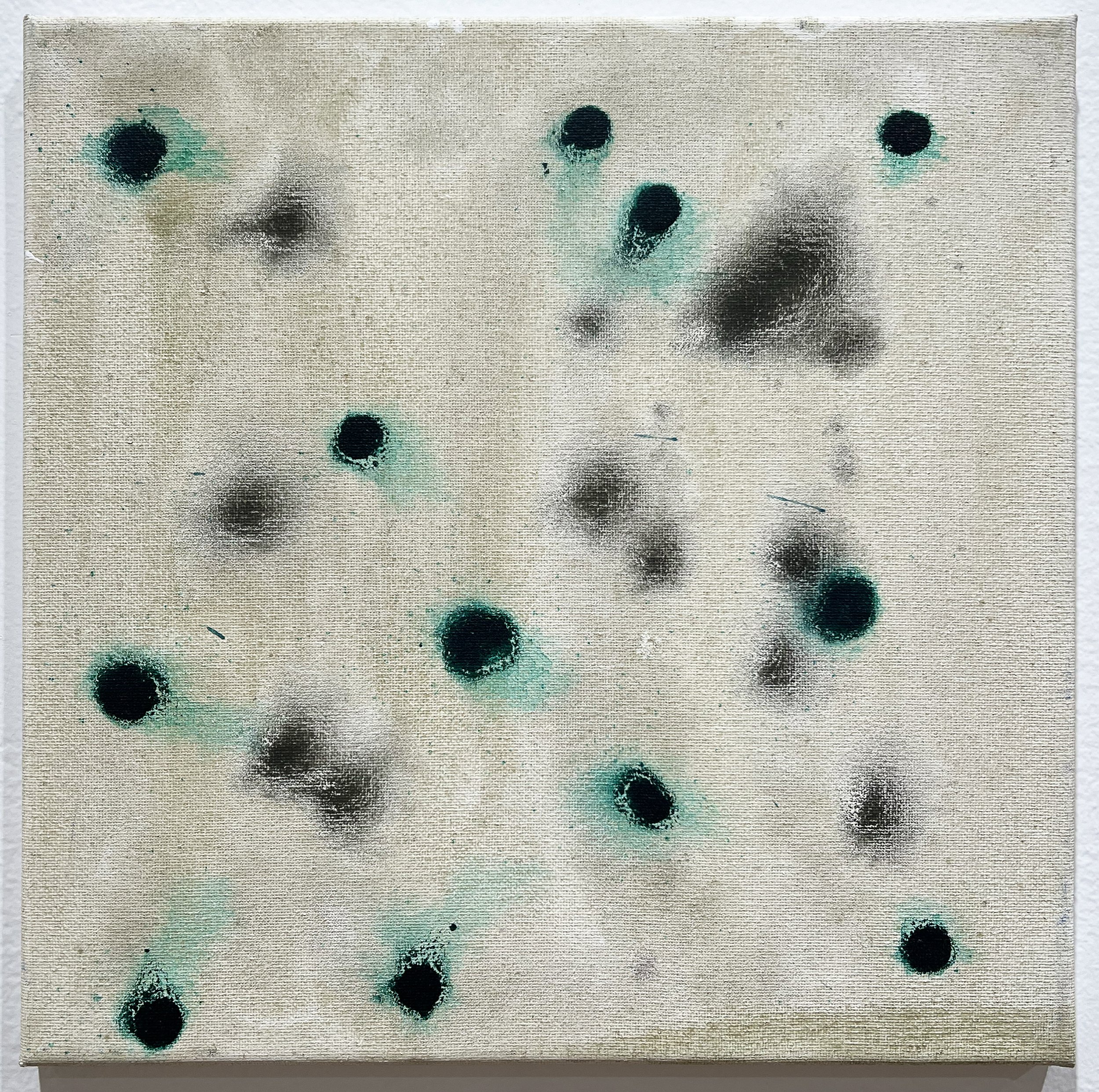
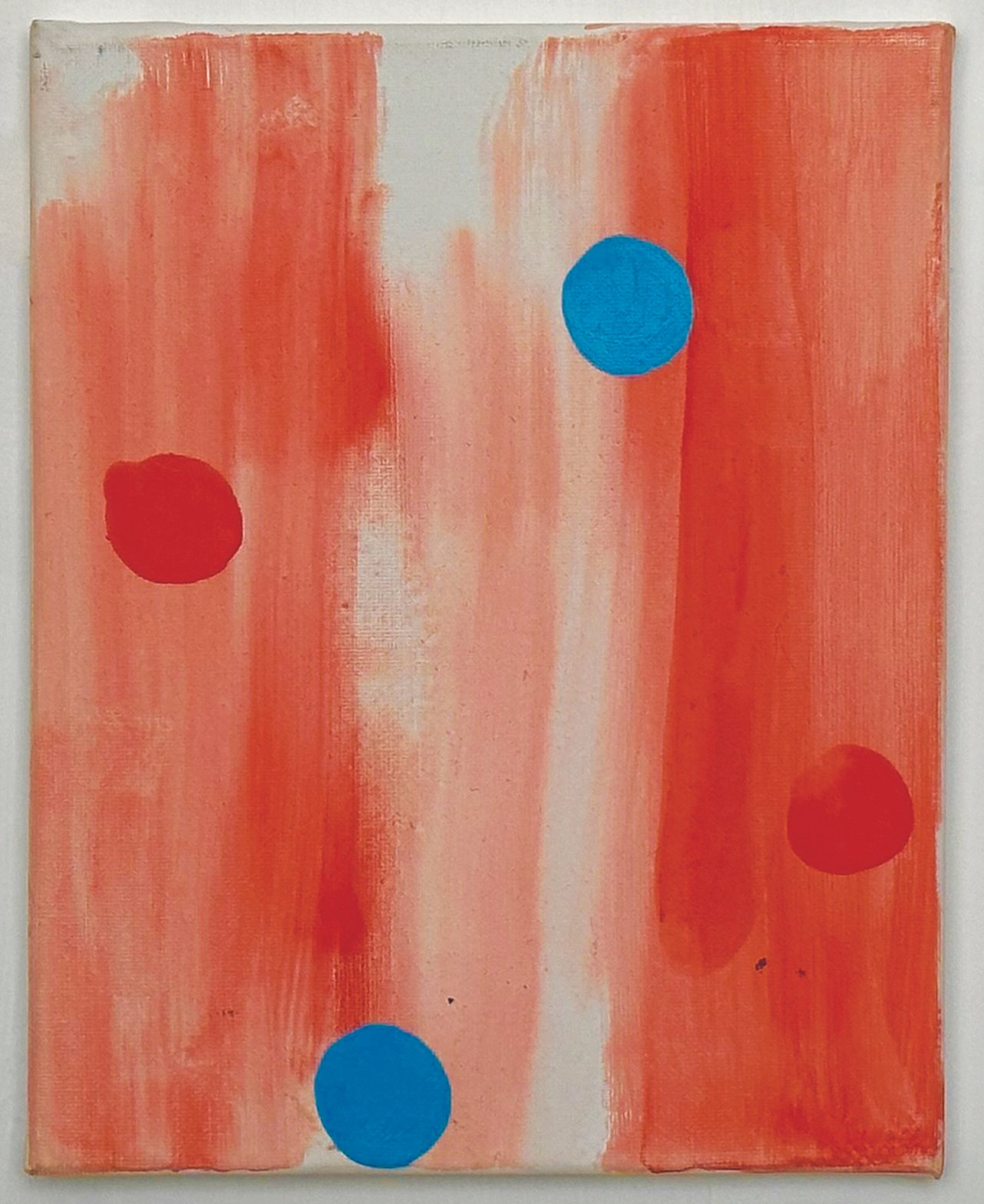
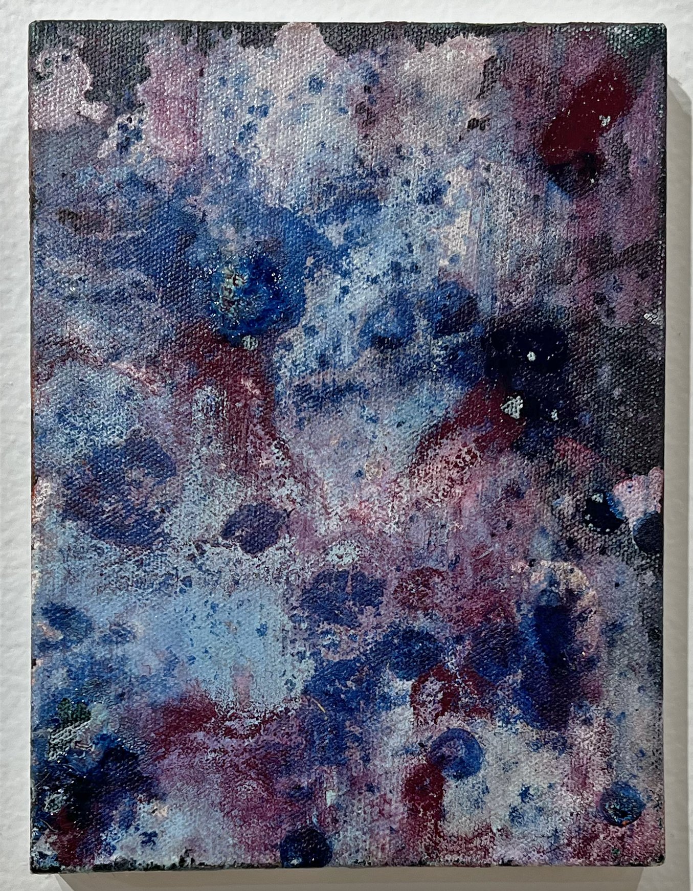
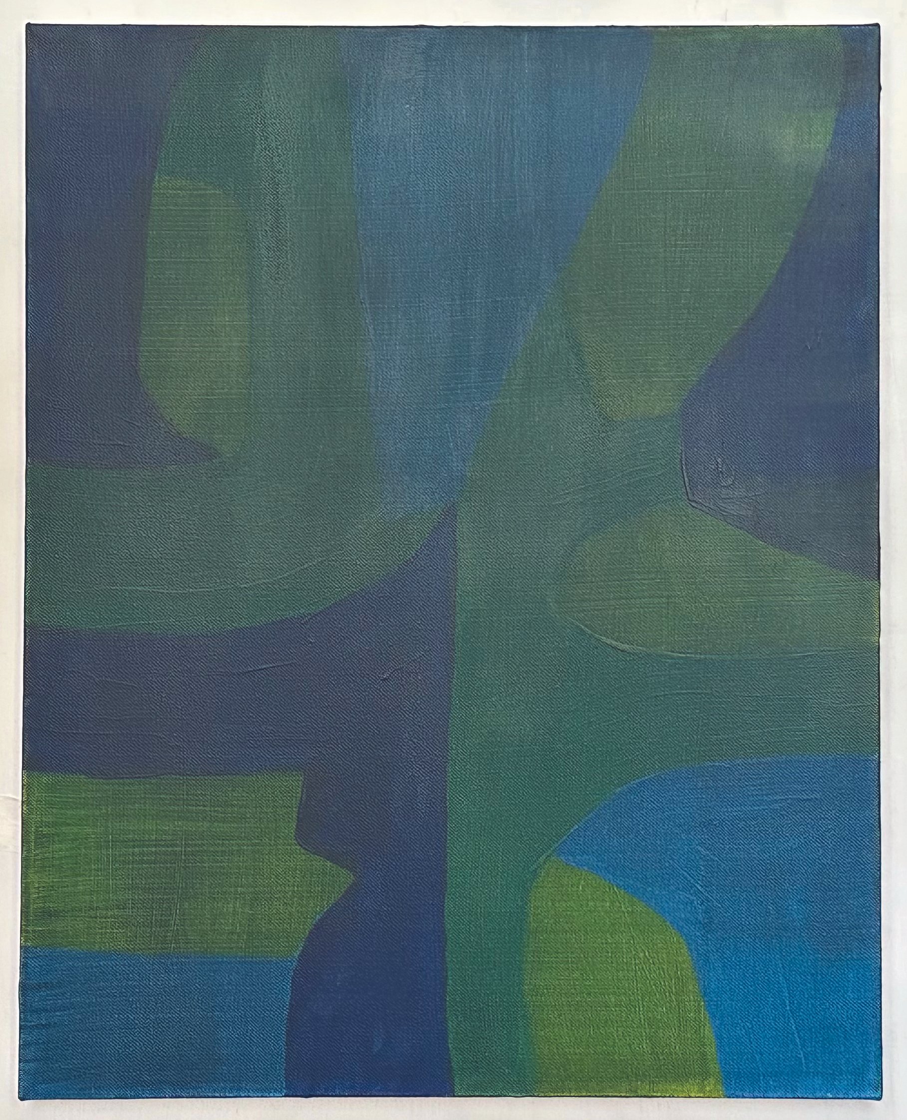
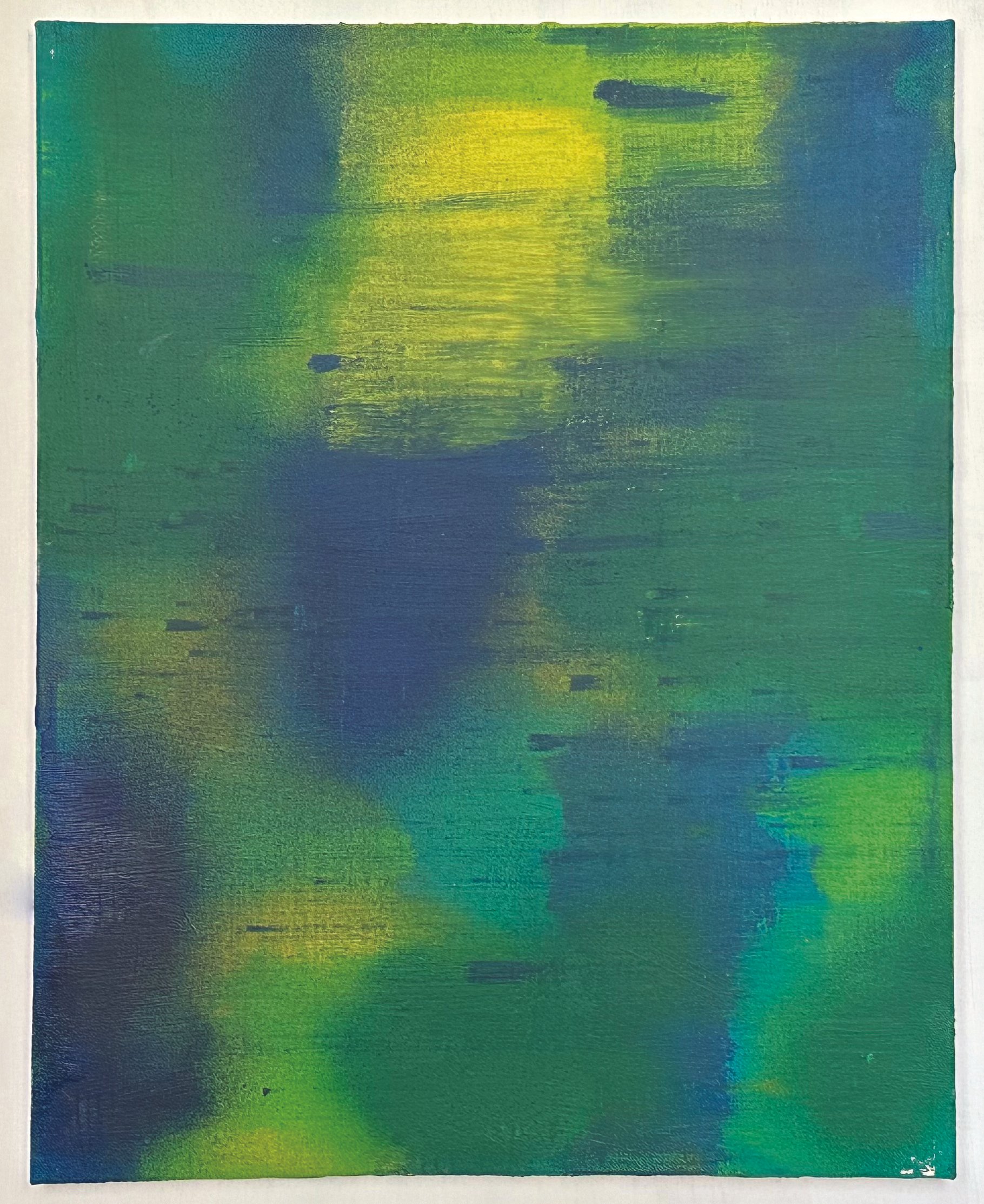
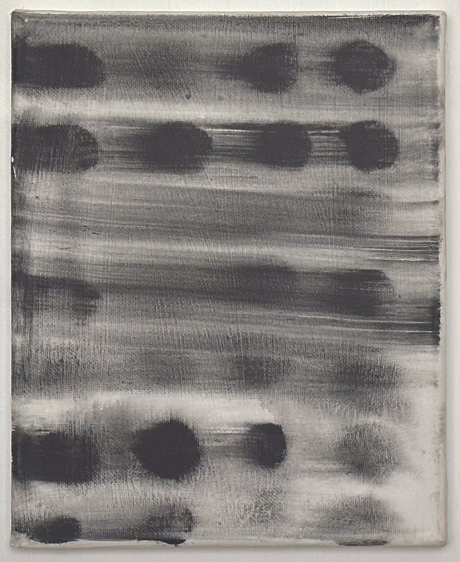
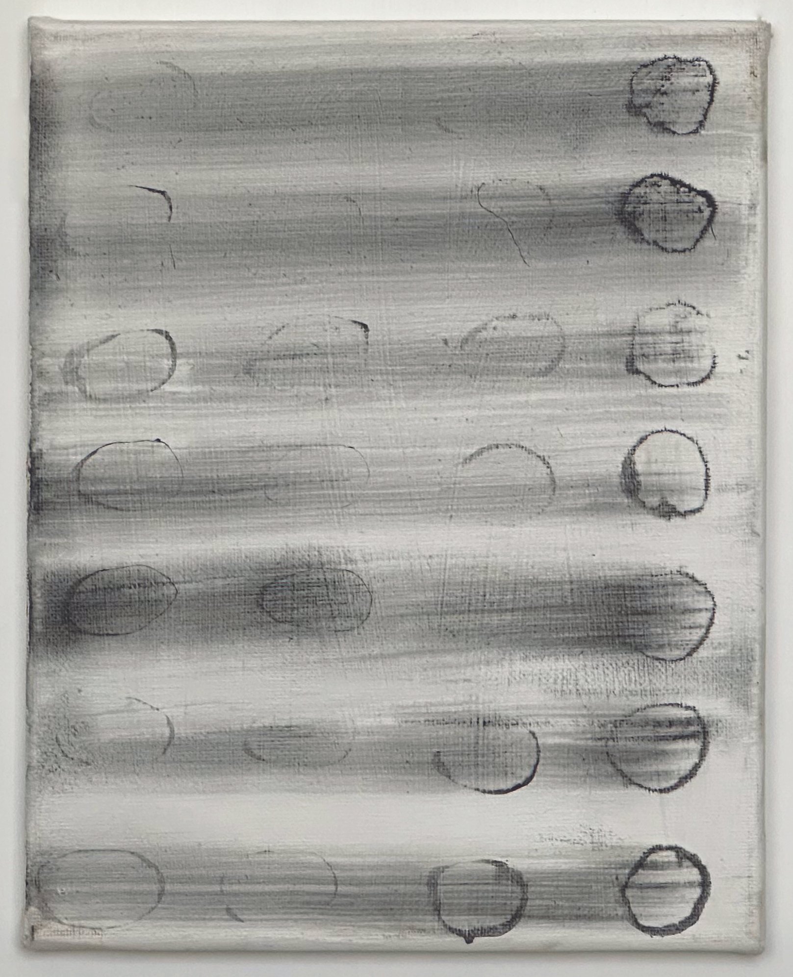
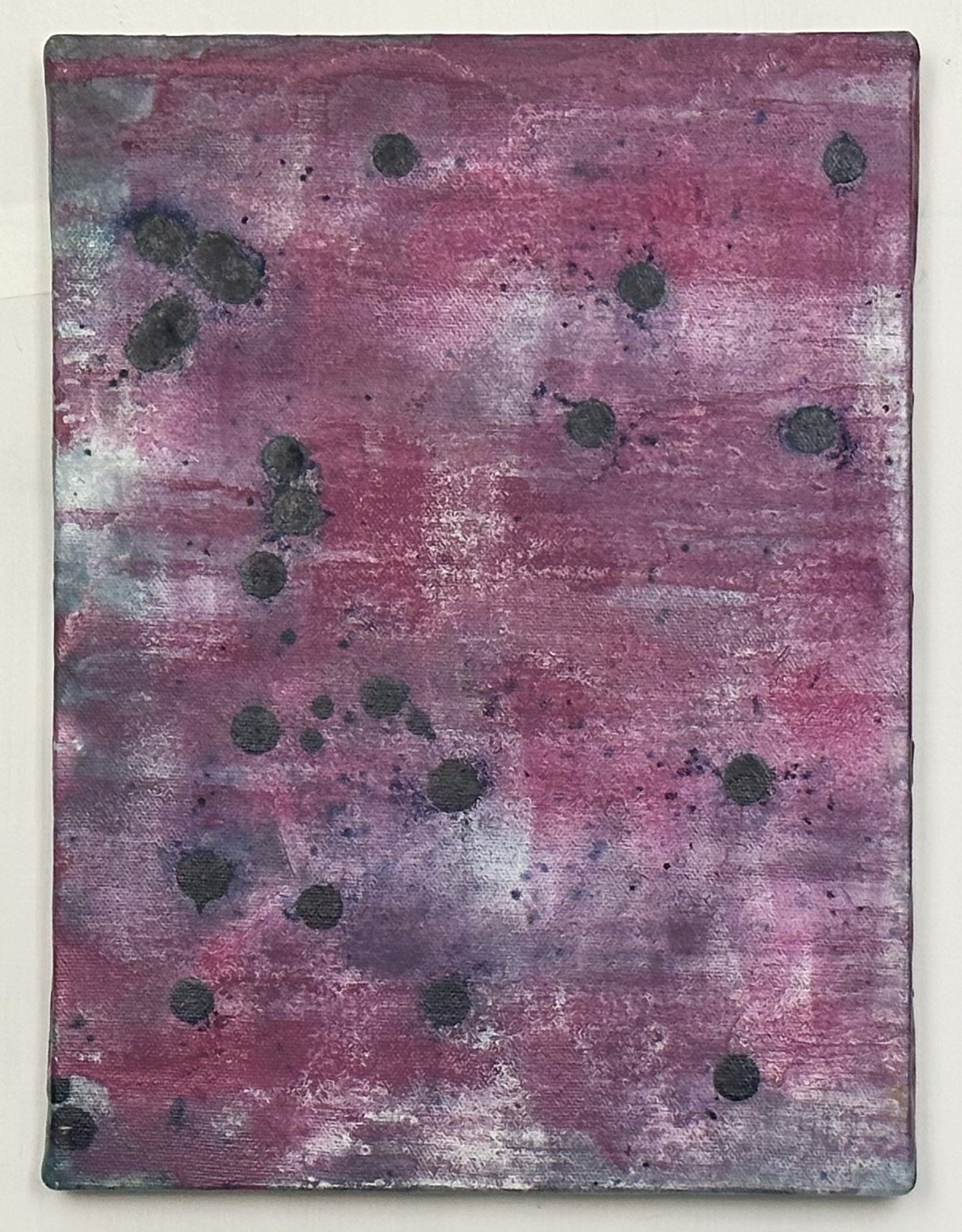
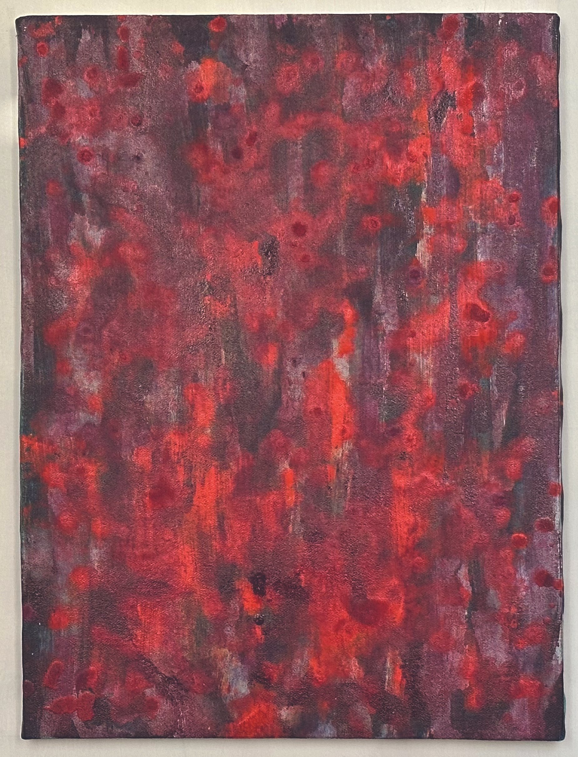
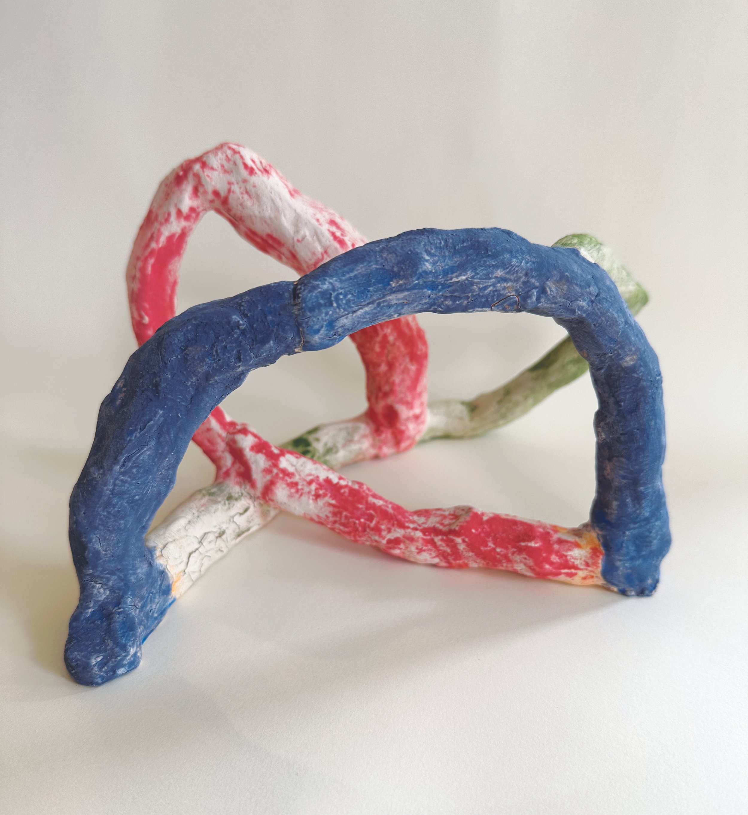
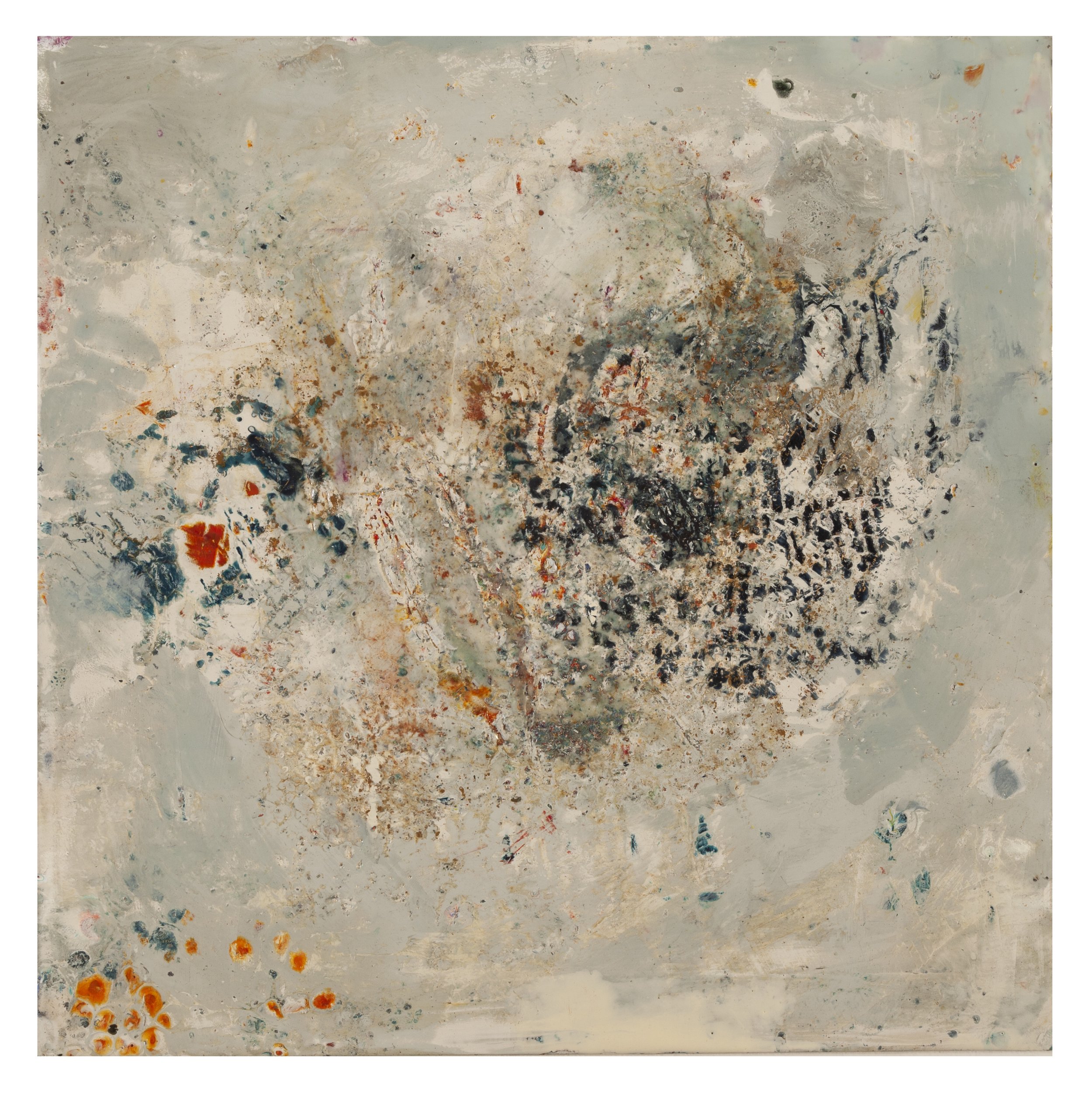
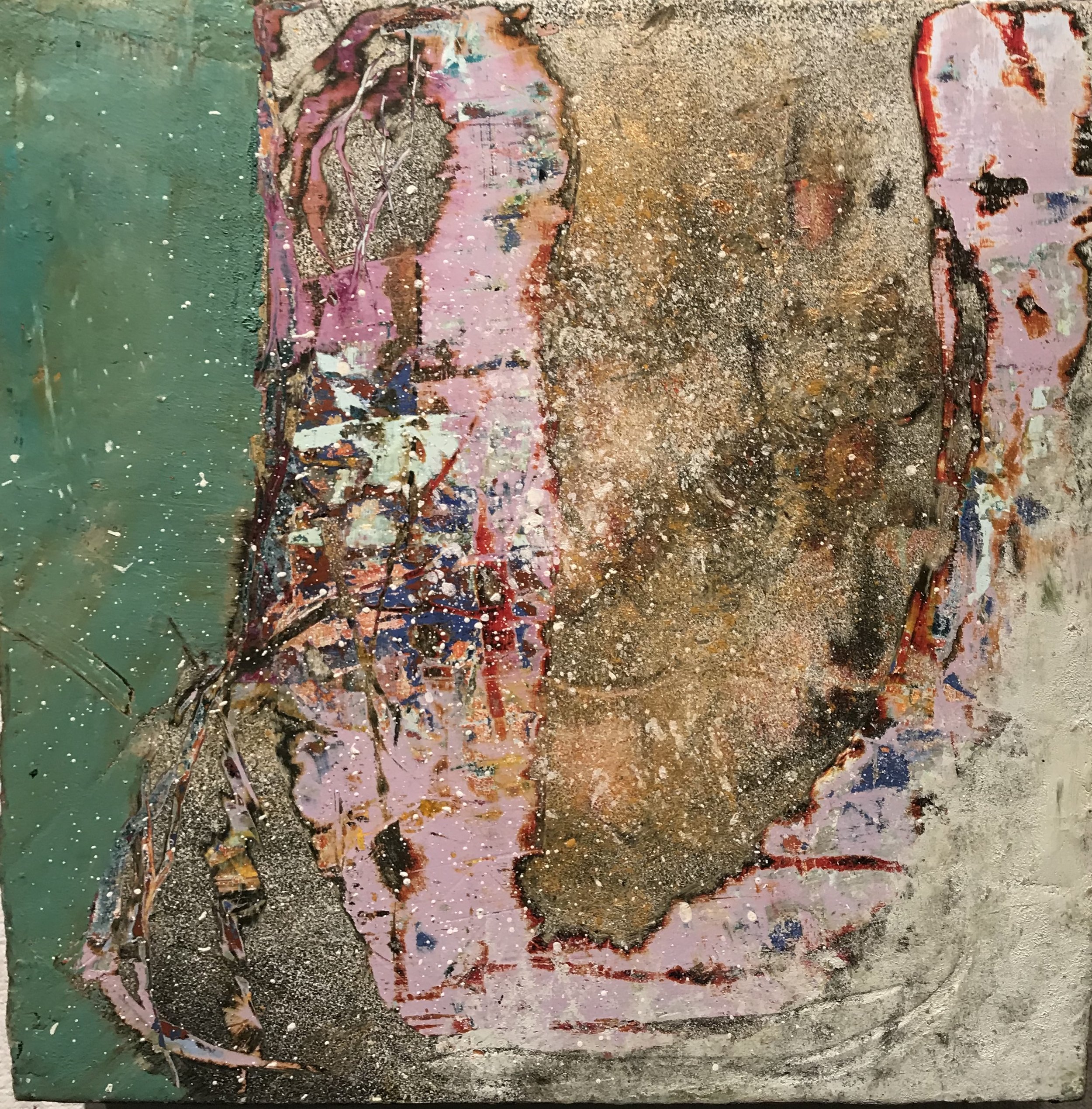
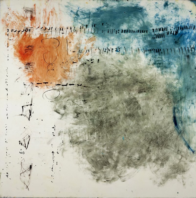
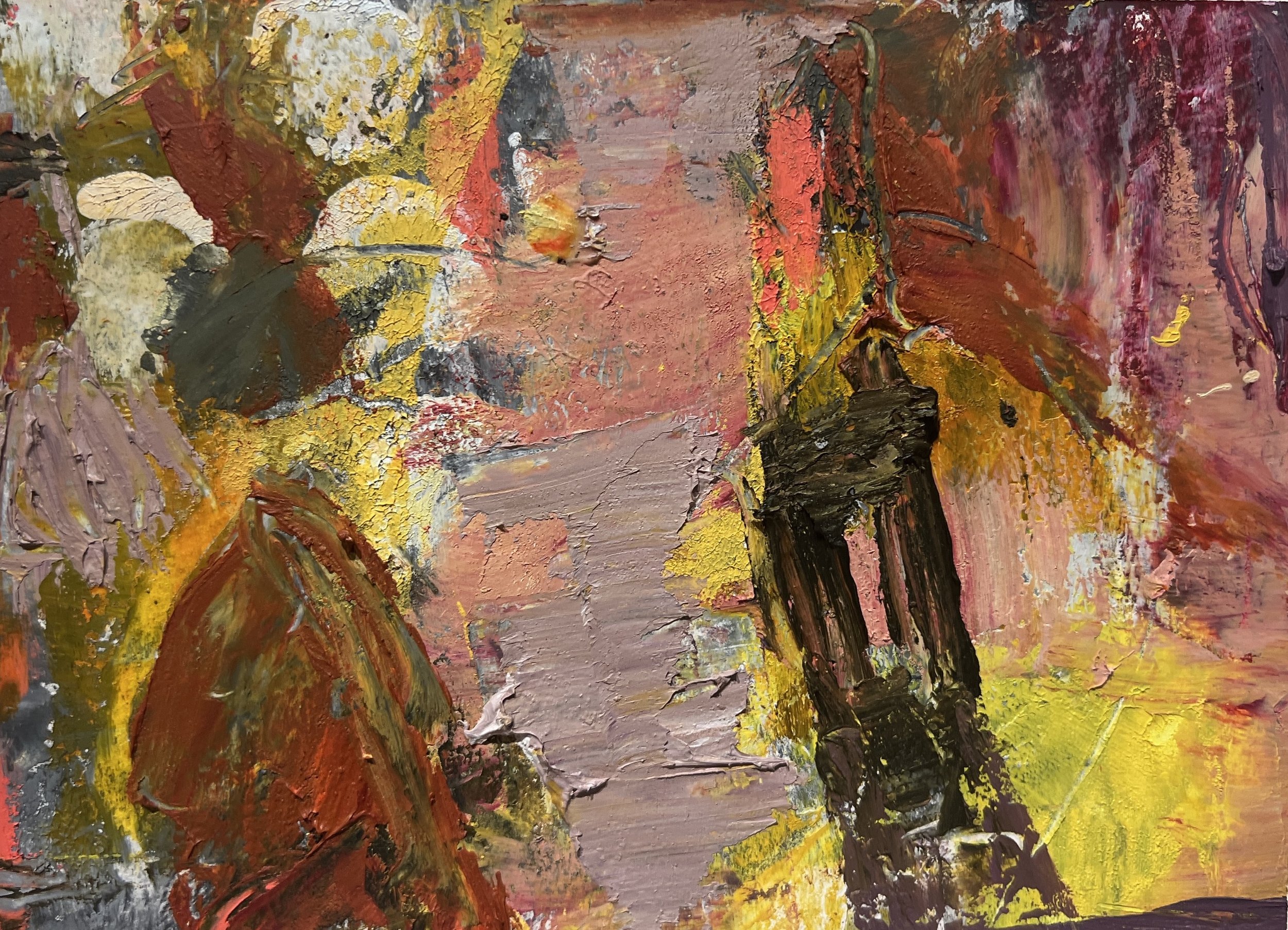
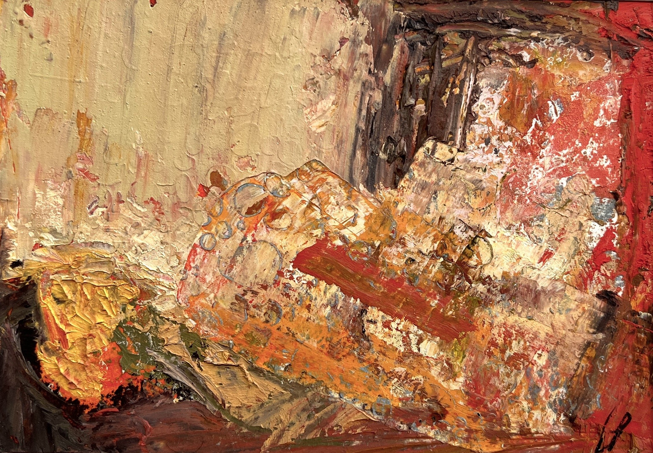
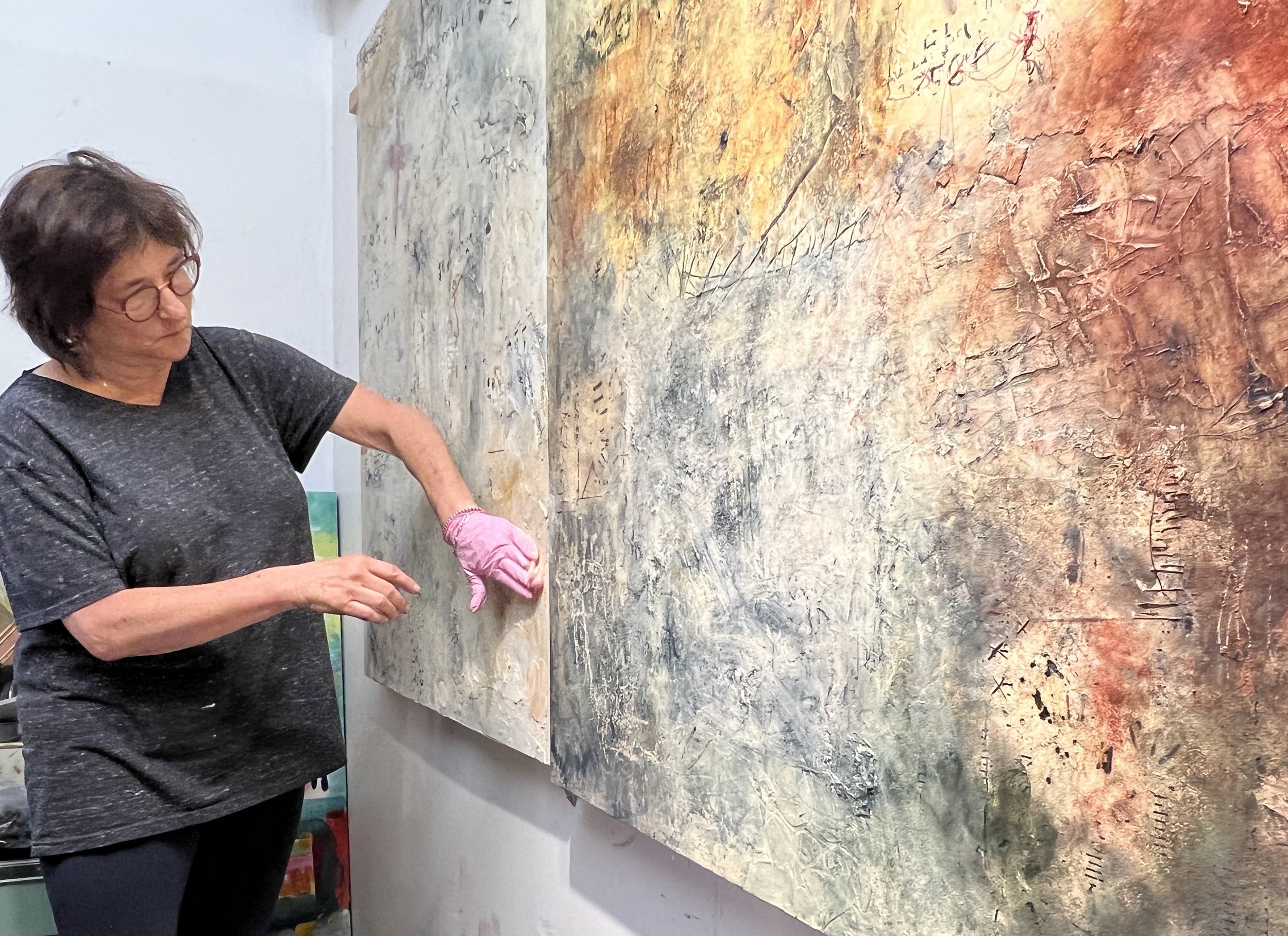
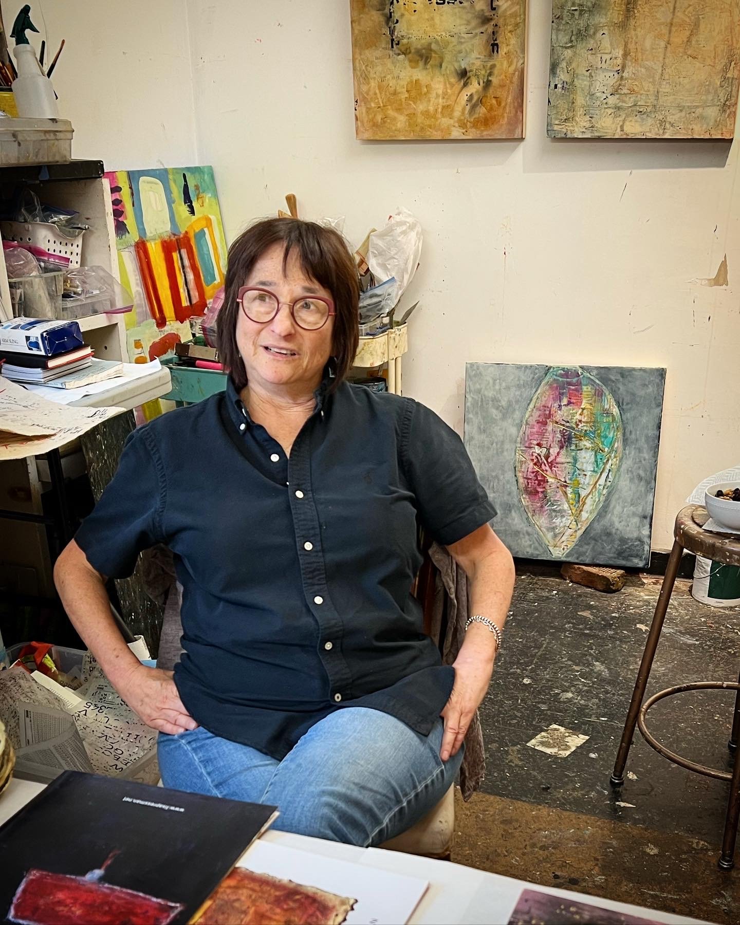
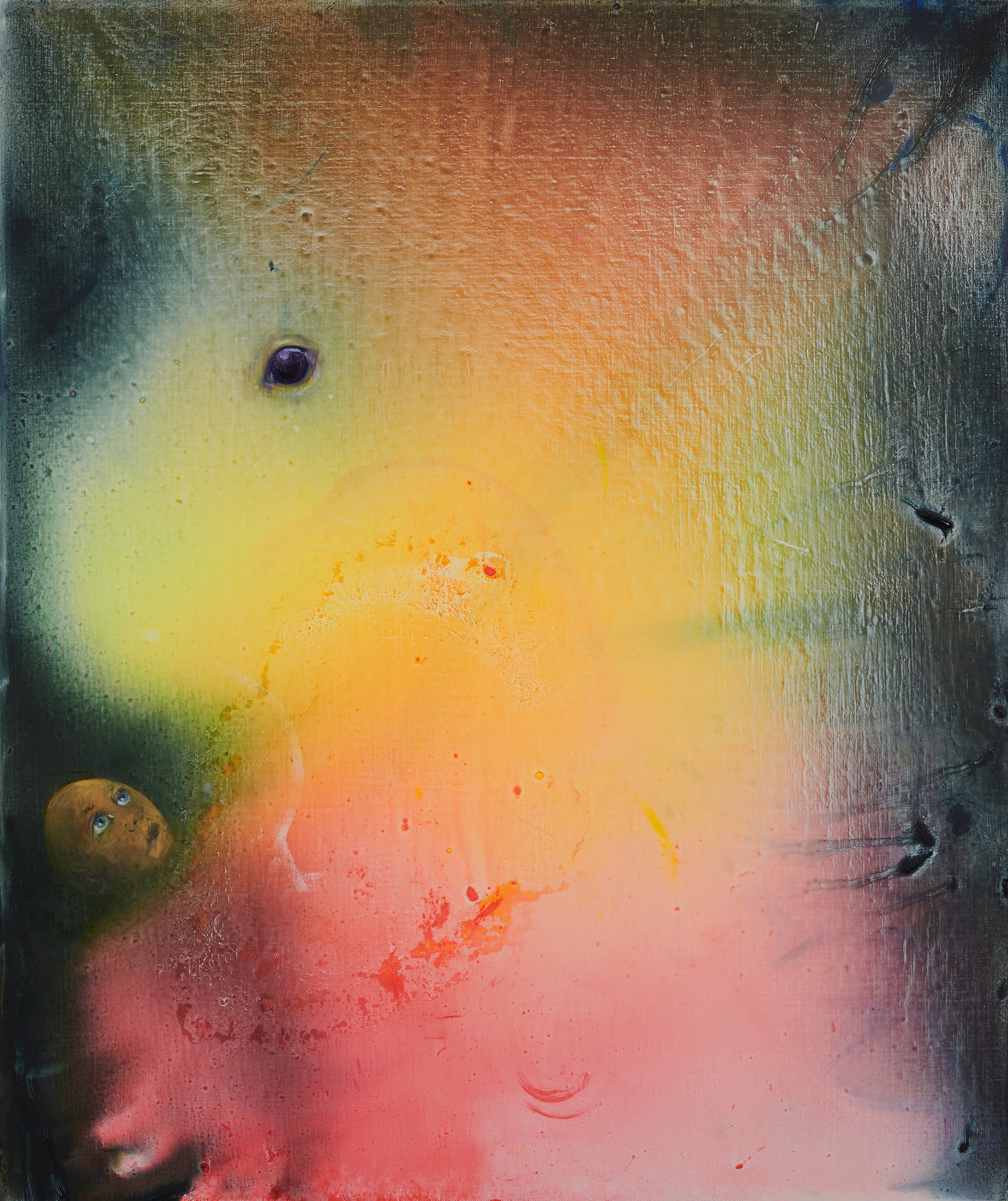
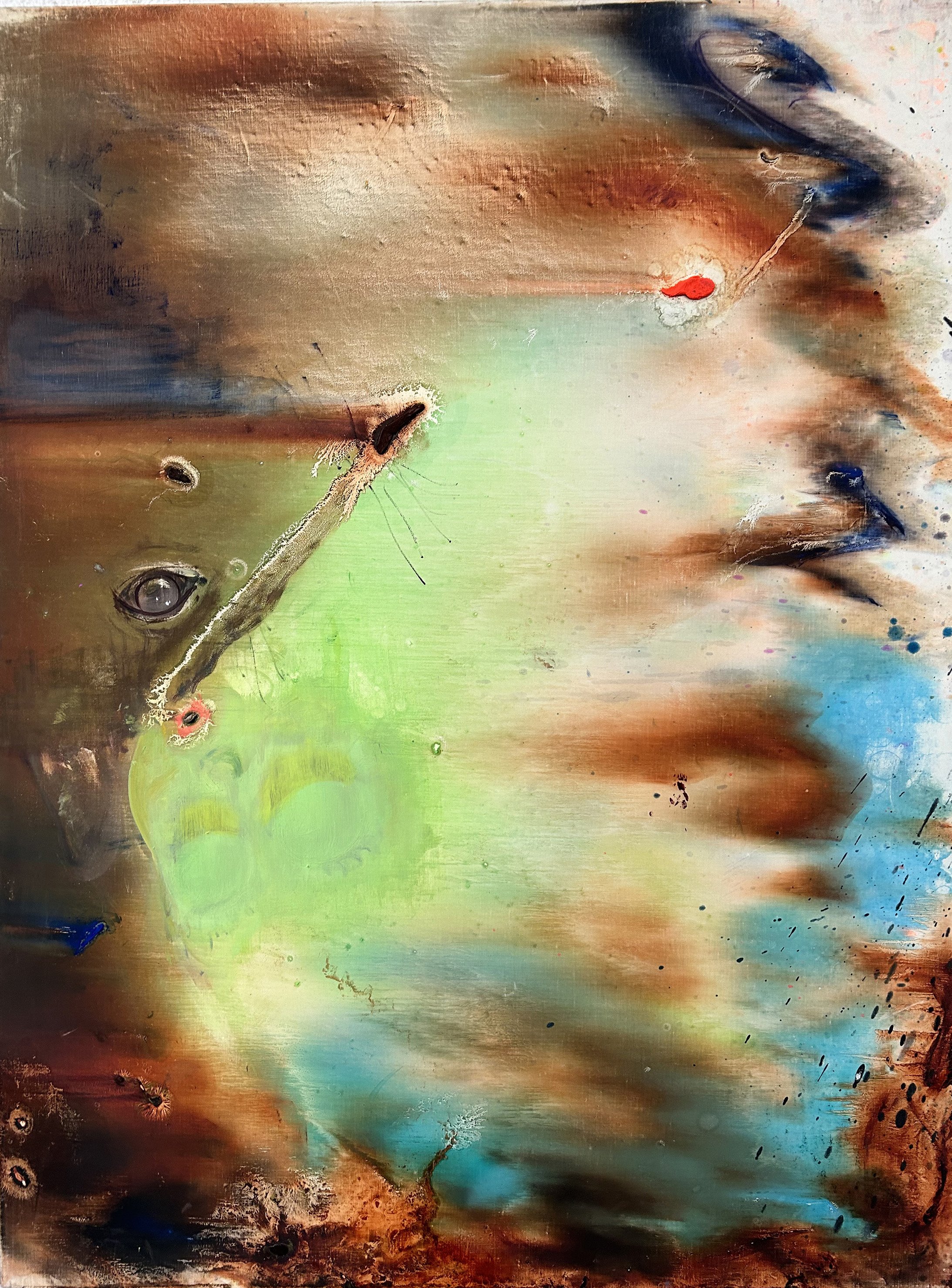
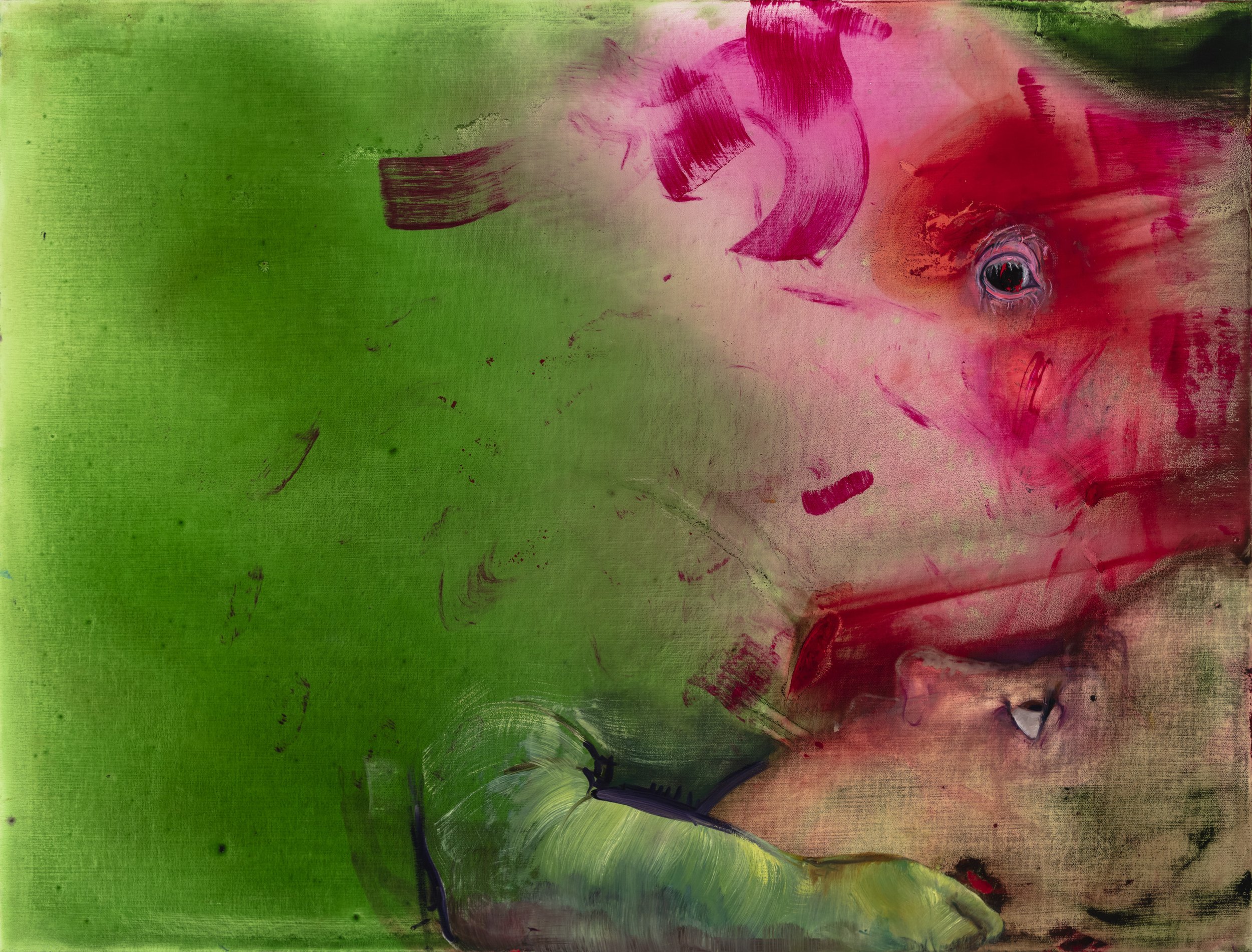
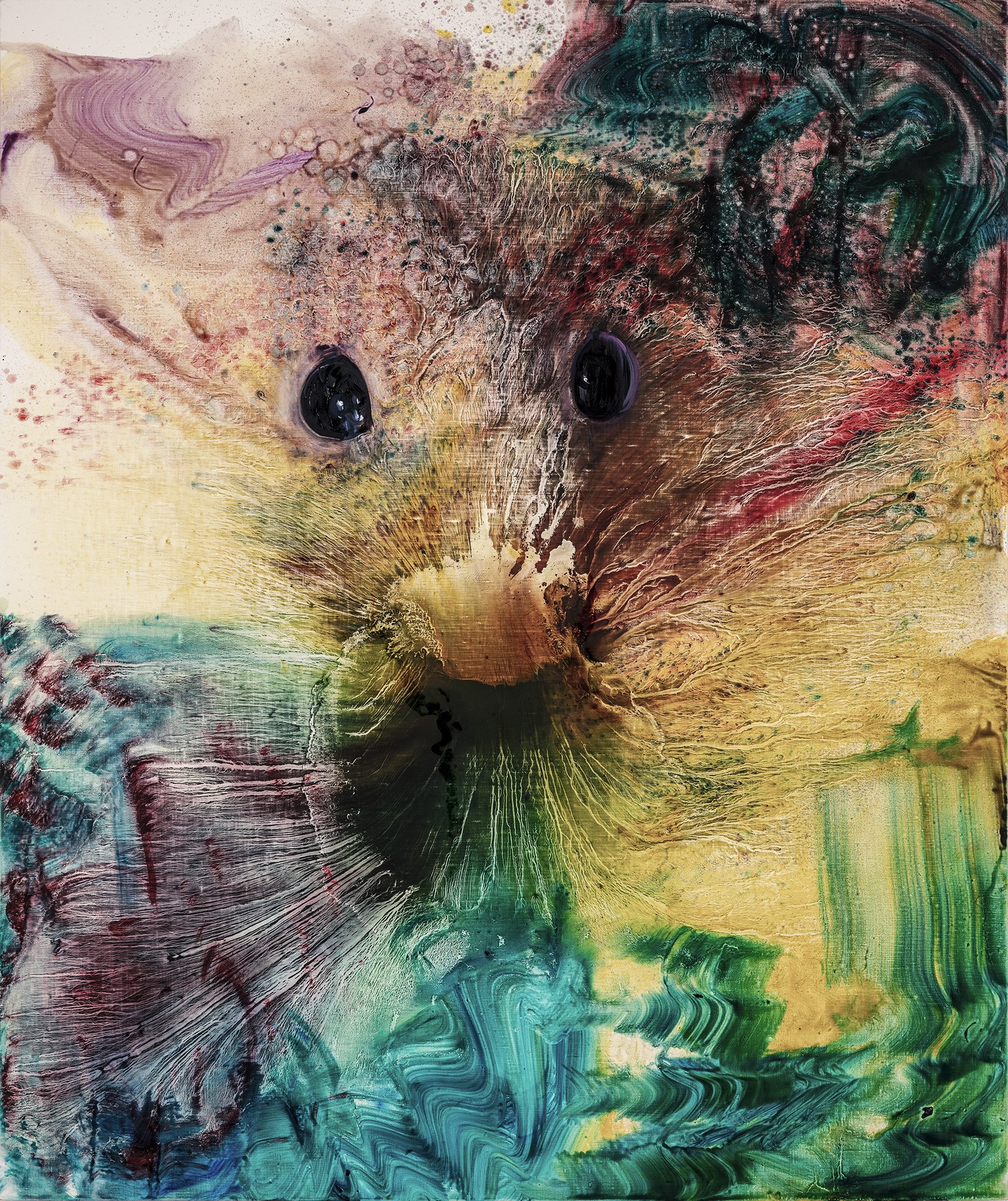
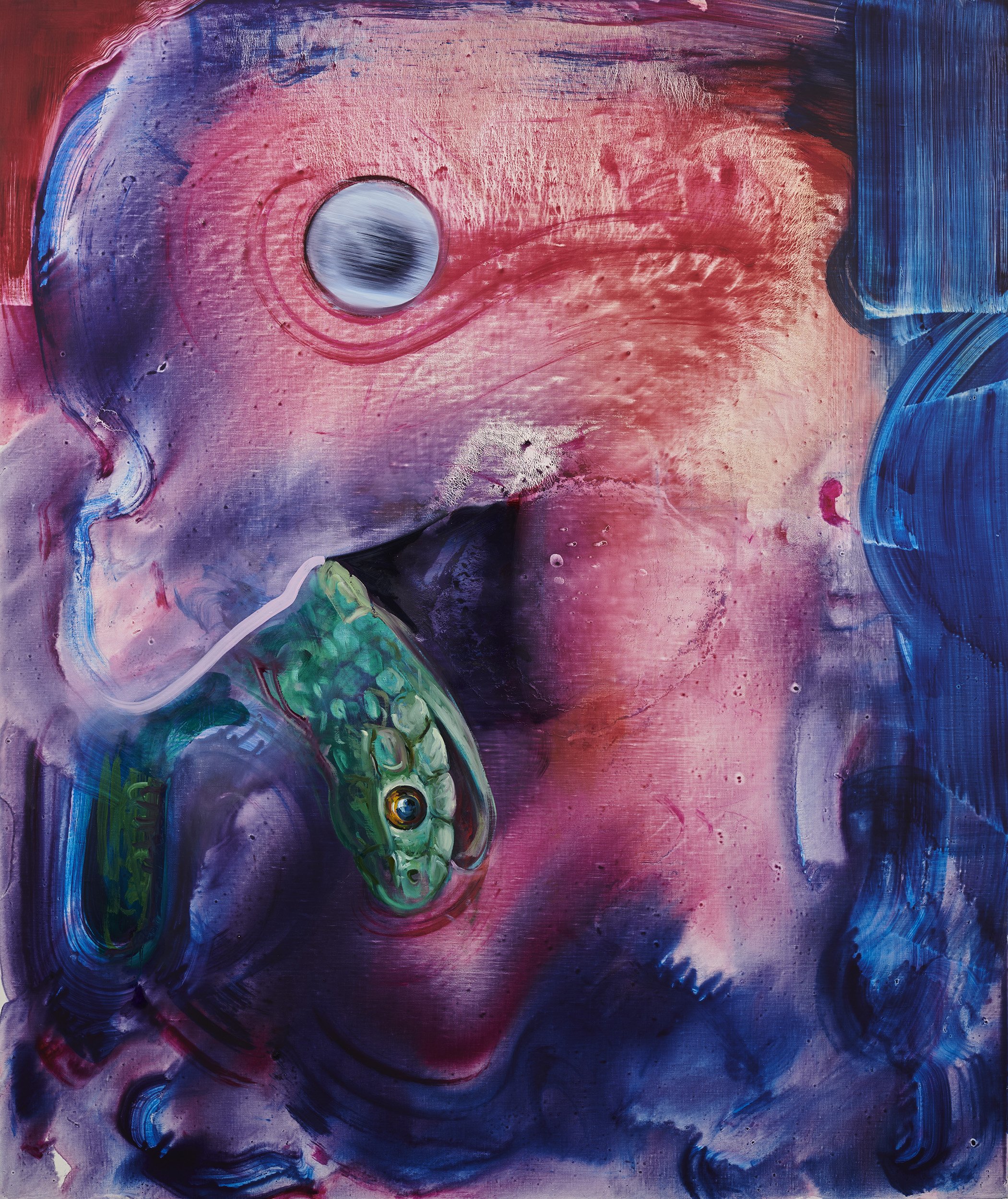
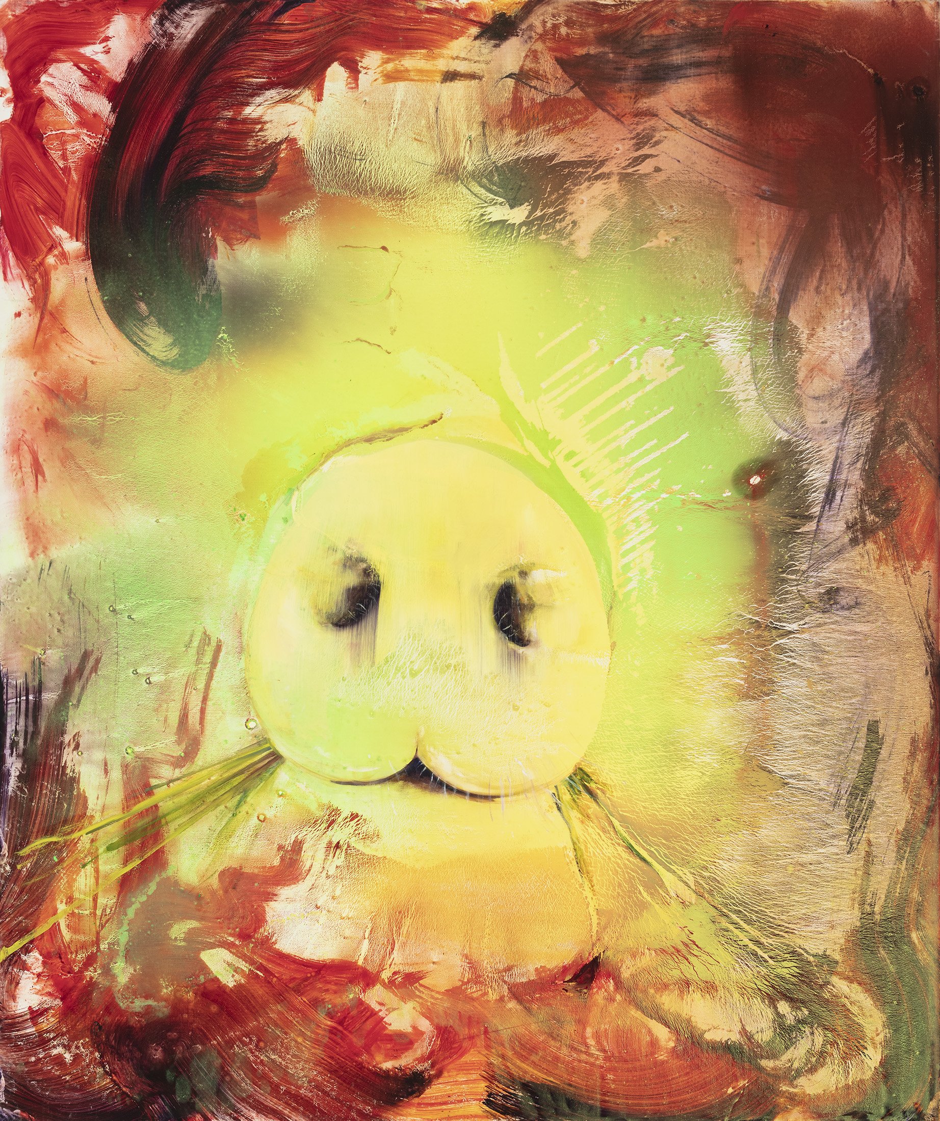
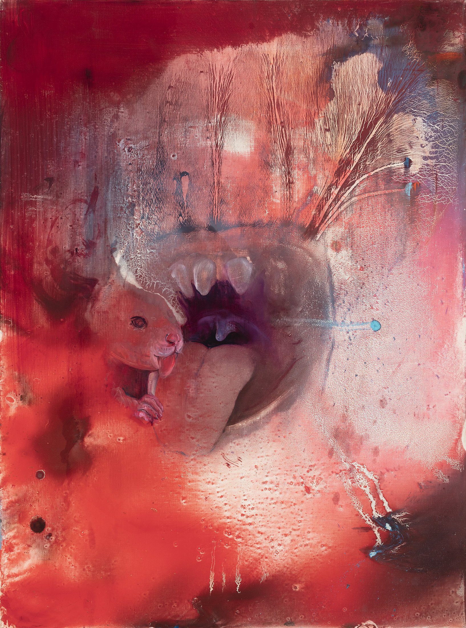
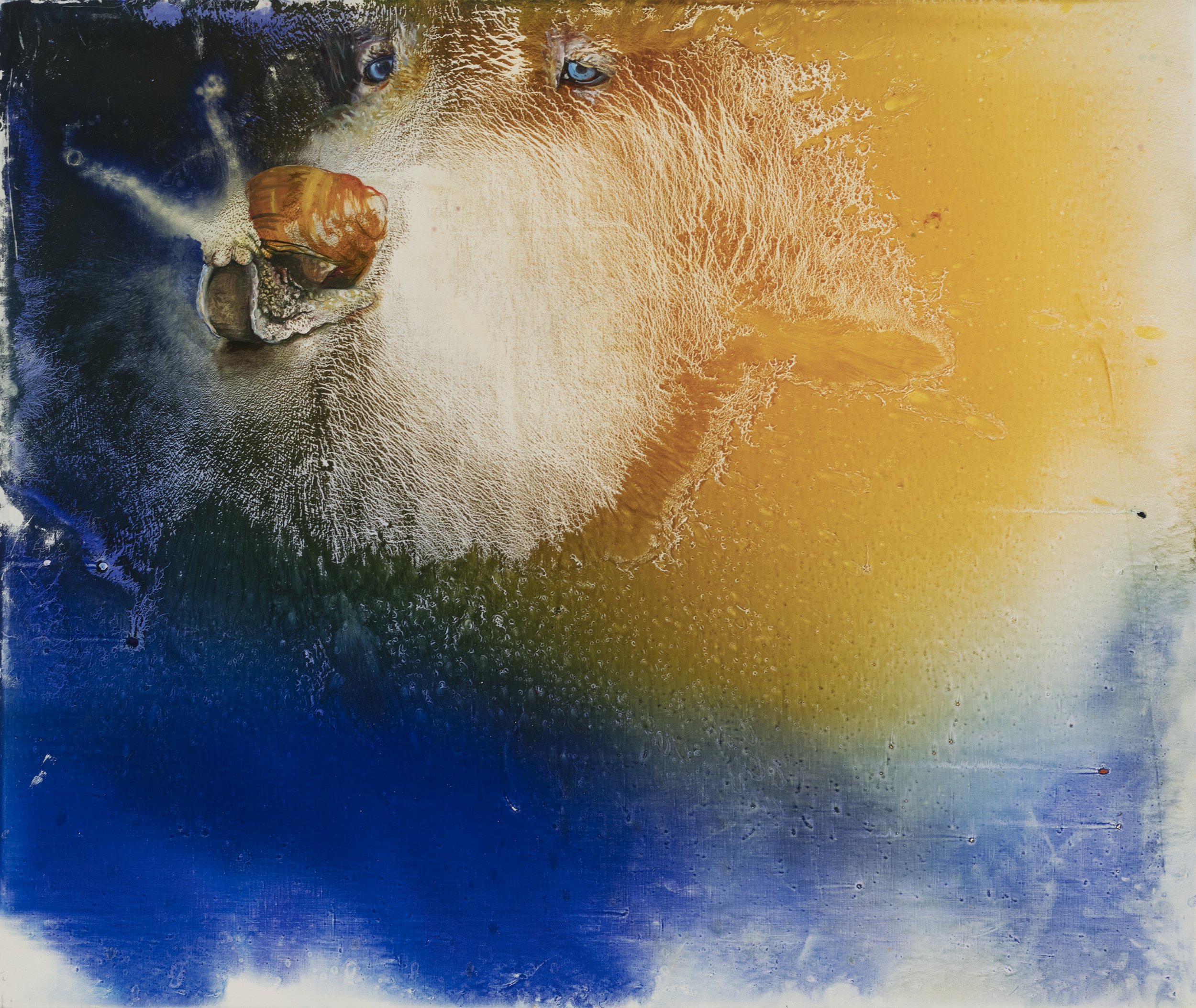
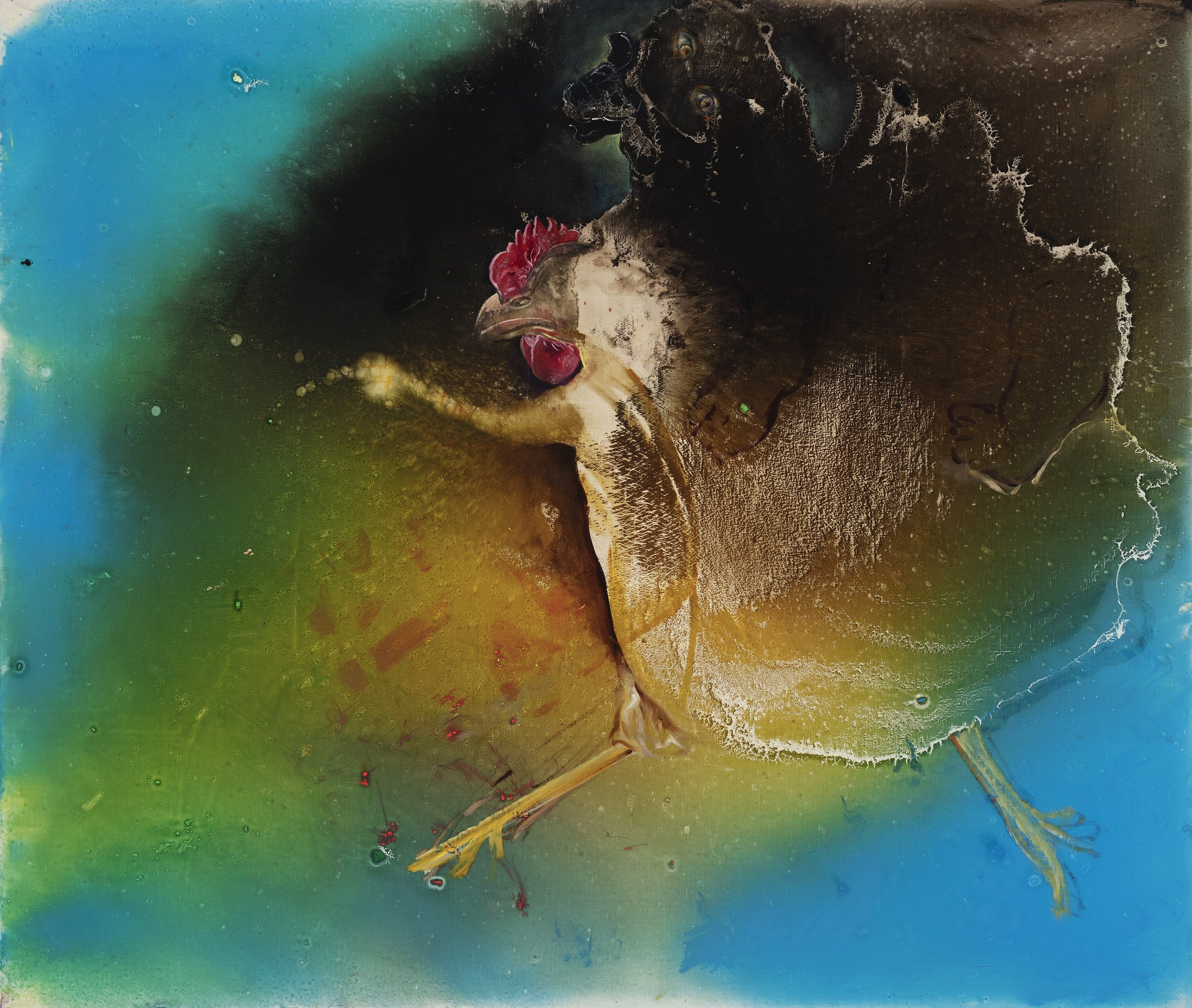
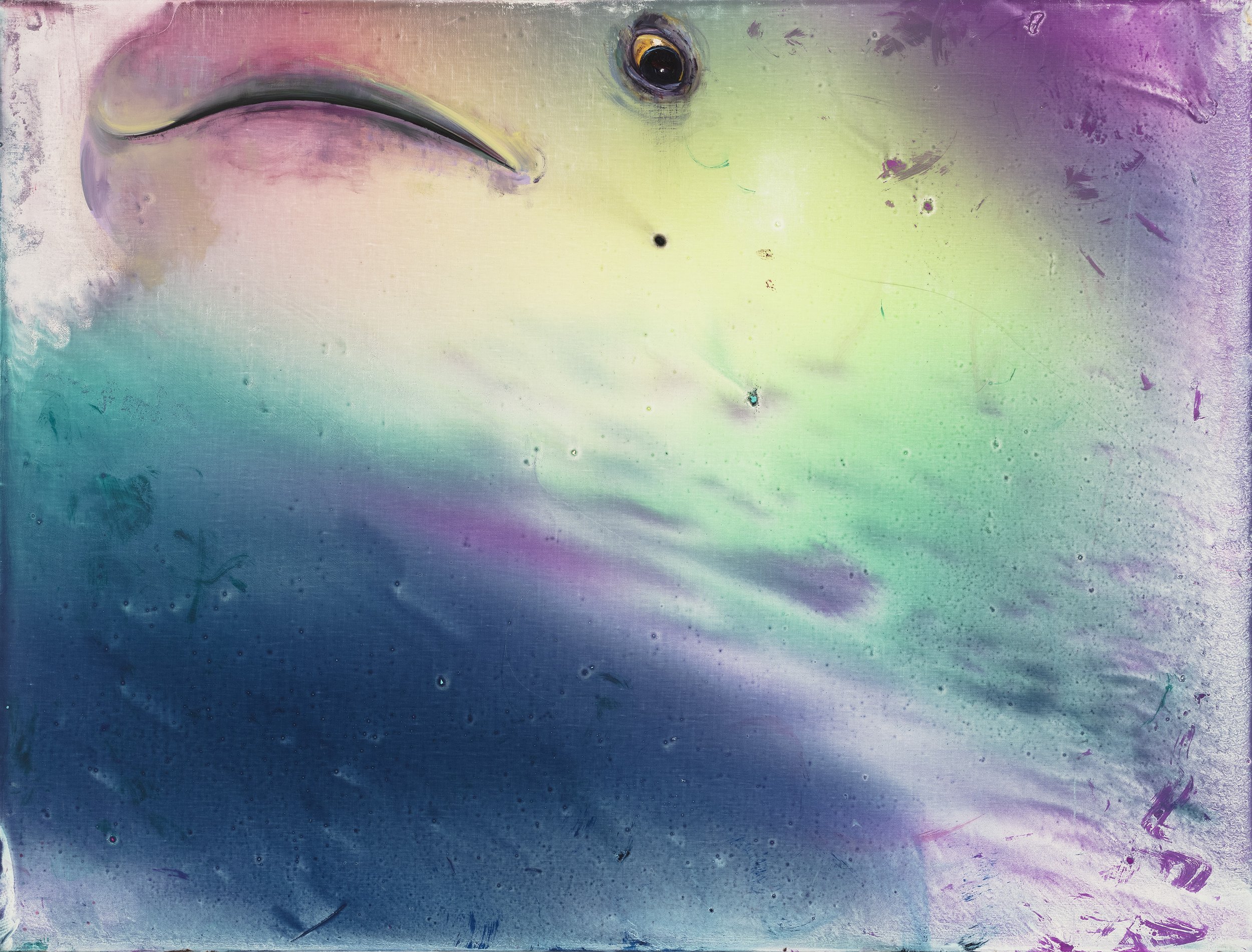
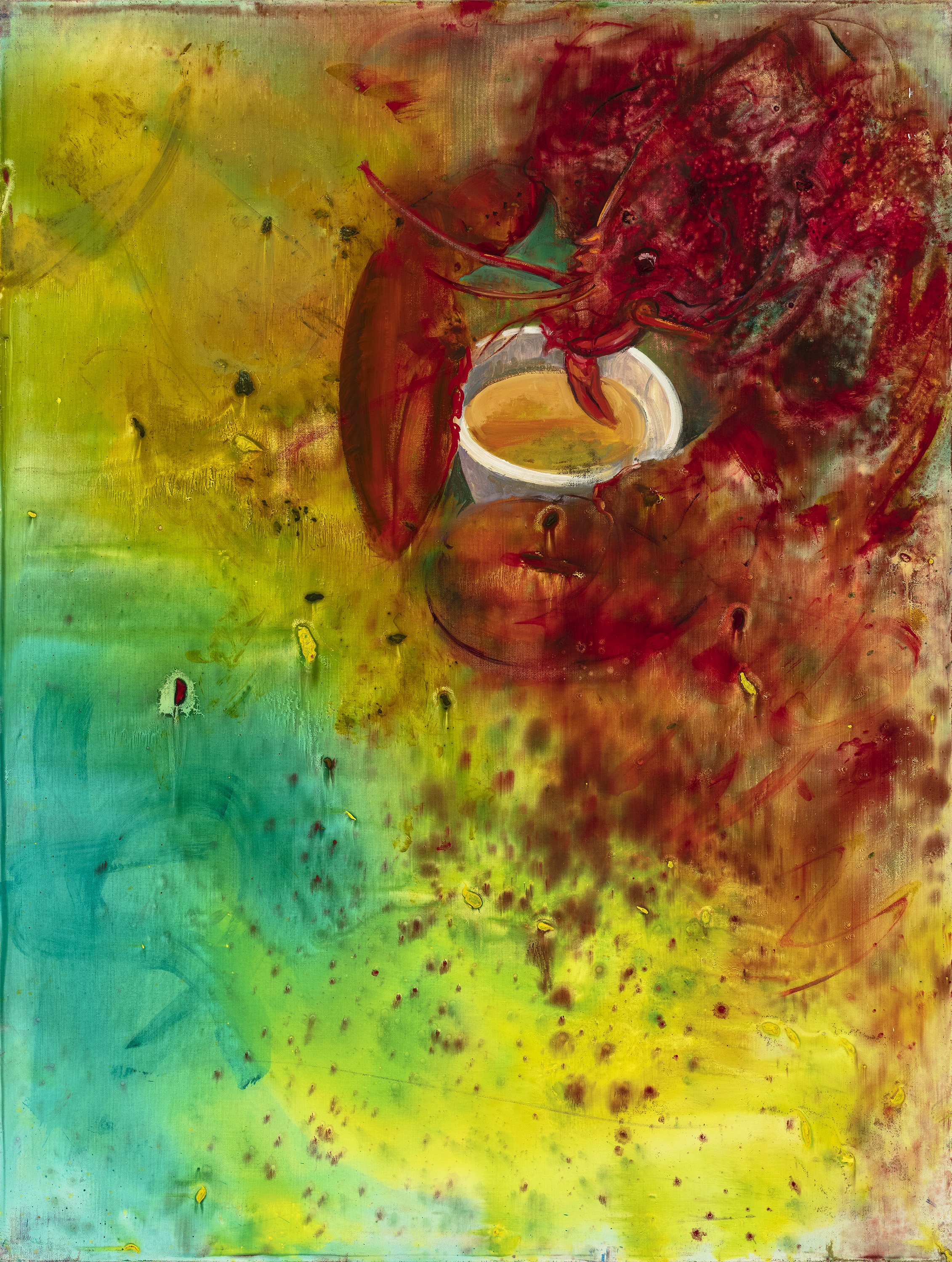
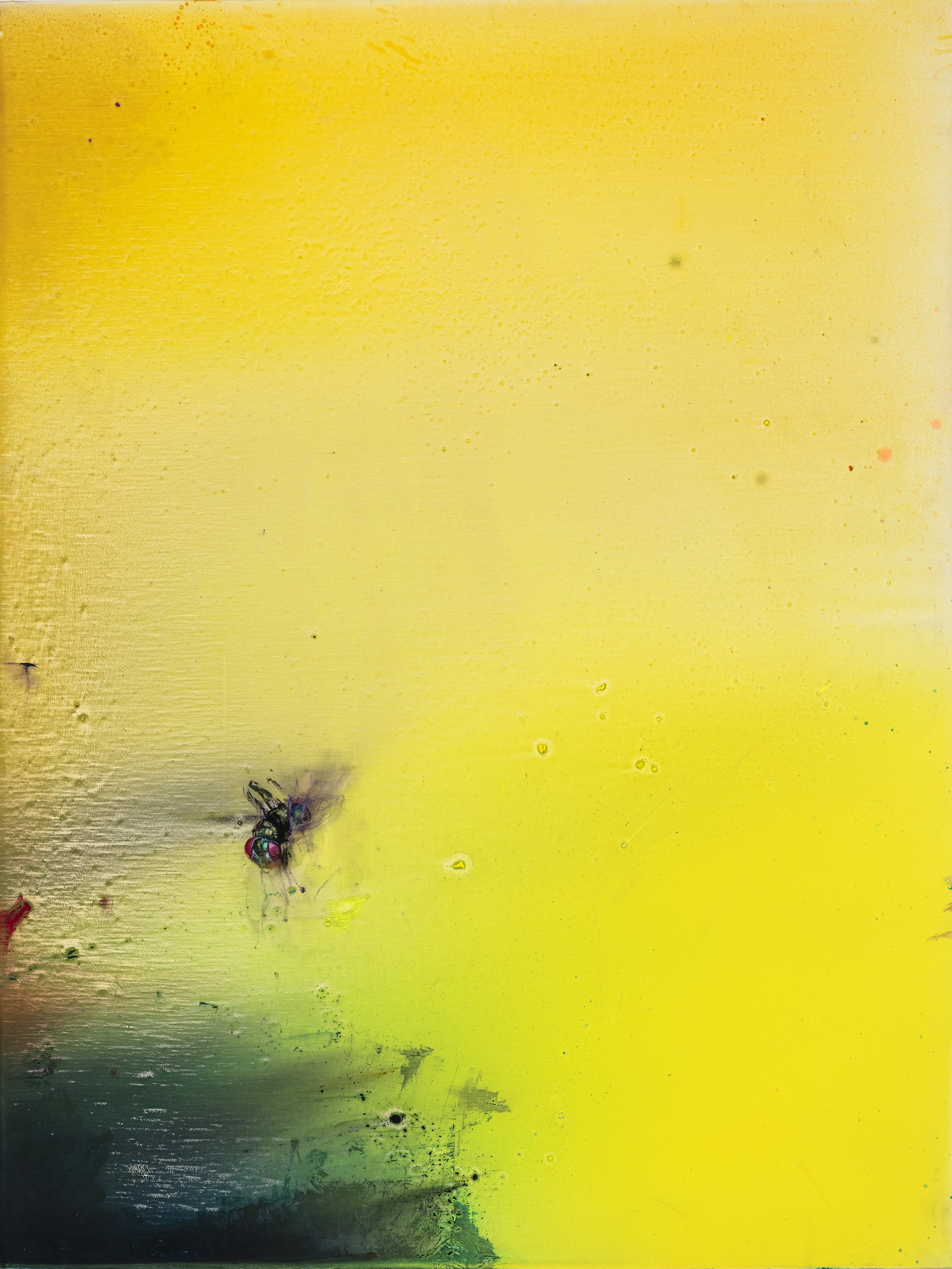
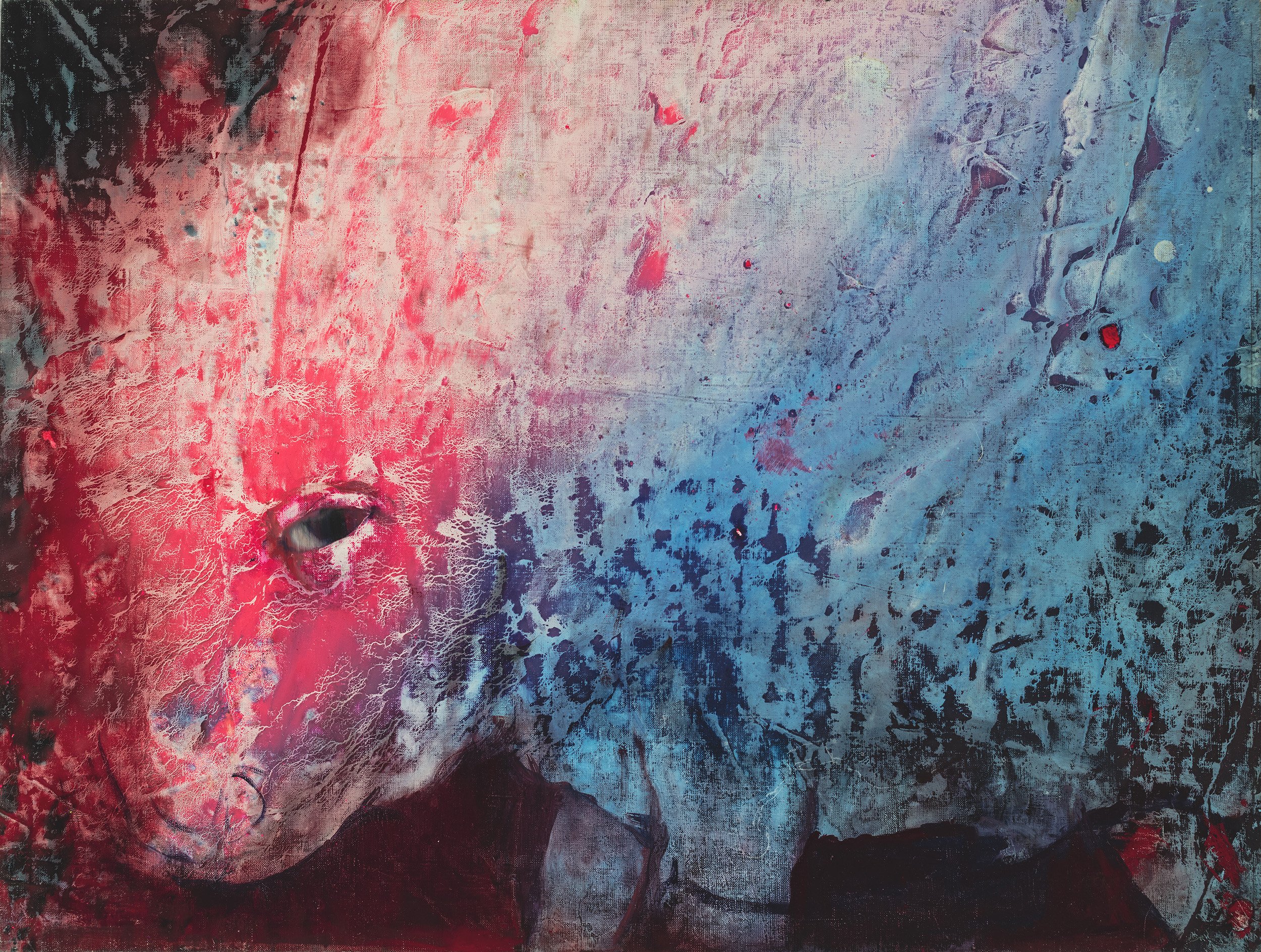
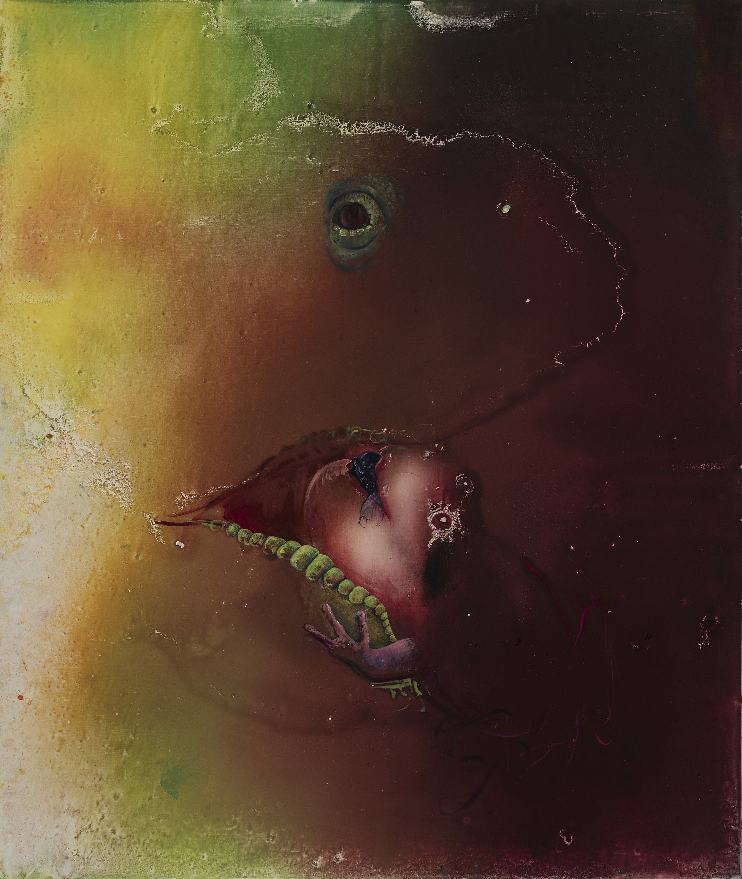
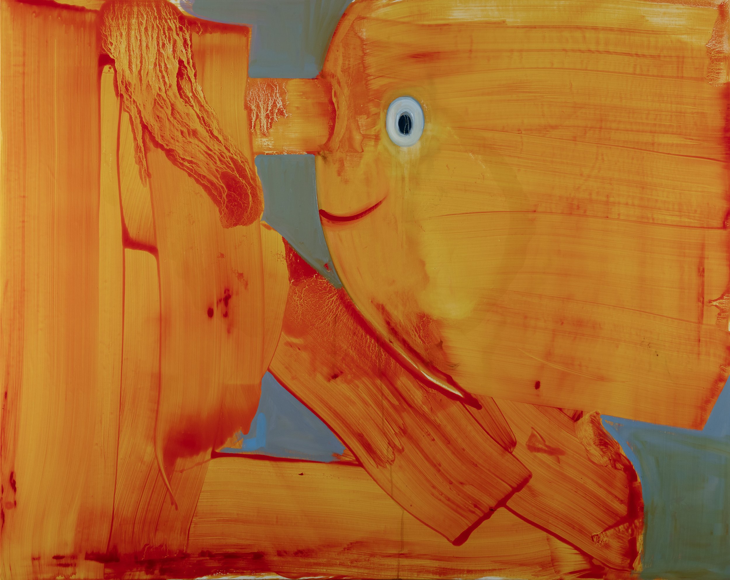
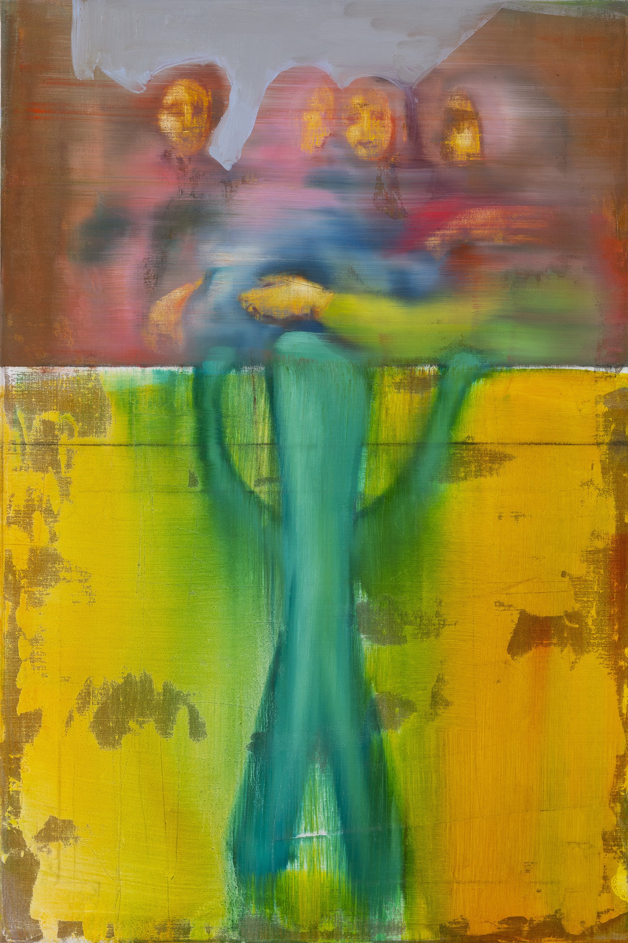
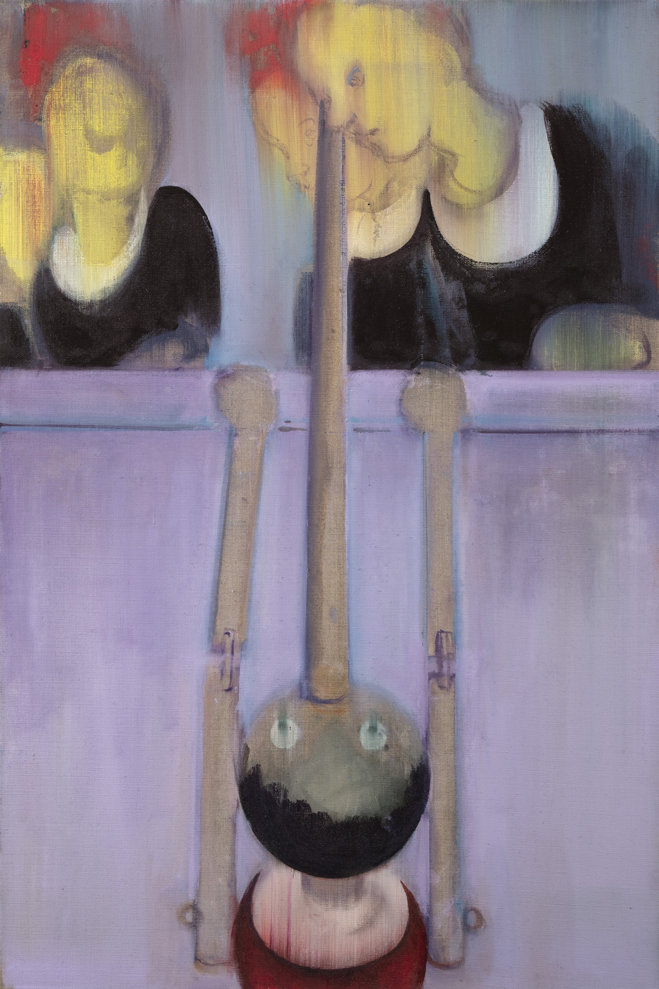
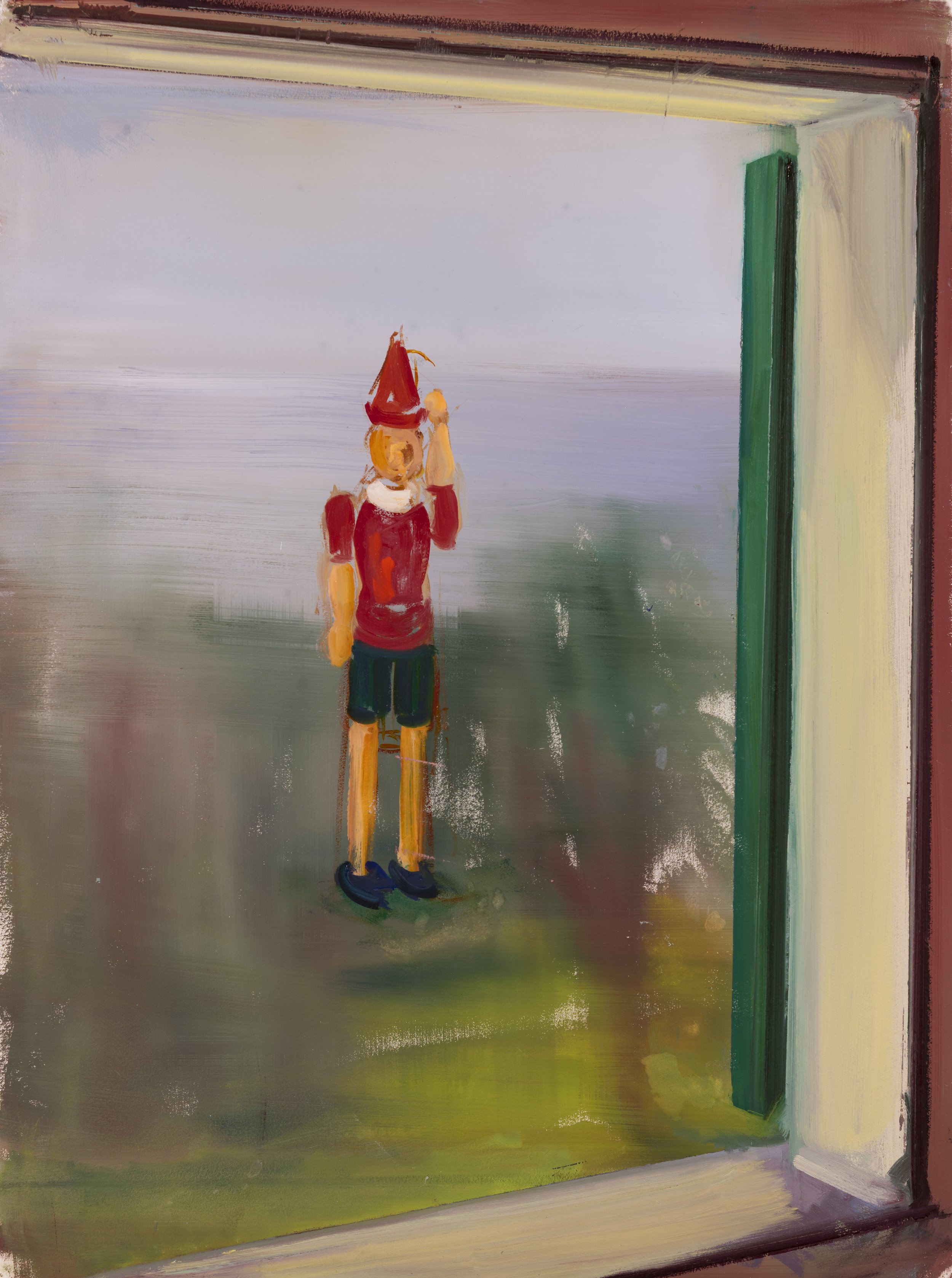
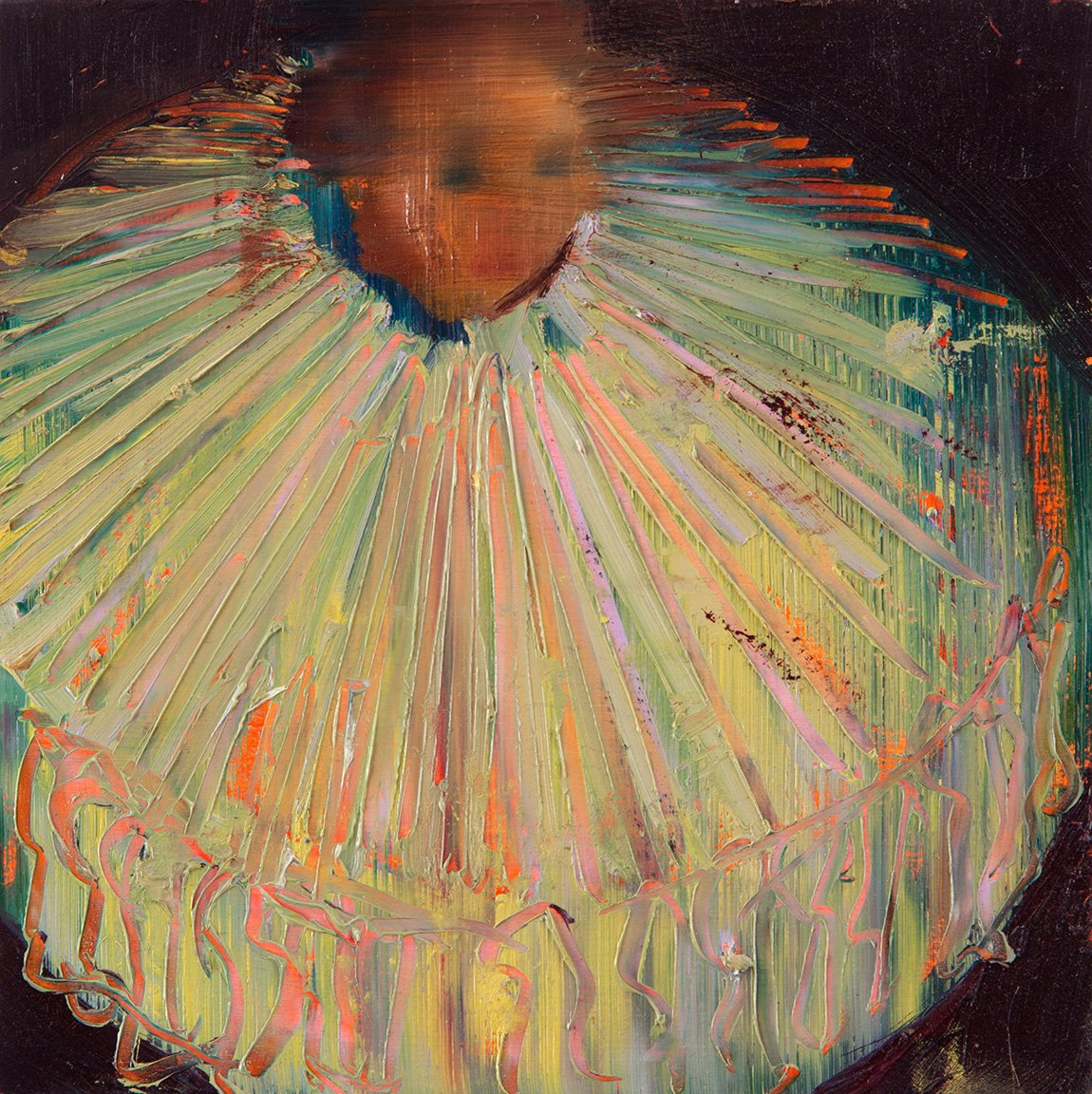
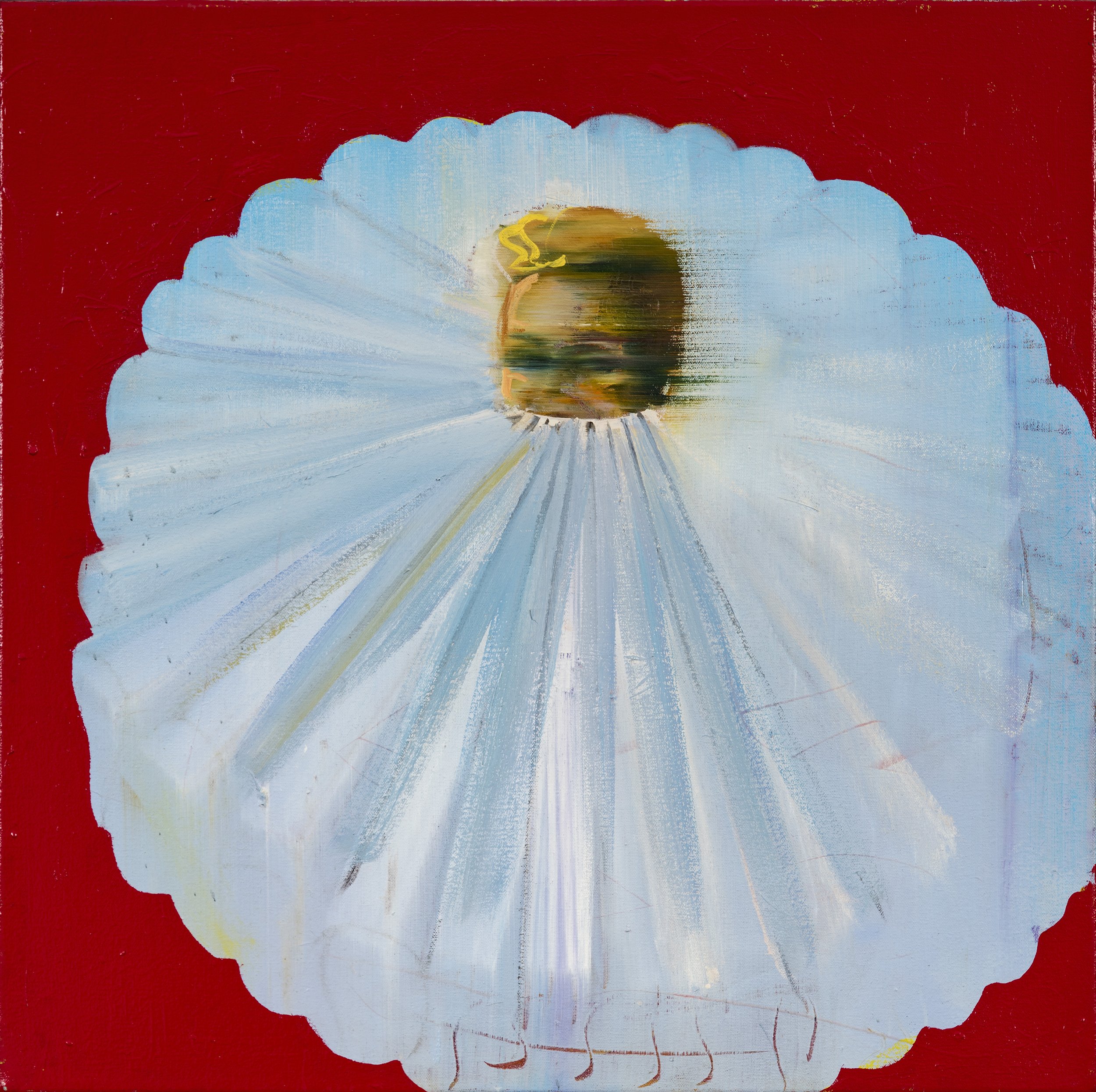
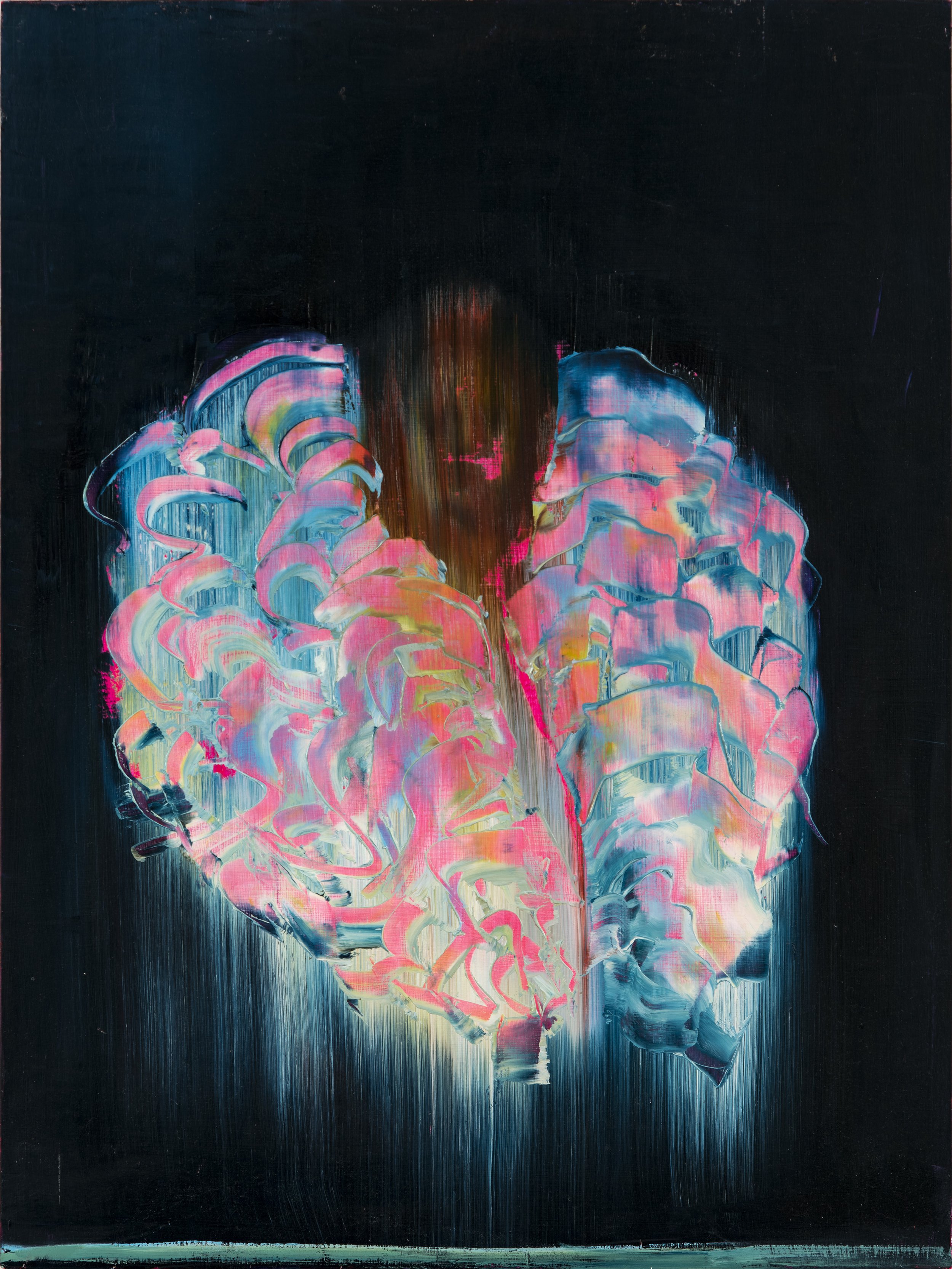
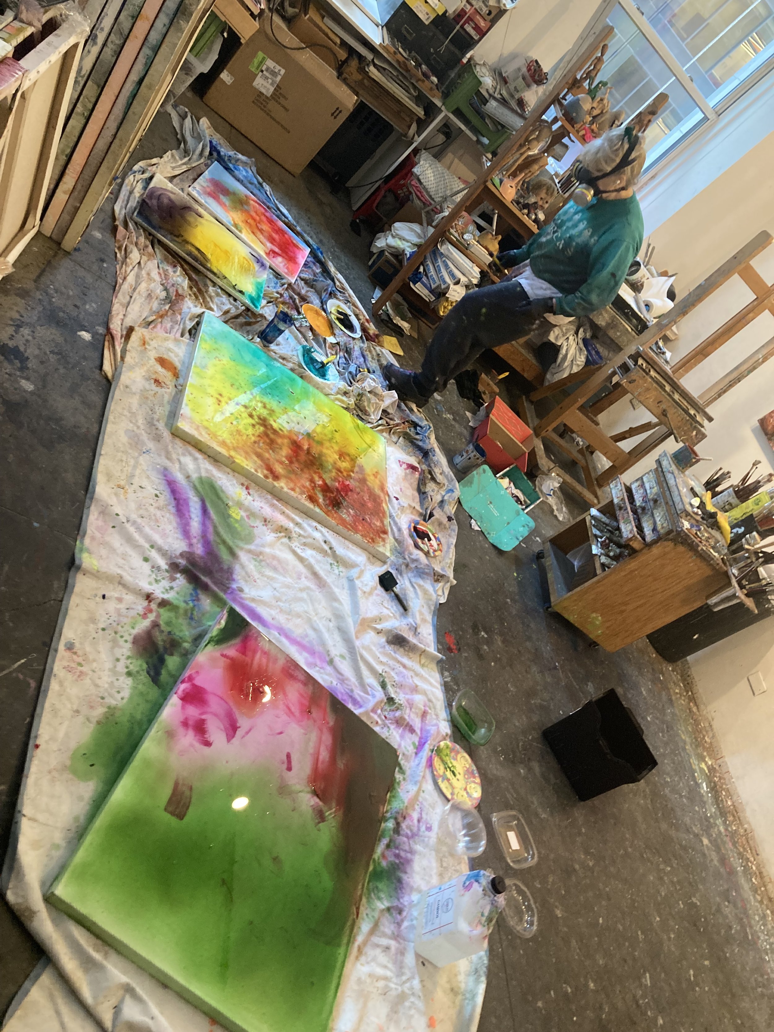
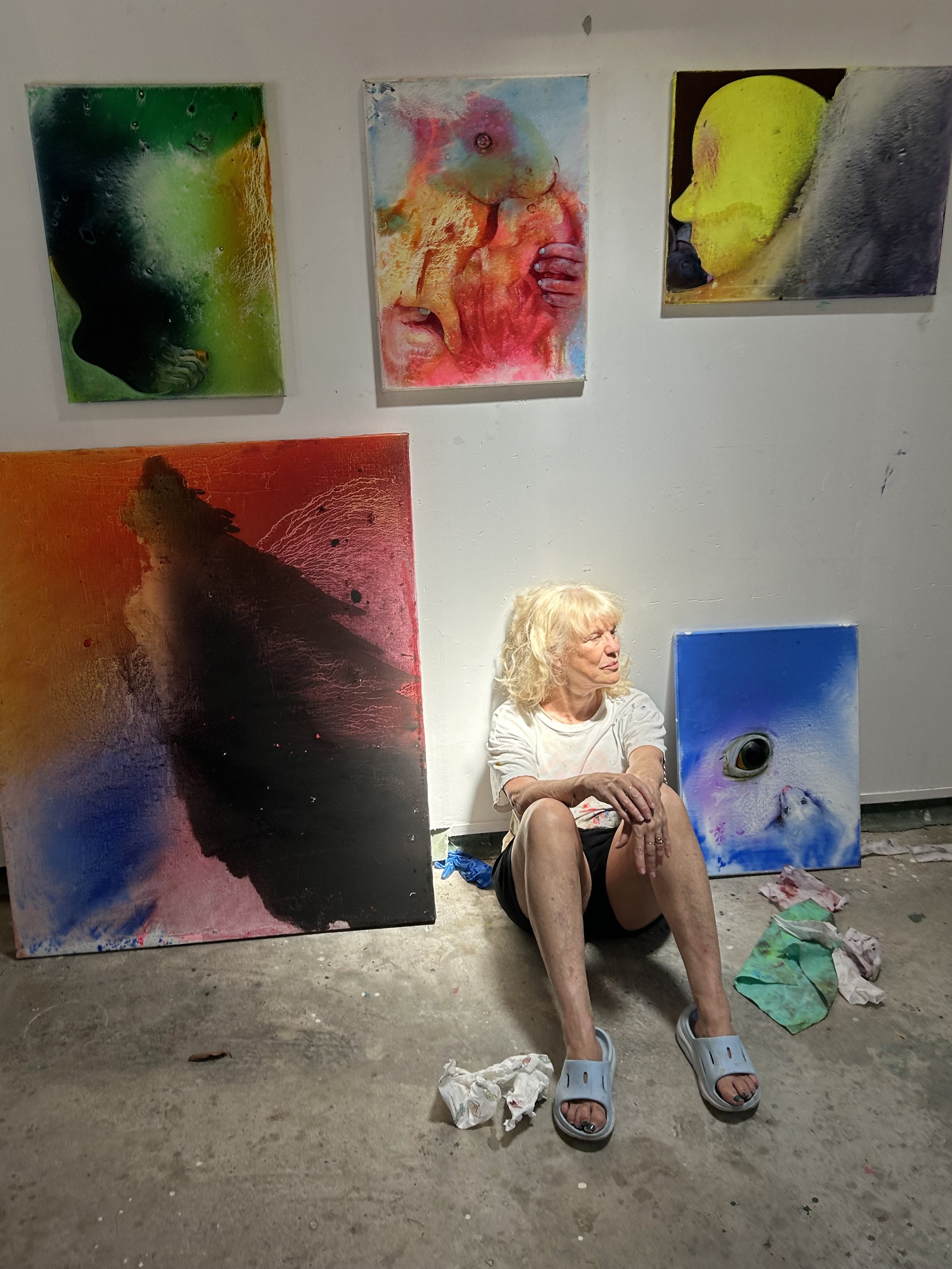
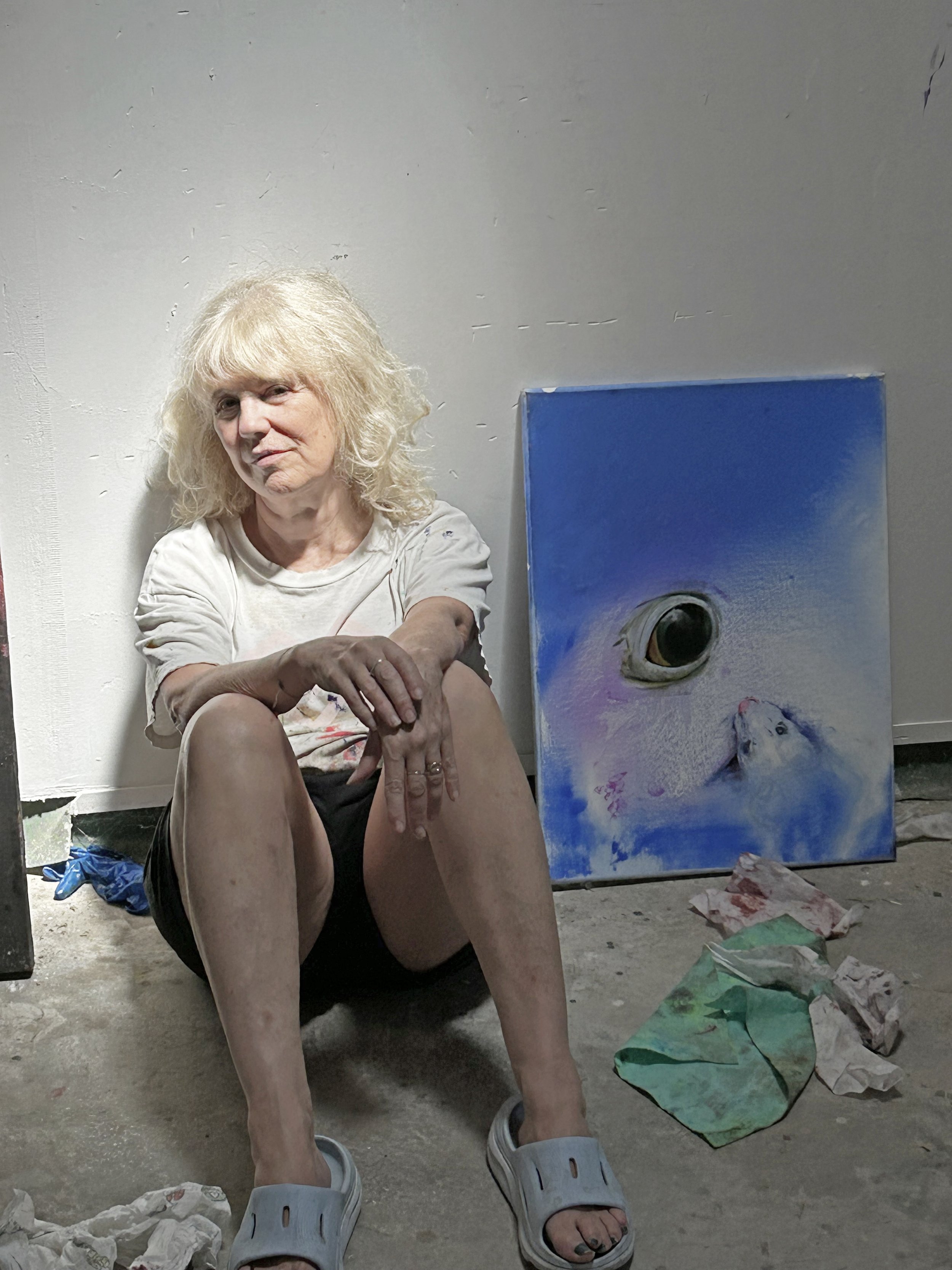
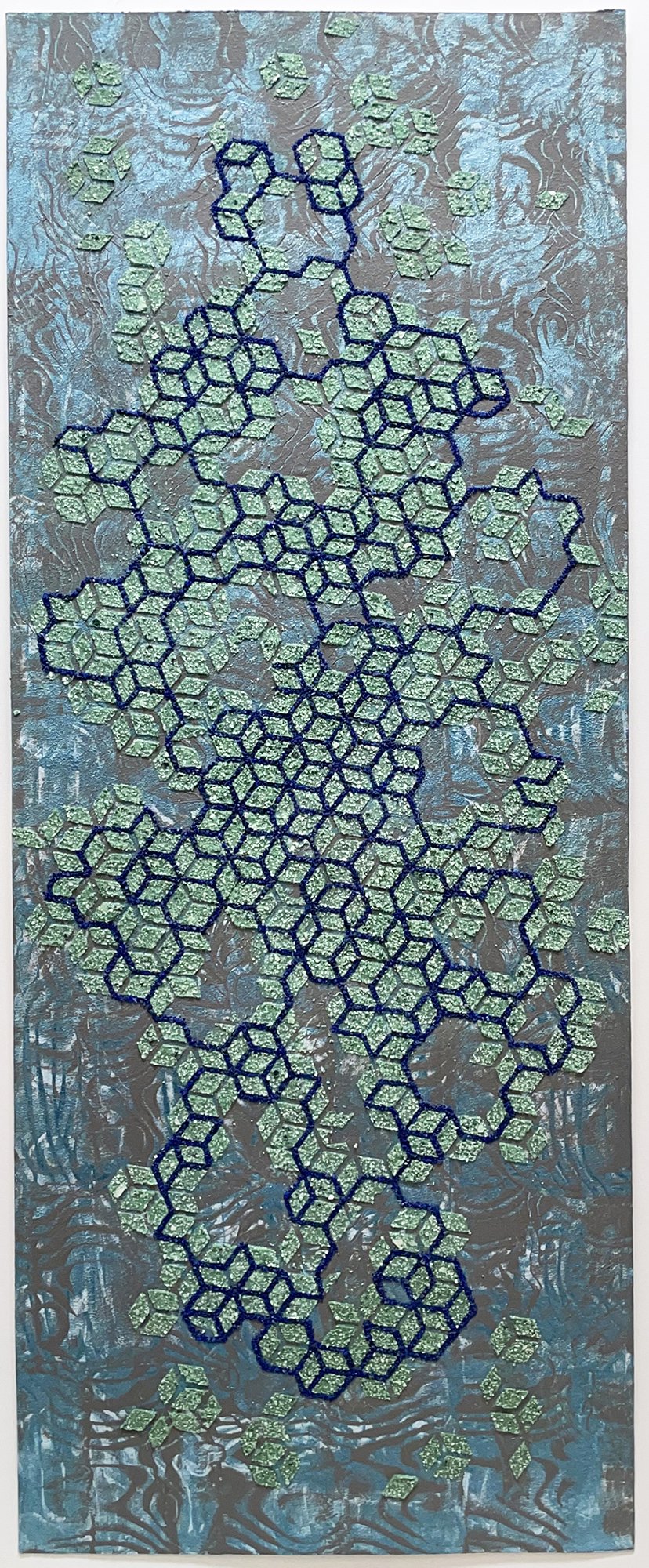
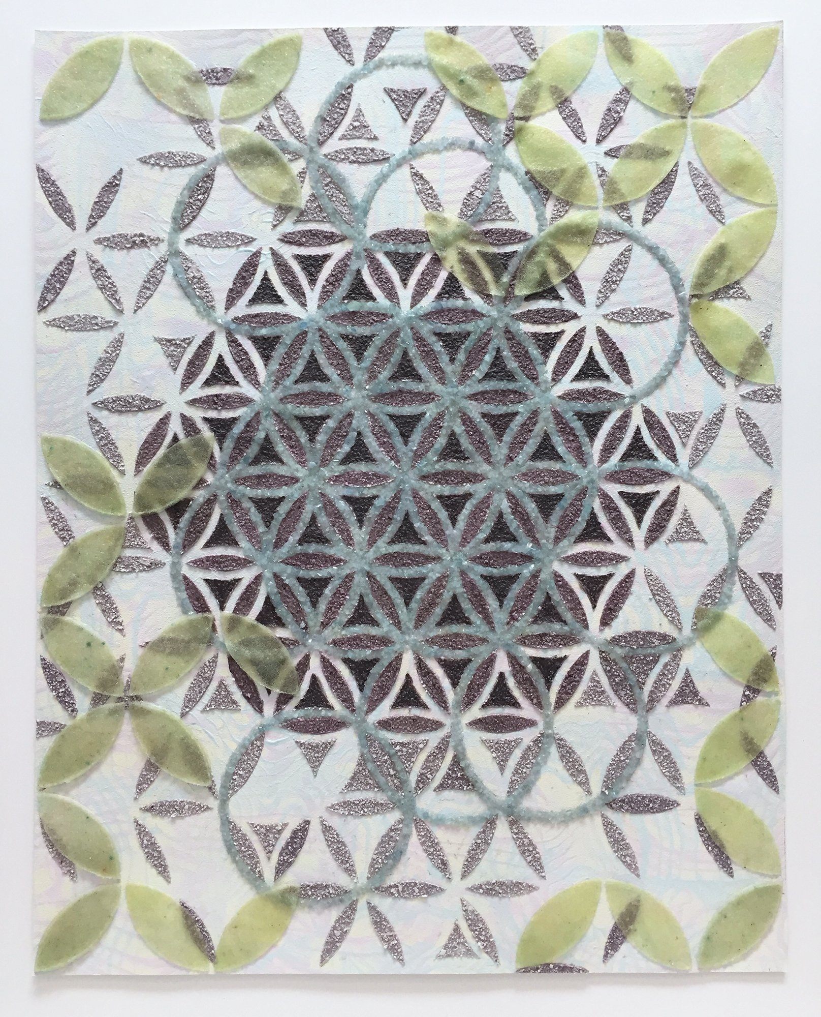
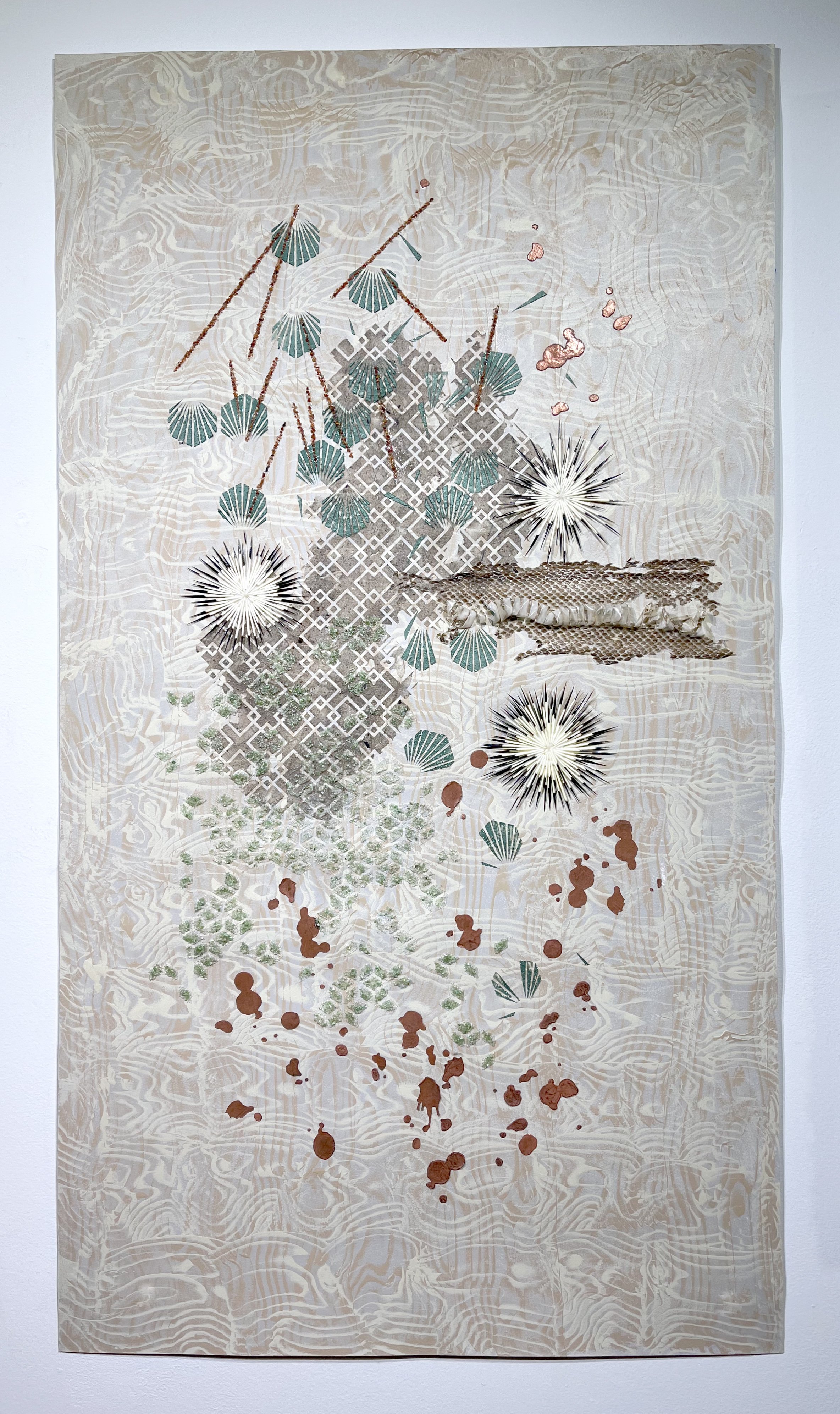
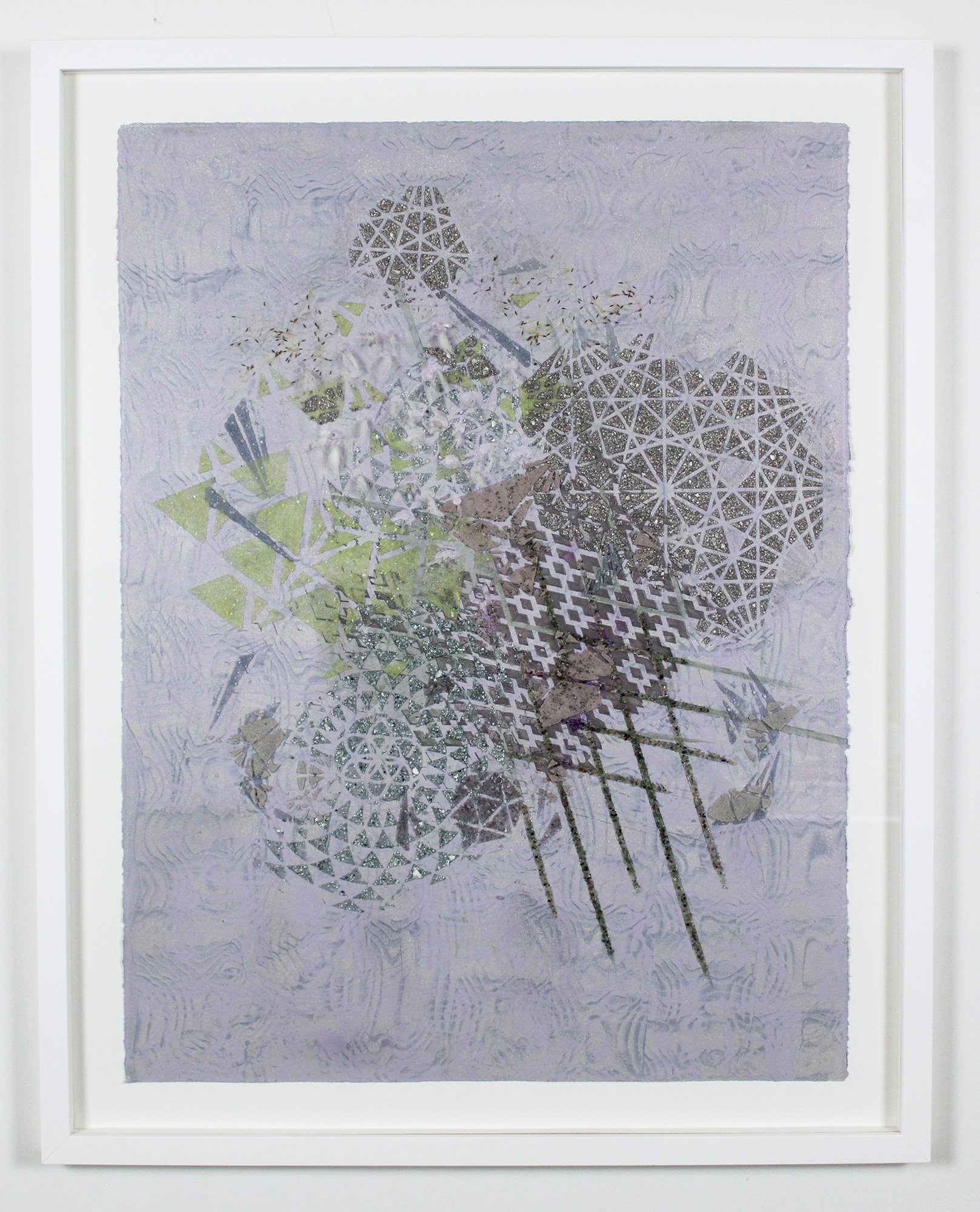
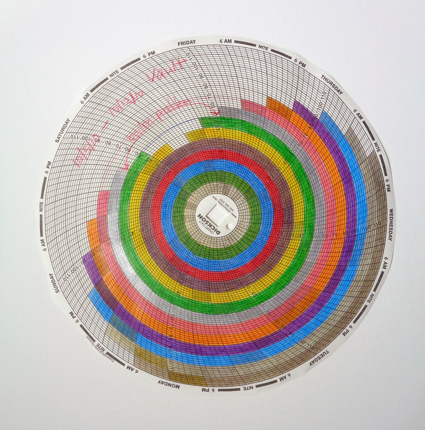
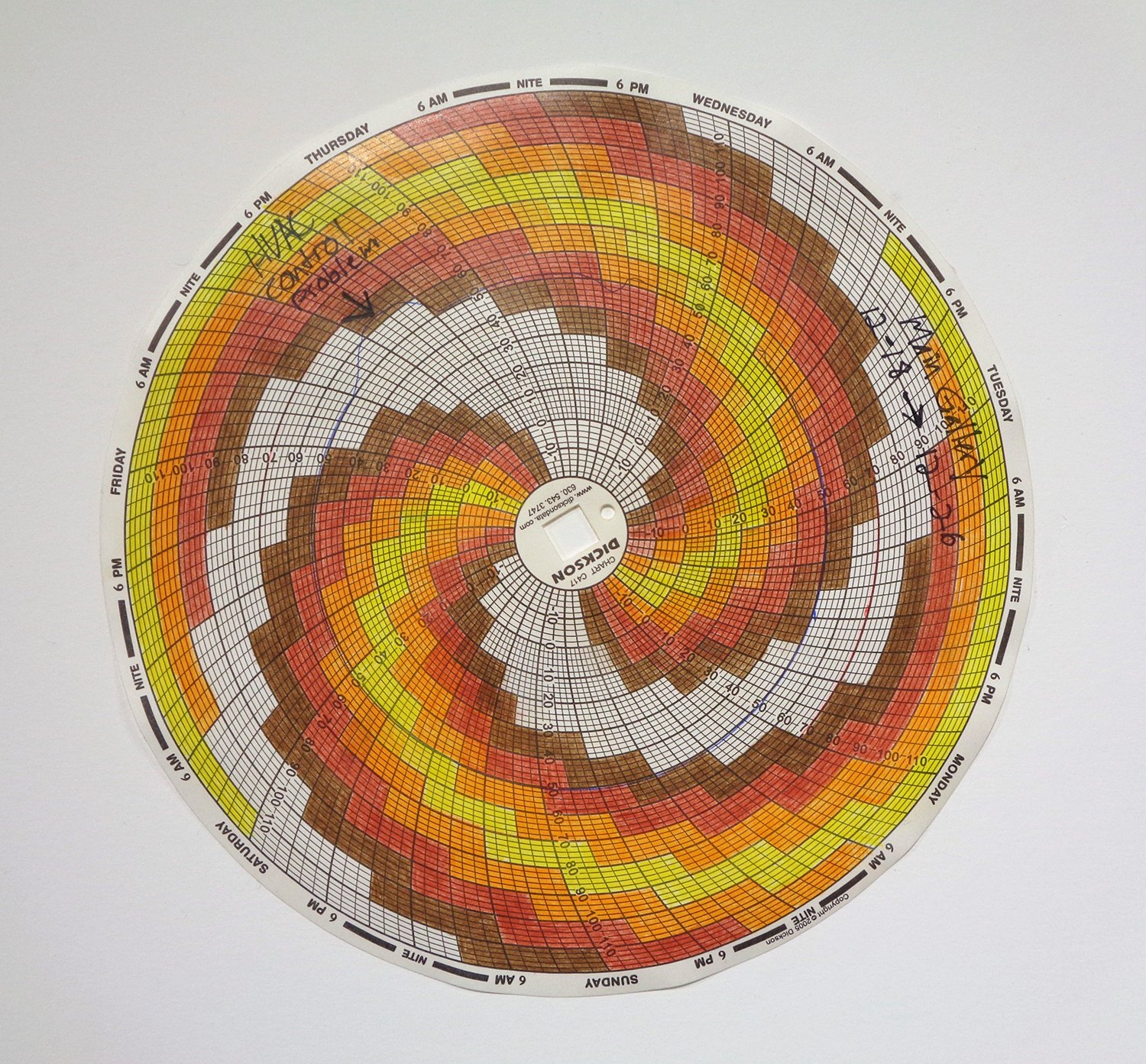
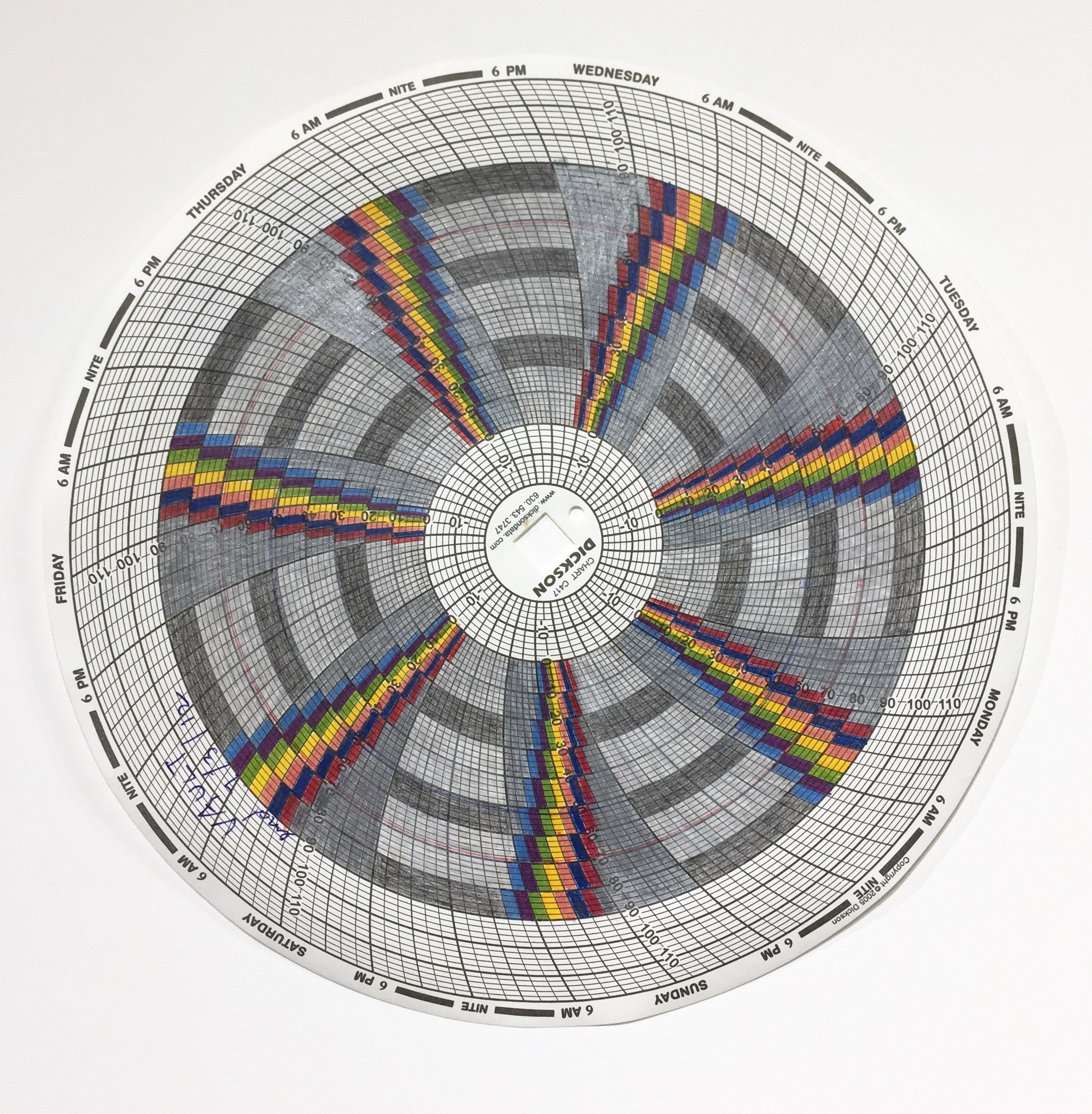
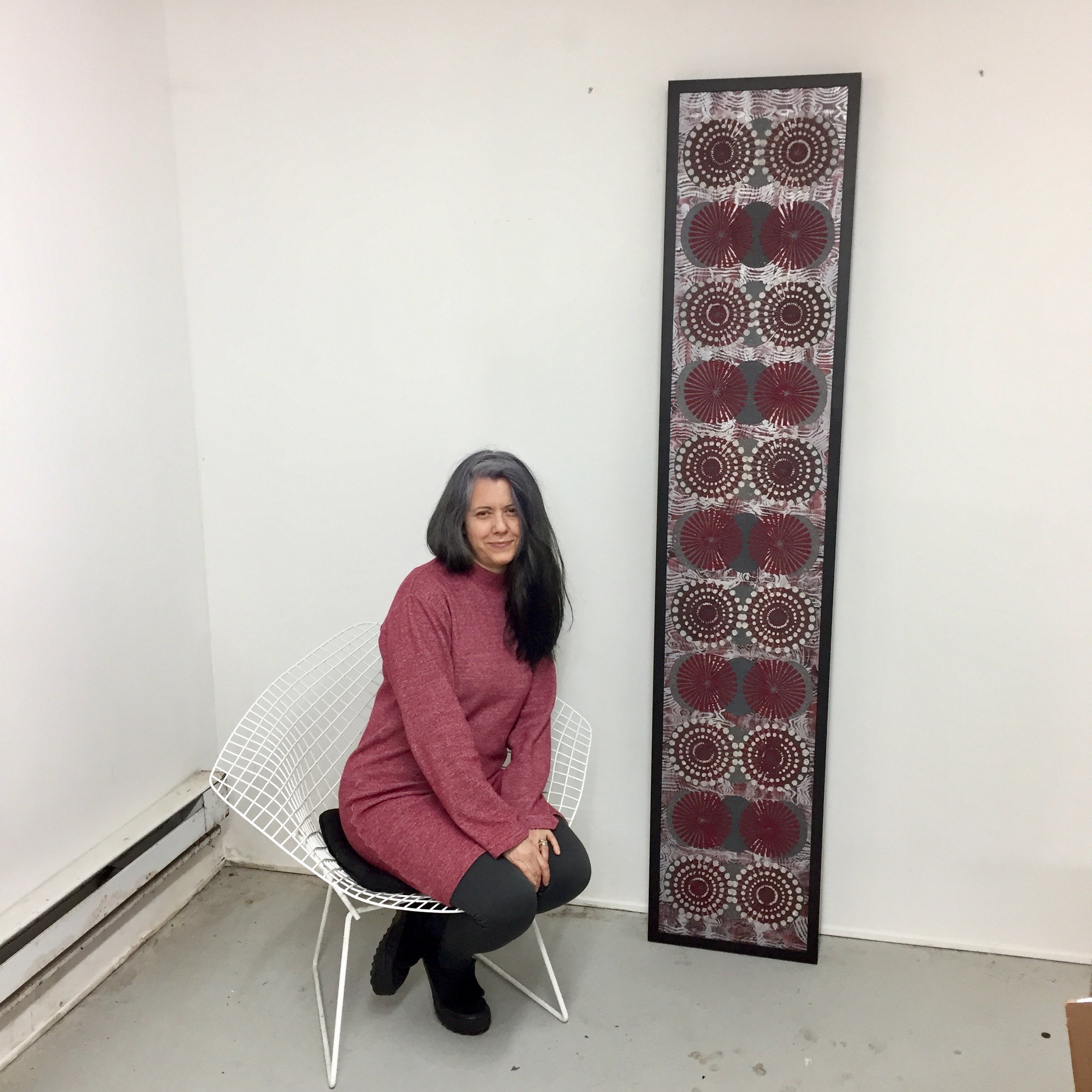
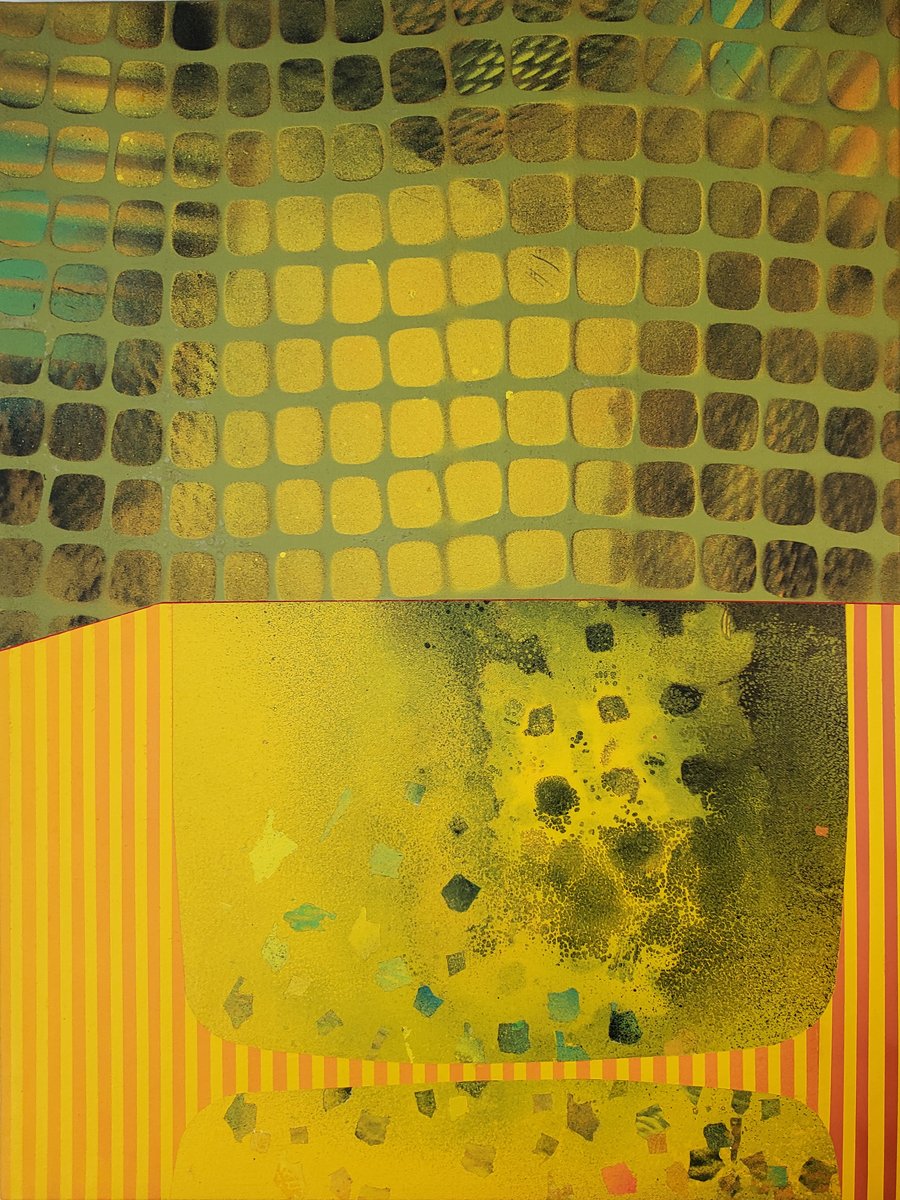
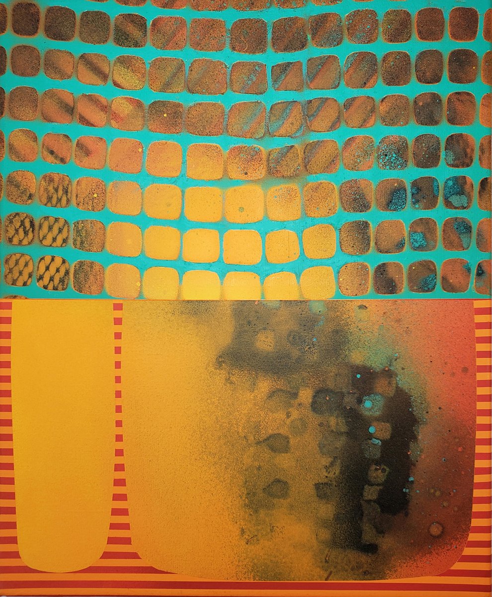
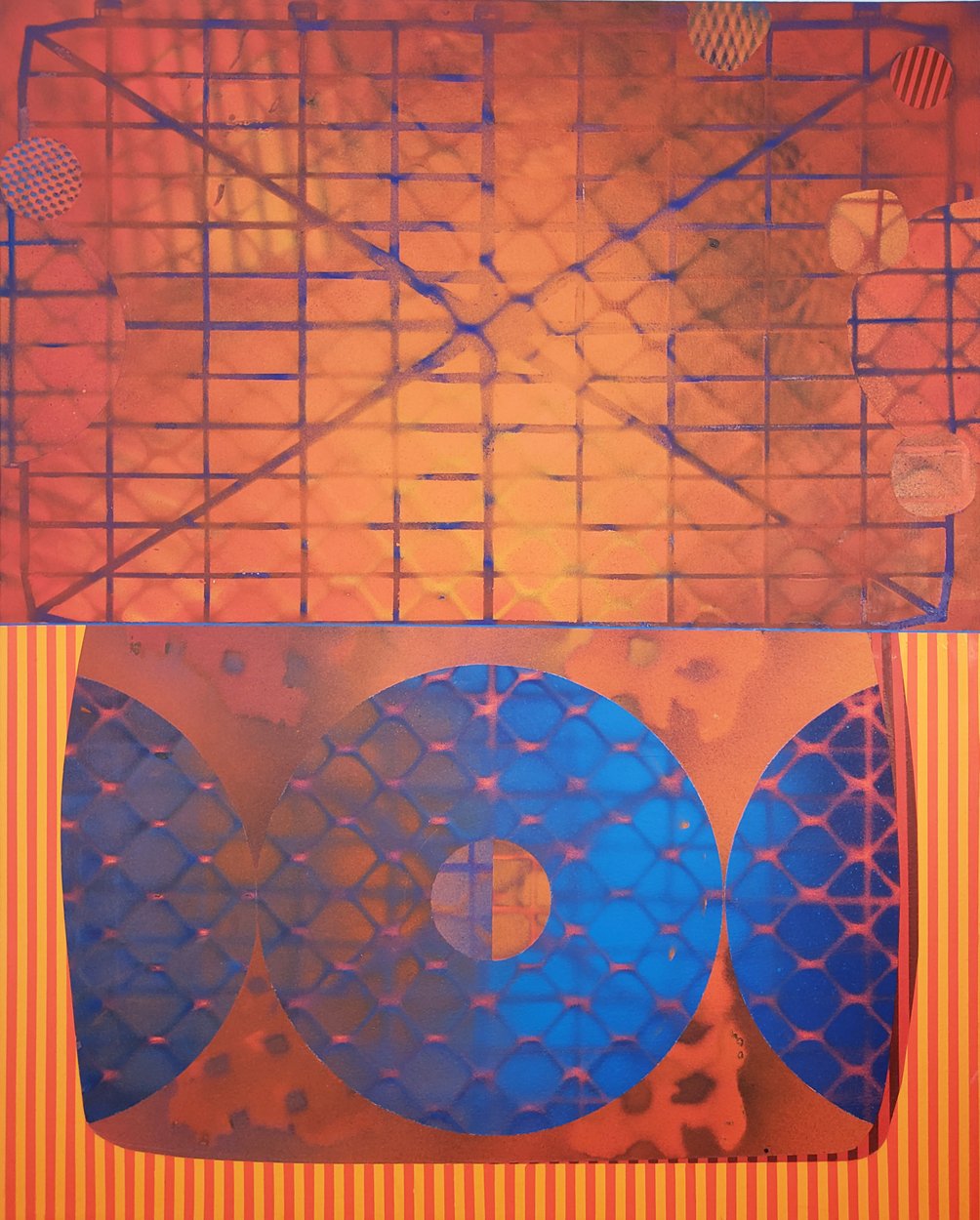
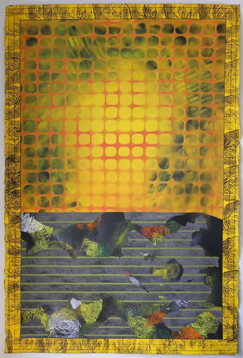
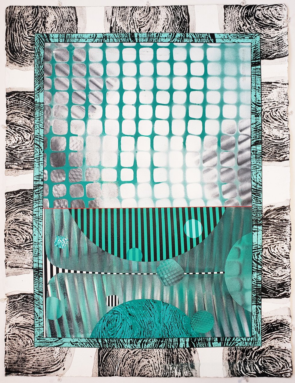
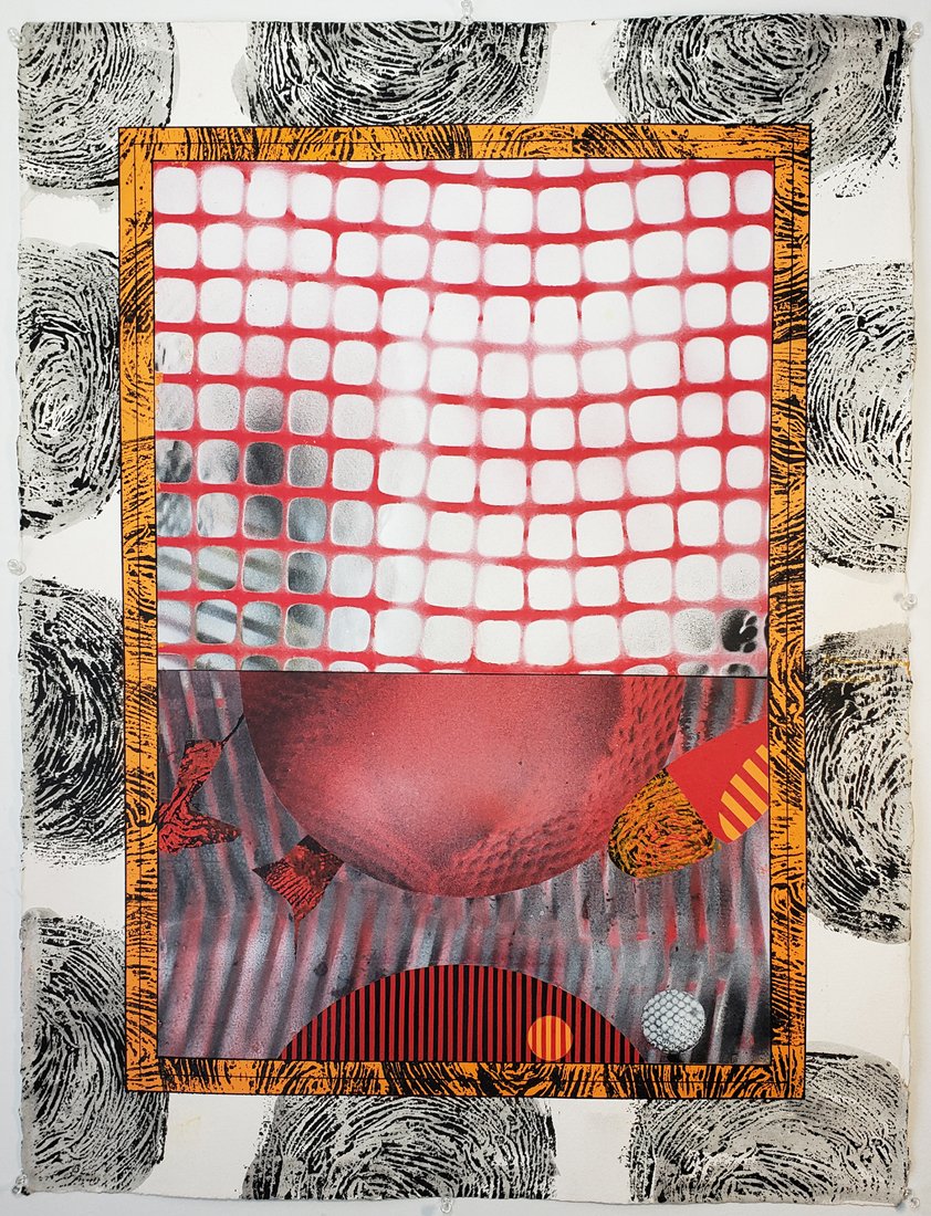
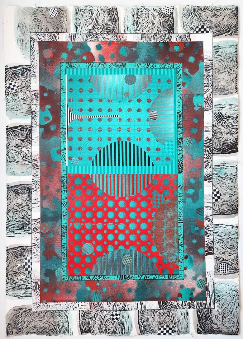
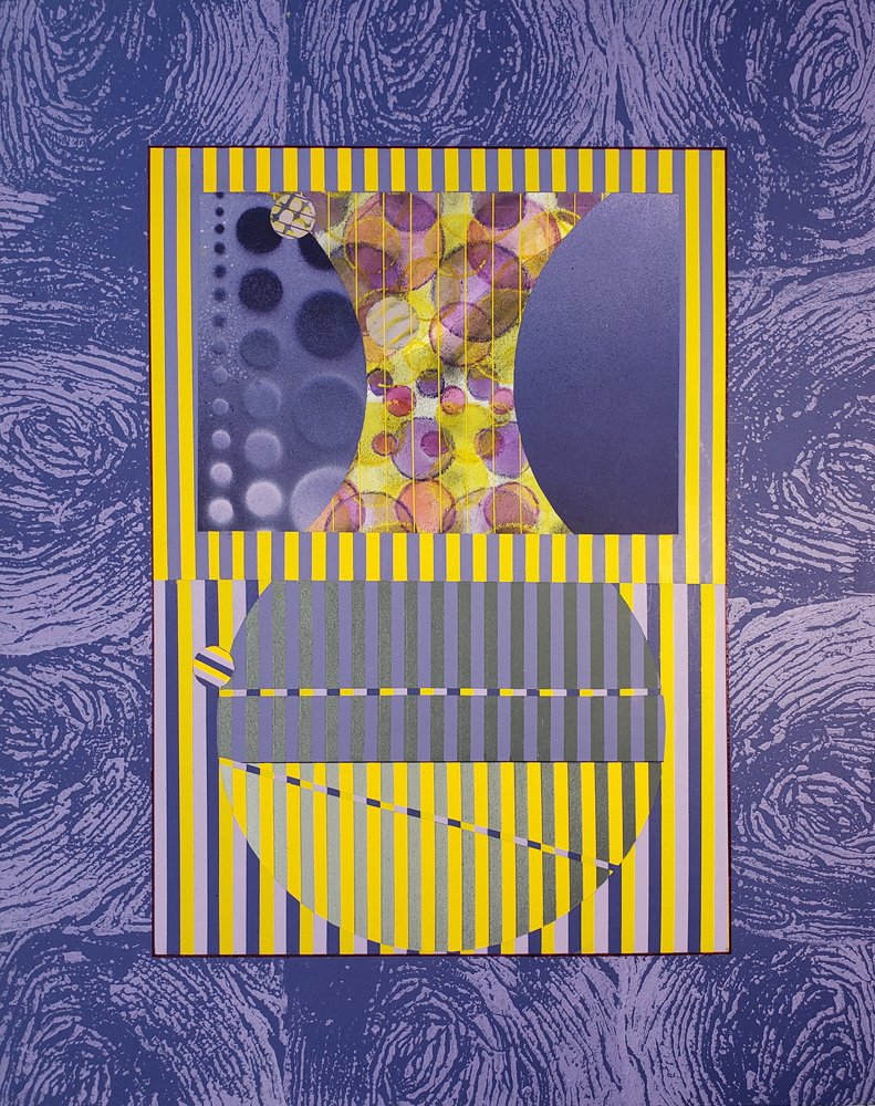
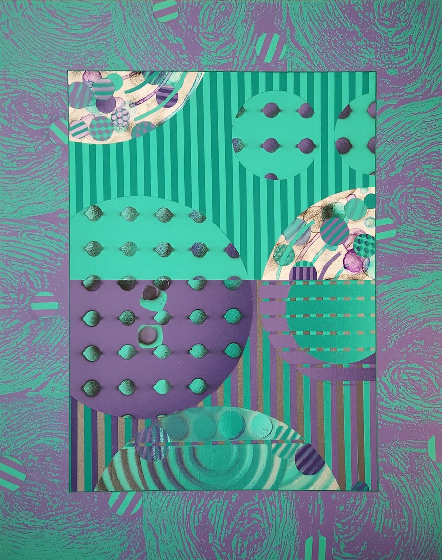
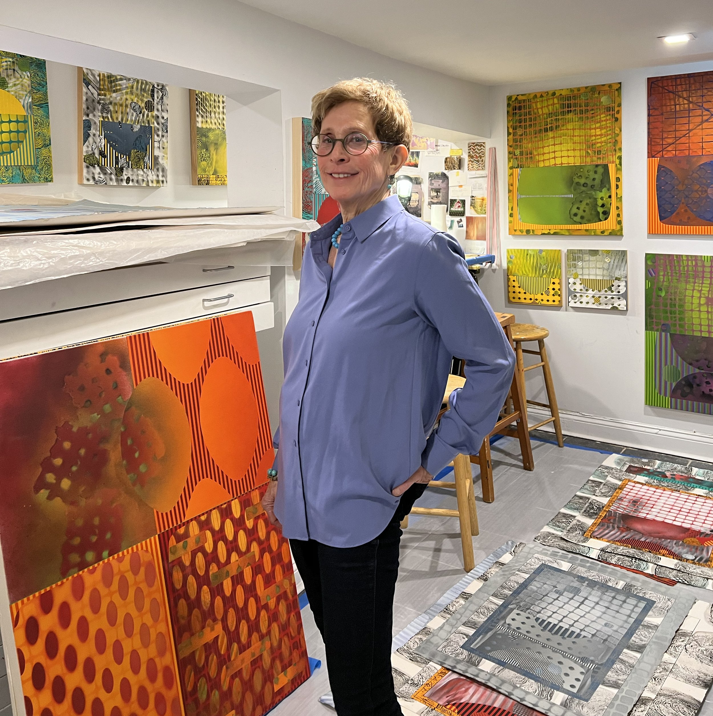
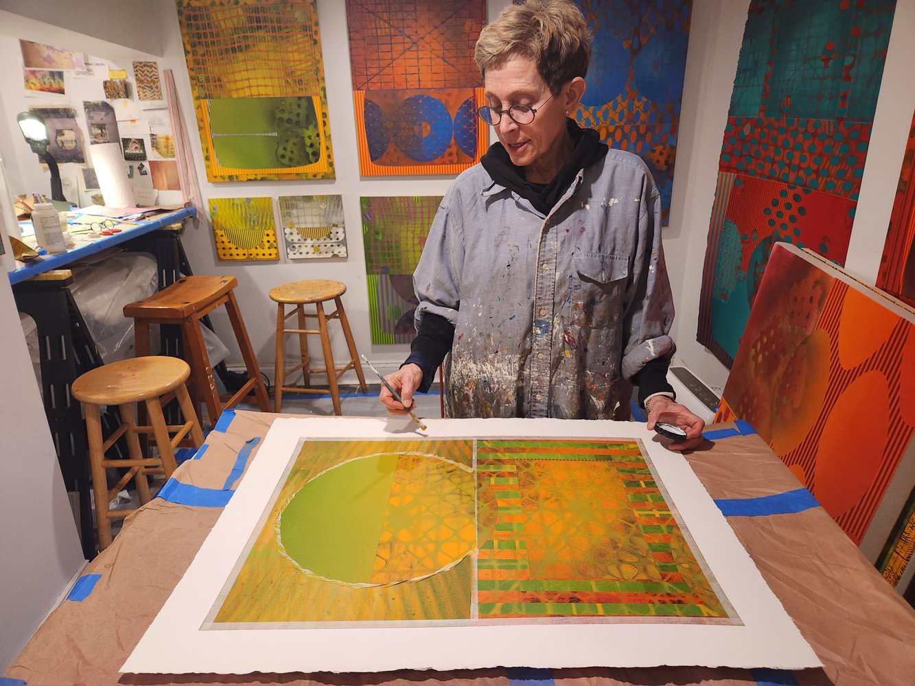
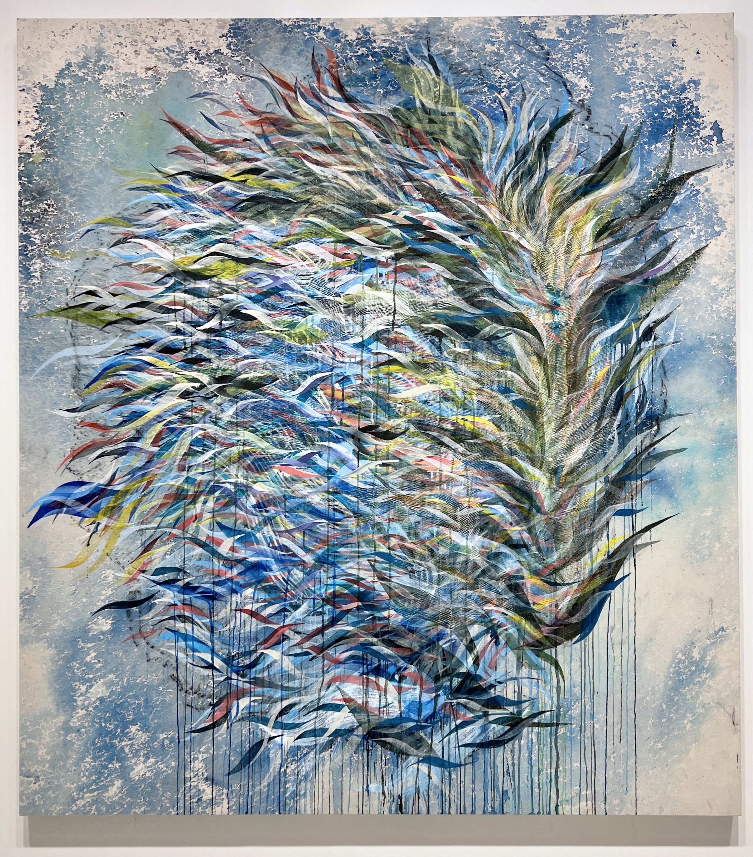
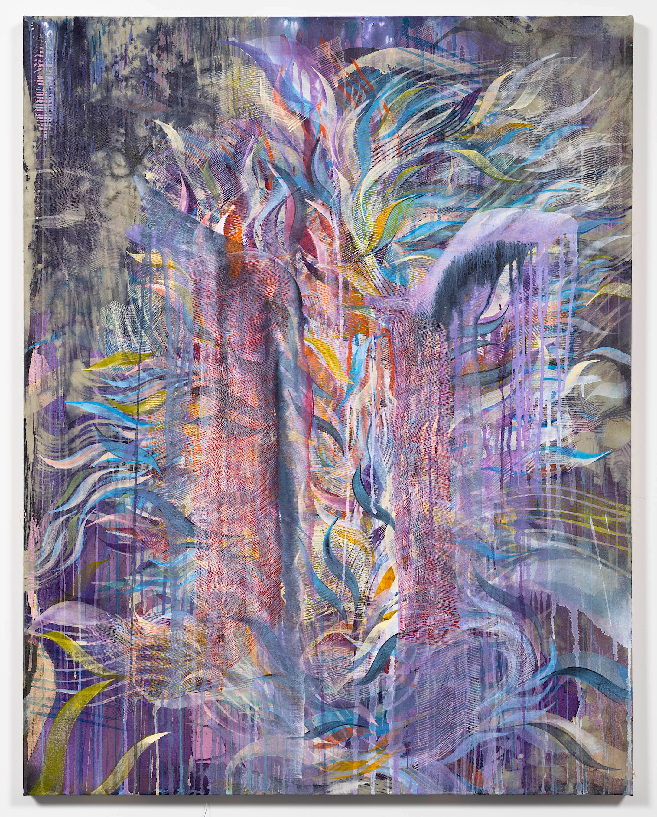
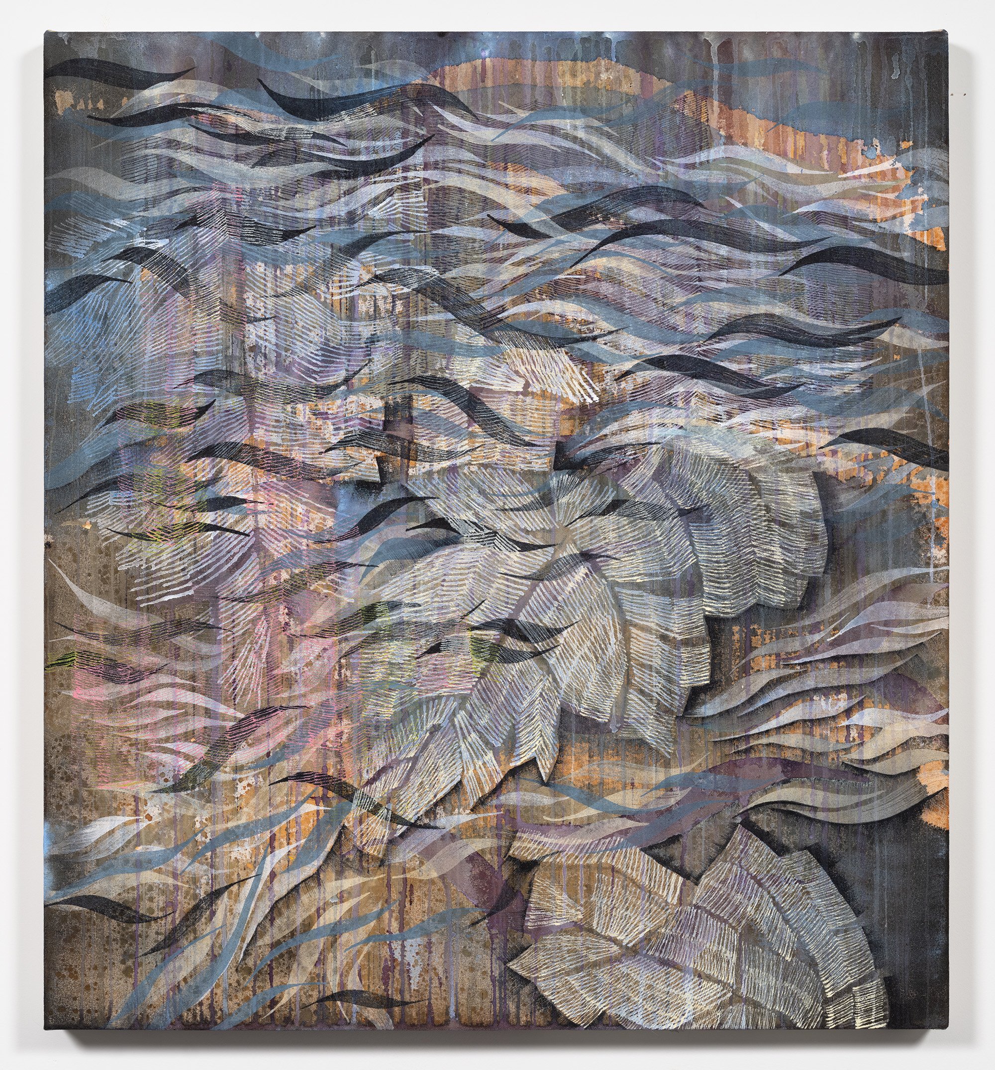
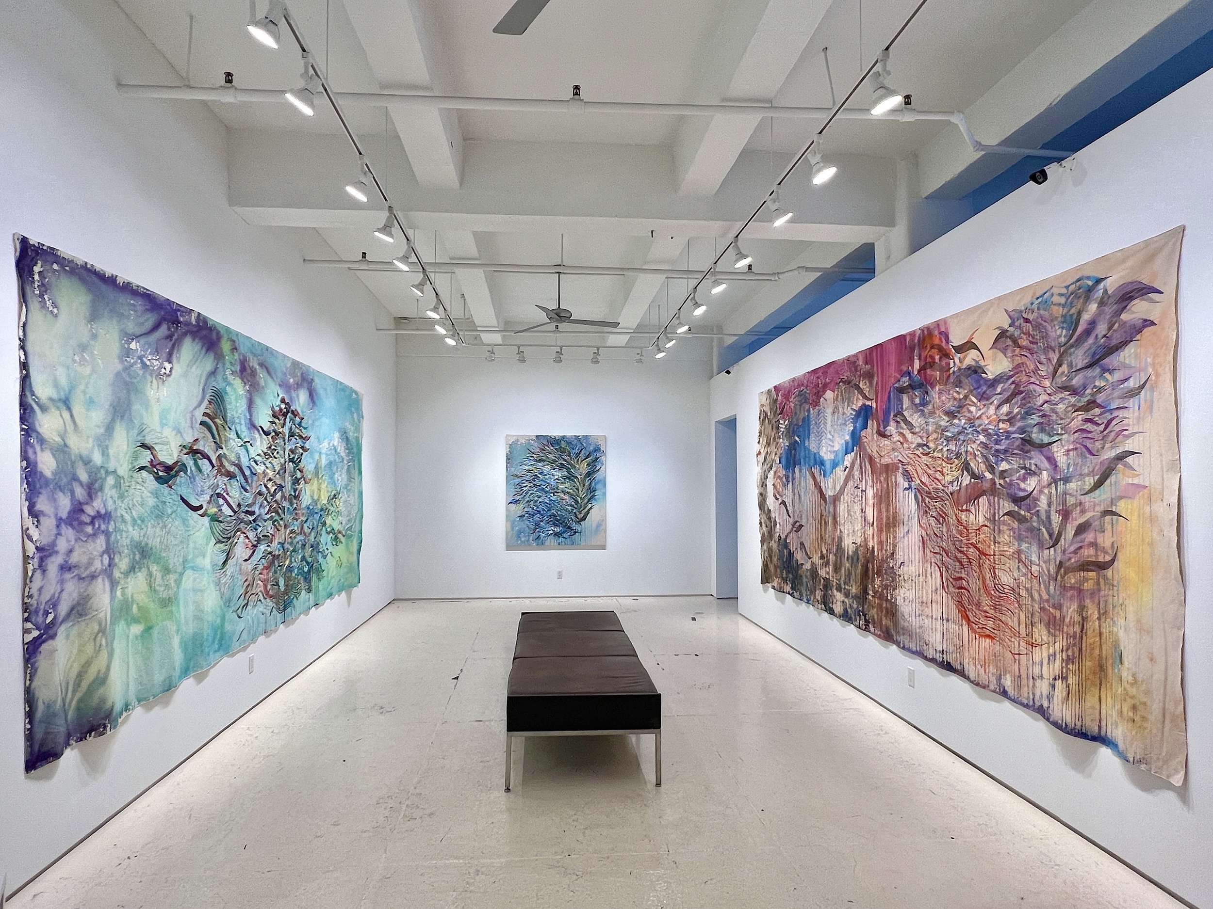
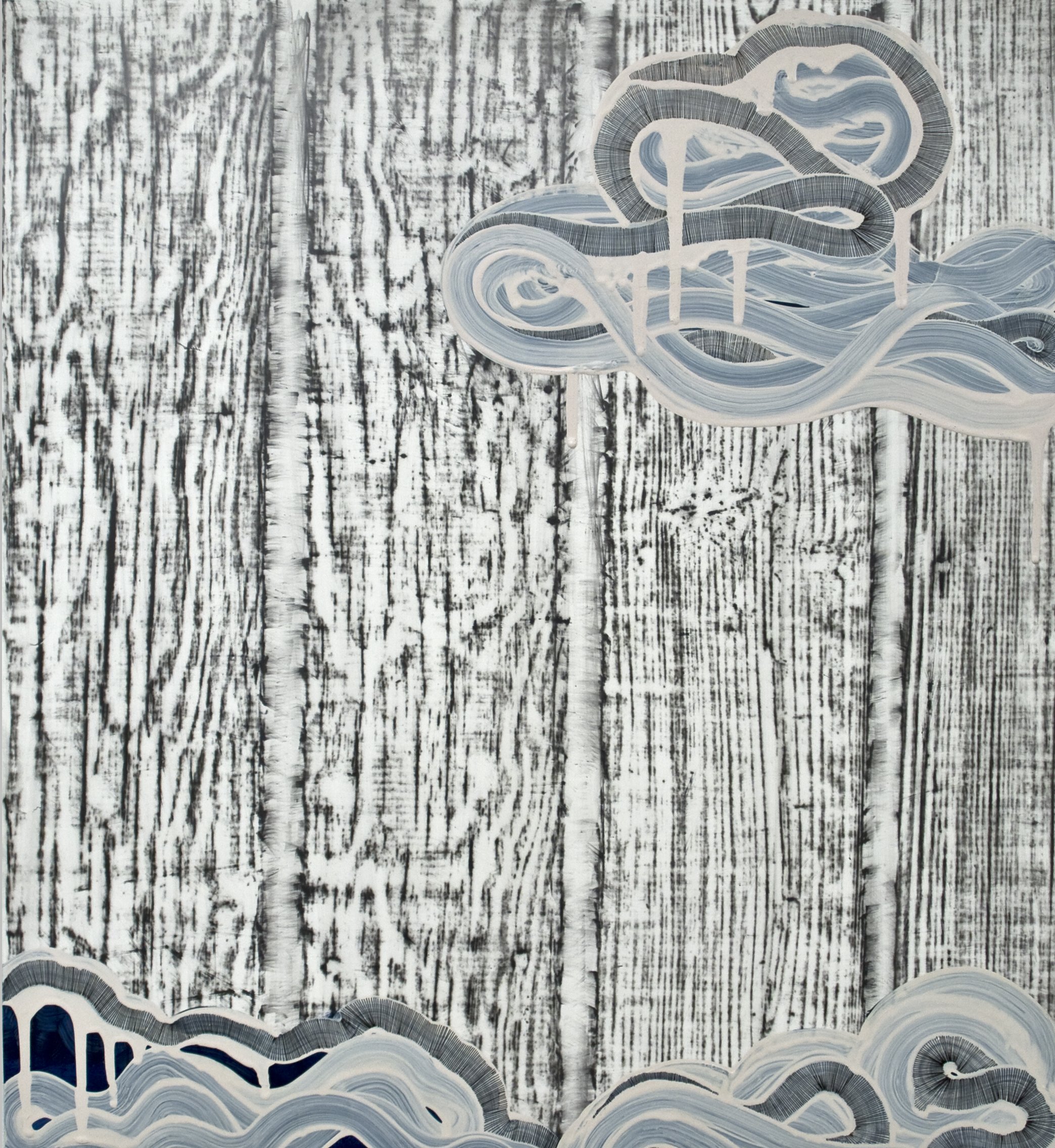
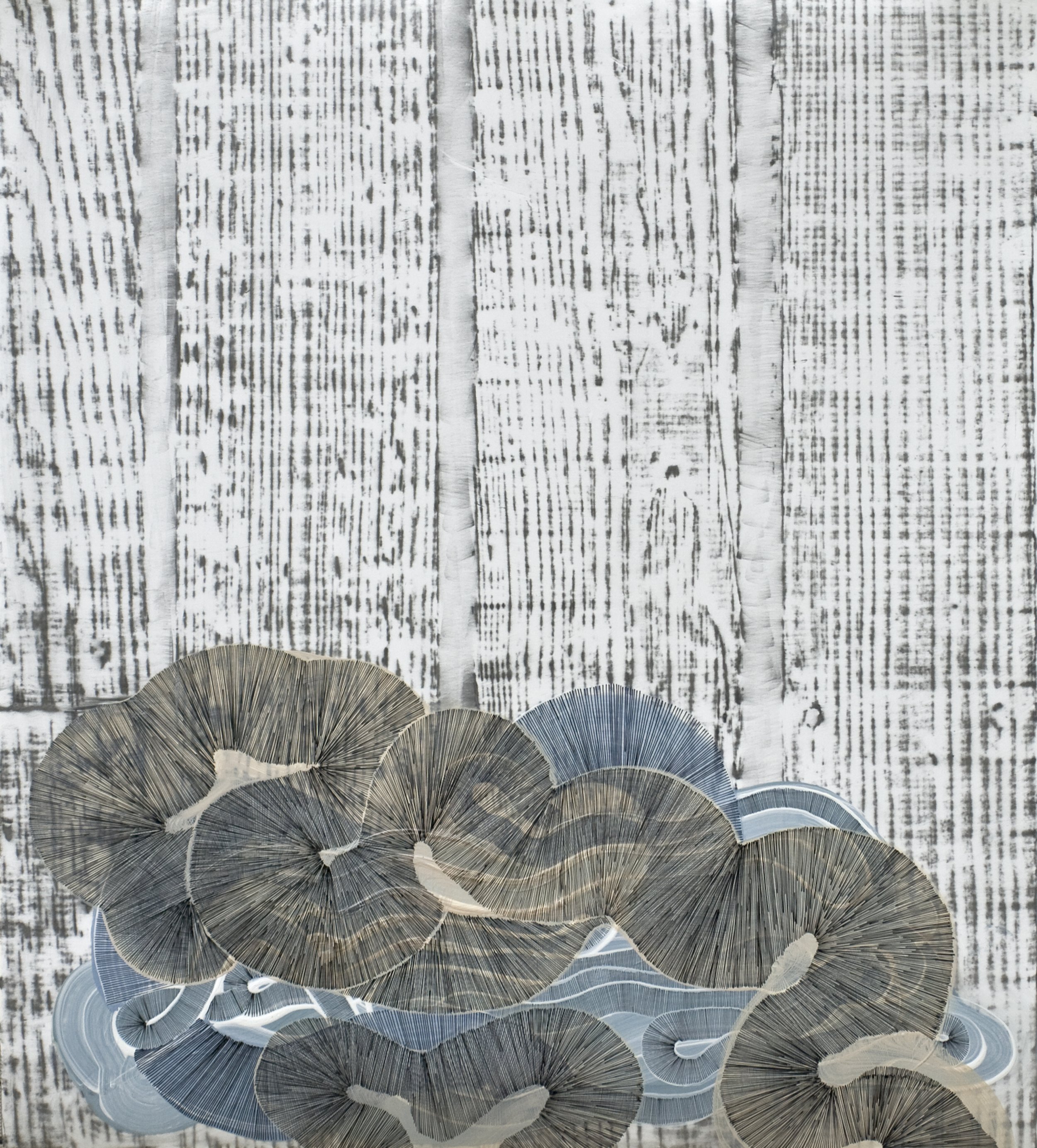
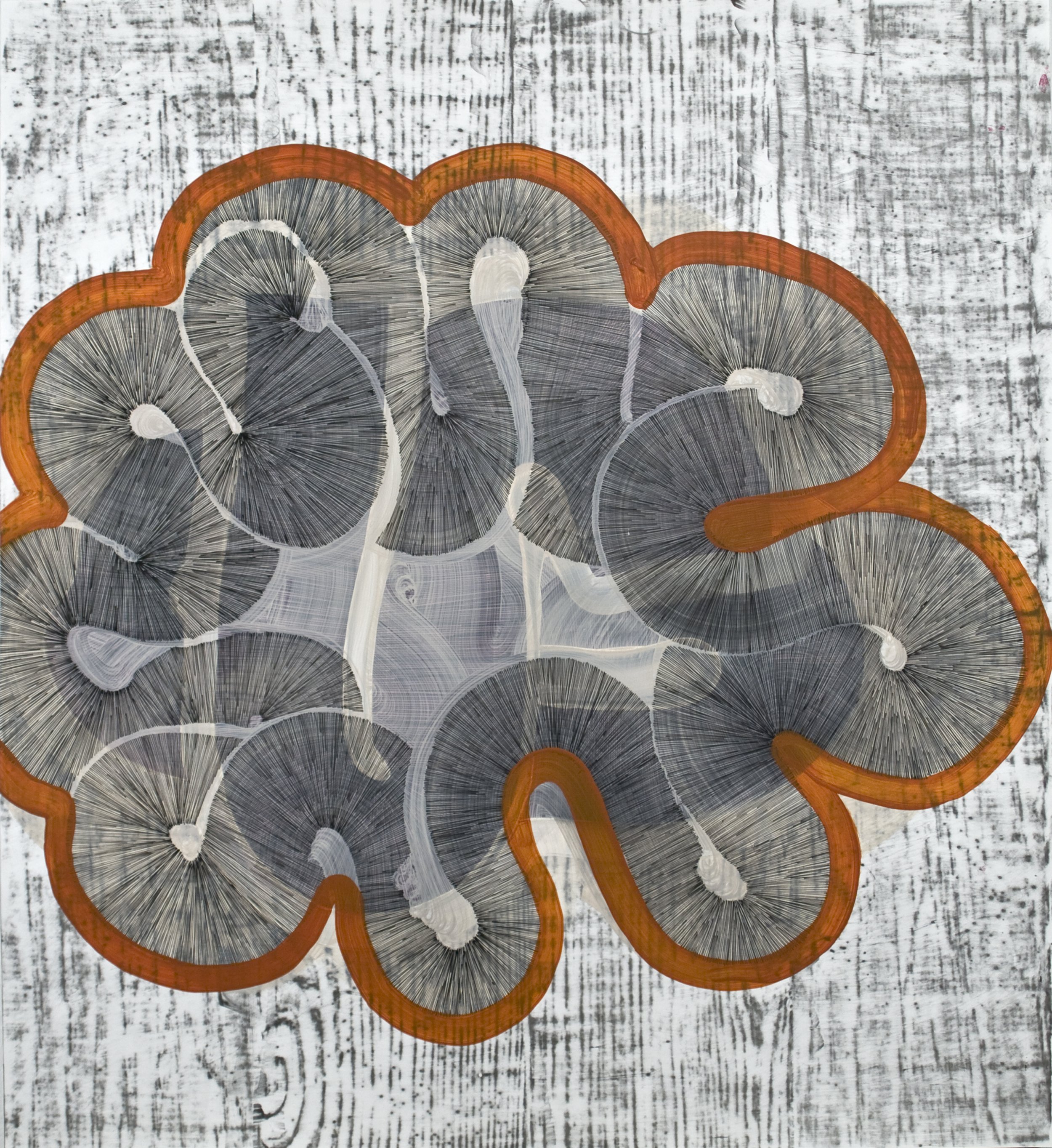
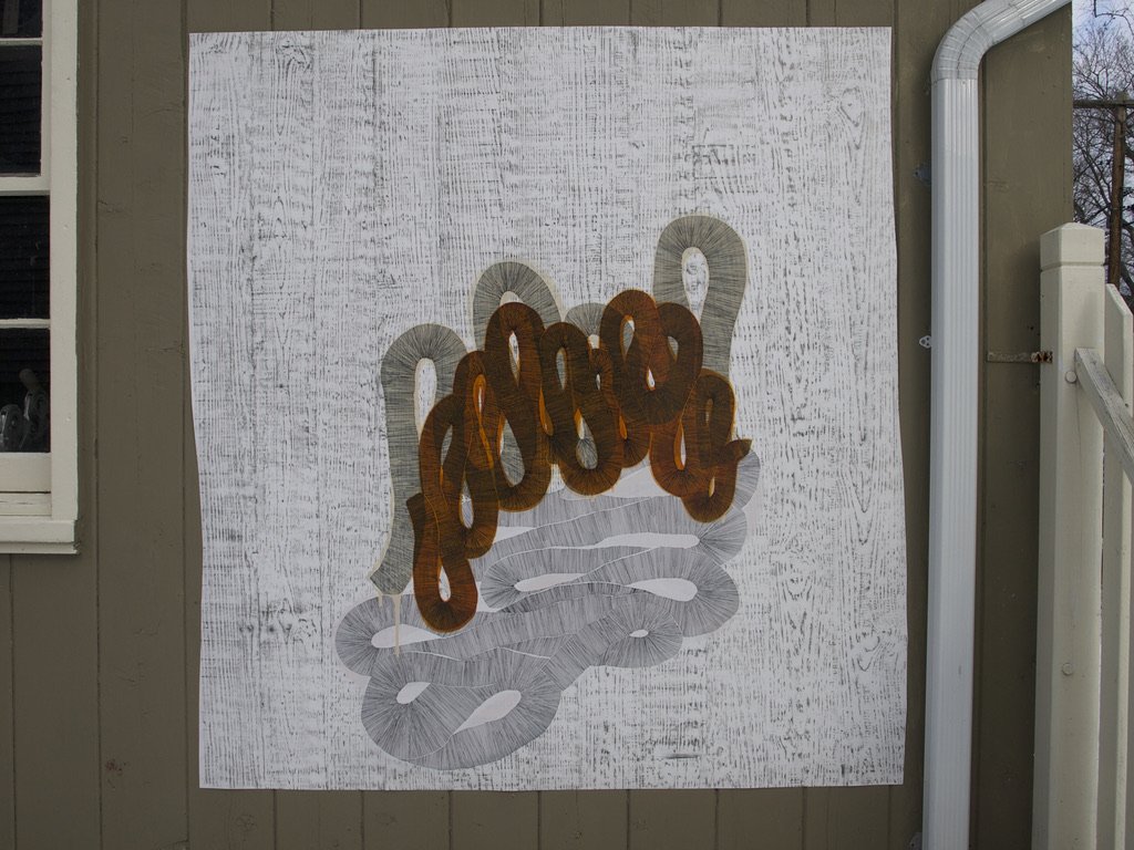
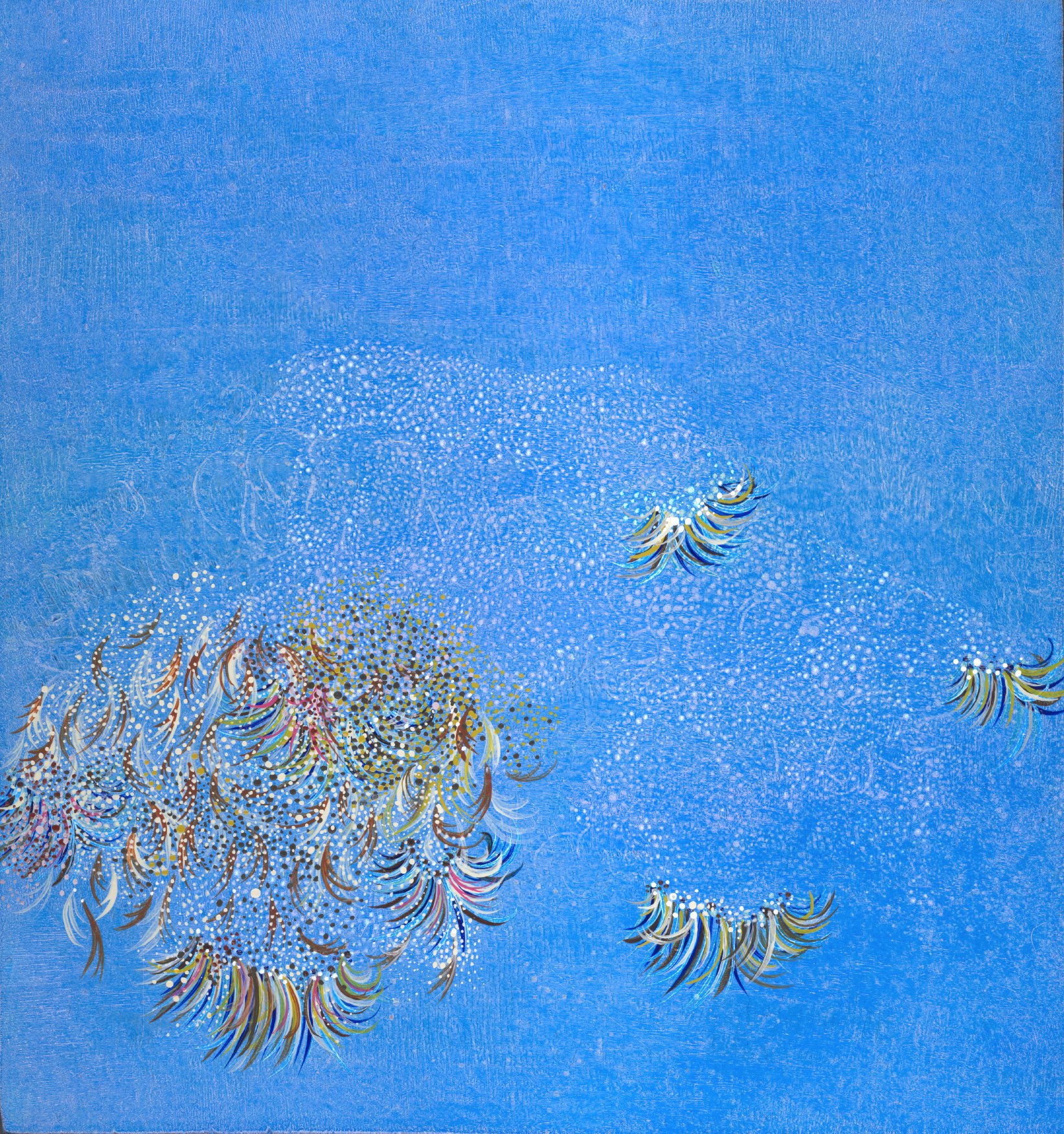
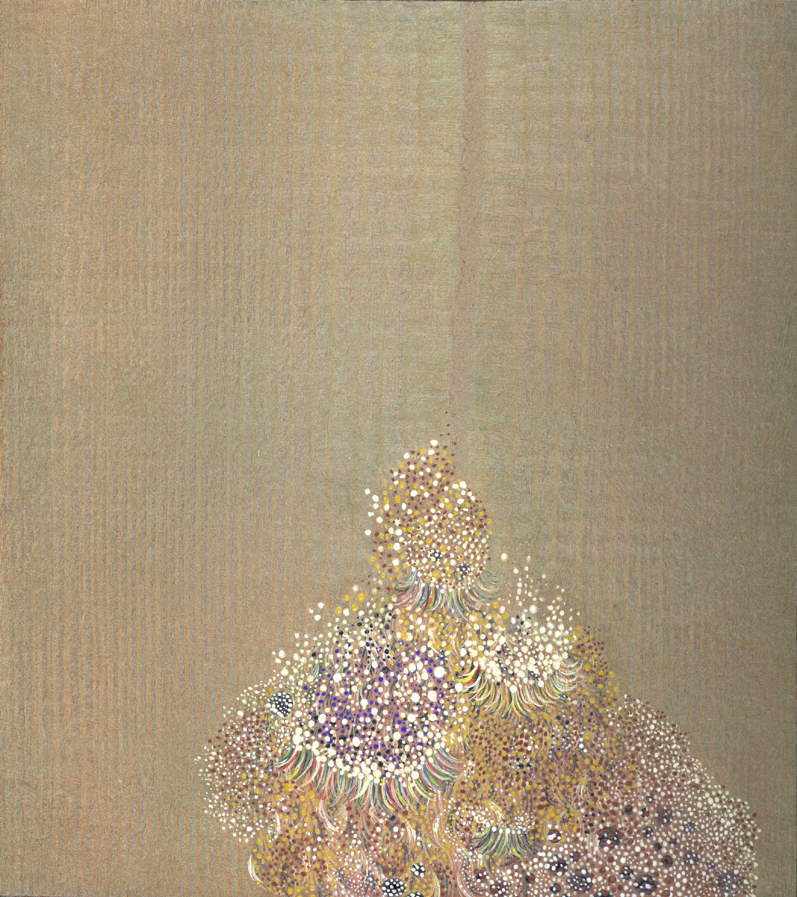
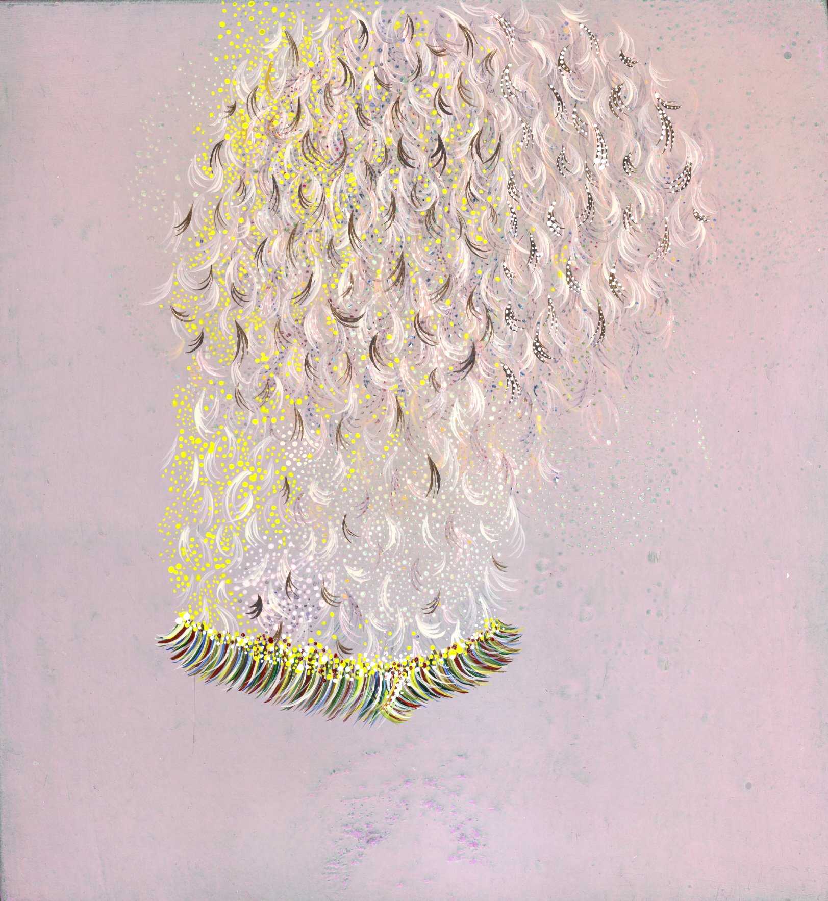
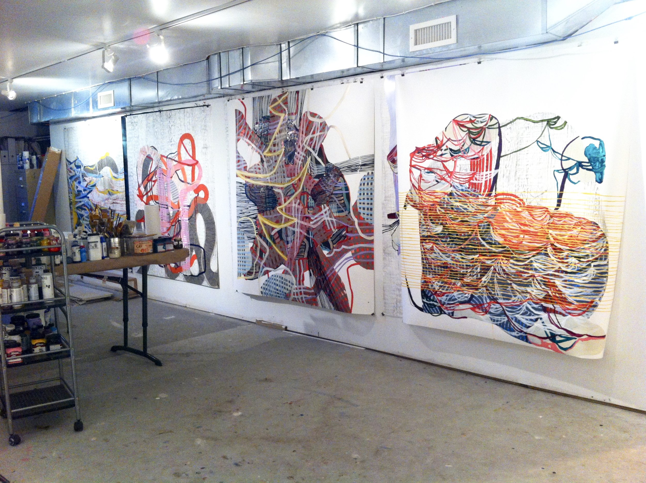
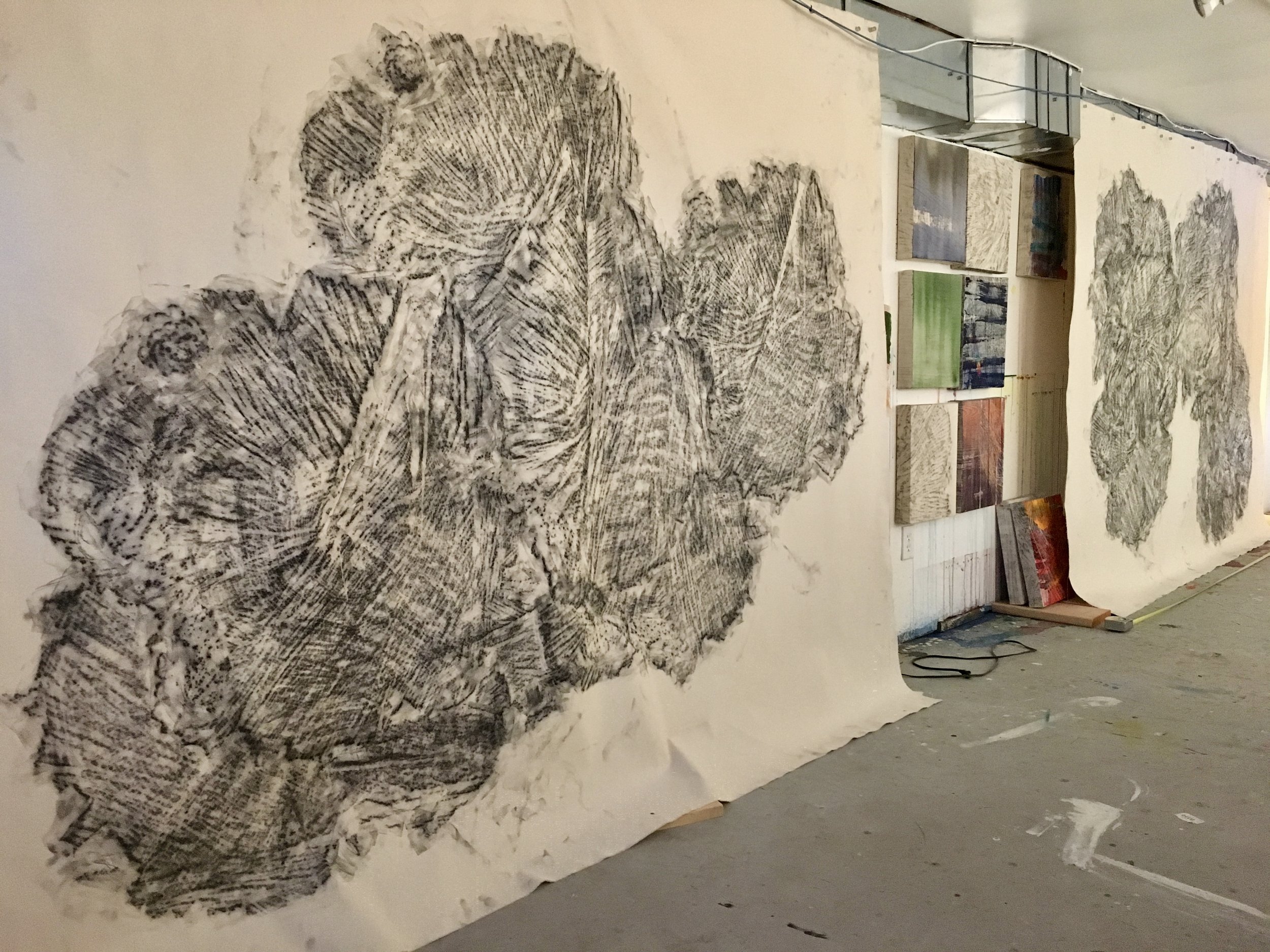
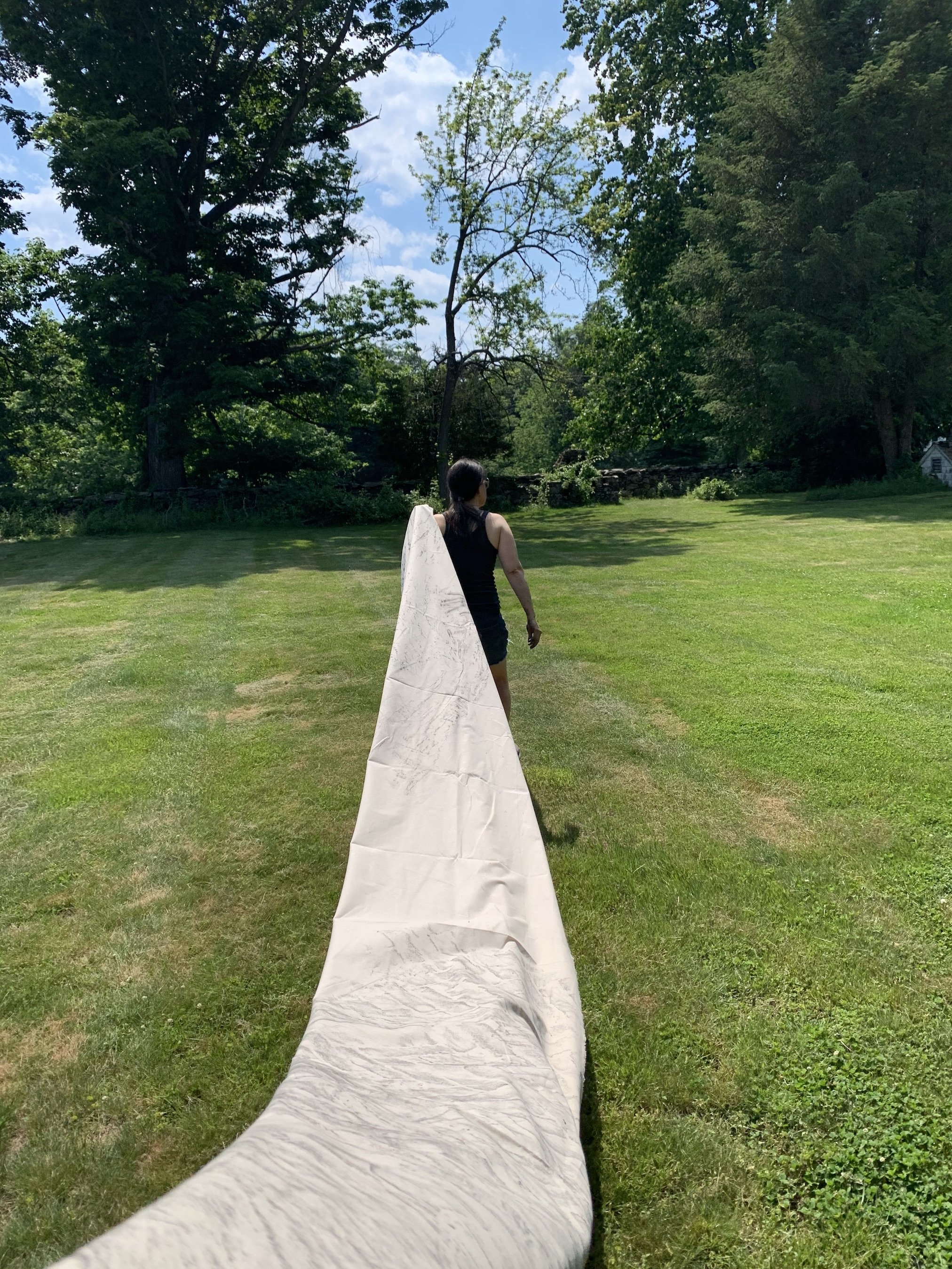
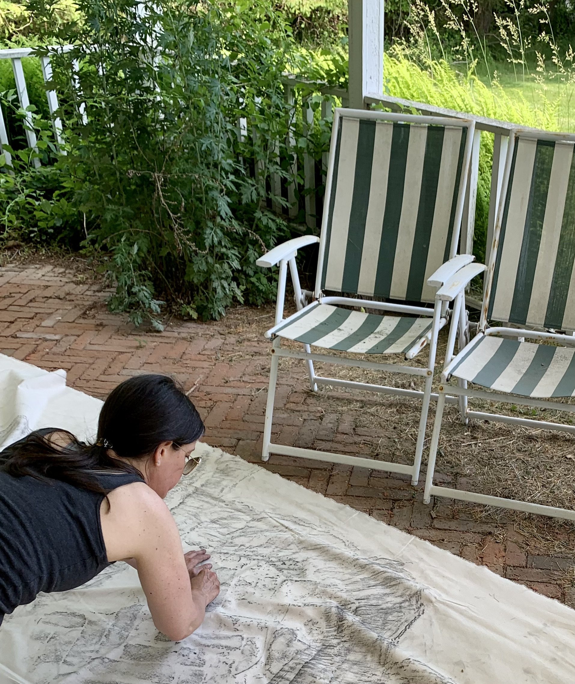
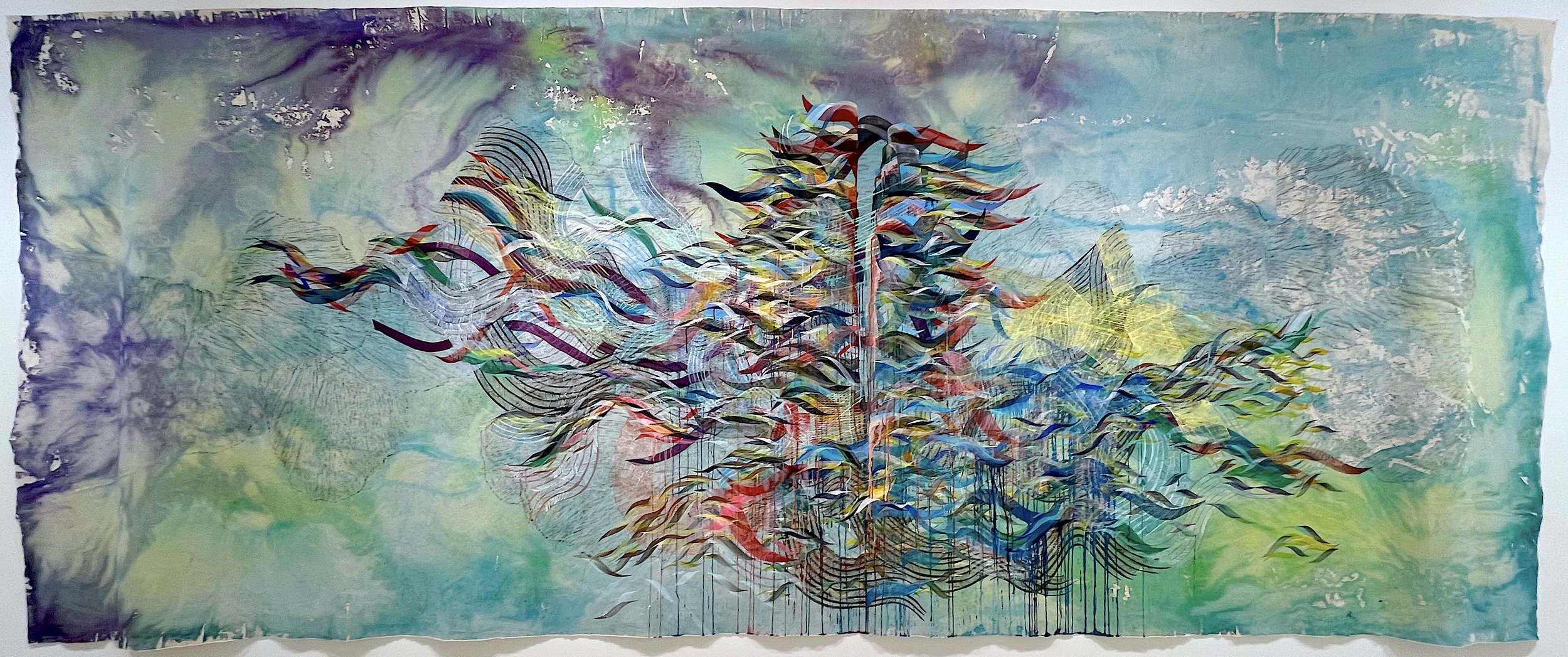
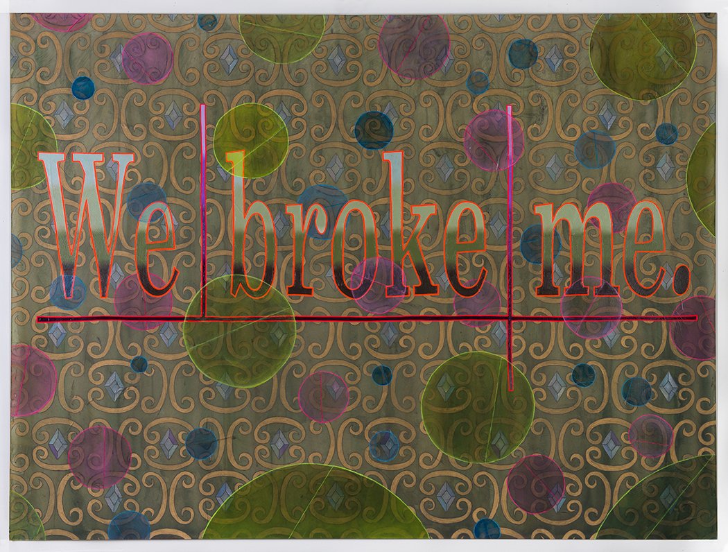
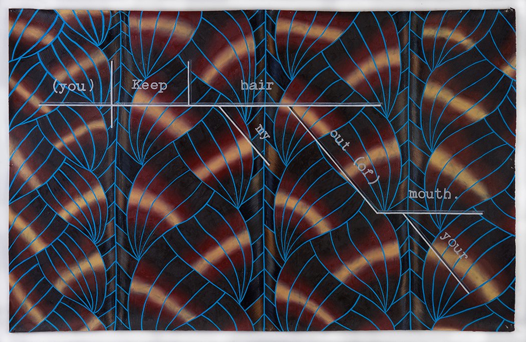
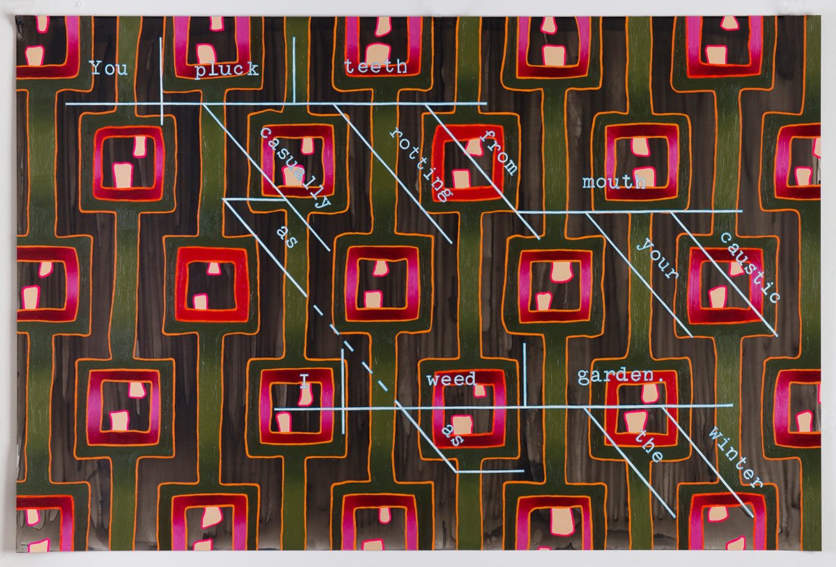
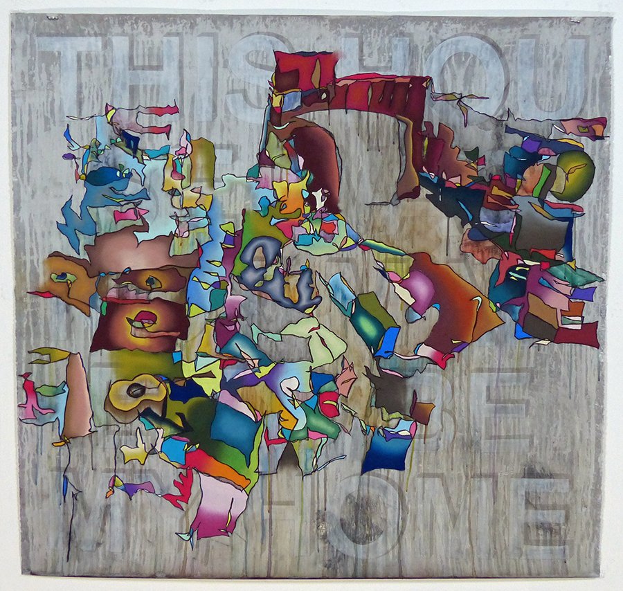
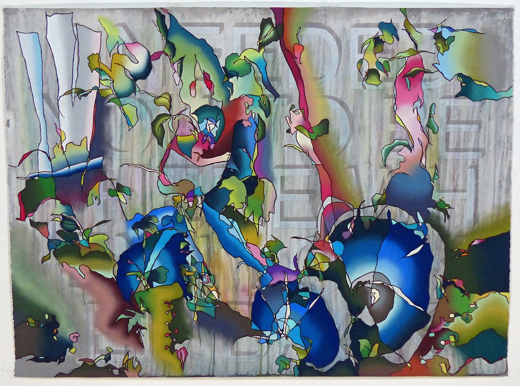
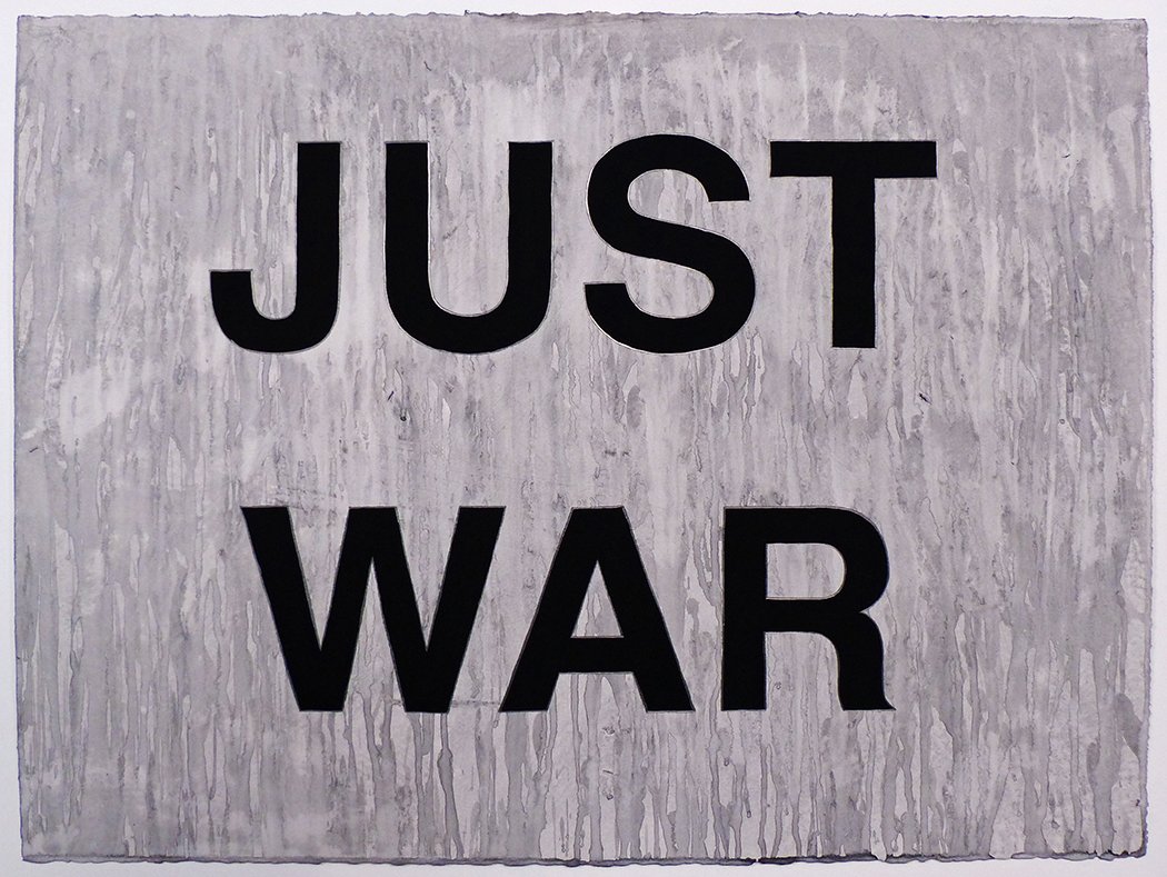
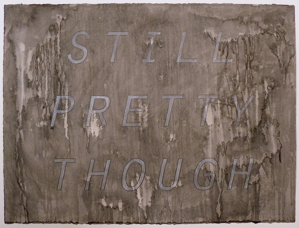
M Pettee Olsen’s sweeping brushstrokes are at once spontaneous and choreographed, suggesting a painter who confidently engages her whole body in the creative process. As a former dancer, she states that she’s painting the dance in her bones, infusing her large paintings with the grace and fluidity of motion that comes from years of disciplined training in ballet and modern dance. She uses a variety of paint media, including some with reflective properties, to play with luminosity, depth, and perception. Indeed, Pettee Olsen is interested in how we perceive the world, how we interpret it through our respective lenses, and finally, how we form narratives around our subjective experiences. These stories are passed on through oral tradition, dance, theater, and the myriad forms of storytelling through which humans tell their version of history. The discord arises when our narratives clash, often resulting in conflict and tragedy on a global scale. Pettee Olsen invites us to lose the stories that undermine meaningful connection and fuel dualistic thought. She superimposes value scales and geometric elements on her canvases, disrupting the painterly dance/narrative to introduce a more open-ended conversation. By letting go of self-serving storylines, we open ourselves to the common humanity that supersedes the desire for power, marginalization, and war. Pettee Olsen’s gestures are soulful and profound, but they can also be unsettling, as if reflecting our darkest self. The alternating shimmers and shadows in her paintings speak to the best and worst of who we are, as our stories realign to narrate a more faithful portrayal of ourselves and the human condition.
Lisa Kokin
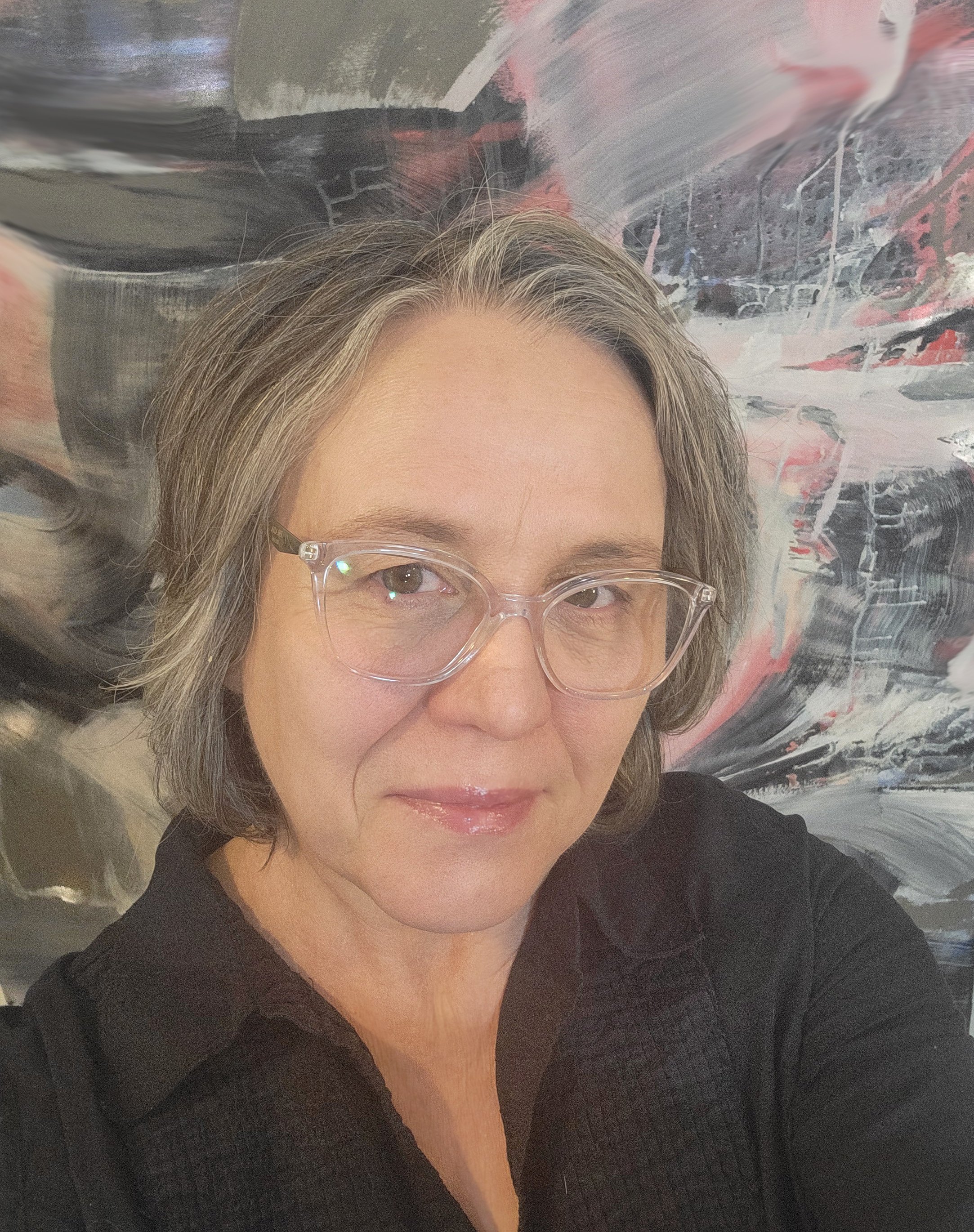
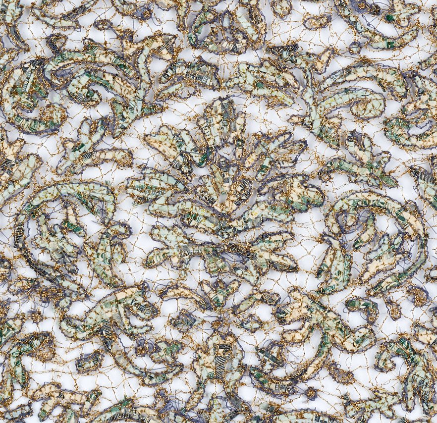
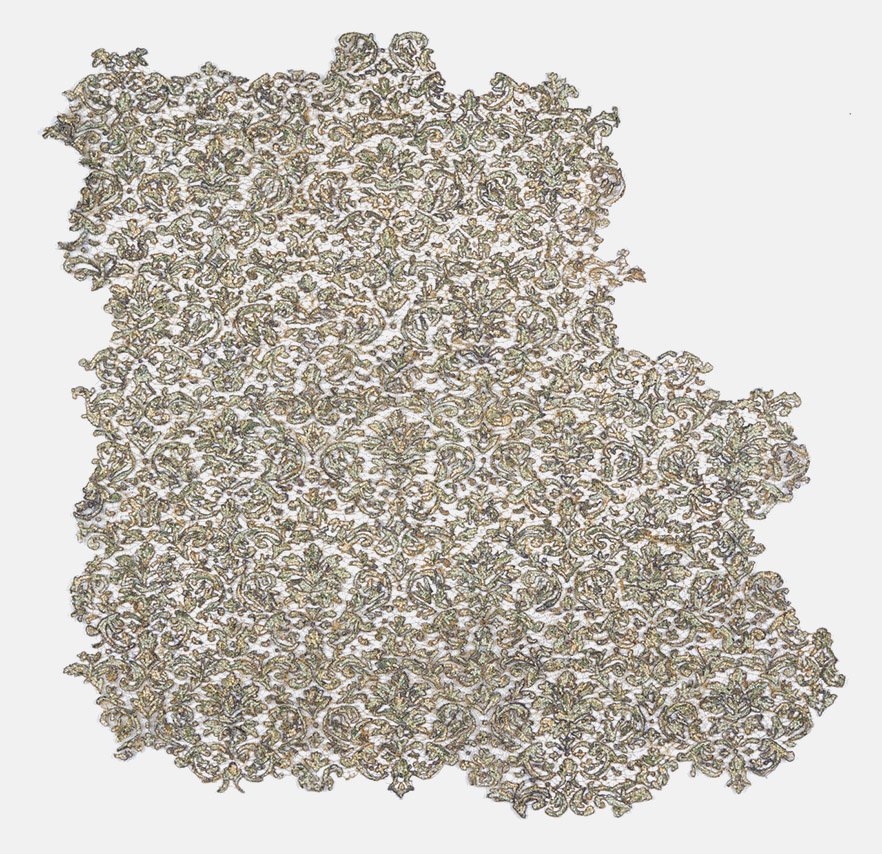
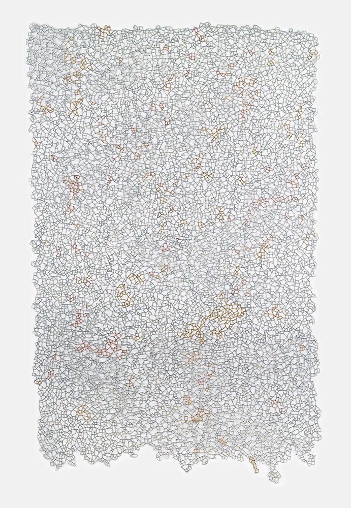
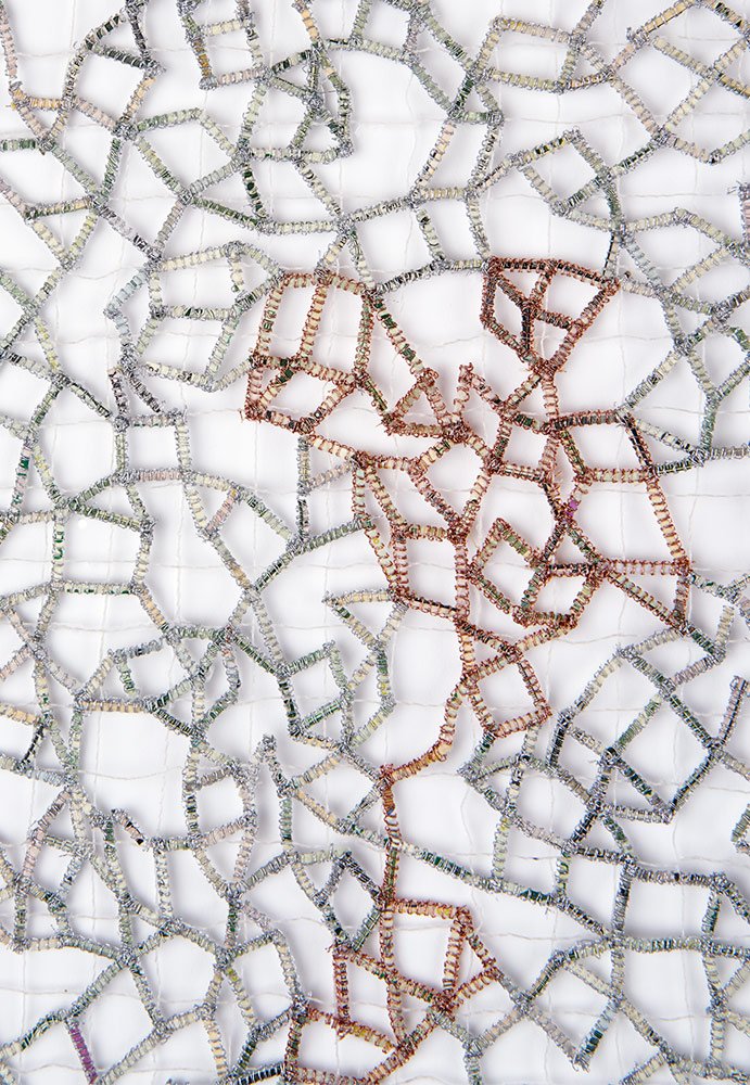
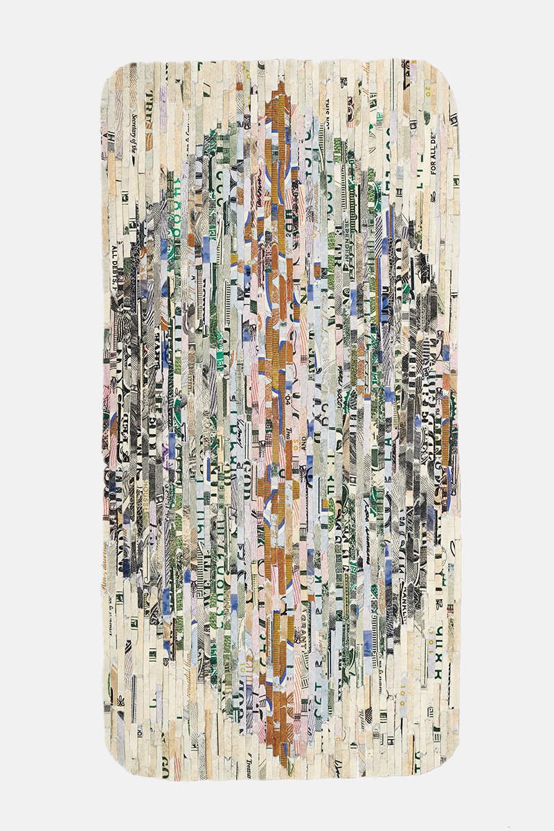
Lisa Kokin works in a variety of materials, from books to buttons to shredded currency. While the materials may derive from many sources, the consistent thread that runs through her work is its connection to sewing and needlework. Kokin comes from a long line of sewists: her Romanian grandmother worked in a New York tie factory at the age of 14, her parents had an upholstery shop on Long Island, and Kokin received her first sewing machine at the age of 9. She describes sewing as a means of attachment and embellishment, and uses it to address social, political, and gender issues that are often at odds with mainstream thinking. Through a labor-intensive studio practice, Kokin expresses her views in a visual language that is at once alluring and tendentious. Indeed, her finely crafted work has an obsessive quality that entices us to move in closer, only to find that the content may be challenging. But Kokin doesn’t shy away from controversial themes. Her current series, Red Line, addresses the ongoing conflict between Israel and Palestine; her series Lucre, made with shredded money, makes a bold statement about greed and capitalism. Kokin is a master of her craft, but her superpower rests in her ability to challenge the status quo with grace, humor, and unflinching honesty.
MH: Your work varies from series to series, but there’s a consistency throughout that is recognizable as your voice. How would you describe your overall body of work?
LK: My imagery can vary a lot, but there are certain elements that unify my work. There’s the presence of sewing in one form or another, which I use as a means of attachment and embellishment. In the past I’ve made books, sculpture, and installations that have a social justice or historical component, and I’ve expressed my various experiences of being Jewish, being in a same-sex relationship, and my affinity with the underdog and marginalized. There’s also an ongoing investigation into Jewish history in a way that makes sense to me as an adult, as opposed to how it was taught to me as a child. So there’s a consistency of looking critically at the outer world and commenting on it, not heavy-handedly or didactically but often with humor.
MH: Your work often includes zippers, buttons, and needles, and you incorporate a lot of sewing and hand stitching. Weren’t your parents and grandparents in the sewing business? This must have influenced your work.
LK: Yes, it has. My grandmother immigrated from Romania to New York at the age of 14 and worked in a tie factory, then my parents had a small upholstery shop on Long Island where I spent a lot of time. These were the days before daycare, so I was around fabric and sewing ever since I can remember. When I was 9 years old, I was given my first sewing machine, this big hunk of cast iron, and it still works well. I also have my parents’ industrial sewing machine which put me through college twice. So sewing is in my blood, a congenital condition, and it connects me to those who went before me.
MH: I love the precision of your work, which has an obsessive quality. I see it as a modern-day version of the “fancy work” that ladies did back in the day: embroidery, lace, tatting. Why do you think you’re drawn to fine detail work rather than, say, large, drippy paintings? What does your process give you?
LK: I’ve never been drawn to paint. I’ve done a lot of drawing, but my thing is materials and materiality. I draw with thread! Regarding the obsessive thing, I don’t have a diagnosis, but I think that when you look at my work you probably would think I have some form of OCD.
MH: You must really enjoy that kind of detail work.
LK: I feel like it's my way of meditating. I’m fully present, in the zone, and I like the effect of it. The only way to get this detailed work done is to sit down and do it. So on a good day it’s meditative, but on a not-great day it can be monotonous.
MH: If you didn’t have a studio practice, do you think you’d be locked up somewhere?
LK: I like to say that if I didn’t have my art, I’d be a menace to society. I go crazy about the state of the world, but my studio is my refuge, a place where I can go to do what I have to do. It keeps me relatively sane, to the point where if I don’t get into my studio for a couple of days, I start to feel untethered.
MH: I’m quoting you here: “I try as much as possible to relinquish control and let my inner intuitive voice guide me.” How does that work in practice? Your work is very tight and controlled, so how and where do get yourself to let go and let the materials take over?
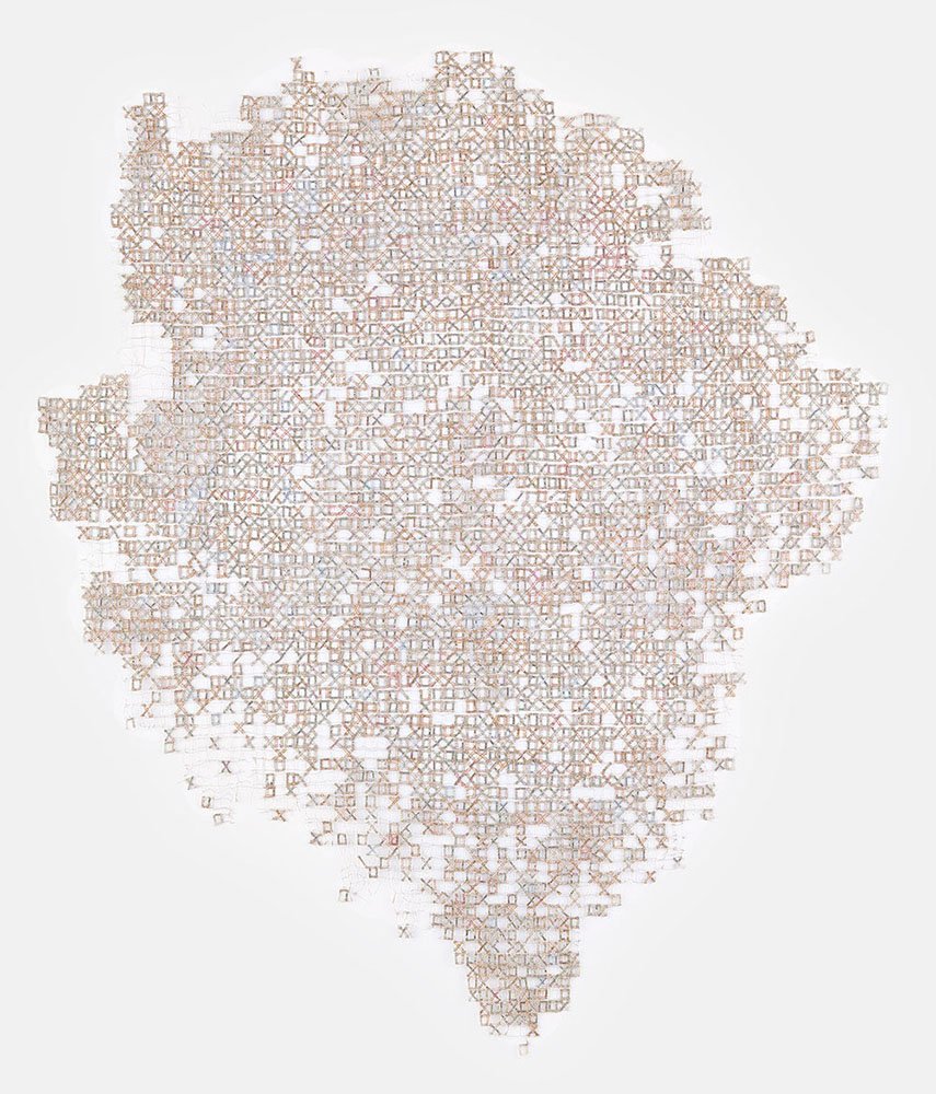
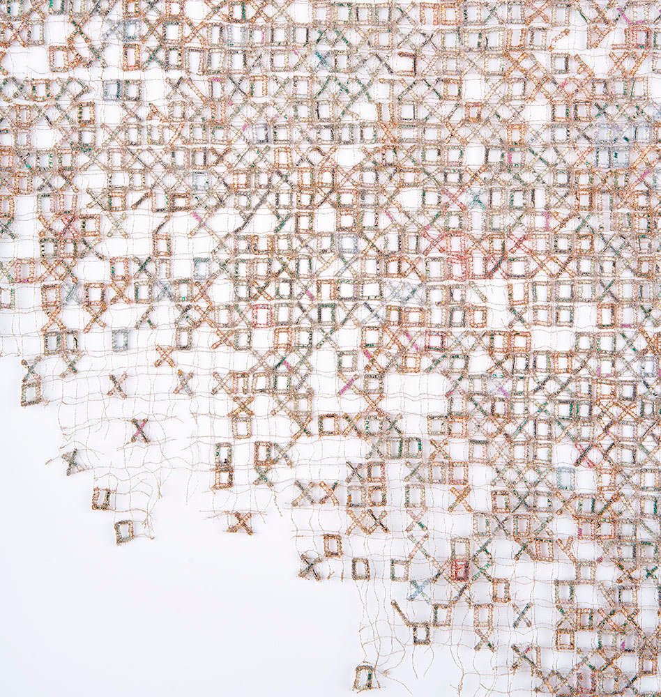
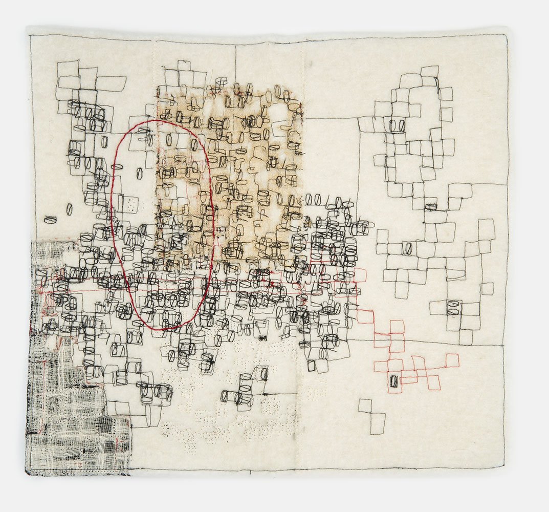
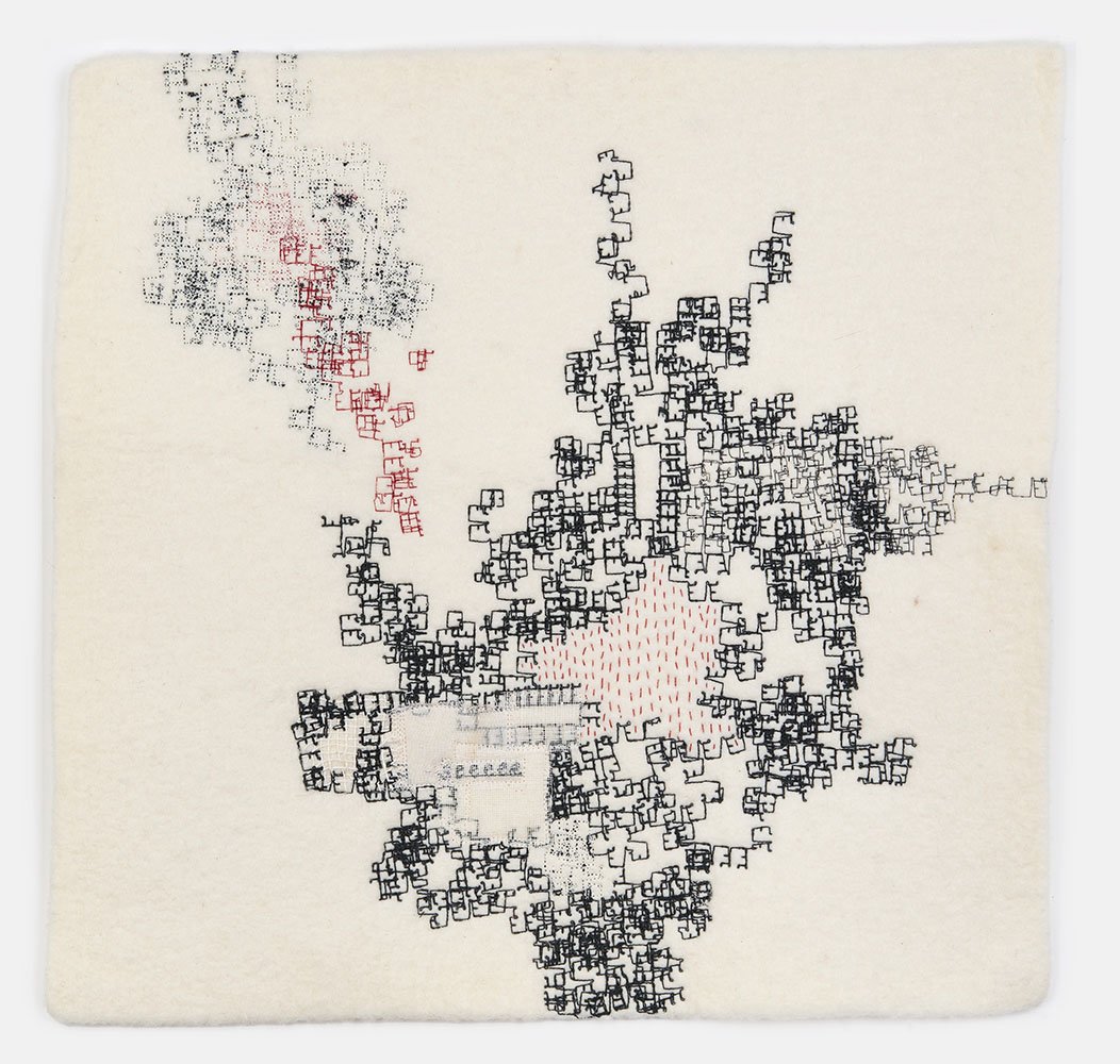
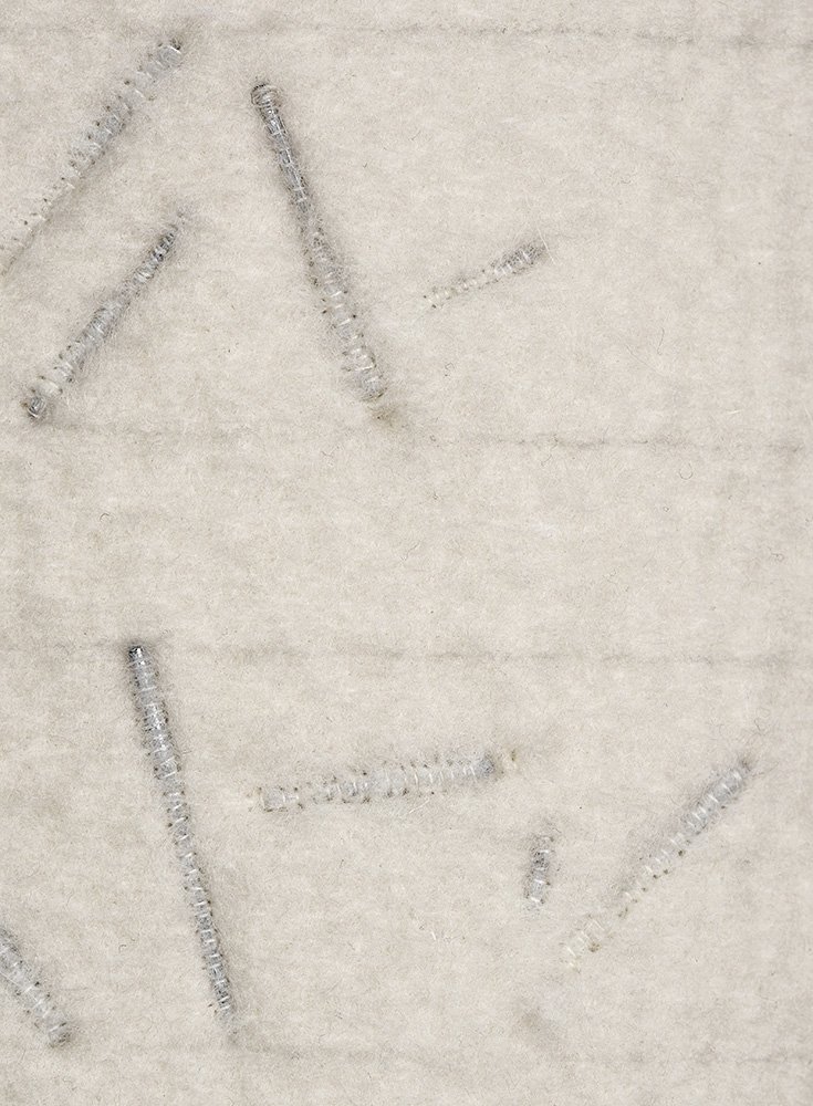
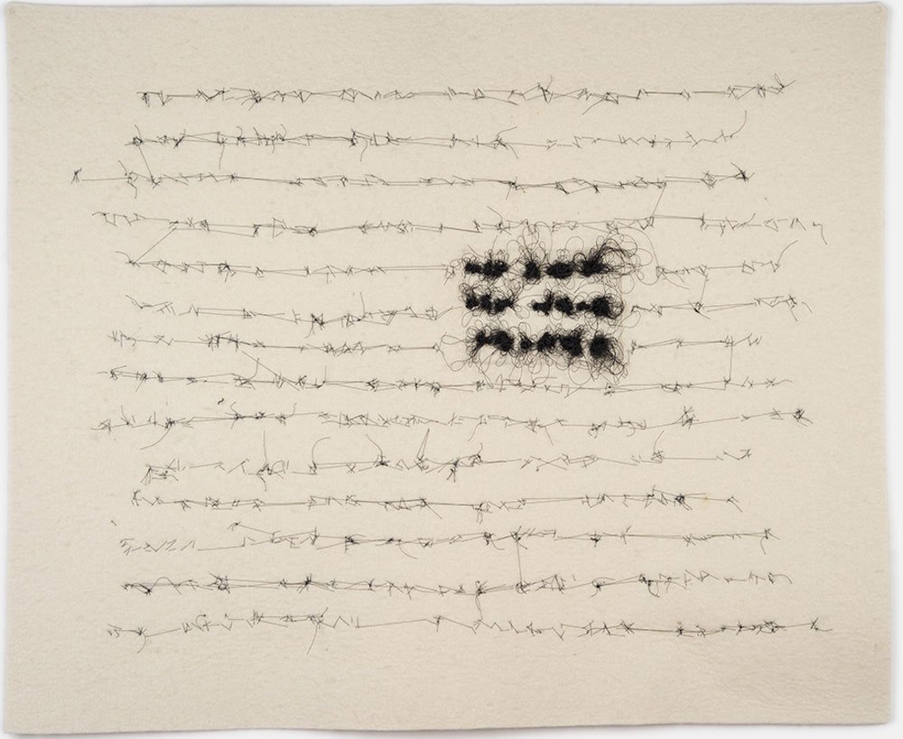
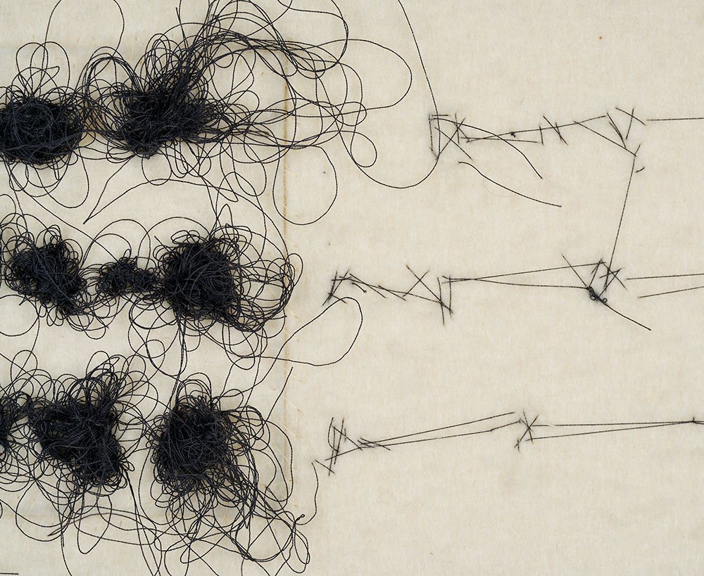
LK: It’s funny that you say that my work is tight and controlled, because I don’t think of it that way. My current series is The Wandering Alphabet, and it may look organized but it’s completely unplanned. I start with a piece of industrial felt and use the programmed alphabets in my sewing machine, but I manipulate them to create unpredictable patterns. It’s completely spontaneous.
MH: What about content? Are you comfortable with ambiguity? Not the kind where this shape could be a cloud or it could be a bear, but serious issues with conflicting perspectives?
LK: I’m very comfortable with ambiguity. I don’t want to spell things out. If someone misinterprets my work, I’m okay with that. It’s illuminating to hear what people see in the work, especially when it has nothing to do with my intention.
MH: I wonder if as we mature as artists, we move away from black and white and embrace gray scales. It’s like we get more comfortable with ambiguity, not just in art but in life.
LK: Yes, I think so. I don’t want to hit people over the head anymore. I used to think that art could change the world, and I considered myself to be a cultural worker. Now I feel like this is just my take on things, and if you can connect with it, that’s great.
MH: I find some of your work to be subtly subversive, and I wondered how important that is to you. For example, I found an interesting snippet buried in your website, where you refer to “…my divergence from an all-or-nothing stance towards Israel.” How is that expressed in your work?
LK: I like my work to be subtly subversive because I think it’s important to question the status quo. I have issues with our capitalist system that privileges money over everything, which I address in my series Lucre. And I have issues with xenophobia, racism, and all the other isms, so I like to critique these disparities whenever I can, either obliquely or with humor. I like the quote by James Baldwin, “The purpose of art is to lay bare the questions that have been hidden by the answers”. To me that encapsulates what we’re talking about.
MH: Your current work indirectly touches on the situation in the Middle East. Would you care to talk about that a little?
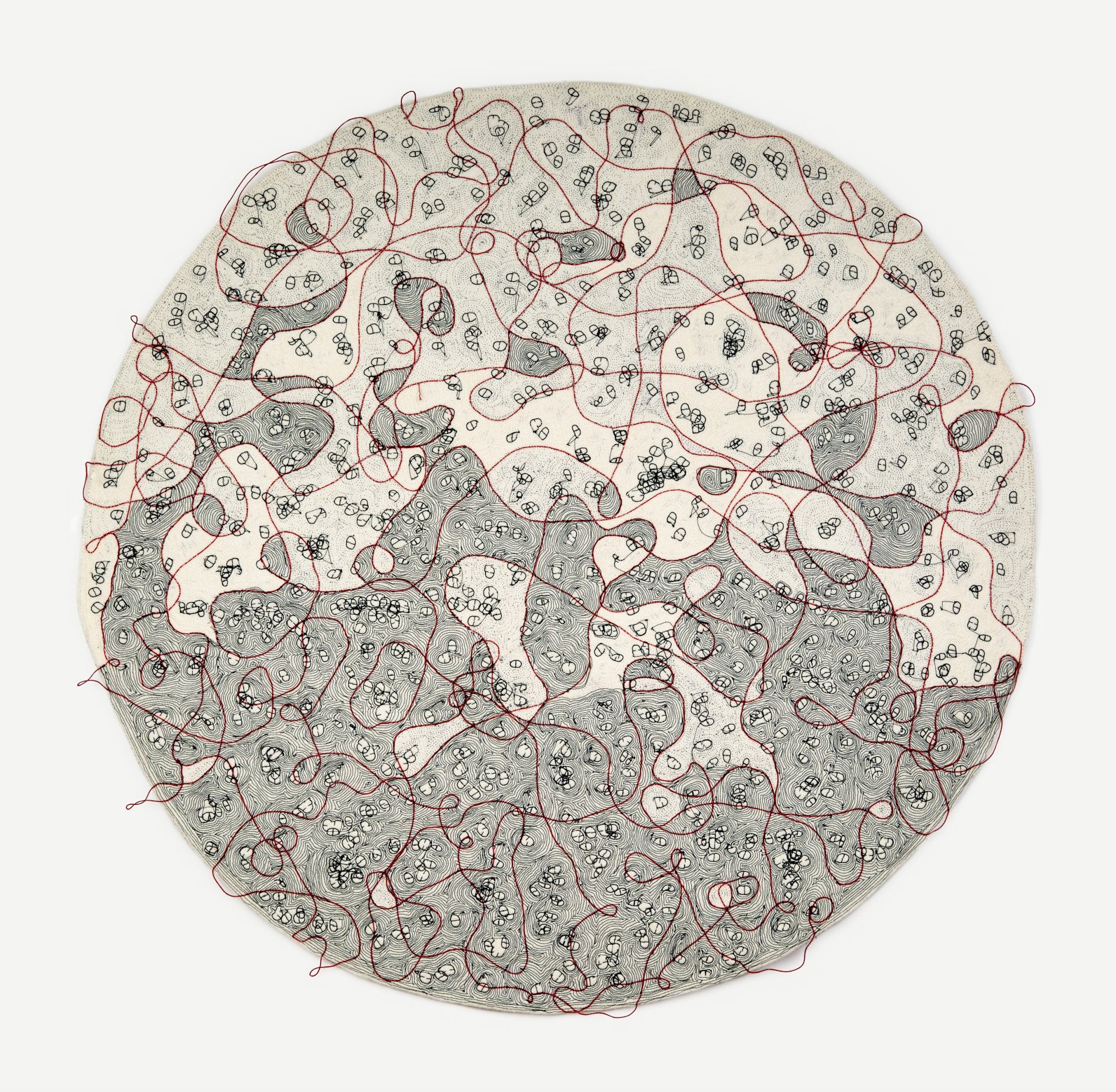
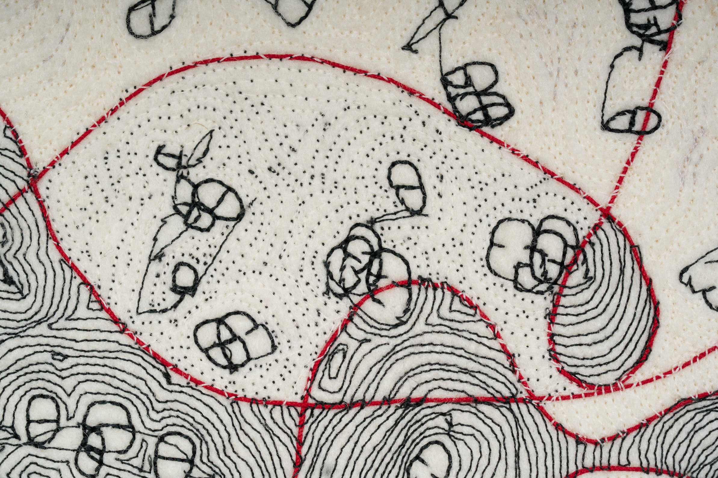
LK: Yes, a couple of pieces that I’m working on now are connected to what’s currently happening in Gaza. I grew up in a Jewish family, very secular, but I went to Hebrew school which was an indoctrination into a certain way of thinking about being a Jew. I accepted it all until I became an adult and started thinking for myself, and eventually realized that I couldn’t accept the whole package. I was proud to be a Jew, but I didn’t feel that it was the same as being a Zionist. I’m very distressed by everything that’s happened: October 7th as well as the subsequent bombing in Gaza and the genocide of the Palestinians. I know that among Jews I’m a minority and I want to be respectful, so I express my viewpoint through my artwork. My new pieces are like aerial maps, and I’m calling this series Red Line, which is a reference to the red line beyond which it’s not acceptable to go. I feel that we’re beyond there already.
MH: Thanks for sharing all of that. It makes sense that you’d express your viewpoint through your work, given that it’s such an incendiary subject right now.
LK: So much of it has to do with binary thinking and conflations: Jews with Zionists, support for Palestinian self-determination with anti-Semitism, Palestinians with terrorists. It’s not a black and white situation; there are many shades of gray.
MH: In your series Lucre, you stitched shredded currency into ornate patterns and large wall hangings that are incredibly detailed. I read this as a commentary on unharnessed materialism, and yet the work was dazzling and probably expensive. I thought it was subversive in that you were wryly poking fun at the wealthy art collectors who couldn’t resist buying a piece for their collection. What were you thinking about while you worked on this series?
LK: I started the series when Trump became a candidate, and if you look at some of the titles, like Let Them Eat Cake and Cold Comforter, it’s a commentary on the capitalist system, where money dictates everything, including our health. I used shredded money that I bought from the government at $45 for a 5-pound bag, then painstakingly stitched it together to make a statement about capitalism. I loved the paradox and all the connections that were made in the work. Plus, it’s a beautiful material!
MH: By using shredding money, you shred it of its value, right? But then you repurpose it into a luxury item that only affluent people can afford. I love the way you play with the concept and turn it back on itself. Do I also read some self-deprecating humor in it?
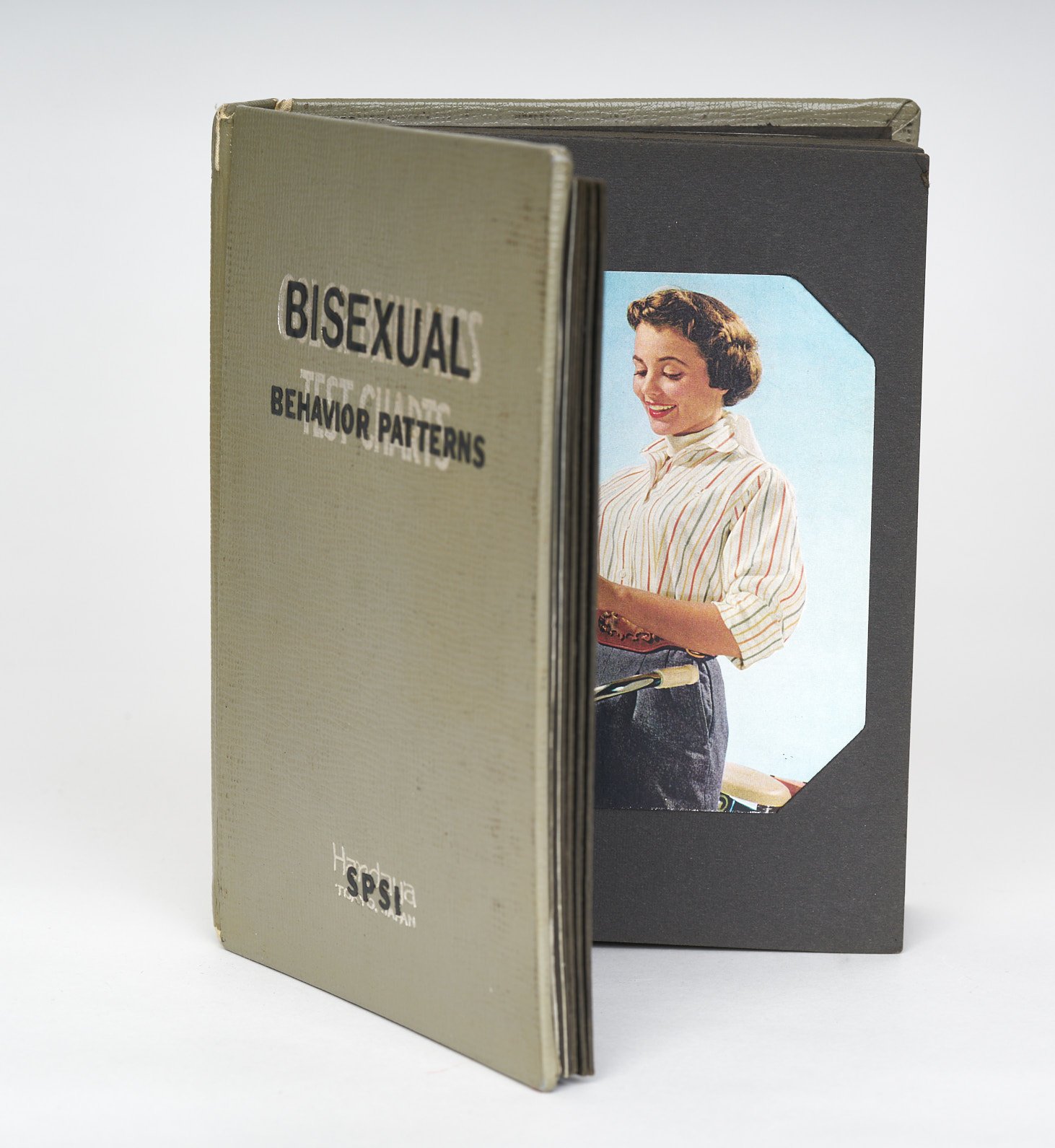
LK: Oh, always! I laugh at myself whenever possible. For example, I made a book called Bisexual Behavior Patterns, and it’s all about my former dating experience of being bisexual and trying to date lesbians. I also did a book called Irritable Vowel Syndrome, where I took all the vowels out of a cookbook and put them back into an intestinal tube that trails out from the book. My humor comes out the most in my books, and I have no quality control when it comes to puns.
MH: It seems like when we repurpose something, even an object as benign as a book or button, we’re undermining its accepted meaning or intention, which is a subversive act. It may not be seditious, but it creates tension and upends value and content. How do you think about altering and repurposing?
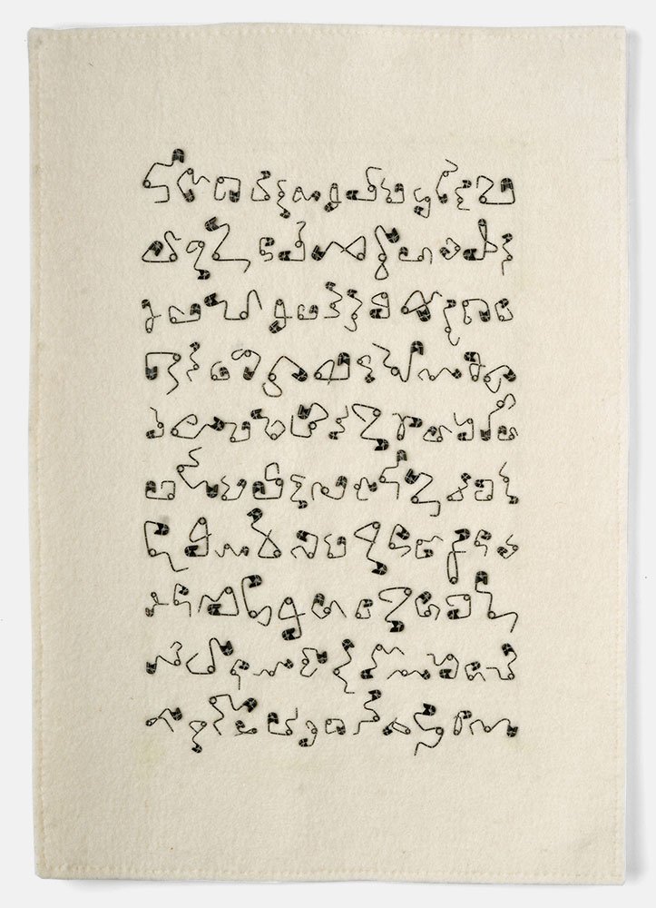
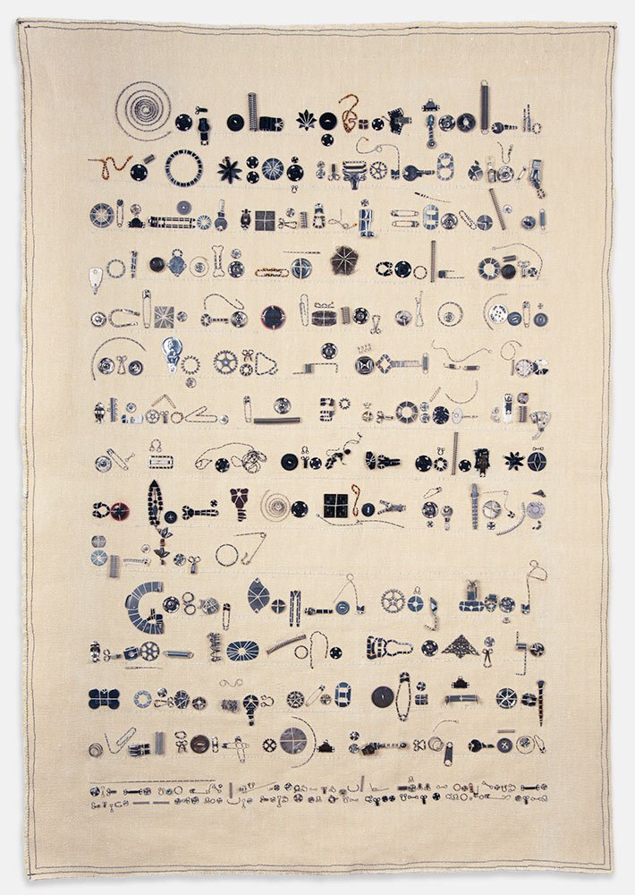
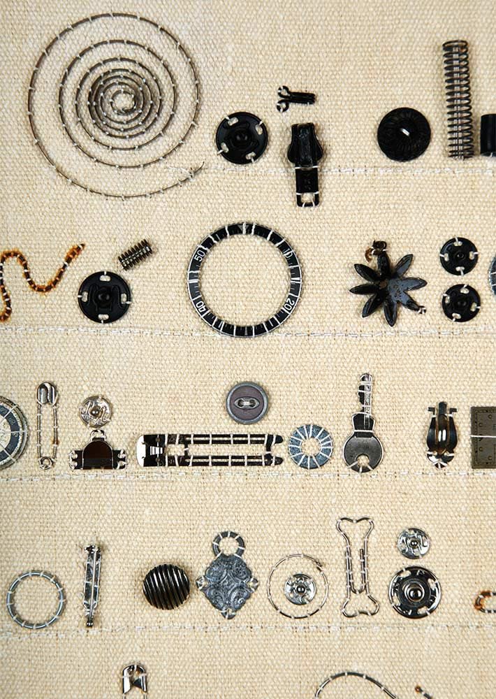
LK: I love using things in a way that decontextualizes their original use. I use a lot of sewing notions to make asemic text, and I appreciate those objects for their aesthetic value. By isolating a button and placing it in a different context, it becomes a beautiful little gem.
MH: Hands down, the thing that I think you do so well is to camouflage challenging material in a seductive visual language. Your work is beautifully crafted and appealing, and yet it has this undercurrent that only reveals itself when you get in close. Do you think about this as you’re working?
LK: Yes. I love that. I’m not intentionally trying to deceive people, but I like the contrast that happens when you’re up close versus far away, discovering different aspects of a piece depending on your physical relationship to it.
MH: What would you most like to accomplish through your art practice and career? Beyond the gallery shows, sales, and reviews, what do you want to communicate?
LK: My art practice is the way I synthesize and process my feelings and viewpoints, and if other people see it and can relate to it, I feel good about that. I always tell my students that art is the cake, and the recognition and awards and sales are the icing. The whole process of making stuff is a reward in itself.
MH: What’s the best part about being an artist?
LK: The privilege of being able to spend my life doing this. I feel so fortunate to have a way to process my experiences and feelings in a visual form. I also teach art, and I consider that to be an outgrowth of my studio practice; it’s not a vocation, it’s a calling. And for me, who’s not religious or even spiritual, my art is the closest thing I have to a spiritual practice. It’s the thing I do every day where I’m in the present moment. Creating something from nothing is a sort of transcendent process that I love, even when it’s not going well. I just keep showing up and I know that something will happen.
IMAGE LIST
All images by Lia Roozendaal
1. Brokeade #2 (detail), 2017, shredded U.S. currency, metallic thread, 26.5 x 26 in.
2. Brokeade #2, 2017, shredded U.S. currency, metallic thread, 26.5 x 26 in.
3. Cold Comforter, 2018, shredded U.S. currency, metallic thread, 67 x 44 in.
4. Cold Comforter, detail
5. Attachment Disorder, 2017, shredded U.S. currency, metallic thread, 42 x 35 in.
6. Attachment Disorder, detail
7. Red Line, 2023, machine stitching on industrial felt, 28.5 x 29.5 in.
8. Red Line, detail
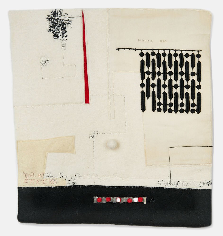
9. Other, 2023, thread, cord, linen, mull, industrial felt, 13.25 x 14.5 in.
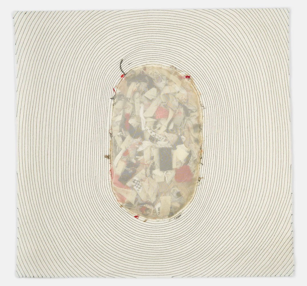
10. Sobrante, 2023, thread, fabric scraps, industrial felt, 18 x 18.5 in.
11. Incursion, 2023, thread, mull, industrial felt, 17 x 17.5 in.
12. Who Knows, 2023, thread, trim, pompoms, synthetic felt, industrial felt, 19.5 x 17.5 in.
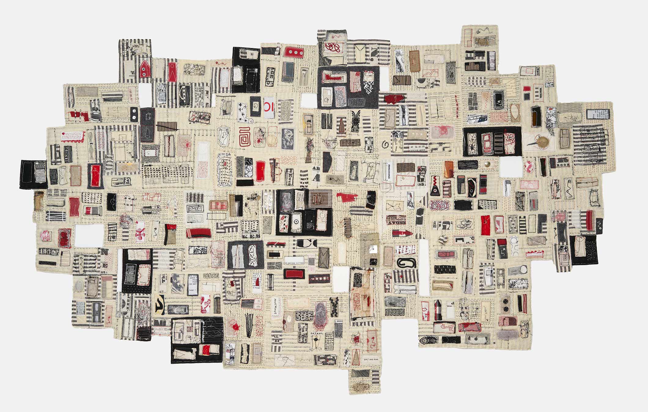
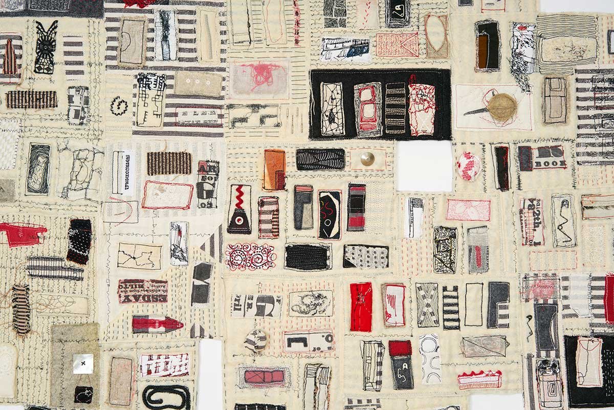
13. Territory, 2022, thread, mixed media textiles, found objects, 49 x 80 in.
14. Territory, detail
15. Warp #9, 2020, shredded U.S. currency on Canson watercolor paper, 9 x 12 in.
16. Warp #2, shredded U.S. currency on Canson watercolor paper, 9 x 12 in.
17. Shpilkes, 2017, broken sewing machine needles, thread, wood, industrial felt, 36 x 26 x 3 in.
18. Shpilkes, detail
19. Practice, 2015, safety pins, thread, industrial felt, 22 x 15.5 in.
20. Synopsis, 2016, thread, metal, hemp, 23. x 19.5 in.
21. Synopsis, detail
22. Interjection, 2020, thread, industrial felt, 30.25 x 24 in.
23. Interjection, detail
24. Bisexual Behavior Patterns, 1998, altered book, magazine pages, photocopied text, 7.5 x 6 x 1.5 in.
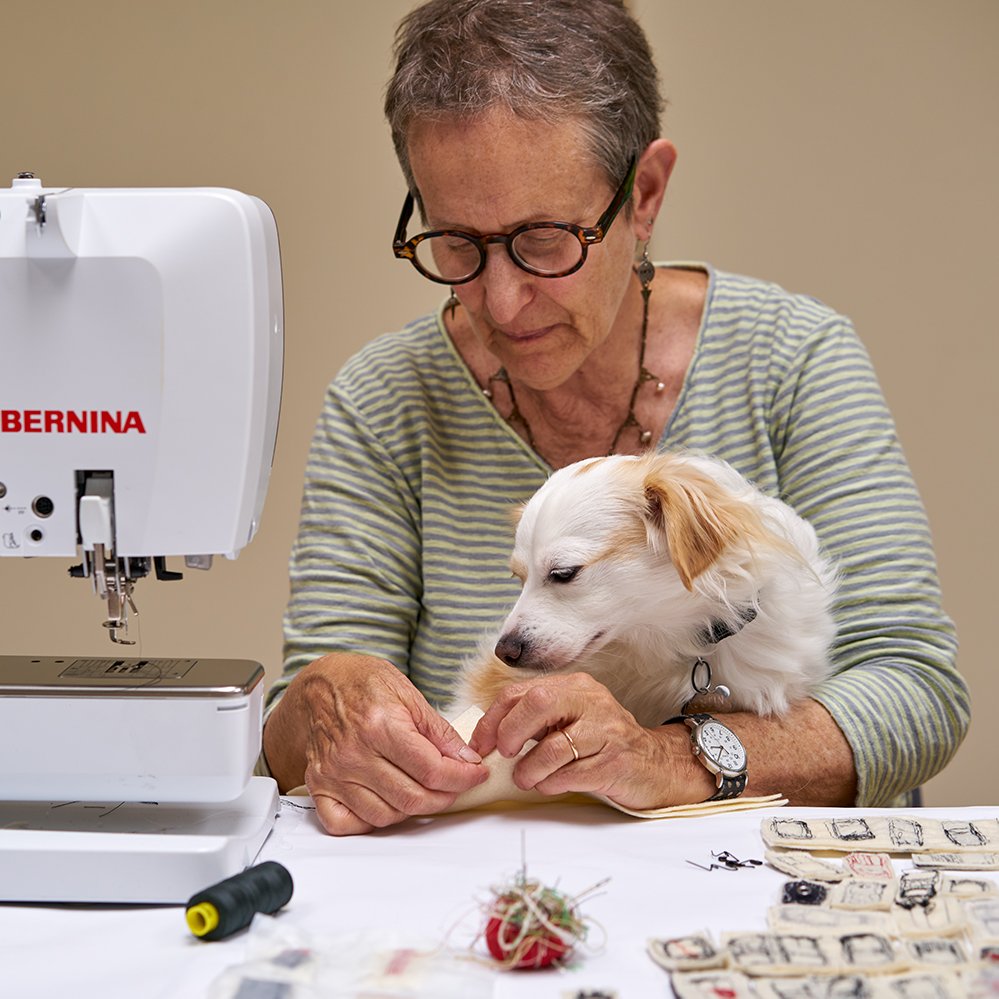
25. The artist and Austin in her studio.
Fran Shalom
The abstract figures in Fran Shalom’s paintings seem complete and inevitable, as if born fully formed and ready for action. In truth, they are the result of a long birthing process in which Shalom reacts to her previous marks, adding or subtracting paint as needed. Her process-oriented work is based in a Zen Buddhist practice in which she responds to each moment without premeditation, allowing the existing brushstrokes to inform her next move. This unusual blend of spontaneity and inevitability creates a tension that energizes the figures, as if they want nothing more than to interact with each other and with us. It’s quirky that Shalom regards these forms as figures, but what else could they be? The absence of anatomy in no way diminishes their presence; we are captivated even without an accompanying narrative. This lack of context creates a vacuum that we rush to fill, imposing our affections and aversions on the figures as if ours was the only interpretation. But Shalom seems to ask us to withdraw our projections, just for the moment, and experience her paintings as she does, with a fresh eye and an open heart. Her process requires that she fully engage not just in each painting, but in every brushstroke and breath. Shalom is a painter’s painter, masterful in the art of improvisation, but her greater gift is to inspire us to drop our ongoing narratives and directly experience the present moment, without judgment or attachment.
oOo
Fran Shalom’s solo show Taking the Backward Step runs through December 2nd at Kathryn Markel Fine Arts.
oOo
MH: Your paintings consist of bold, abstract shapes that appear to be solid and complete, as if they were born that way. Do you have a vision before you start painting, or is it always a process of discovery?
FS: It’s mostly a process of discovery. I never start out with a drawing that I’ve created beforehand, but I have shapes that I gravitate toward. It’s just a matter of getting something down on the panel, and then there’s a conversation between that and what I do next. It’s all in the moment, but I’ve been painting long enough that I know something will appear that I can work with.
MH: Your paintings don’t have a cookie cutter look. I get the sense that each painting is a journey or discovery.
FS: It is, and sometimes I worry about the work not being consistent enough. I don’t think in terms of series, but there’s a underlying consistency that comes through so that’s what I’m hoping for.
MH: When you start a piece, are you confident that you’ll get it to the place where it’s a good painting?
FS: It’s a great question. I’ll start a painting and get to a point where I think to myself, this isn’t working at all, I don’t know what I’m doing. Then I’ll change something that maybe I was attached to, and it starts to work. So I’m fairly confident that I’ll get there, and that I’ll come out the other side.
MH: The shapes are very satisfying, in part because the negative space is so well defined. Are you thinking about the figure/ground relationship as you work?
FS: I do think about it, maybe not as much as other artists, but the figure is very important to me. The negative space becomes a shape in relationship to the foreground shape, and it’s harder to come by than it looks. The figure needs to be located in the composition in a way that feels satisfactory, then as I move toward its resolution, I become more aware of the play of figure and ground.
MH: You refer to the forms in your paintings as “ambiguous characters who inhabit my studio and keep me company.” You must have a very large studio [haha]. What do these figures represent to you? Are they your allies?
FS: They’re definitely my allies. Over the years they’ve become different things, but I love the conversation with them, and I feel that some of them want to be named or identified. There was a famous psychologist, Philip Bromberg, who talked about self-states, which are different parts of ourselves that we may have disassociated from. We need to recognize and become friendly with our self-states, and in some ways that’s how I think of the figures. It’s a relationship that feels very comforting, as if they’re my companions.
MH: They seem vulnerable to me, and maybe a little anxious. It’s like they’re aspiring to be human but keep missing the mark. I’m curious why you avoid making them more representational?
FS: I started out making abstracted heads years ago that were influenced by my son who was 3 or 4 at the time. He was constantly drawing these very simple heads and figures, so I started thinking about how minimal I could be and still have it be recognizable as a head, without eyes or features. My paintings are always on the verge of becoming more literal, but when they get too suggestive, I get a little nervous and I want it to be more abstract. I don’t mind the back and forth, but I’m not interested in painting representationally.
MH: Do they evoke compassion for you? They do for me.
FS: Oh good, I’m glad to hear that. Yes, there’s compassion, calmness, satisfaction, and I have a relationship with them, like every artist has with their own work. It’s very satisfying.
MH: Your artist statement cites a reference to Zen Buddhism, and I know this is one of your primary influences. How do the Zen teachings show up in your work?
FS: They show up in the practice more than in the painting. For me it’s about being with the canvas and just trying to be open to whatever mark or shape I put down, then I play with it for a little bit and start responding to whatever’s there. There comes a time later on where I pull back and criticize and make the necessary changes, and that’s really important and healthy. But in the beginning, you just have to get out of your own way, and that’s very Zen.
MH: As a Buddhist practitioner, can you distinguish between a “good” and “bad” painting? Or would that judgment be considered antithetical to Buddhist philosophy?
FS: It’s not antithetical. We all have likes and dislikes and preferences; that’s how we function in the world. Buddhism is not about being on another plane, it’s about practicing and being on the cushion and then taking that practice out into the world. Buddhism is about the ordinary mind, not an exalted state; it’s what you encounter every day in your life. But I don’t think it’s a good idea to judge a painting as bad, because that obstructs the process, and you start working against yourself.
MH: What does a successful painting look like through a Buddhist lens? How do you step outside the ego to make that determination?
FS: Yeah, it’s hard. Sometimes it’s helpful to bring a friend into the studio and then I can see it through their eyes, and possibly see it in a different way. You get so invested in what you’ve created, but stepping away, turning it against the wall for a few days and then coming back to it can give it a freshness. I think the interval is important, and the ego is always there, but you can push it to the background a little. Toward the end of the painting, I think it gets very clear what’s successful and what’s not.
MH: Well sure, you get over the hump, but that hump generally doesn’t come until the very end.
FS: Yes, and I find that when I can’t do anything more to this painting, that’s when I know it’s done. It’s the best I can do in this moment, and that can be very satisfying.
MH: How would a masterpiece be recognized in the Buddhist tradition? Is it a painting in which the artist leaves no trace of herself?
FS: I think when there’s a universal quality to it, an authenticity; when there’s something that speaks to the individual but also moves beyond, that might be considered a masterful Buddhist painting.
MH: Maybe the concept of a masterpiece is altogether antiquated, Zen or no Zen. It requires a certain objectivity to state that a work of art possesses those rare qualities, and there are so few areas in our lives where objectivity still exists. Is it even relevant to talk about great art and artists?
FS: It’s hard to be objective. We all come with our constructed, preconceived views of the world, and it’s all so subjective. There’s a collective objectivity in how we look at a Rembrandt, but in terms of great artists and great art, that may be more for critics and art writers than it is for the artist. There are so many great artists who never came to fame and so many who never will, so I think that it’s more for the pantheon of art that we talk about greatness. It’s fun when they list The Top Ten Great Artists, but it’s kind of meaningless.
MH: Yeah, like when those annoying posts come across your Instagram feed, Ten Artists Whose Work You Need to Go See Right Now. I always wonder who was number 11? But the idea of a masterpiece, maybe that’s something you read about in art history books. It’s not a term I hear thrown around so much anymore.
FS: Yes, and there used to be more “isms”. Now it’s anything and everything, which makes it meaningless on some level.
MH: I’m sure you have paintings that you consider your most successful works. What do they possess or express that makes them so?
FS: It’s hard to put into words. The paintings that I get connected to are usually the ones that sell, and I don’t want to let them go. So why is that? I think it happens when things come together in a way that feels right and that is very satisfying, and somehow that comes through in the finished painting.
MH: Would you say that in your successful paintings, your ego wasn’t as involved?
FS: Yes, I think it’s when I was invested more in the process than the outcome. And it may have to do with how I come into the studio, like if I’m relaxed and focused and not thinking about other things.
MH: Could you elaborate on being more invested in the process than the outcome?
FS: I’m very process oriented. I love the actual doing of it, and I love that it’s so forgiving. I can put something down and make a mistake, then I can fix that mistake by covering it over or taking it off, so the process is energizing in its own way.
MH: It can also be very anxiety producing.
FS: Oh, absolutely! It’s totally anxiety producing trying to figure out what you’re doing, but that’s part of it. You have to allow for it or you’re not going to be able to make work.
MH: How do you balance your career as an artist, which depends to some extent on an indomitable ego, with your spiritual path, that seeks to diminish the ego?
FS: What always comes up for me is the issue of wanting. How much do I want, and is there an end to wanting more? It’s a fascinating question because in Buddhism it’s all about acceptance. It’s okay to want, but you should know why you want something, and when enough is enough. We have all these expectations, and we cause ourselves so much anxiety. Buddhism isn’t about denying yourself, it’s about learning to accept your life and all its ramifications.
MH: Would you say a few words about your current show at Kathryn Markel?
FS: The title of the show, Taking the Backward Step, is a quote from Dogen, the founder of Soto Zen Buddhism. It’s about turning inward to look at yourself and the world and experience the present moment without judgment or attachment. I thought it was a great description of how I move inward into the painting. My work evolves slowly and I’m trying to leave a little more in them than I usually do, rather than subtract them right away.
MH: What’s the best part about being an artist?
FS: Being able to go to my studio, to be by myself, and then have the opportunity to share it with people. I love the art community, which is so supportive and generous, and I love the process of struggling with a painting. It’s a very fortunate life that we live, and very satisfying, and I don’t take it for granted.
www.franshalom.com
Joanne Ungar
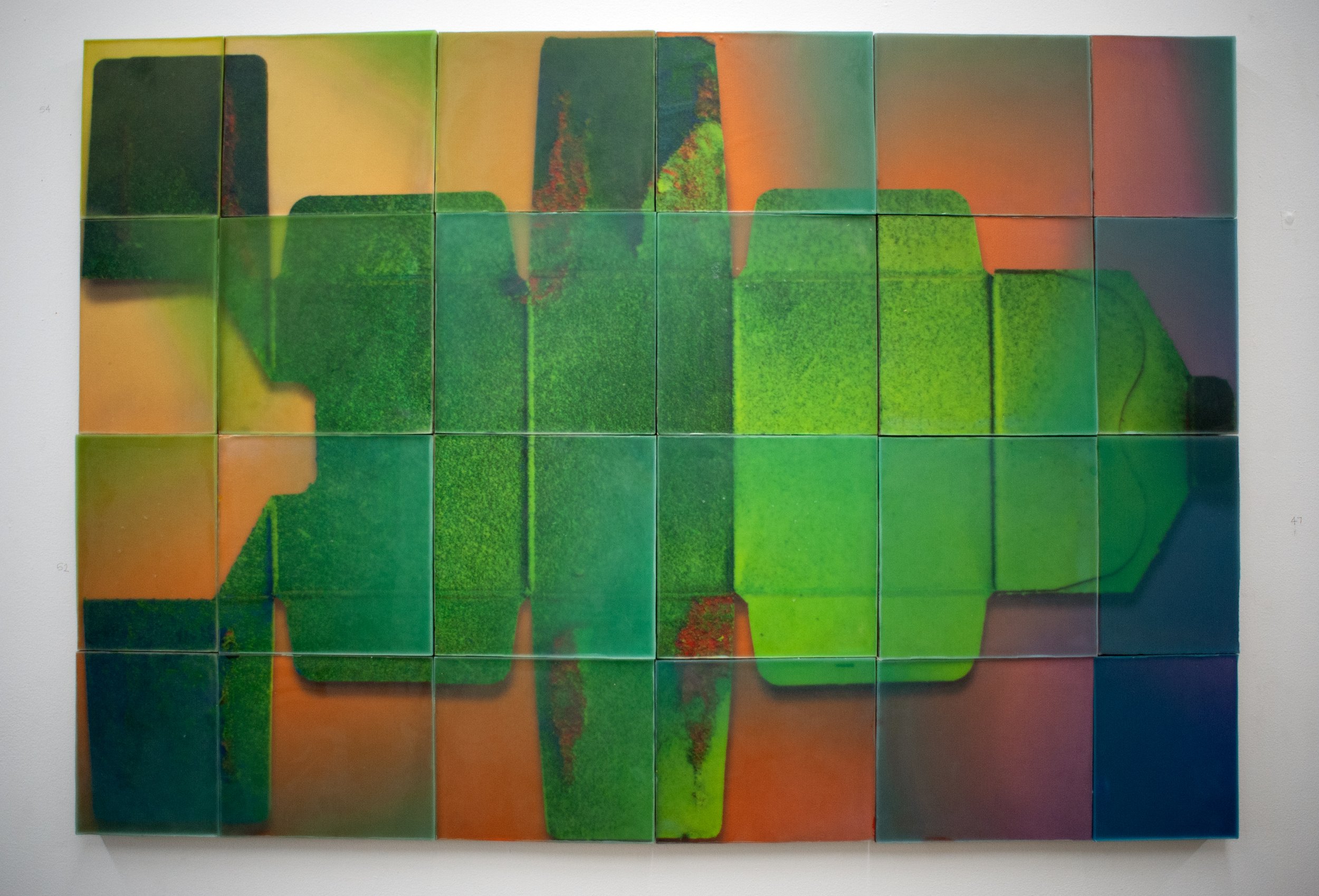
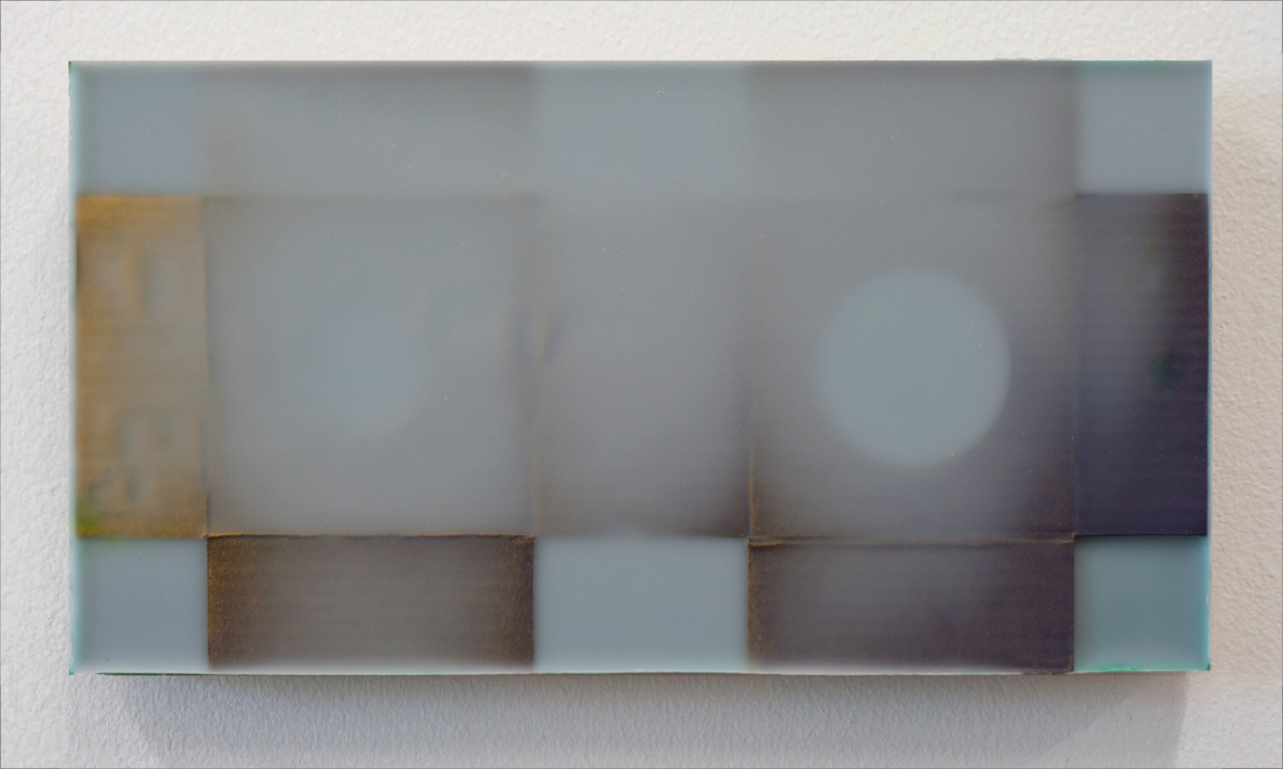
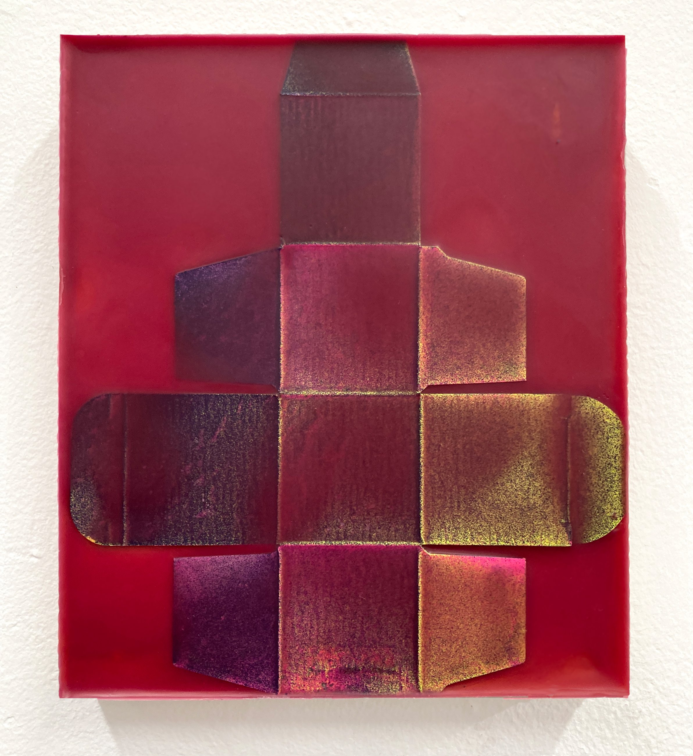
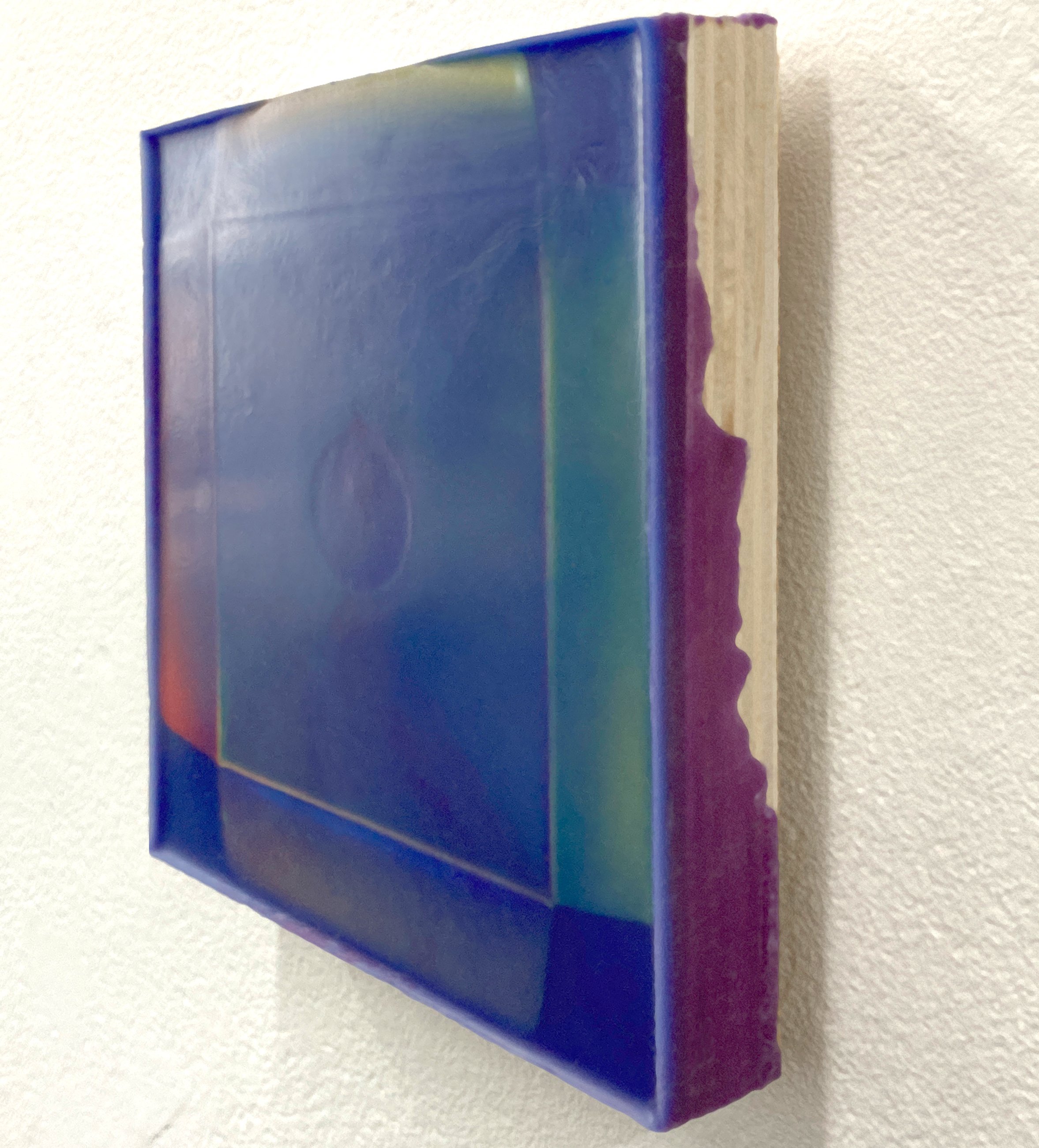
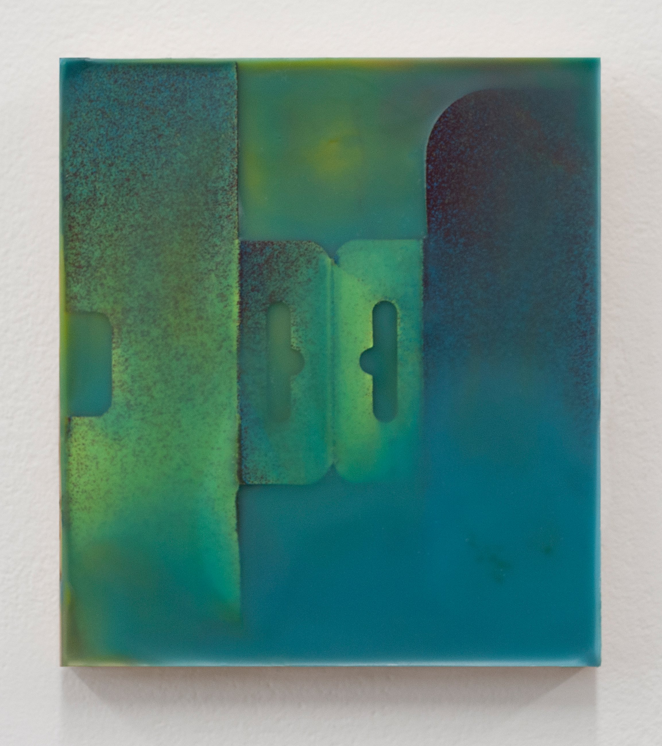
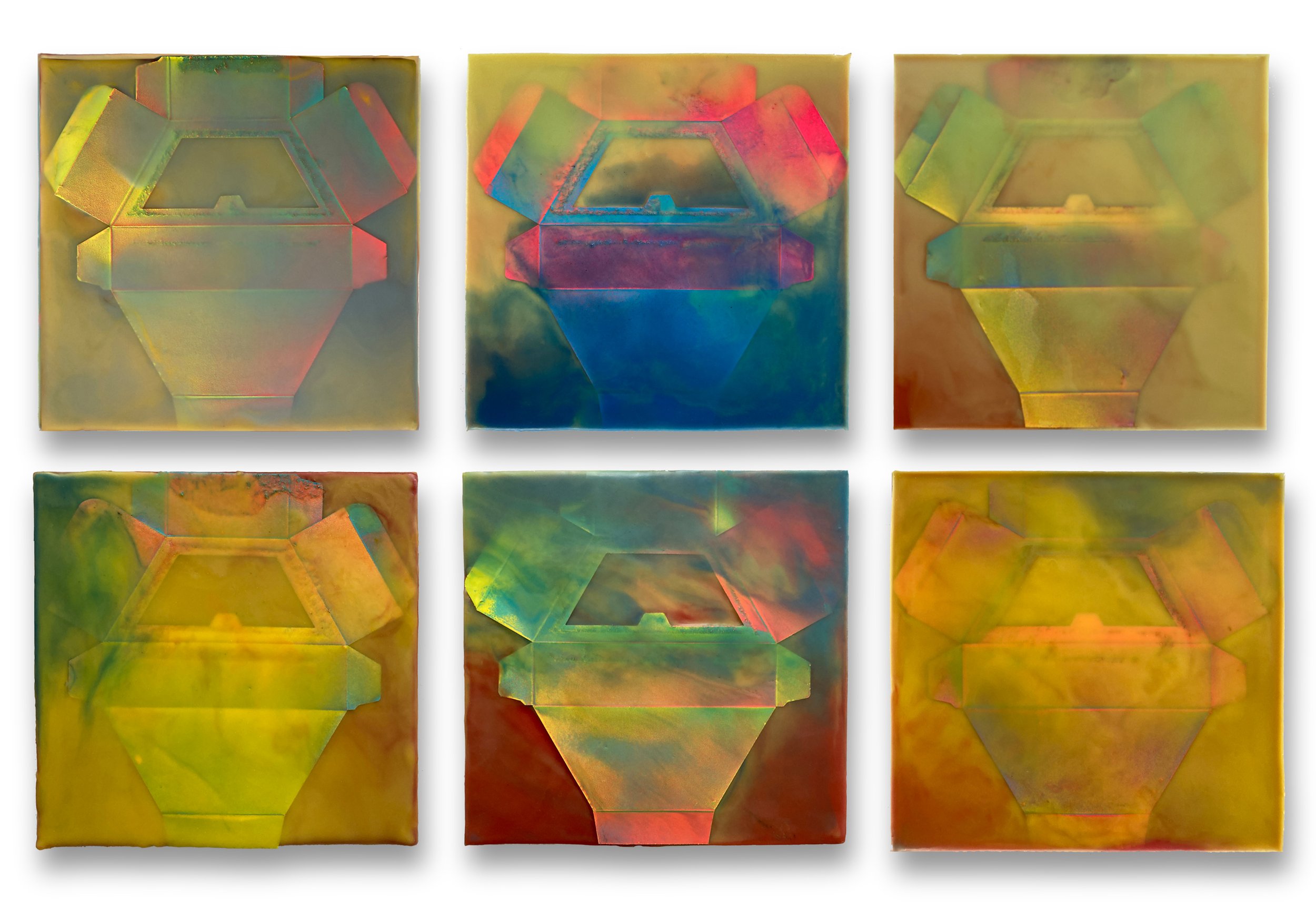
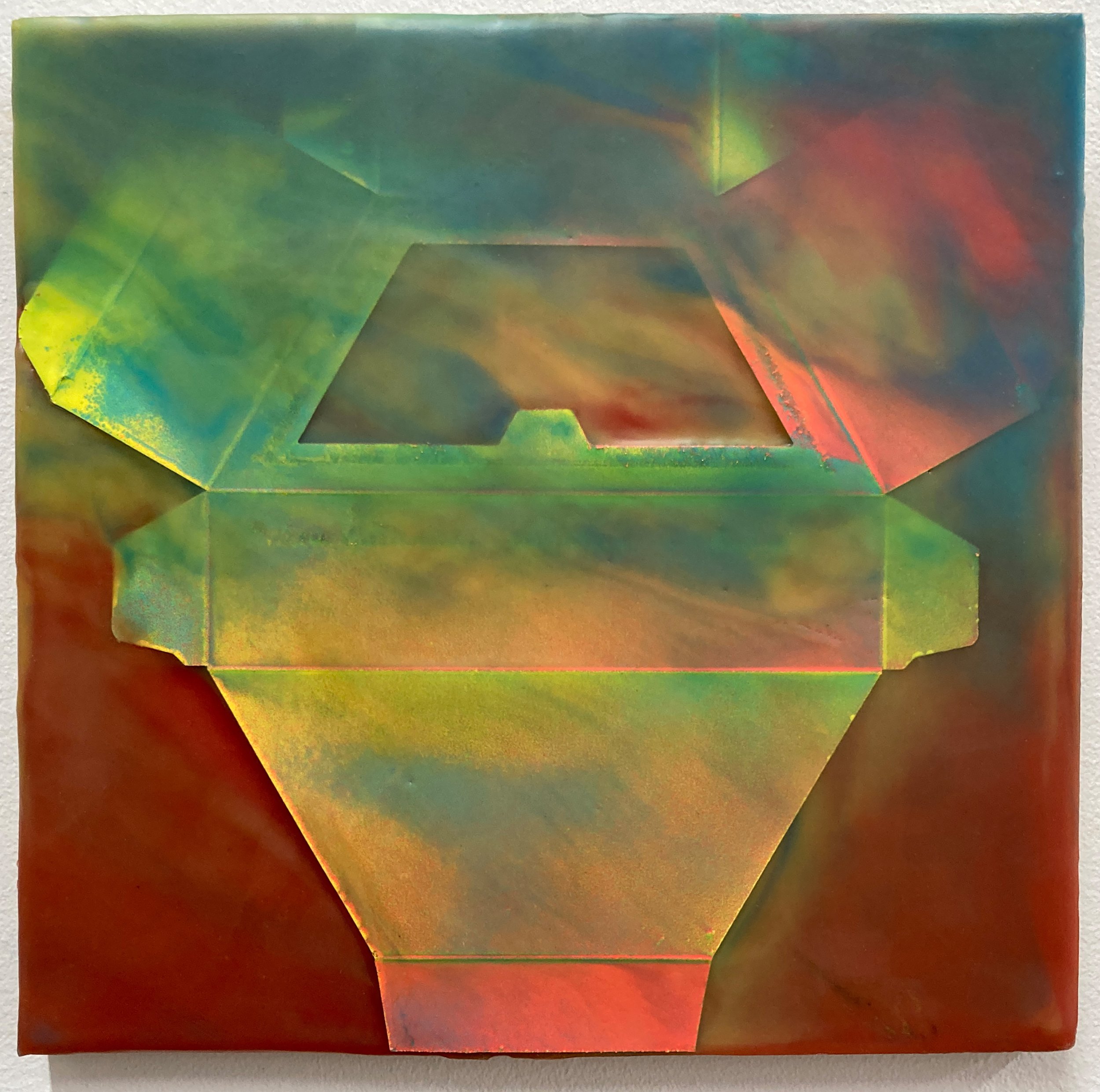
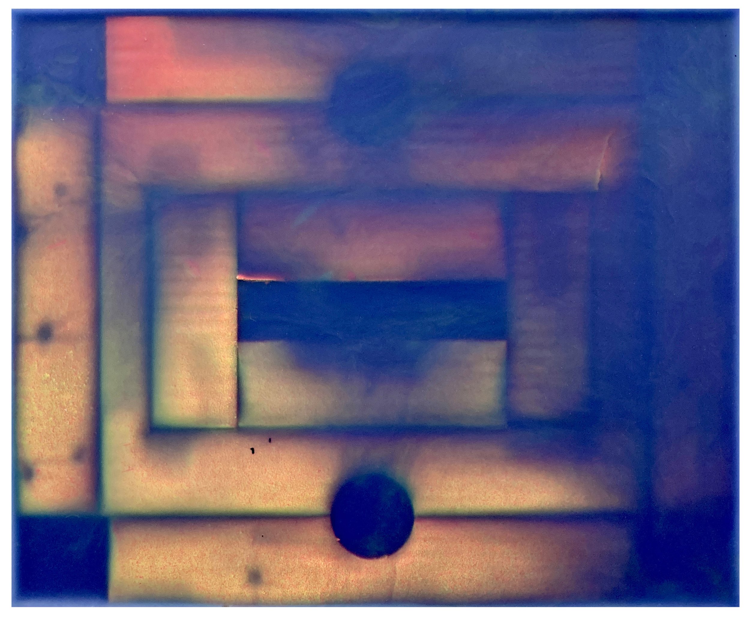
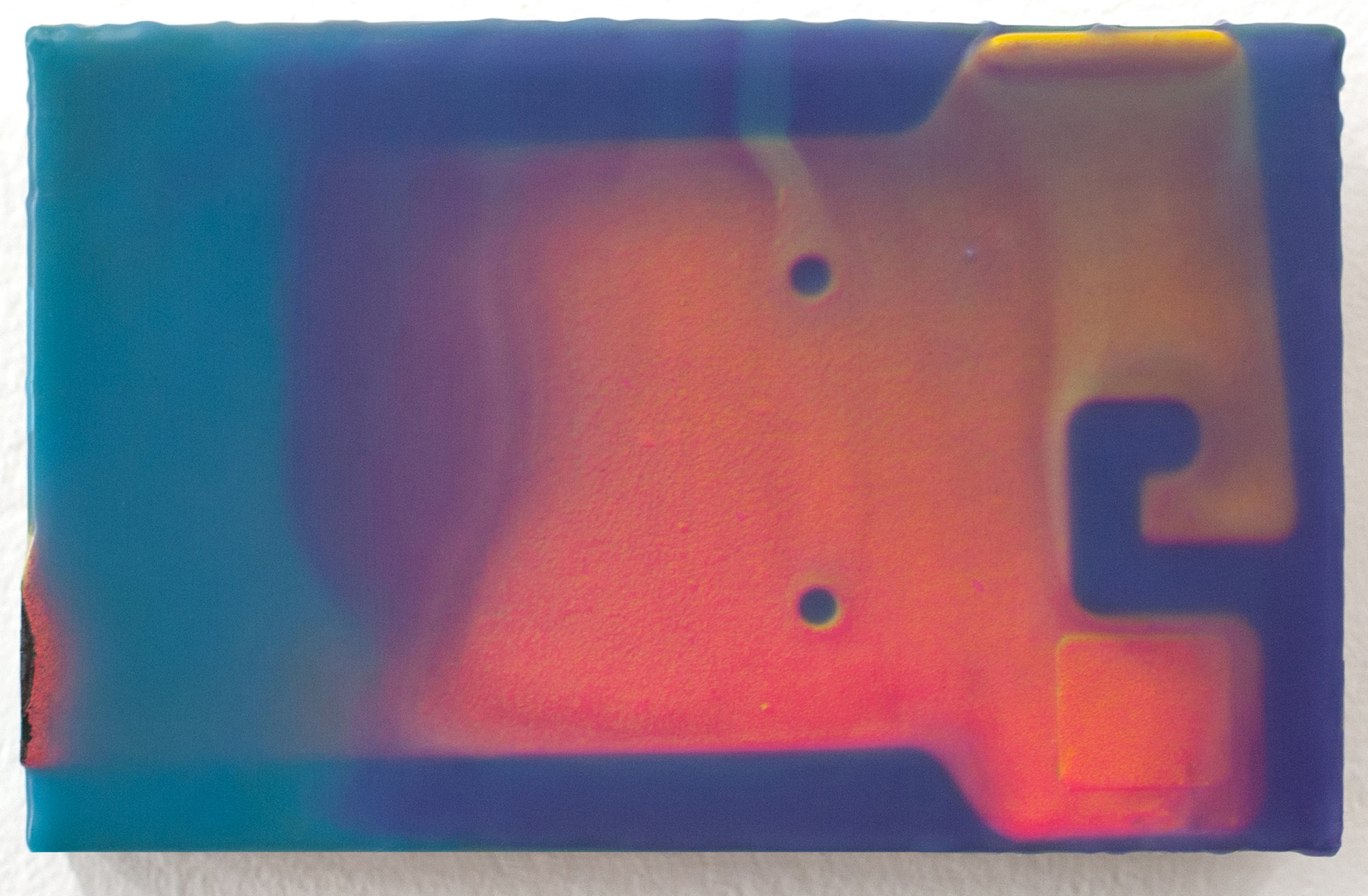
Part and Parcel, Joanne Ungar’s solo show at Front Room Gallery, consists of a series of encaustic works that appear as luminous, shapeshifting forms. On closer examination, the alien figures emerge as if through clouds to reveal themselves as the cardboard packaging that you throw in the recycling bin every week. Ungar began using cardboard when she worked in the cosmetics industry, deconstructing the packaging that contains lipstick, eyeshadow, and the elusive concept of beauty itself. This early series is a commentary on an industry whose success lies in undermining the self-esteem of the women who value its products. Later, she departed from feminist-based work to explore a more environmental approach, based in consumerism and the recycling of materials. Her work enshrines a product that has become ubiquitous in our materialist culture; indeed, cardboard is so central to our economy that it hardly needs explanation as a symbol of consumerism and waste. But Ungar’s use of cardboard is not purely conceptual; she’s also passionate about its properties as a raw material in her creative process. She waxes poetic about encaustic, explaining in detail how the tiny bubbles rise to the surface and pop as the wax solidifies. Her palette, once understated, has become saturated with color, elevating the cardboard to a thing of beauty and desire. Relieved from the function of protecting the object of value that’s being shipped, the cardboard is now that object, an irony not lost on the artist. Ungar embraces her medium with all its contradictions, and her work radiates with an inner light that transforms common materials into objects of uncommon beauty.
MH: You’ve been working with cardboard and encaustic for a long time. When did you start combining these two materials, and what about your medium engages you?
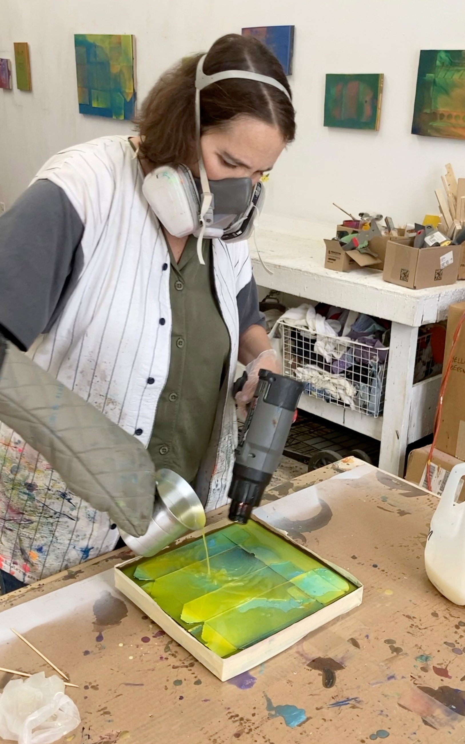
JU: I started working with wax about 25 years ago. I was searching for another translucent medium to employ in collage making, after having previously worked with resin, Elmer’s glue, acrylic medium, and anything else I could get my hands on. For a while I suspended bubble wrap in the wax, and eventually I started using found and fashioned objects, including cardboard. I find my process to be mesmerizing and endlessly engaging. When I’m working with wax, it goes through transformations from solid into molten and translucent, and then when it starts to cure it becomes opaque, then it becomes translucent again. The unknowingness and the lack of control is really at the heart of what I like about it.
MH: How did cardboard become your medium? Was it a moment of inspiration, or the gradual evolution of a cool idea?
JU: Initially it was economy and availability. I could cut cardboard into any shape that I wanted, and I liked the way that corrugation, which is made up of little tubes of air, reacted when it was submerged in wax. It gave me interesting and cool results.
MH: That’s interesting. The hot wax rushes into the little tubes, and then what?
JU: Well, it’s always different, but one of the first experiences that turned me on was submersing a piece of corrugated cardboard in wax. As the wax was coagulating, the air was squeezed out of the tubes and little air bubbles rose to the surface, popping up around the edges.
MH: What’s your background? How did you become an artist?
JU: I just enjoy making stuff, being involved with my hands, not overthinking it. I went to art school, so I have the education and training, but I’m not that theory-oriented, and I’m not that business-oriented. The way I was raised and where I come from, I was very rule-bound. I’ve always been a very good girl, and I’ve always followed the rules. But in my studio, it’s another story. I get to do exactly what I want to do, and that’s very important to me.
MH: Regarding your process, it looks like sometimes the cardboard is used without altering it, and other times you paint it. What’s your thinking behind that?
JU: Initially my work was more monochrome and subtle. Over the years I started using more color, and I’m at the point now where I’m using tons of pigment. The work is highly chromatose—a word that I made up—and painting the cardboard is one aspect of that. The paint creates an illusion of depth that I wouldn’t get otherwise. I like this sleight of hand, where people look at a piece and can’t figure out how I did it. I like it to be unknown; it gives me some privacy.
MH: Does your use of non-traditional materials bring a component to your work that you might not be able to achieve with traditional painting? I’m curious because they’re paintings in the sense that they’re two-dimensional, but a three-dimensional object is embedded in the painting. How do you think about this?
JU: Most of the art that I love and admire is painting, but I don’t consider myself to be a painter. In my heart I feel like these are assemblages or collages because I’m putting materials together. I say that I paint, but I don’t use brushes at all; I use encaustic pigments and I melt them into small containers of molten beeswax and encaustic medium. And the cardboard is spray-painted.
MH: Your compositions are intriguing, because the cardboard goes right up to the edge, with no border. I find it aesthetically pleasing, but it could also feel a bit claustrophobic. What consideration goes into your compositions?
JU: To create freely I have to give myself some boundaries. When I first started working with boxes, I gave myself the rule that the dimensions of the box would define the size of the piece. If you look at my earlier work, it was less claustrophobic—there was more space around the edges. But to your point about claustrophobia, to me that creates a visual tension between the space and the hard edge of the boundary. And I’m really into the negative spaces that are created.
MH: What about the “beauty” aspect of your work? Some of the boxes are from the packaging of cosmetics, and you used to work in that industry. Do you make any connections between your work and the commodification of beauty?
JU: Absolutely. That’s how it all started. Before working with boxes, I was using cosmetics packaging: false nails, eyeshadows, mascaras, lipsticks. I was doing it very consciously because I felt bad about working in that industry, specifically the way it commodifies women, homogenizes them, destroys the self-esteem of young women, and so forth. The reason I moved away from it was that the materials were very small, like 2 x 4 inches, so if I wanted to go bigger I had to use larger boxes.
MH: It’s interesting that your surfaces that have the appearance of flawless skin.
JU: That’s part of it, and I’ve spent maybe the last 15 years mastering that technique. It’s just with this current show that I decided to let go of that, because those pristine surfaces are not tantamount to my personal success anymore. I’m looking for more dynamic and interesting surfaces. In the past, if anything breached that surface, I’d abandon the piece.
MH: Your choice of material lends itself to many interpretations. For instance, you could be making a statement about the environment, consumerism, or any number of things. How do you think about your work now?
JU: At this point I feel like my work relates more to materialism and consumerism rather than the beauty business specifically. One of the many reasons I like working with the cardboard is for the recycling and sustainability factor. We create tons of refuse that isn’t reused, so my current work addresses that issue. But it’s not just about the waste, it’s also about the way that we’re manipulated by advertising agencies. So the conceptual aspect of my work has changed from feminism to a more environmental approach.
MH: Does the cardboard, which is very ordinary, bring with it an energy or allusion that’s in keeping with your values? You could have used candy wrappers, McDonald’s containers, book pages, or gold leaf, each of which would have communicated something different. What does cardboard communicate?
JU: That’s a great question. It has a personal appeal for me because I’m from the Midwest and was raised to be very modest. You don’t brag or toot your horn or draw attention to yourself in any way. As far as materials go, used cardboard is about as modest as you can get!
MH: Right. Cardboard has a lot of unfortunate associations. Like when you see unhoused people on the street, they often have shelters built of cardboard.
JU: Right. Seeing people living in those cardboard shelters make me so upset. But in general, I don’t associate cardboard specifically with being unhoused. I associate it with wastefulness and pollution and destroyed trees. I feel good about re-using it, giving it second life instead of sending it to a landfill.
MH: Cardboard has become ubiquitous in our lives, especially since Covid. We order almost everything online now, and it has to be shipped in a cardboard box. It’s interesting that your work enshrines the product that has become indispensable in our culture.
JU: Right! Every piece is made with a custom mold, and I make those molds out of used cardboard. So every cardboard box that comes through our house goes to my studio, and I cut it up to make these molds. There’s a part of me that would like to stop buying art supplies altogether and just use what’s in my studio.
MH: How do you feel about people misinterpreting your work? Like an annoying art blogger who assigns meaning that has nothing to do with your work. Is it humorous? Cloying? Unconscionable?
JU: That doesn’t happen to me. What does happen is that people say they see things in my work, like a landscape. And that’s fine with me, but in general, I don’t get accused of creating something that I didn’t intend to create. If there’s ever any negative feedback, I don’t hear it.
MH: Beyond the artist’s intention and the critics’ interpretations, do you think art has a higher purpose?
JU: Absolutely. Life without art would be intolerable. Art brings aesthetic pleasure to life, which is a basic aspect of living. I mean, life can be a slog! But I think art and music and writing can transport people to a place of beauty and transcendence. Visual art is a facet of that. The people who buy my work tell me how much they love having it on their wall. That’s so rewarding! That’s really all I need, knowing that other people get it.
MH: What about the artist’s concept or intention? Does it even matter what her work is about? I’m starting to think that what we create is irrelevant, and that it’s all about another energy that comes through the work. And that is what people are reacting to, not the lofty concept.
JU: I totally agree. When I get stuck and feel like what’s the point, eventually I come around to the understanding that my job is just to make stuff. You just make it, and let other people worry about the meaning. If instead I say, “Okay, today I’m going to go make work about recycling and waste,” it’s always a dead end for me. What I end up making is something very different, and it has nothing to do with where I started. I used to think it was a failure, but I realize now that all I have to do is start somewhere and be open to the process, to the universe. They don’t teach you that in art school!
MH: You could even say that the artist’s concept gets in the way or bogs it down. Kandinsky, one of the first non-representational painters, placed so much dense theory on his work that he may as well have stuck with landscapes. Your work is abstract, or at least an abstraction. Are you content to let it speak for itself, even if the concept gets lost in the shuffle?
JU: Yes. I’m very happy to let other people theorize about it if they want to, but I’m not that invested in what other people think about the work. Again, it’s the one part of my life where I get to do what I want. In other parts of my life, I can be judged and assessed on all kinds of things, but in the art studio there’s a freedom from all of that. I do what I want to do.
MH: What do you want people to receive from your work?
JU: The word that comes to mind is thoughtfulness. My current body of work is what I call tricky, meaning the viewer often can’t figure out how I’ve done what I‘ve done. For me, this is a gateway into the viewing process, as it starts someone thinking and looking more closely. I am always delighted to hear how folks receive it and respond to it. Ideally, they’ll think about how wasteful and how ugly our consumerist culture is.
MH: What’s the best part about being an artist?
JU: I get to do whatever I want. There’s a freedom of thought and action in my studio that I don’t have anywhere else. It’s a harsh world out there, both in nature and in society. I find making art and looking at art to be a refuge into a realm of beauty and thoughtfulness, where I prefer to be.
www.joanneungar.com
Ungar’s solo show Part and Parcel is at Front Room Gallery in Hudson, NY through November 26.
IMAGE LIST
1. Botox, 2018, beeswax, paraffin, and pigment print on 24 magnetized panels, 37 x 54 in.
2. For-eva Lifetime Light, 2014, encaustic and painted cardboard box on panel, 6 x 11 in.
3. MAX Lip Scrubtious, 2022, encaustic and painted cardboard box on panel, 7 x 6 in.
4. Blue Insert, 2022, encaustic and painted cardboard box on panel, 6 x 6 in.
5. Kiss, 2021, encaustic and painted cardboard box on panel, 7 x 6 in.
6. Airgami, 2023, encaustic and painted cardboard box on 6 panels, 23 x 35 in.
7. Airgami (detail), 11 x 11 in.
8. Knot, 2022, encaustic and painted cardboard box on panel, 7 x 9 in.
9. L.L. Bean Mountain Classic 2, 2023, encaustic and painted cardboard box on panel, 4 x 7 in.
10. Advanced Glass, 2015, beeswax, paraffin and cardboard box on panel, 31 x 30 in.
11. Installation view at a4L Gallery, 2005, mixed media, 72 x 48 in.
12. The Morning ’s Amber Road, 2002, carnuba wax, beeswax, and plexiglass on panel, 12 x 12 in.
13. Untitled (small #10), 2002, beeswax, paraffin and plexiglass on panel, 6 x 6 in.
14. Pang, 2005, beeswax, paraffin and plexiglass on panel, 13 x 13 in.
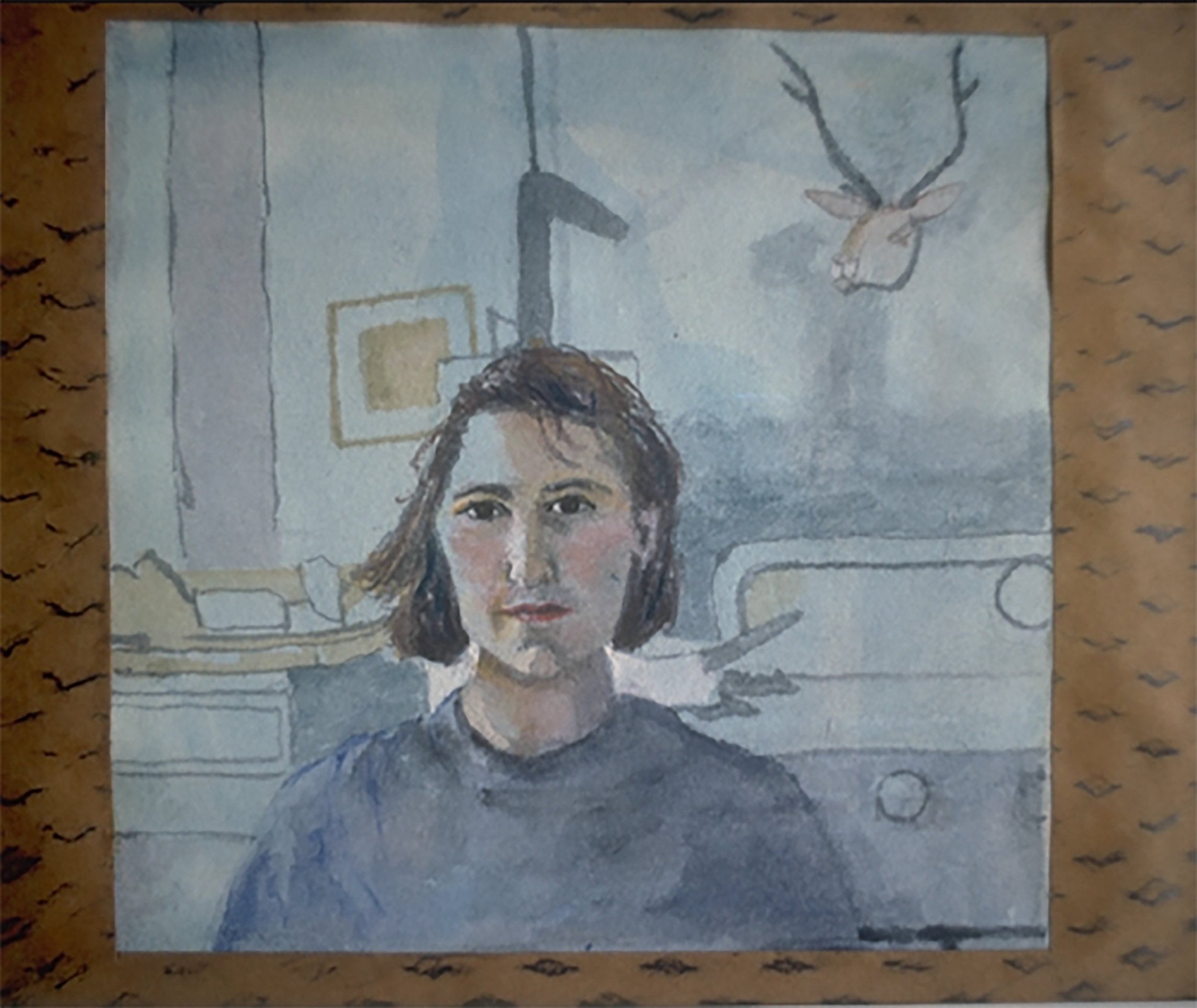
15. Self Portrait, 1988, watercolor and collage on paper, 6 x 8 in.
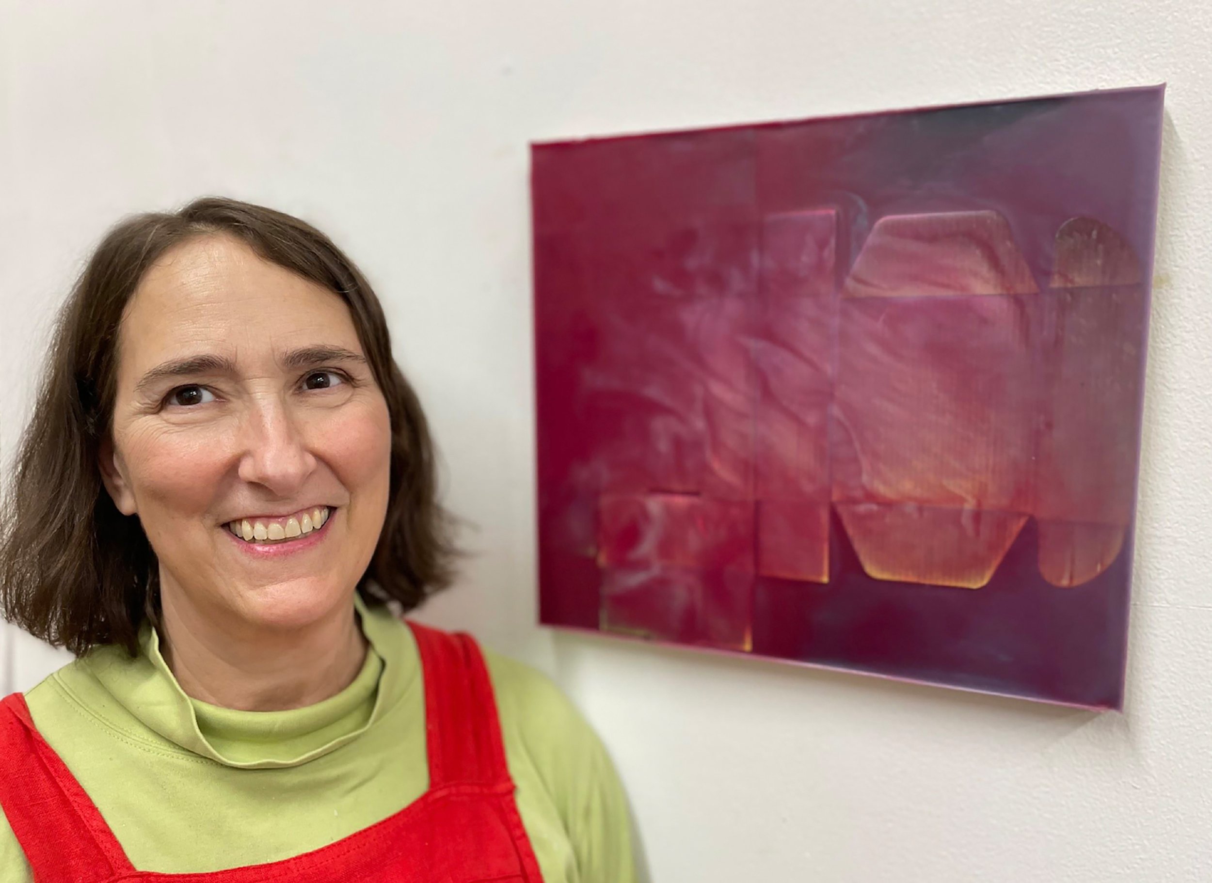
16 and 17. The artist in her studio.
Kate Horsfield
In her solo show Attempt to Form, Kate Horsfield exhibits her recent body of paintings and ceramics in which she explores the relationship between form, emptiness, and abstraction. Horsfield pushes the parameters of traditional painting by allowing her compositions to fall apart, as if succumbing to the laws of entropy. Through a process of reduction and elimination, she removes all allusions to the external world, relinquishing the shapes and shadows that tether us to representation. Her work originates in an approach that is minimally invasive, where the artist defers to the paint, medium, and gravity to determine the outcome. Horsfield begins each painting by dripping paint onto the canvas, spraying it with turpentine, then allowing the paint to do what paint does. This relinquishing of control is at the heart of Horsfield’s practice; she becomes an observer of the active paint, engaged but not engaging with its movement as it spreads and settles. The resulting forms are nebulous stains in a field of emptiness, a collaboration between artist and medium in which there is equal influence. Horsfield’s paintings read as ephemeral exhalations, suggesting that after a painting has been emptied of pictorial content, the breath of the artist is all that remains. The finished painting may be regarded as a dance between form and emptiness, doing and not-doing. Her ceramic sculptures are similarly spare in contour and color, their looping lines reminiscent of Chinese calligraphy. The authentic, unpolished surfaces of her paintings are repeated in her ceramics; indeed, the two are of a piece, informing each other and confronting the solidity of their respective forms. Horsfield’s two- and three-dimensional works challenge the space they occupy and read as visual oases in a continuum of emptiness. In her departure from traditional iconography, Kate Horsfield encounters the metaphysical realm, where form, emptiness, and abstraction are in an eternal process of unfolding.
MH: You were a graduate of the Art Institute of Chicago, where you and Lyn Blumenthal created the Video Data Bank, your project from 1976 - 2006. How did that project inform your work as an artist?
KH: Our video project started in 1974 with an interview with Marcia Tucker, the founder of the New Museum. As young artists, we were interested in how older artists decided what they wanted to do, how they worked with their materials, faced accidents in their work, and so on. This was the height of the feminist movement, and we were particularly interested in hearing women talk about the motivations behind their work. Listening to all these artists talk intimately about their practices and values was very influential, not so much in my work, but more of a sense of dedication, of adopting good artistic values and practices, rather than wanting to get involved in making money.
MH: You left the Art Institute in 2006 and taught drawing and painting for a year in Austin, Texas, then returned to New York in 2008. At what point along the way did you dive back into your studio work?
KH: I had a studio in Austin, so I was painting while I was teaching there. But I started painting seriously when I came back to New York and sublet a studio at the Elizabeth Foundation in 2010. Then I had a variety of different workspaces, including PS122 in the East Village for a few years, then at Brooklyn Fireproof in Bushwick.
MH: What you had to say as a 20- or 30-something artist undoubtedly changed over the intervening decades. Was it challenging to rediscover your voice as an artist?
KH: It was extremely difficult at first. Consistency and time make a huge difference as an artist, and I’d been working full-time for many years, which impacted my development. So when I first walked into the studio in 2010, it was a strange experience for me. I really had to start from scratch.
MH: You said that you were searching for a painting surface that was pleasing to you, so you started applying paint to the canvas, then removing it. What did you discover through this? And was the process also satisfying?
KH: Yes, I was trying to flesh out what I wanted in the way of surface. I knew what I didn’t want but didn’t know yet what I wanted. There’s a phenomenology of paint, of putting paint on a surface and then allowing it to move around in a random way, without my having control over it. There's something about both manipulating and not being able to manipulate the color moving across the surface that I find very interesting. I also found that to be extremely interesting in ceramics, and it wasn’t a big leap for me to take the painting process from a flat surface to a three-dimensional surface.
MH: At some point the painting started to “fall apart”, in your words. How so?
KH: My aesthetic started to change; even abstract shapes became too literal for me. How do you talk about things falling apart without going into any kind of representational iconography? So I came up with a new way of working on the surface using a spray bottle, dripping paint, and letting the color go wherever it does. I manipulated it slightly, but mostly it was just gravity. And although I wasn’t thinking about it at the time, this reflected what was happening in our country. Some of the things that I and my generation fought for in our lifetime were falling apart, the things that were solid were no longer solid, and I wanted to find a way to talk about this in my paintings.
MH: Your paintings are minimal, both in palette and form. It seems that in your search for authentic expression, yours is a reductive process: how much can I take away and still have it hold together as a painting? Is that a fair assessment?
KH: Yes, it’s very reductive, but the paintings can also be quite complex. There are a lot of things happening on the surface, but temperamentally I like the ones that are almost empty. The emptiness of it, in addition to the random flow of the paint, were the things that were most interesting to me. What is the least thing that I could do to make a painting look like a painting? That's an old idea in art.
MH: So you were feeling disconnected from the process of painting, and it was making you feel anxious. Then you had the opportunity to play around a little with ceramics, and everything changed. How did working with clay open things up for you?
KH: Ceramics had never been very interesting to me, but a friend encouraged me to try it, and I took to it instantly. It was like an explosion went off in my head, and I realized there was something incredibly liberating and primal about working with clay. I found that I didn’t have the anxiety working with ceramics that I had with painting. Painting was so loaded for me that it was very hard to do, but with ceramics I was able to let go of any expectations and make something and it was okay.
MH: Once you started working in ceramics, did your paintings start to make more sense? Is there a connection between the two mediums that’s integral to your work?
KH: When I started in ceramics, I didn't make a connection to what I had been doing in my paintings at all. It was just a different thing. But when I pulled out some of my paintings and looked at them, I could see a line of progression between the two practices. And I was thrilled by that, because I saw that I had been pursuing this vision all along.
MH: It sounds like ceramics made you more comfortable with painting, and painting made you more comfortable with ceramics.
KH: Exactly. They’re tied together somehow. Artists need to see connections in their work; it needs to somehow make sense. The similarity between the two has to do with the process of applying and taking off color in both ceramics and painting. This creates the kind of surface that I like, no matter what I’m doing. I like it to look aged, less refined, more authentic.
MH: Do you find that in your work with clay, you have a similar desire to reduce the formal elements? I suppose you have to work with the fact that it exists in space, and there are practical concerns. Like, it has to not fall over.
KH: Right. It has its own rules and you have to follow them. The pieces that I’m working on now have loose, loopy, open spaces, and I see them as individual strokes in space, like calligraphy in a way. That’s a very fragile ceramic space, but it might be a strong painting space.
MH: What is it about representational art that’s problematic for you? Does it create tension? Or is it simply that there are enough artists doing it that you don’t feel the need?
KH: Interestingly enough, the way I decided to become an artist in the first place was that I was really good at rendering. I was good at the things that people think an artist should be able to do! So my progression as an artist has been to move away from that. I don’t have anything against representation, but I don’t particularly need to do it myself.
MH: In your process of reducing a painting to its absolute minimal color and form, you lose a lot: imagery, a full palette, and arguably, self-expression. What do you gain? Why are you drawn to work minimally?
KH: I don’t lose self-expression—that’s actually a gain. There’s something about emptiness that attracts me. It’s not just on a canvas or in ceramics, it’s also in the physical world. I grew up in Amarillo, Texas and I love empty space; I feel comfortable in that landscape. The minimalists proposed that if you give less, the audience will fill in the blanks, and I find that to be true. Agnes Martin talked about the fact that some people didn’t like her paintings because it required them to have an internal response. A lot of people don’t like that feeling, but I happen to be very attracted to that.
MH: So much of your studio practice is about reducing and reducing, getting your painting down to the barest expression that it can handle and still be called a painting, and then someone comes into the gallery, sees your painting, and says, “Oh, what a beautiful seascape!” Is that like your worst nightmare?
KH: Not at all! I find that to be incredibly interesting. As artists we have to accept that we have our ideas about what we’re making, but once you put it out into the world, you’re going to get a multitude of responses. I might not agree with someone’s assessment, but I think we have to be respectful of others’ reactions.
MH: Seascapes aside, what would be the ideal reaction to your work?
KH: I would hope that someone would try to see if there’s something in the painting or sculpture that would be meaningful for them. Making the work is a phenomenological experience for me, like the sensation of putting red and phthalo green on a surface and observing how they intermingle. So I’ve collapsed narrative, content, and context down to a few dots that are floating around on a surface. That’s just my way of working. It doesn’t require anything intellectual, it’s more of a sensation than an intellectual understanding.
MH: You talk a lot about relinquishing control and letting the paint do what paint does. It’s almost as if you’re trying to disappear from the equation. Does this resonate with you?
KH: Yes, in a way. I think if you’re willing to give up control, you’re going to get unexpected results, some that you like and some that you don’t. There’s some manipulation on my part, in terms of getting the paint to flow in a different direction, but for the most part I’m allowing a kind of randomness to take over.
MH: Is the culmination of your reductive process an elimination of yourself? Not in a nihilistic sense, but in the Buddhist tradition of no-self?
KH: Yes, it’s definitely there. You can make a correlation between minimalism and empty space. But anyone who sees my show has to come up with their own conclusion about what it means without me telling them.
MH: Would you say that your work points toward emptiness? The Buddhist term is shunyata, which translates as emptiness of ego and attachment. Or might it be an emptying of your creative energy into your medium, transferring it from yourself to the painting?
KH: Both are true, but I’ll take the second interpretation. Painting was always a struggle between seeing myself and not seeing myself. There are ways of seeing yourself in your work that are critical to any creative endeavor. But it’s okay for me not to be present in my own work; the idea of emptiness and draining out the ego is very attractive to me, even in painting.
MH: As artists I think we express ourselves through our medium, and effectively empty ourselves from whatever urge is compelling us. Then we show the work in a gallery or whatever, and the viewer is filled up from looking at our piece. It’s a transfusion of sorts, hopefully meaningful for the viewer. What do you think of the idea of art as a transfusion of creative energy?
KH: I hope that’s true. Beyond the goal of just making something, the idea of someone else coming in and getting something out of what you’ve done, particularly if they get what you want them to get – that sounds like the goal.
MH: Do you think that abstract painting has a better chance of that transfusion that we’re talking about? Because with a narrative painting, the story is another layer that you have to get through, whereas with your work, there’s no perceivable narrative, so is there a better chance of that transfusion happening?
KH: It really depends on who’s looking at the work, and what their experience with art is. The people who have more experience looking at art and are more tolerant of the radicalism of abstraction are going to feel it more fully. I don’t think people without a background in art can walk into a gallery and immediately fall for abstract or minimal work. The appreciation of abstraction is something that people acquire over time.
MH: What would you most like your work to transfer to your audience?
KH: I hope people look at the work and get some sense of pleasure and enjoyment from it. I think the ceramics will be easier for people in a lot of ways, maybe because it has more of a material reality.
MH: Do ceramics require less of the viewer?
KH: That’s an interesting question. I don’t want to re-ghettoize ceramics – it’s inhabited a specific space all these years and finally it’s stepping up the ladder of fine arts. Which means there are more ceramicists, more creative experiments going on that would match any other form of creativity. I think it’s building an audience right now.
MH: What’s the best part about being an artist?
KH: The practice of being an artist is a wonderful space to live in. You have a series of goals that go on for your entire life, and you have a community of artists who support each other’s practices. I look at this art world and I’m completely grateful that I’ve always been a part of it. No matter what role I played in it, there was always tremendous excitement to see other people succeed or make breakthroughs. I’m overwhelmed by what a great decision it was to be an artist – it’s just a wonderful life.
Kate Horsfield and Lyn Blumenthal directed the Video Data Bank at The School of the Art Institute of Chicago from 1976 to 2006. “Attempt to Form” is showing at the College of Staten Island Art Gallery, curated by Cynthia Chris and Siona Wilson. The show runs through October 19.
IMAGE LIST
1. Calliope, 2018, oil on canvas, 18 x 12 in.
2. Elemental, 2017, oil on canvas, 20 x 16 in.
3. Green Dispersion #1, 2018, oil on canvas, 12 x 12 in.
4. Acceleration, 2018, flashe and oil on canvas, 10 x 8 in.
5. Attempt to Form, 2018, oil on canvas, 8 x 6 in.
6. Blue Alignment, 2017, oil on canvas, 20 x 16 in.
7. Yellow Rising, 2016, oil on canvas, 20 x 16 in.
8. Swipe Left 1, 2017, flashe and oil on canvas, 10 x 8 in.
9. Swipe Left 2, 2017, flashe and oil on canvas, 10 x 8 in.
10. Who By Fire, 2017, oil on canvas, 16 x 12 in.
11. Fuzzy Red, 2018, oil on canvas, 12 x 16 in.
12. GH 3, 2022, ceramic, 5 x 4 x 4 in.
13. WGH 10, 2021, ceramic 7 x 4 x 6 in.
14. WGH 19, 2023, ceramic, 8 x 9 x 7 in.
15. GH 4, 2022, ceramic, 4 1/2 x 4 x 7 in.
16. Untitled, 2023, ceramic, 15 x 6 x 5 in.
17. Maine 22, 2020, ceramic, 4 x 4x 3 1/2 in.
18. Maine 26, 2020, ceramic, 2 x 2 x 4 in.
19. Maine 23, 2020, ceramic, 3 x 3 x 2 in.
20. Kate Horsfield
Susan Walsh
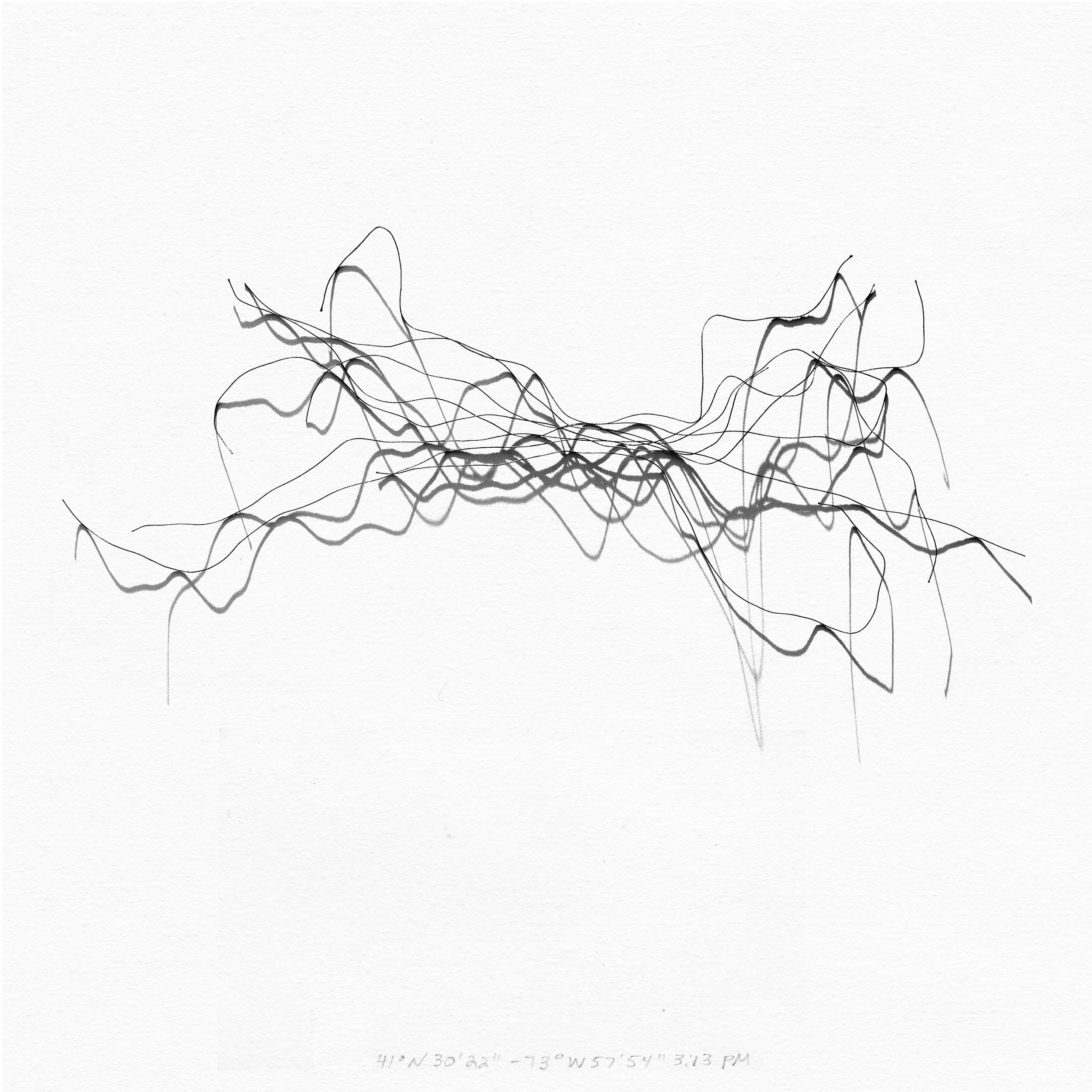
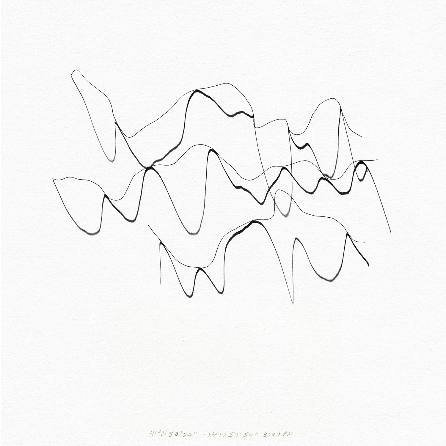
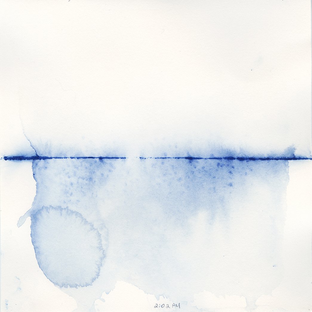
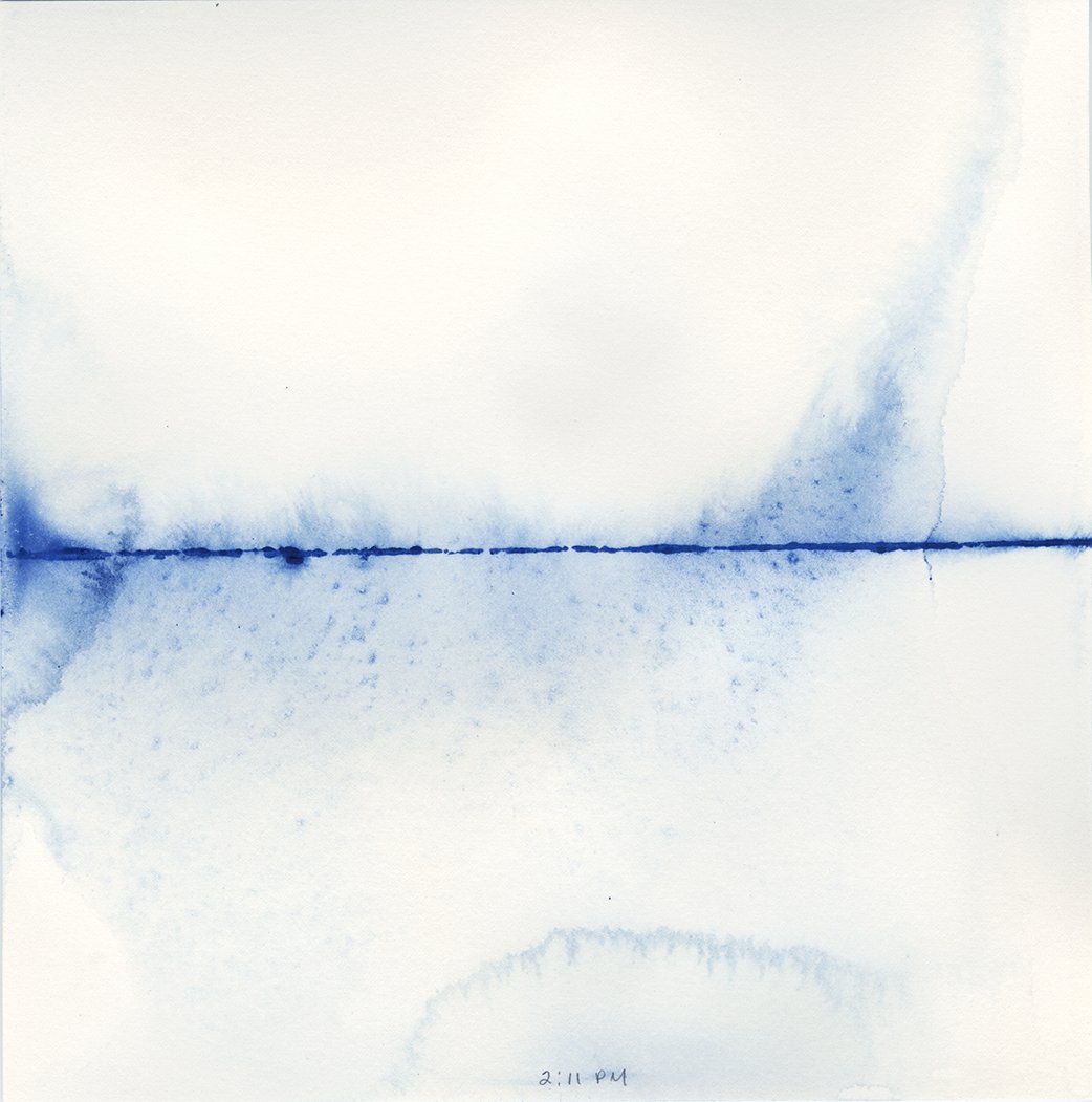
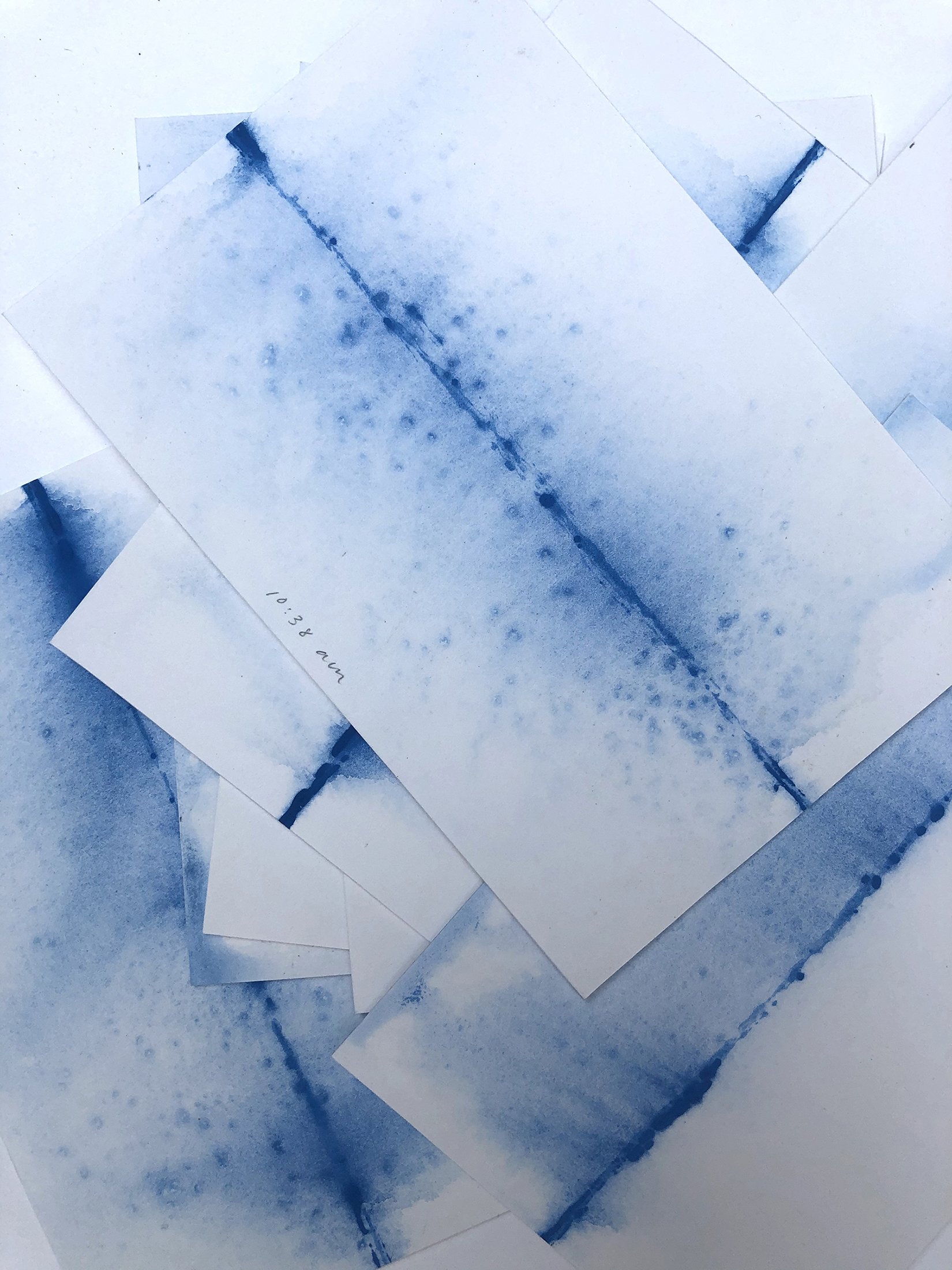
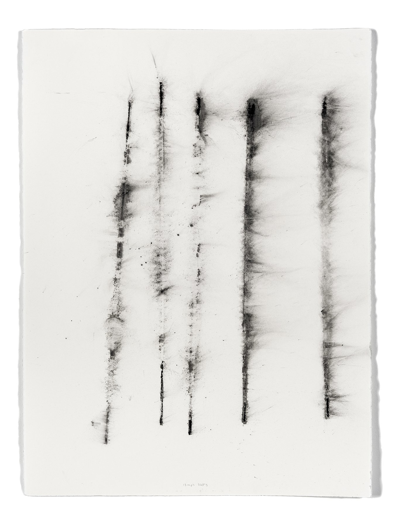
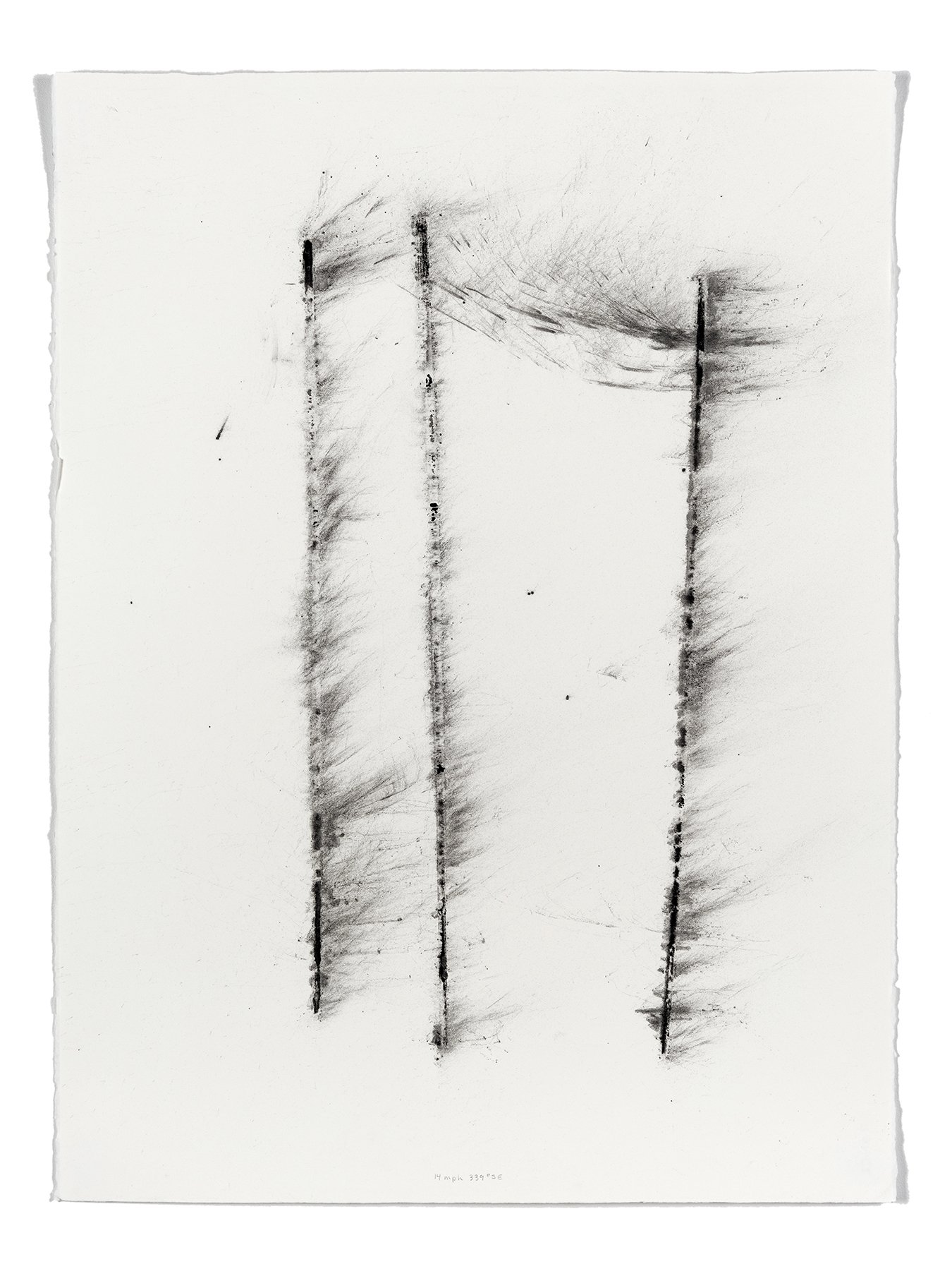
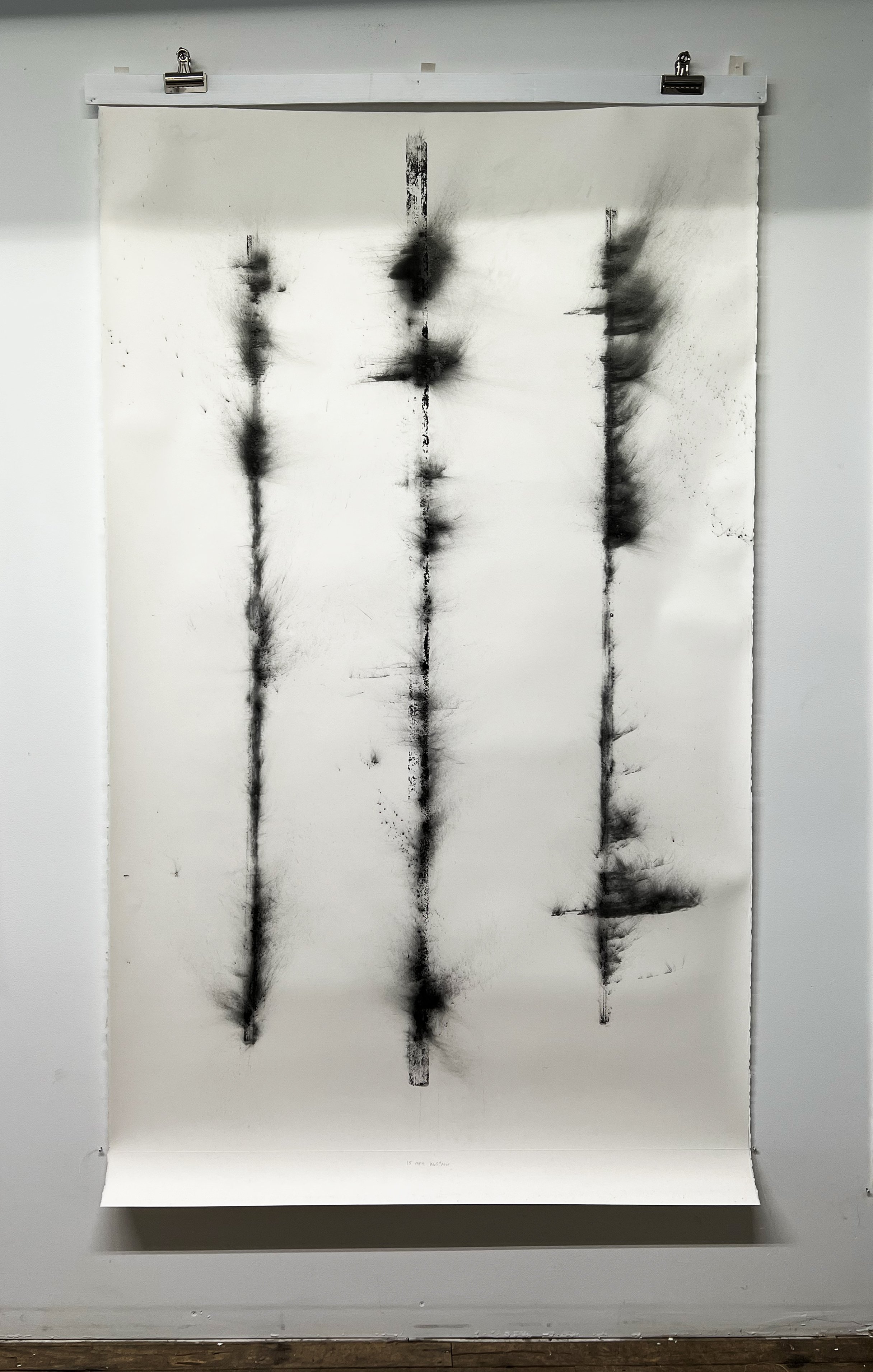
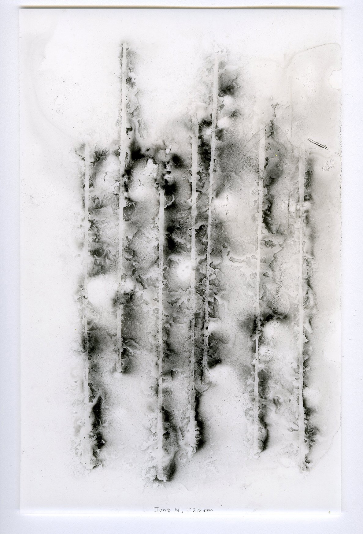
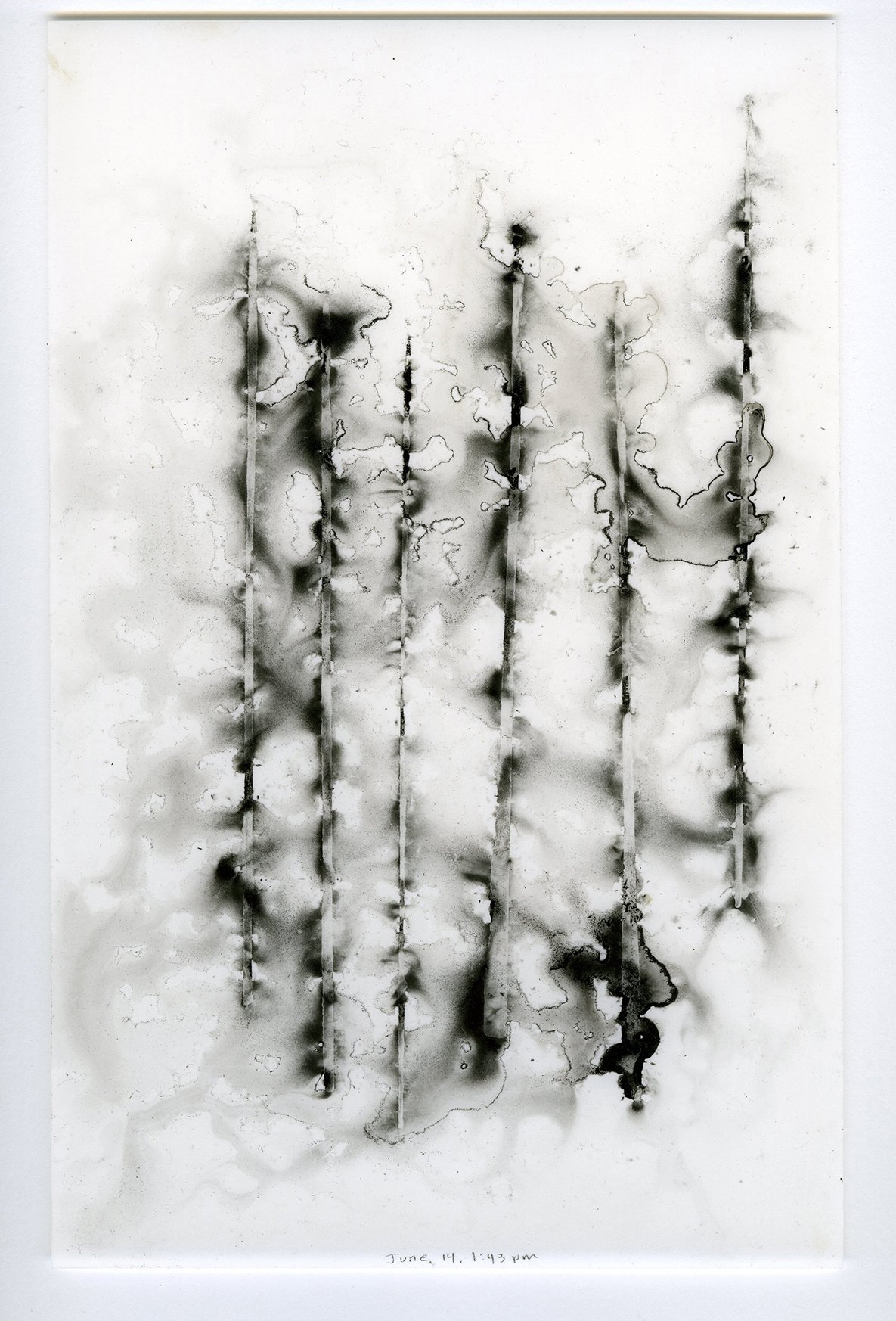
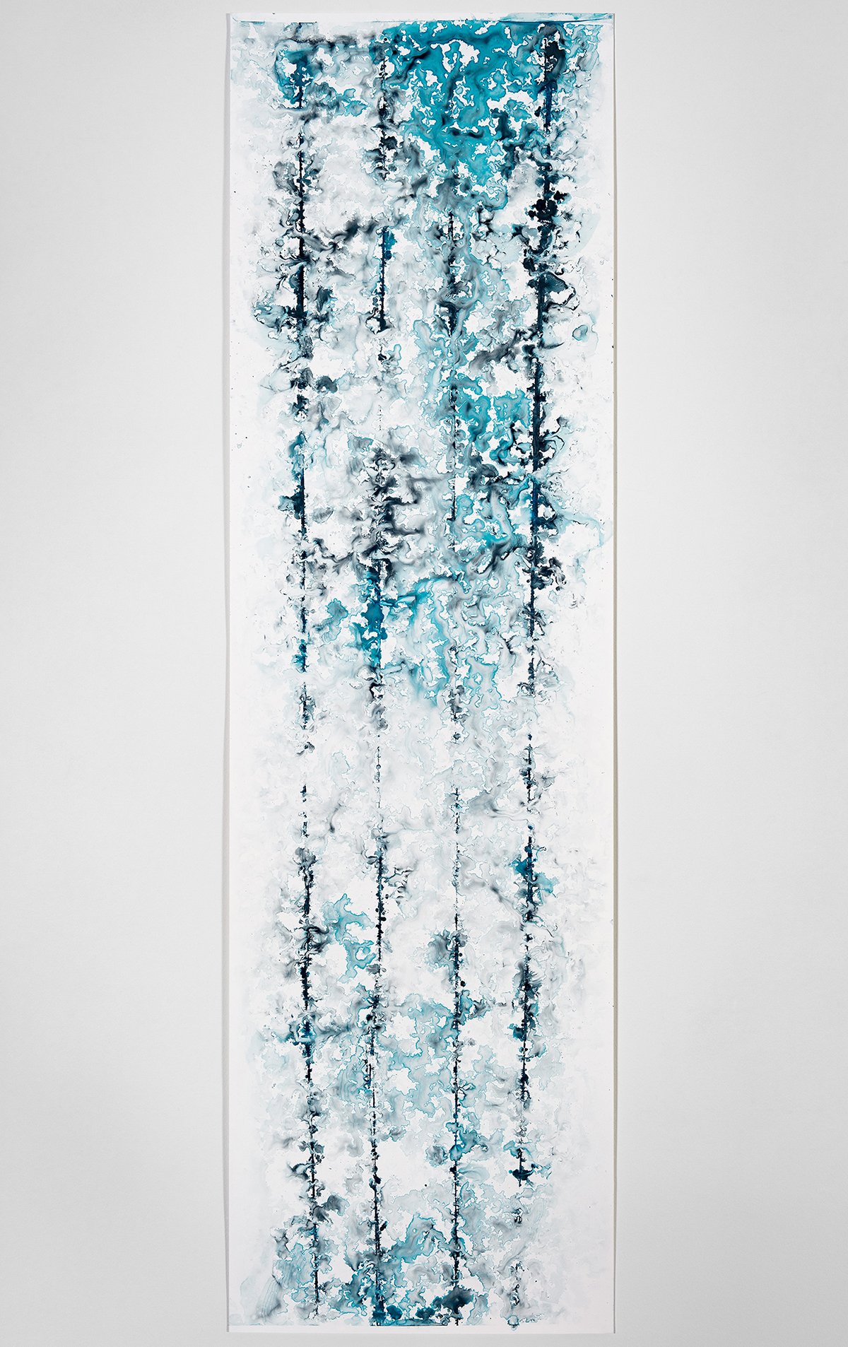
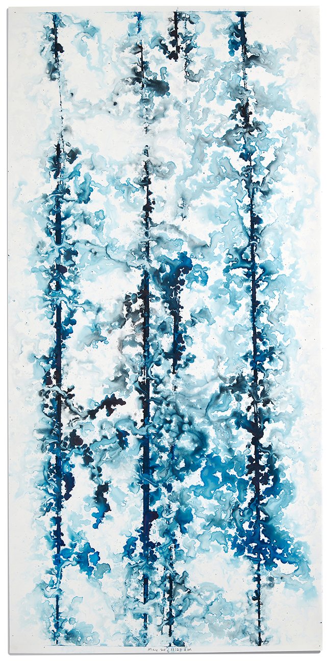
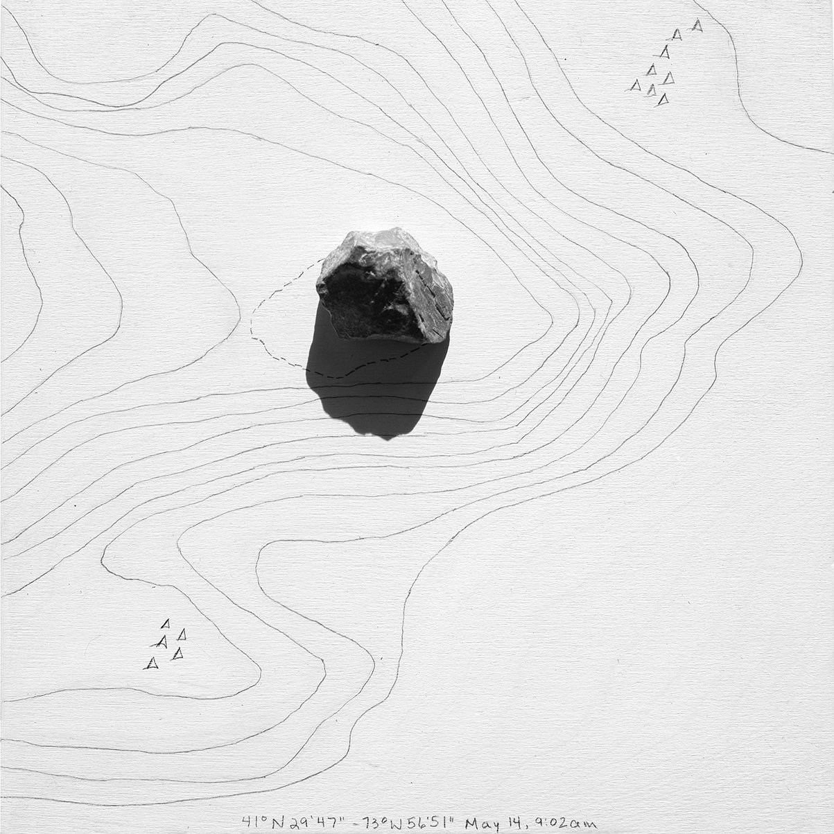
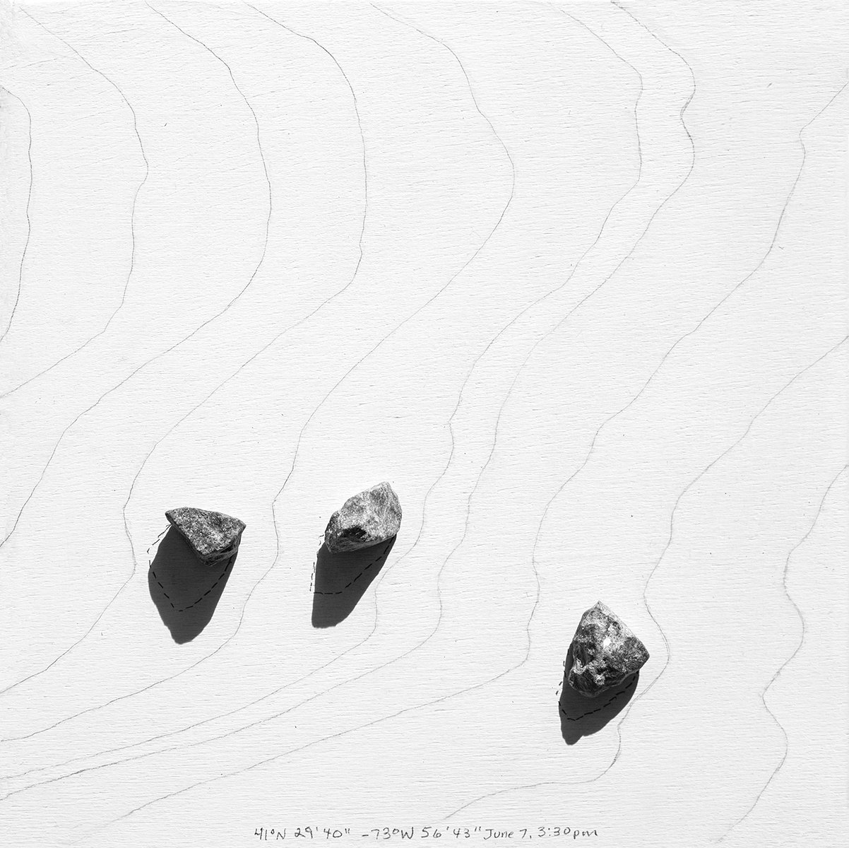
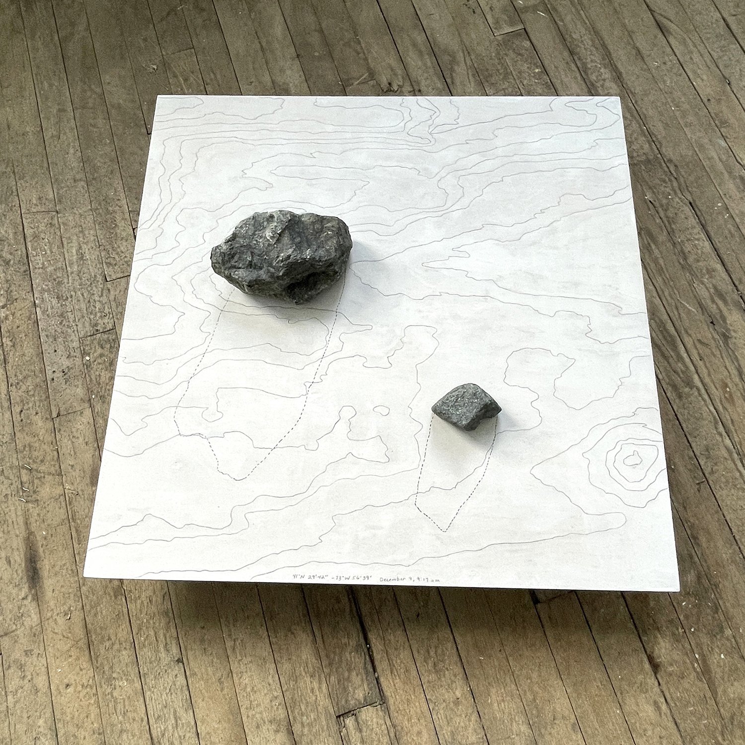
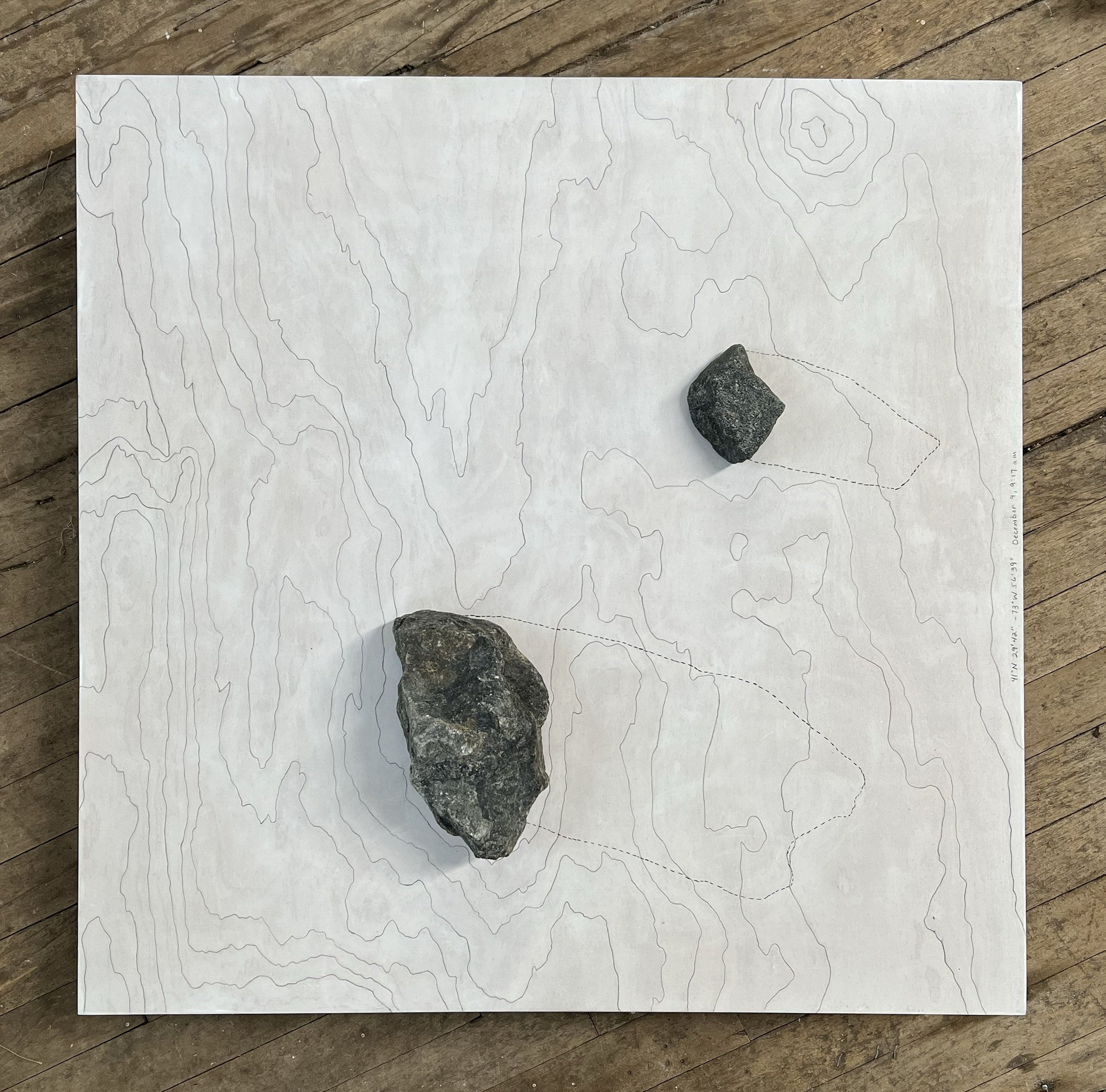
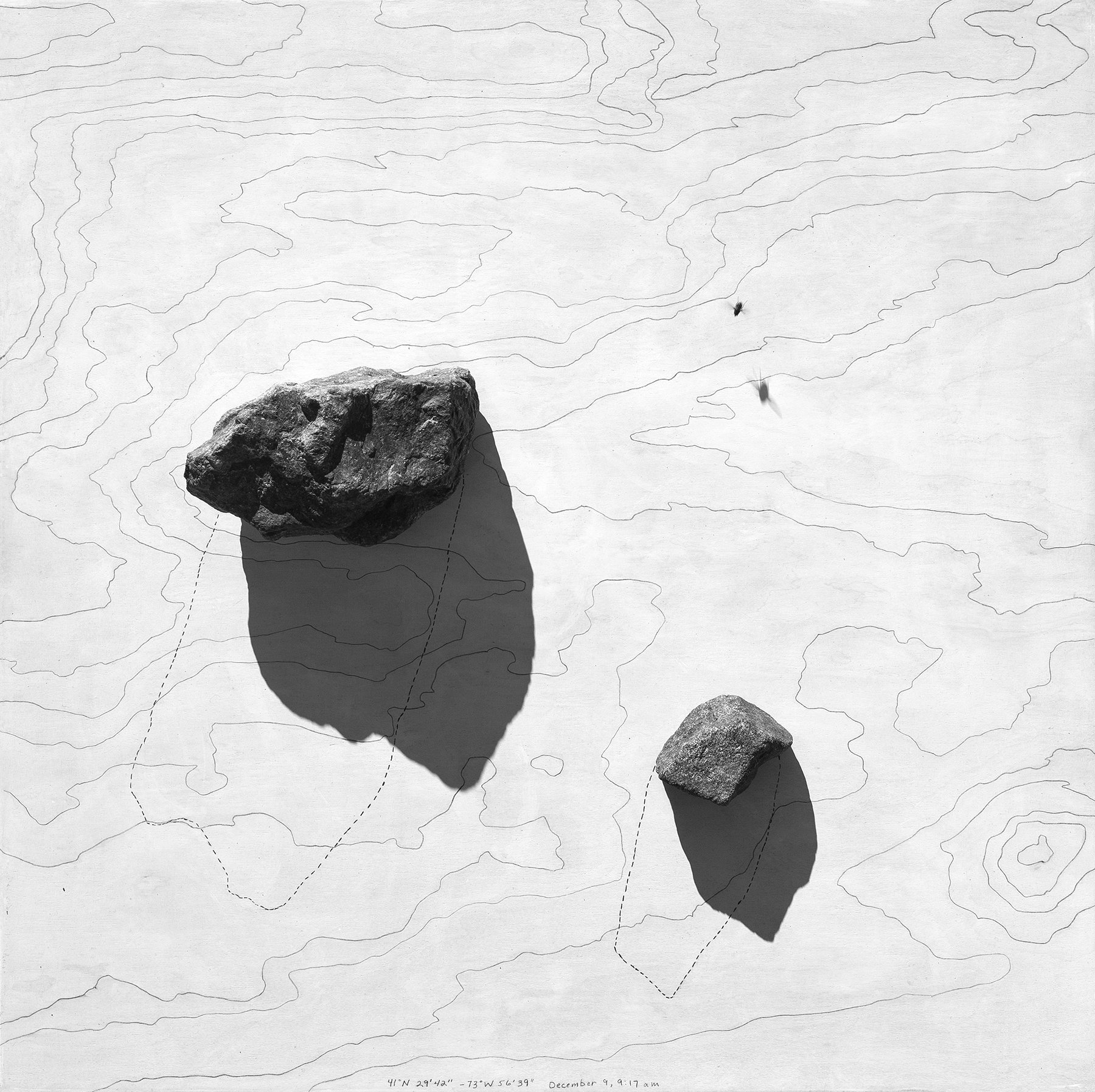
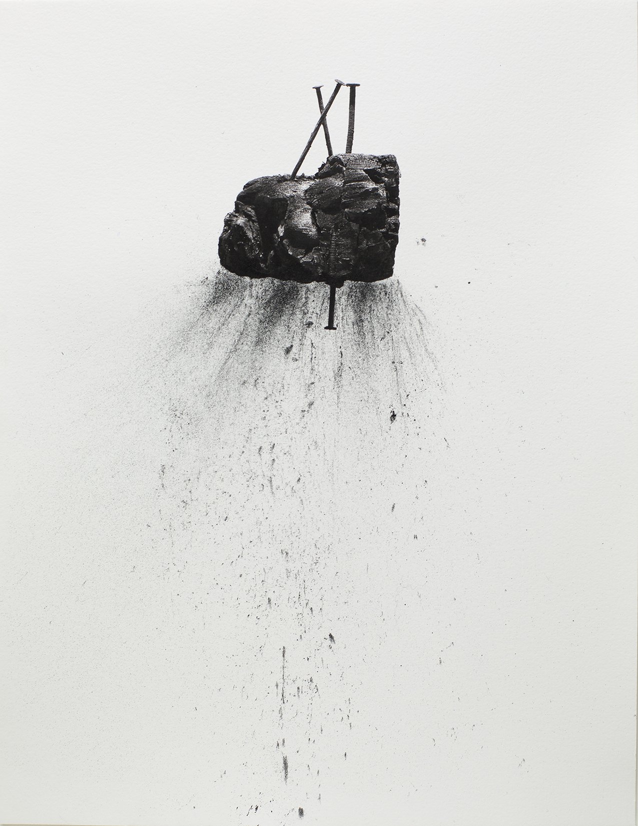
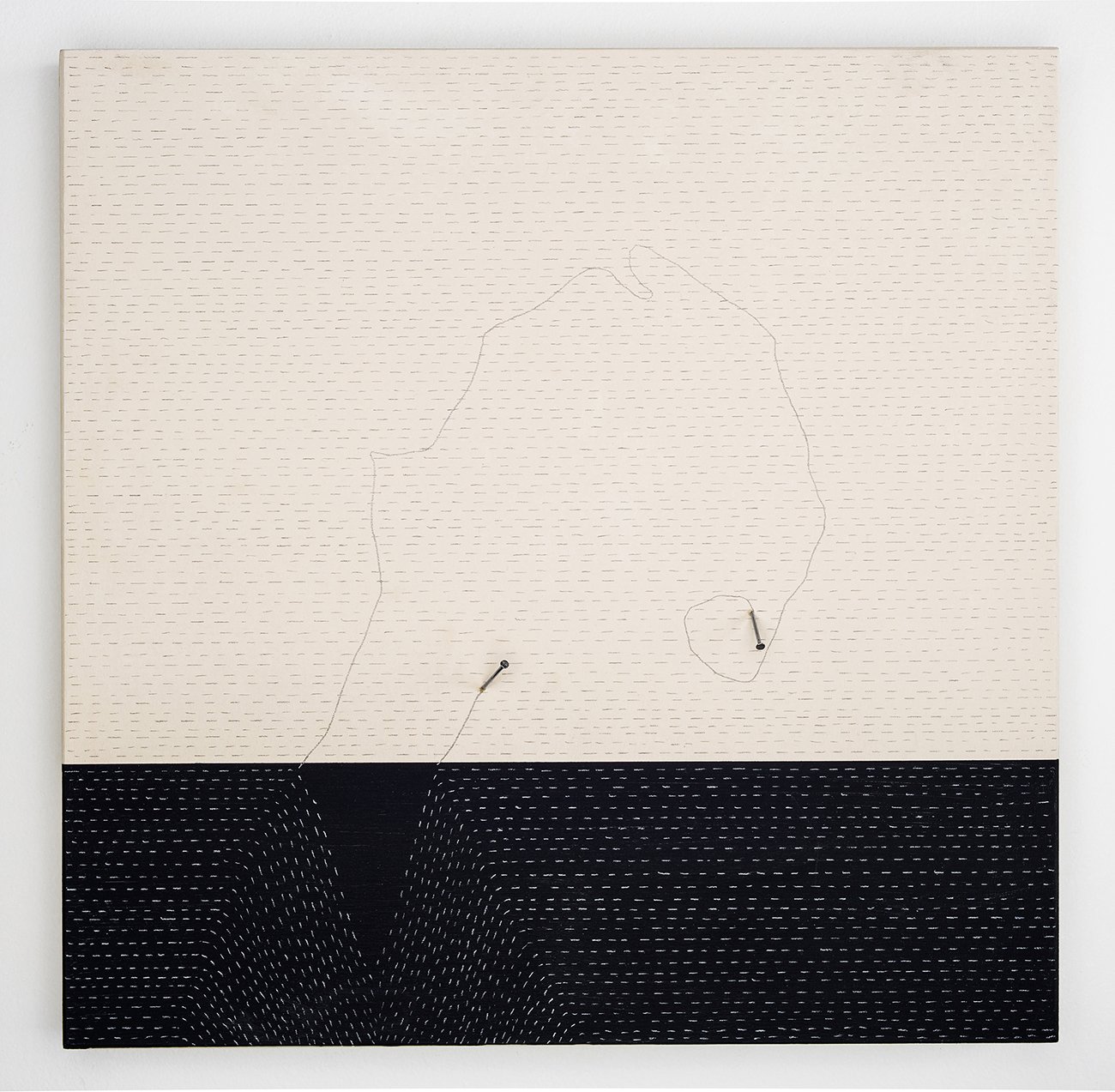
The equinox seems an appropriate time to share the work of Susan Walsh, as her focus is on the change of seasons, time-based processes, and the effects of the elements. Walsh is a multimedia artist whose materials include wind, rain, waves, and shadows. Her subject is time, and her object is to record it by setting up experiments that are at once scientific and poetic. She meticulously researches weather conditions and seasonal patterns, zeroing in on the optimal conditions for spontaneous mark making. This is a collaboration between the artist and the elements, and Walsh’s research involves finding the precise speed that the wind must blow to disperse the charcoal across, but not off, the paper. In another series, she determines the narrow season in which a piece of thread will cast a perfect, ink-like shadow across the paper (spoiler alert: it’s January through March), or the perfect admixture and amount of gouache so that when the rain pelts the paper, the pigments will separate and spatter just so. Walsh’s studio is a laboratory of trial and error, a labor of love and curiosity in which she painstakingly documents the patterns and quirks of her collaborator. By the time she places her paper in the elements, she has achieved a high level of predictability, with a generous tolerance for accidents. It’s the latter that excites Walsh, those unexpected natural events that leave irregular marks and remind her that no amount of record keeping can ensure an anticipated outcome. Walsh makes notations on the paper that include the date, time, and location of the commencement of the drawing. It also records notations such as the wind’s speed and direction, and these exhaustive details become the human mark, a fingerprint of the artist, so to speak, which is a ledger of where she was at a precise moment in time. In theory, if all her drawings were placed in chronological order, we would have a timeline of the artist’s movement across the landscape of her life. Walsh’s sundials similarly attest to the presence of the artist as she records the shapes and shadows cast by stone, nail, and thread. Everything is a sundial, according to Walsh, but it requires a scientist, poet, or artist to initiate the essential inquiry. Walsh is all of these, as she harnesses the power of the elements and uses them to create her elegant time- and nature-based works.
MH: To quote your artist statement, “The consistent theme of my work has been marking time through observable changes in natural phenomena.” When did you become interested in the passing of time, and why does it hold such interest for you?
SW: I’ve always been interested in time, but it didn’t become part of my work until I moved to the Hudson Valley in 2008. I started to write the time of day on photographs that I took, and I felt like I was recording an energy or an instance of something. Then I had this moment in the studio when I was playing around with thread, and I noticed that the winter sun had cast shadows on the thread that was laying on white paper, and it looked like a pen and ink drawing. It was one of those amazing moments that you have in the studio. This moment was about time, the elements, the winter sun casting a shadow, and the object becoming a sundial. From there I started to research the recording of time, and began to think about everything as a type of sundial.
MH: So it sounds like you had been vaguely interested in time, but then you had this epiphany around it, and your interest expanded.
SW: Yes, it was a super-epiphany, and I had a strong feeling that it was the beginning of my work changing in a big way. Prior to this, when I was living in New Mexico, my work was more about politics and the female body. When I moved to New York City, I was taking photos as a way of sketching, but that work was no longer important to me. So this new direction was really exciting.
MH: You meticulously mark the passing of time by using nature-based processes: sunlight, shadow, wind, rain, waves. In one series, a wave crashes onto a piece of paper and leaves a mark. You then record the precise time that the mark was made. Why are you interested in recording the exact moment of an occurrence?
SW: It’s about where I am at the moment that I connect with this natural object or event. It’s like I’m the recorder of myself in connection with the elements. This happened, and I was there. It becomes a collection of these moments and where I was in the world at that moment. It’s also a moment of dissolving with that thing, with the rain, and I become very present.
MH: I’d like to dive into your process to understand it better. In your series Rain Drawings, you place pigment on a sheet of paper and leave it outside in the rain, which pelts into the pigment and leaves a mark. Do you attempt to regulate or edit the drawing in any way, or do you leave it entirely to the elements?
SW: It’s pretty much up to the elements. The part when I’m involved is when I decide that it’s done. So the date and time that I put on the rain drawing is the moment it began, then I stand there, getting wet and watching the rain do its thing. It’s just wonderful to watch the rain disperse the paint, then when I decide it’s finished I carry it inside and it takes 24 hours to dry. And during that process it continues to become something else, because it changes as it dries. It’s a beautiful process.
MH: In your series Wind Drawings, you lay charcoal on a sheet of Arches paper, and then what? You place it in the wind? Please describe how this works.
SW: In this case I’m stamping the paper with charcoal powder and another medium, otherwise it all blows off the paper. And again, I decide when it’s done. On these drawings I record the direction and speed of the wind. This notation is part of the narrative, like a mark.
MH: When we look at the finished piece, what do you want the viewer to see? What do you see? Is it a nature-based drawing, or a sort of cross-section of time?
SW: The main thing I’m hoping for people to see is the energy of that element, like the energy of the sun or rain or a wave. I do a lot of experimentation to make this happen so that you first perceive the energy of that thing, and then maybe you see associations to landscape. Like with the wind drawings, some people see them as trees, and with the waves some people see them as the sea. But first I want them to see the energy of those elements, because the true energy is astounding, and that’s what I’m trying to get at. It’s a quieter energy.
MH: It’s interesting that your work isn’t about the charcoal or the ink or pigments, it’s about the energy of the element, but you need something to show where the rain or wave has been.
SW: Yes, the studio is basically an experimentation lab, where I’m trying to find the right materials to convey a certain energy. What properties do charcoal have that will convey the energy of the wind, or gouache to convey the waves?
MH: I’m curious if you engage with the process as an artist purely aesthetically, or do you also feel like a scientist or researcher, with little regard for the visual “product”?
SW: I’d say it’s somewhere in the middle. I’m reading the scientists, the botanists, all the books that excite me about these topics. Right now I’m reading a book about the cultural aspects of rain, but in the experimentation process there are all these aesthetic concerns that I take into consideration. I want the work to be appealing; I want people to feel pleasure when they look at it. It’s more poetry than science.
MH: You don’t have any control, really, over the visual product, except in the very beginning.
SW: Well, yes—I do make decisions about the color of the gouache. That’s an aesthetic decision. The pigments separate as they dry, which is also an aesthetic decision. But as soon as I put it out, I no longer have any control, and that’s what I’m looking for. I don’t want any control. I want there to be an invitation, I want to let go, I want to see what this thing can do, and then I decide when it’s done. So it really is about time.
MH: There are a lot of things that you could do to make your work more “flashy”, less quiet. Like manipulate it into mandalas with Photoshop to give it more visual appeal, that kind of thing. But you don’t. Is that a deliberate choice, not to make it flashy?
SW: I don’t want my work to be flashy, so I don’t need to manipulate it. I like how quiet it is, and I like that the connection it makes to other people is a quiet connection. One year I took some of my thread drawings down to one of the art fairs in Miami, and all the art was loud and screaming, and there were my little, quiet thread drawings (haha). I sold a few pieces, but I realized that my work is not art fair work at all.
MH: In another series, Time Story, you continue to work with the elements to reveal time, but now time becomes geological. There are topographies and ancient time-keeping methods such as sundials and wood patterns that narrate the life of a tree. How does moving into three dimensions expand your investigation of time?
SW: I see the three-dimensional work as something that exists in space and changes from moment to moment. The sun casts a shadow, and seeing how it reacts with my sculpture is interesting to me. There are these cycles in nature that we don’t really notice because we don’t slow down, but I get to see it in my sculpture. So the three-dimensional work is active, not inert. But then if I photograph it, that becomes a fixed moment.
MH: Your participation in the process is essential but minimally invasive. You gather the materials, set them up, then step away from the process. It brings up some interesting questions regarding the will of the artist as well as your self-identification as an artist. Have you wrestled with your role and identity in your practice?
SW: Someone once asked me if I was the artist or if rain was the artist. I don’t struggle with it because some of the art that I’m really drawn to is process-based and experiential, and I like fitting into that camp. There are so many artists who have inspired me, and who have done this kind of work, like Robert Irwin who creates a condition of natural light, theater scrim, and space that slowly changes for the viewer moment by moment. I also like the work of Meghann Riepenhoff, who creates large scale cyanotypes in frozen water, and works where the wind and rain inscribe ice crystals onto the paper.
MH: Your work is very conceptual and cerebral which makes it interesting, but it’s also beautiful. The finished piece has a quiet elegance to it.
SW: Yes, thank you! It starts in the mind like an outline and ends with a quiet trace of a sensory, physical experience.
MH: Whether you’re a scientist or lab technician or artist, if you didn’t set this whole thing up, it wouldn’t happen. So your intention is essential, but your participation is minimal.
SW: I see my participation and the elements’ participation as an equal collaboration. The elements are making the marks, but I spend a lot of time experimenting with materials before I get to the point of setting up the drawing. Like when I first tried to do the wind drawings, I couldn’t find the right energy, and eventually I figured out that the speed of the wind had to be between 14 and 20 mph. If it was less it just sat on the paper, if it was more it would just blow off. With the thread drawings, I discovered that it was only between January and March when the sun is really low in the sky that it works; any other time I can’t get the desired effects. So even though it all looks very simple, it’s complex and takes a lot of trial and error.
MH: What is the difference between an artist and a technician? I’m thinking not only of the set-up of your drawings, but also of the painter who has amazing technical skills, but whose work is little more than a display of virtuosity, a portrait that’s life-like but sterile. Is there a meaningful distinction between being an artist and being a savvy technician?
SW: I think the artist is always going to look for the poetry. I don’t think the technician would be able to let go of control. Being a good technician means that you get it just right, you tighten the bolts, you’re drawing the lines perfectly and precisely. My work is not about that. So the letting go is the poetry and the art. It’s where the work goes when I let go.
MH: Well, your work is most definitely poetic, almost by definition. I mean, I don’t know why anyone would go to all the trouble of setting up these visual experiments, if she wasn’t an artist or poet.
SW: Hahaha! So true. Why would they? Charcoal powder is dirty, the wind is a pain, so why would anyone bother?
MH: I’m curious if your studio practice is also a spiritual practice of some sort. It seems to lend itself to that, not only in its focus on time as material, but also on you, the artist, as a temporal agent. If you do your job right, you simply disappear. How do you feel about that?
SW: So spot on. I don’t consider my studio in Newburgh to be my only studio. The studio is also the mountain, my walk, and the whole thing is absolutely a spiritual practice. It’s about slowing down, seeing the constant return of the breath. The idea of the return of the seasons is comforting to me, and the idea of returning to something in terms of material interests me. I’m just figuring out ways to let go and get quiet enough to be open to some magical thing out there.
MH: I’m quoting you here: “The work is complete when the viewer experiences the absence of the material that makes it.” You could substitute the word “artist” for “material”. Is it your ultimate goal to paint yourself out of the picture, as it were?
SW: I wouldn’t say that’s my goal, but I think that’s happening with the work. The elements take the main stage, and that’s okay. I wrote that the material is absent, but in reality I think it’s still there. The rain, the wind, it’s all still there. But I don’t think it’s my goal to paint myself out of the picture, no.
MH: What is your goal, then? Do you have one?
SW: The last time I checked in about this, I wanted to convey that there’s something out there that’s so ubiquitous that maybe we don’t notice it. So if I can convey an awareness of this beauty, which is in the energy of the rain, the wind, and the waves, then that’s the goal. I don’t think that’s painting myself out of the picture, but I’m okay with it if it is.
MH: What’s the best part about being an artist?
SW: I feel so lucky that I have a form for all these crazy things that I’m curious about, and when I go off on these curious tangents, I love where I end up. And then I get to share that excitement with colleagues and friends, which gives me community and connection. It’s such an incredible journey and I love it.
www.susanwalshstudio.com
The artist’s work is featured in Fresh 2023 at Klompching Gallery in Dumbo through Oct. 21, 2023.
IMAGE LIST
1. 41°N30’22” -73W57’54” 3:13 pm, 2013, archival pigment print, 11 x 11 in.
2. 41°N30’22” -73W57’54” 3:00 pm, 2013, archival pigment print, 11 x 11 in.
3. Wave Drawing, Fort Tilden Beach, NY, #2, 2017, gouache, Atlantic sea water, Arches paper, 7 x 7 in.
4. Wave Drawing, Fort Tilden Beach, NY, #3, 2017, gouache, Atlantic sea water, Arches paper, 7 x 7 in.
5. Wave Sending Project (detail), 2020, gouache, Atlantic sea water, paper, 4 x 6 in.
6. Wind Drawing, Beacon, NY #12, 2018, charcoal powder, wind, Arches paper, 22 x 30 in.
7. Wind Drawing, Beacon, NY #15, 2018, charcoal powder, wind, Arches paper, 22 x 30 in.
8. Wind Drawing, (photo taken in artist’s studio)
9. Rain Drawing, June 14, 1:20 pm, 2023, charcoal powder ink, rust powder ink, rain, Yupo paper, 7 x 11 in.
10. Rain Drawing, June 14, 1:43 pm, 2023, charcoal powder ink, rust powder ink, rain, Yupo paper, 7 x 11 in.
11. Rain Drawing, November 13, 8:30 am, 2018, gouache, rain, Yupo paper, 22 x 30 in.
12. Rain Drawing, May 20, 11;230 am, 2018, gouache, rain, Yupo paper, 22 x 30 in.
13. Time Story #4, Sun Drawing, August 14, 8:23 am, 2021, archival pigment print, 11 x 11 in.
14. Time Story #10, Sun Drawing, August 14, 8:29 am, 2021, archival pigment print, 11 x 11 in.
15. Time Story #13 Sculpture, 2022, wood, nails, graphite, paint, 28 x 28 in.
16. Time Story (photo taken in artist’s studio)
17. Time Story #13, Sun Drawing, March 21, 9:21 am, 2022, archival pigment print, 28 x 28 in. image, 32 x 32 in. paper
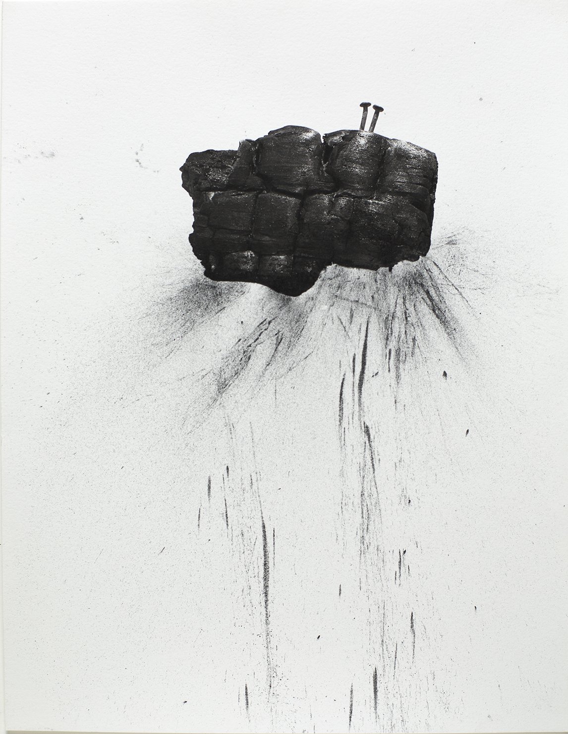
18. Carbon Portrait No.1, 2023, archival pigment print, charcoal powder, 8.5 x 11 in.
19. Carbon Portrait No. 2, 2023, archival pigment print, charcoal powder, 8.5 x 11 in.
20. January 19, 2015 #1 (Agnes Martin/On Kawara), 2015, wood panel, flashe, nails, 12 x 12 in.
21, 22. The artist in her studio.
Lisa Pressman
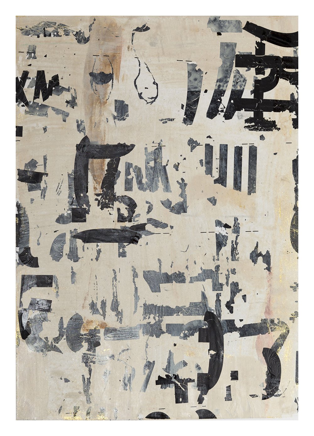
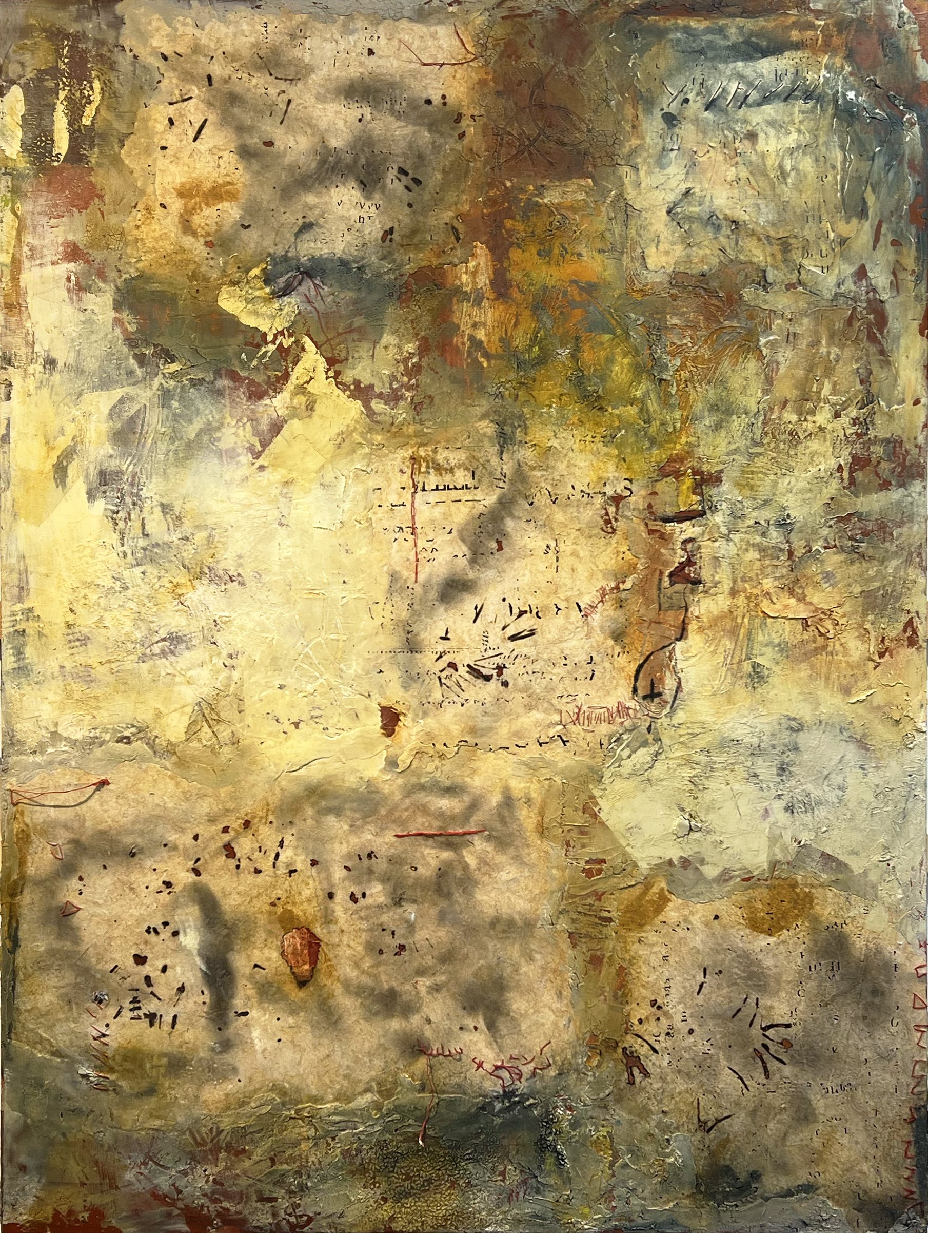
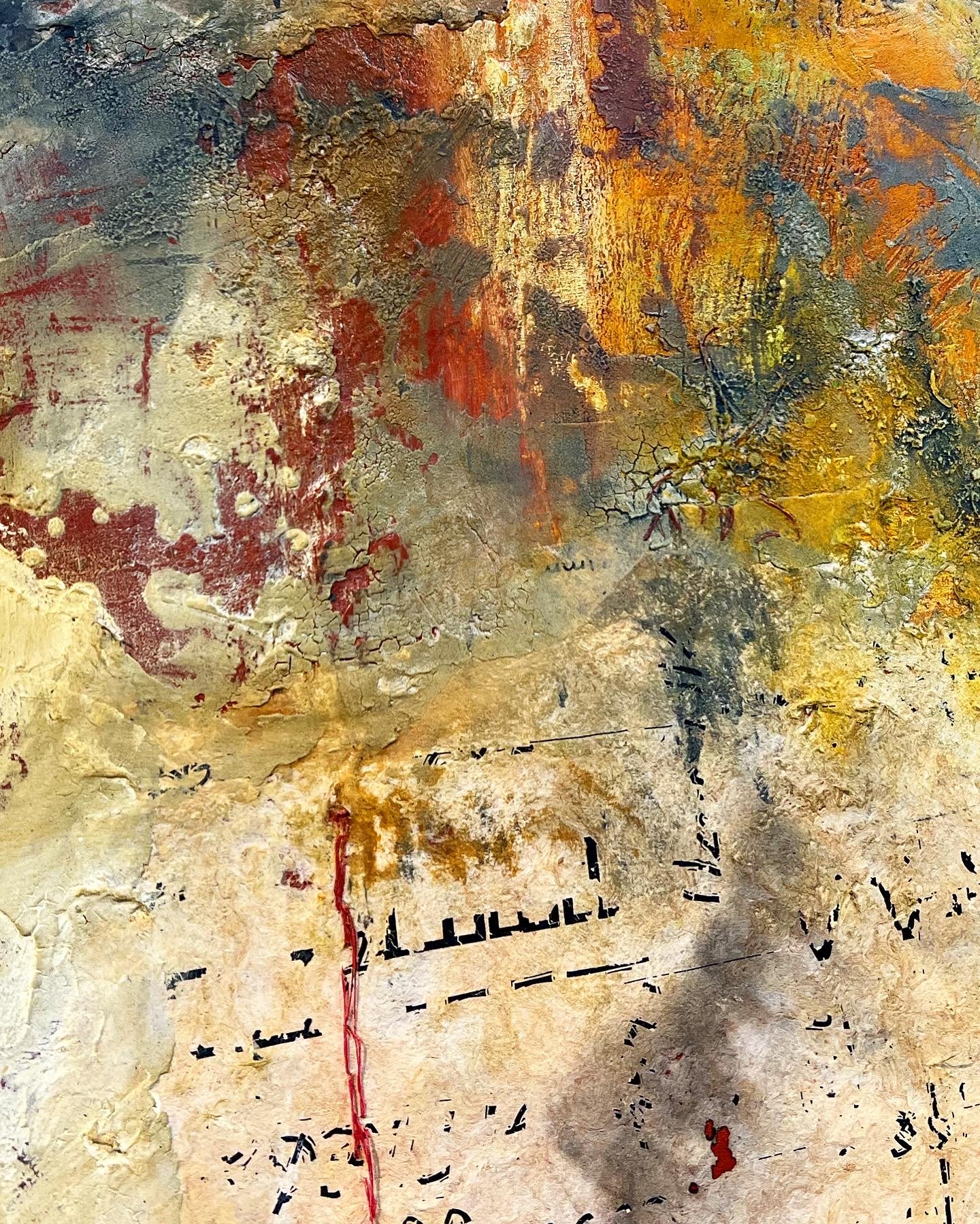
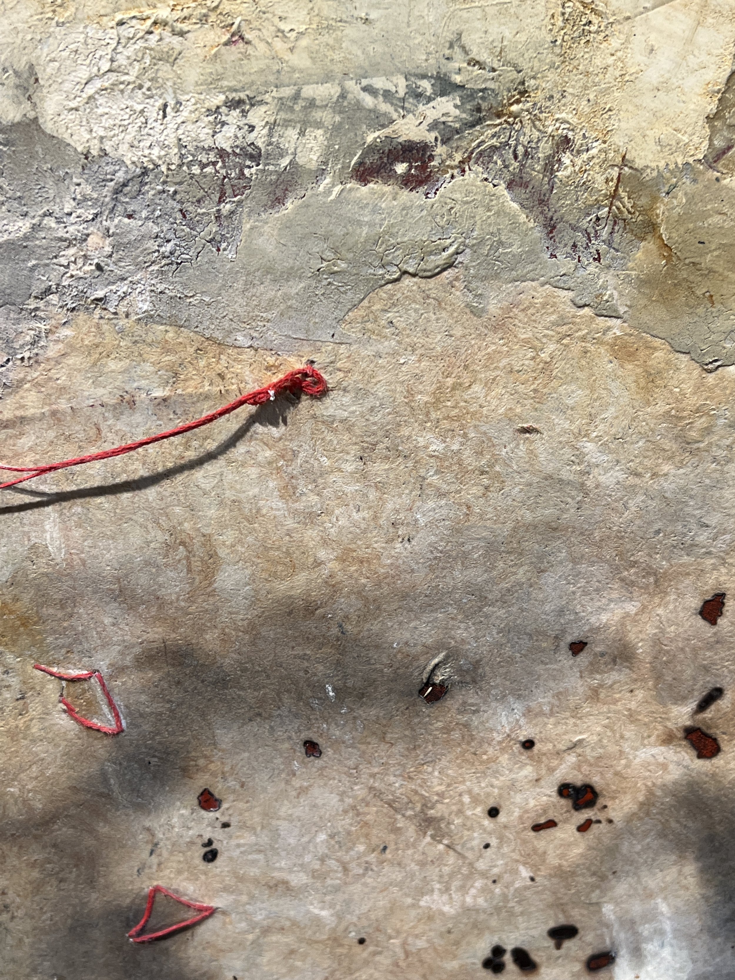
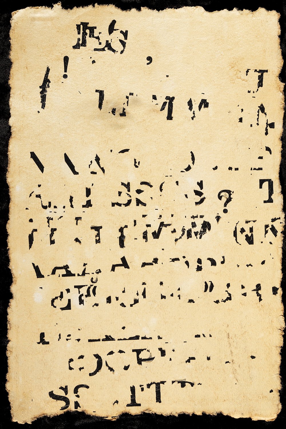
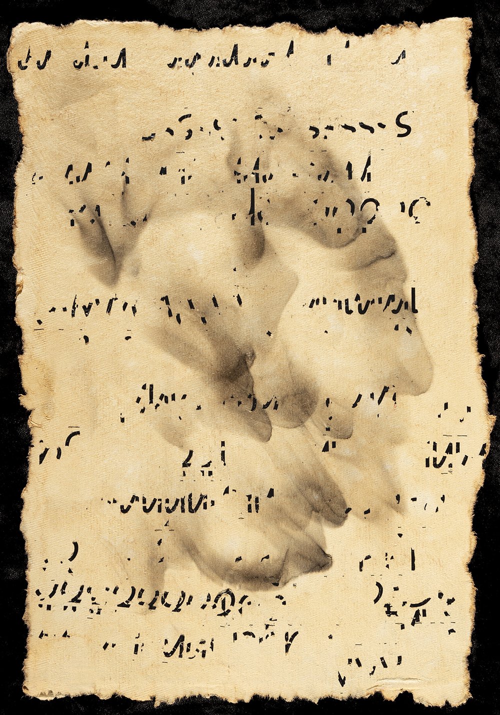
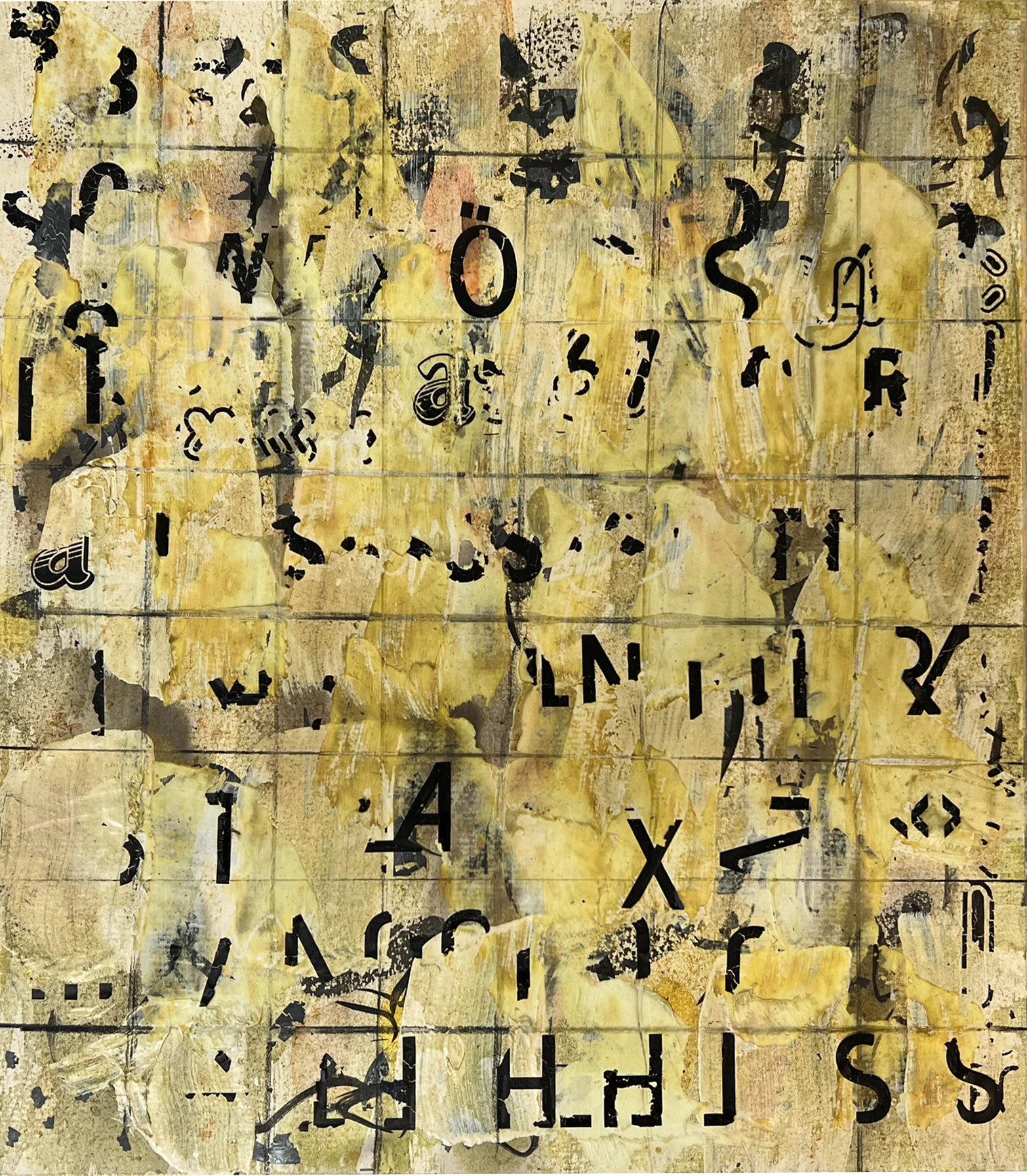
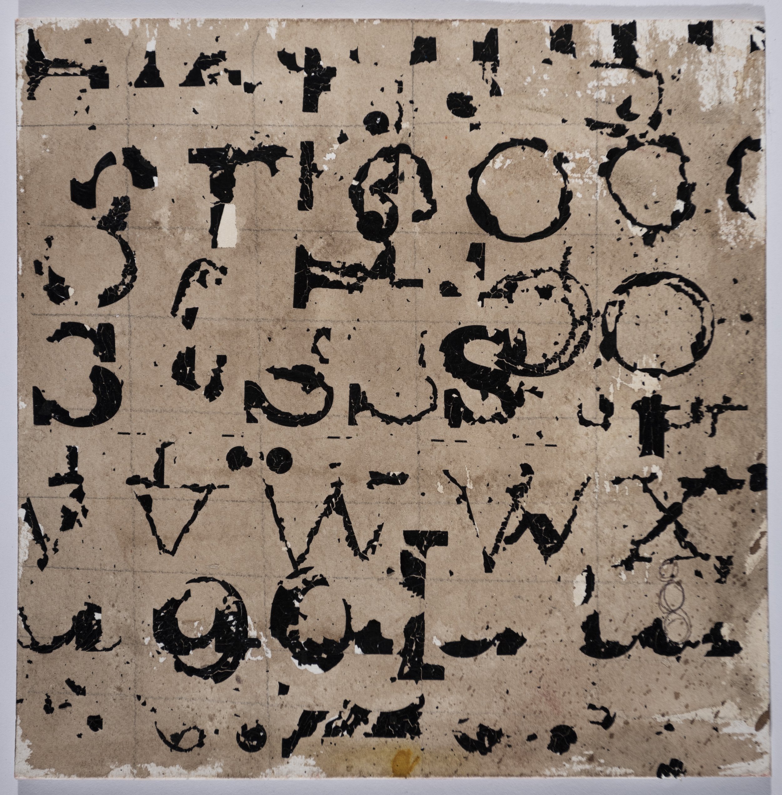
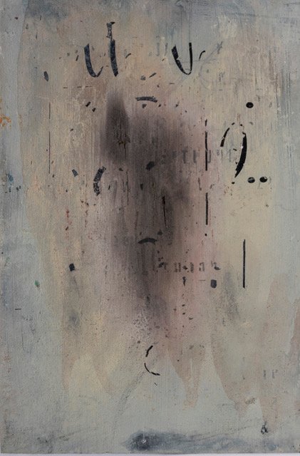
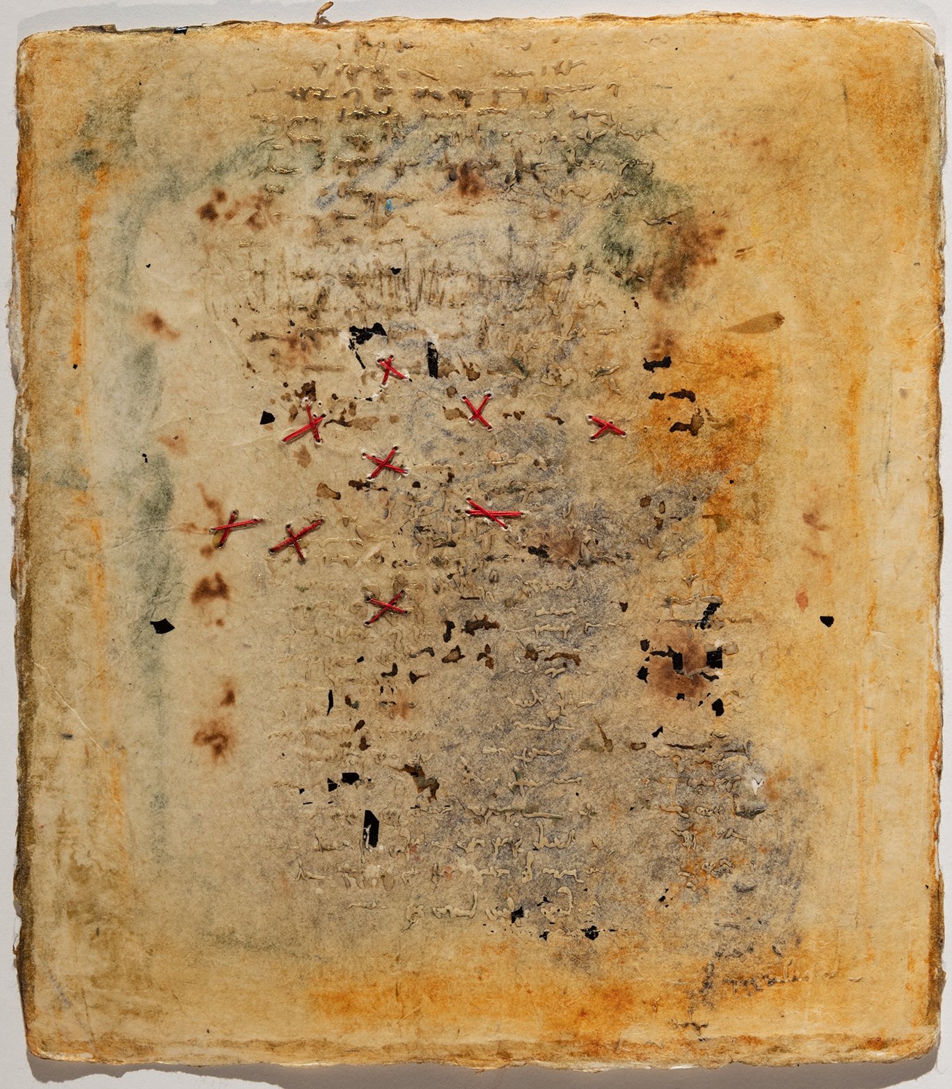
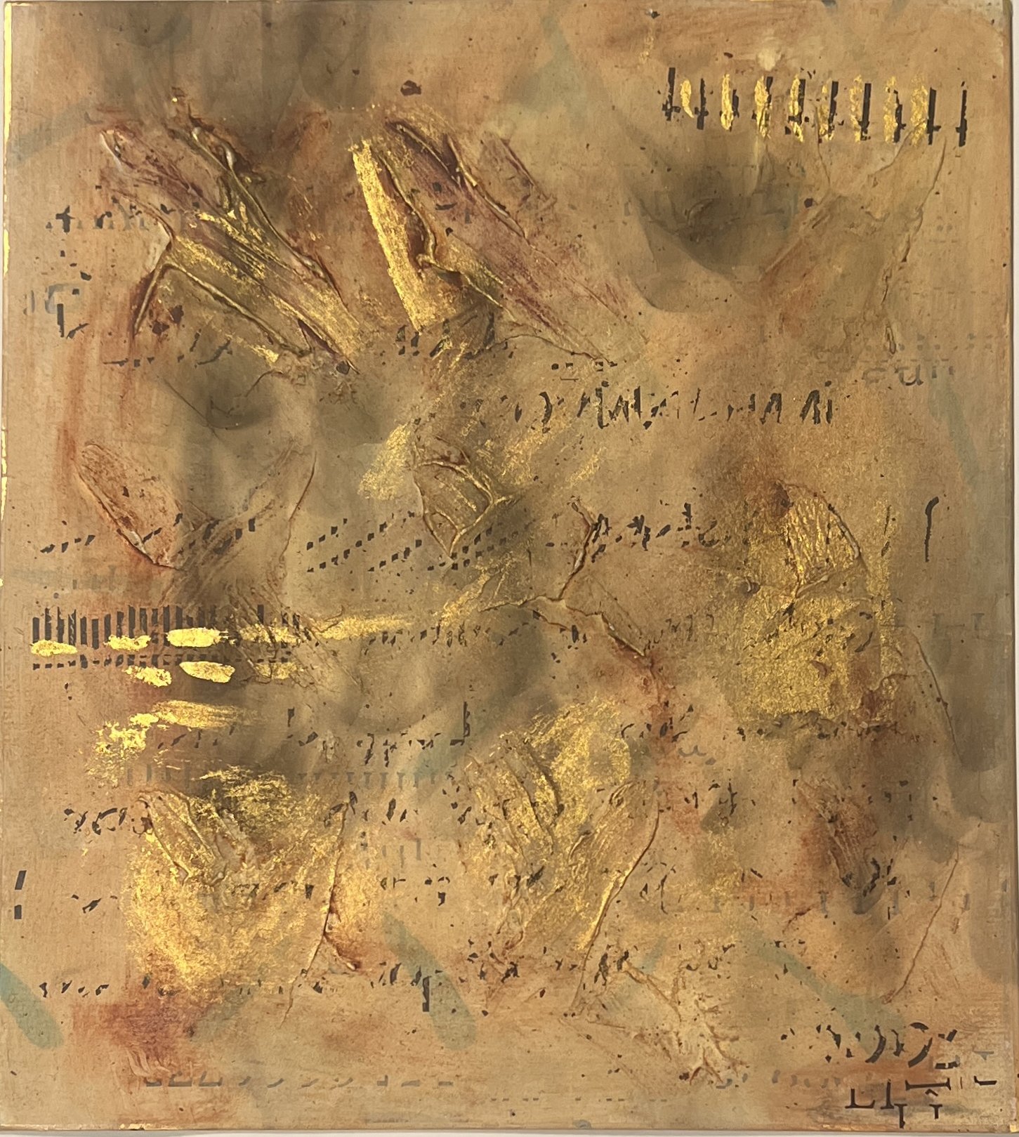
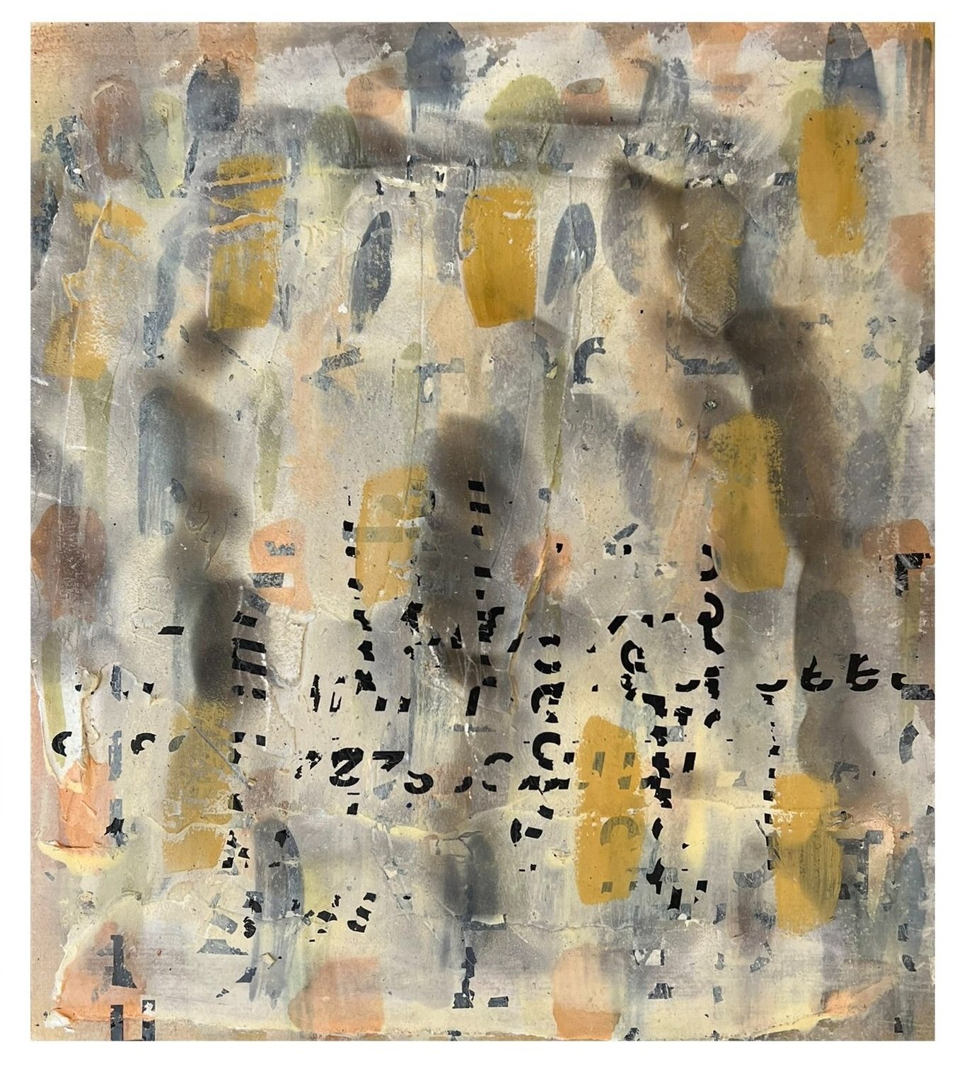
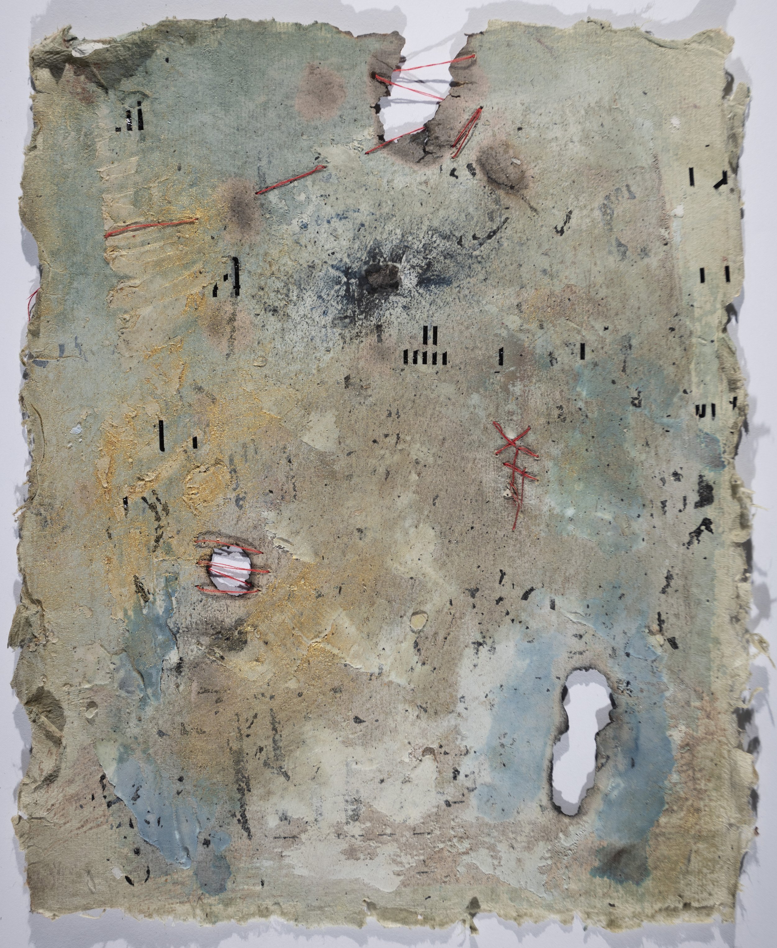
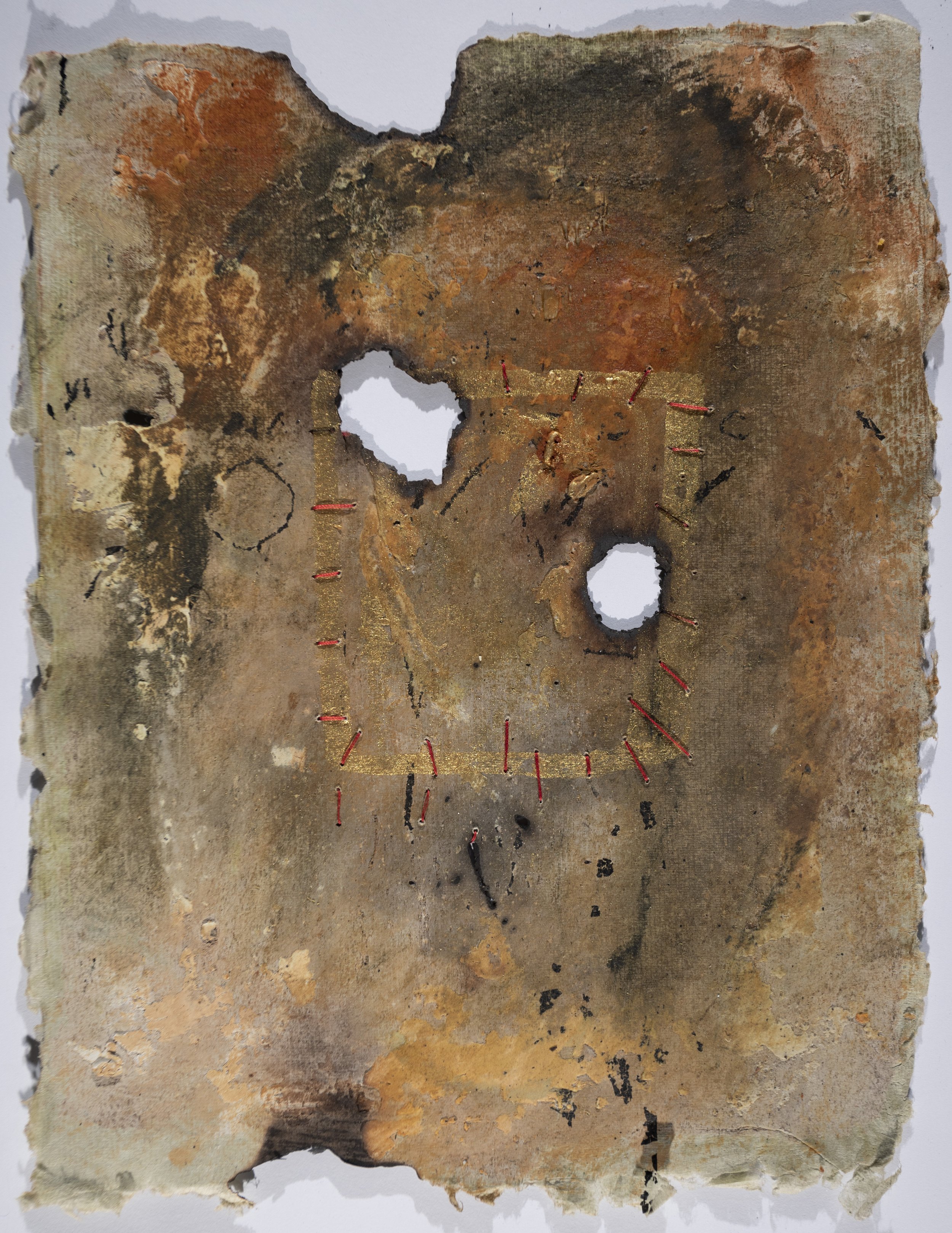
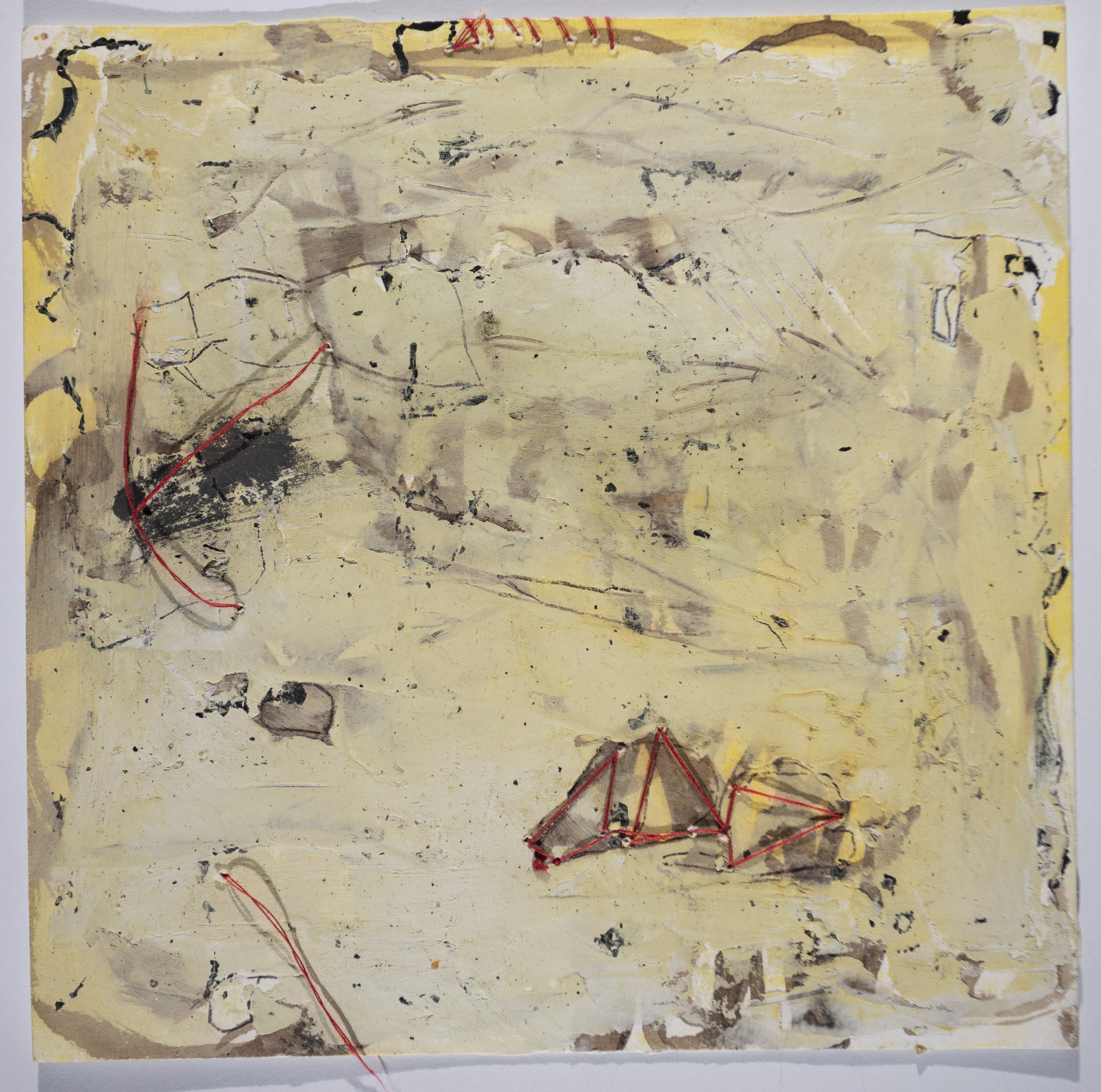
Lisa Pressman’s paintings are explorations of the human condition, with all its triumphs, frailties, and baggage. Her experimental use of materials is visually arresting and seemingly effortless, as she applies layers of translucent color and texture to achieve a rich, luminous surface. Pressman’s mastery over her medium is restrained rather than ostentatious; her paintings radiate with a golden light that is subtle yet seductive. She layers her paintings with encaustic, acrylic, and a variety of mediums and grounds, then digs into them with razor blades and clay tools, as if excavating our deepest emotions. The work is burnt with incense, sewn with suture-like stitches, and covered with a cryptic text that reads as an excised variant of our Roman alphabet. These hieroglyphs are composed of fragmented fonts that are vaguely familiar, but it’s no use trying to decipher them, as their meaning is impenetrable. It’s unclear what Pressman is trying to tell us, or if she knows herself. She appears to be channeling messages in a tongue that bypasses the intellect and speaks directly to the heart. Pressman is fluent in the language of grief, having experienced tremendous loss in her life. Her work is emotionally intense, laden with the acute joys and sorrows that can only be accessed through profound suffering. She shares her journey with a deep generosity of spirit, and we want to travel with her, knowing that on some level it’s our journey as well. Pressman’s work has a ritualized aspect, and we sense that in her process – paint, stitch, burn, repeat – she’s working something out on a transpersonal level. Her paintings have a rhythm, language, and function that remain an enigma, but through them we recognize that our own suffering, past and future, is neither solitary nor in vain. Indeed, in the extremities of our human experience, we all speak the same language.
MH: Your paintings are comprised of many layers, and there are passages where the material becomes very dense. How do you approach your work, and is process important to your practice?
LP: Process is extremely important. The process is about building the history of the piece, of what goes on and what covers up, of what conceals and what reveals, and this applies to anything I’m working on. Process is especially important now as I’m burning, smoking, and stitching the material, and even with the paint, where I’m layering in color, scraping into the surface, and so forth.
MH: The building up of layers, and then scraping into them, feels like an excavation of sorts. Are you searching for something? Is it a formal inquiry, or does it feel more metaphorical? Possibly both?
LP: Yes, absolutely both. Sometimes I’m searching for the magic moment that might be underneath, formally speaking, and with the oil paintings I’m searching for an image or something to reveal itself. I keep digging and digging until I find something that I can work with, a shape or a quality of light, that kind of thing.
MH: At this point in your career as an artist, do you feel confident that you’ll find it?
LP: If you’d asked me a year ago, I’d say absolutely! At the moment I’m having some doubt around it, but I definitely feel confident in my investigations, whether with the material or image. It’s an ongoing process, and the questioning is part of it.
MH: So it’s not always a given that you’ll come up with a good piece?
LP: It’s not always a given. Except that I’m very persistent, and I have no problem painting over something. My motto is when in doubt, paint it white (haha). I rarely throw a piece out, and I have piles and piles of work, so I don’t feel like anything is too precious.
MH: Your studio practice also consists of burning, sewing, melting, and smudging with incense. In addition to achieving a wide variety of marks on your surfaces, this starts to sound like a ritualized process. Do you ever approach your work as ritual?
LP: I never did until after my son Sam passed away in 2019. Now I feel connected to the idea of ritual, incense, burning the paper, rolling the ashes – it captivates me. I taught a class with my working partner Susan Stover on Meditative Practices in Contemporary Art, where we looked at a lot of work that has to do with burning, sewing, repetitive text – practices that relate to ritual. It inspired me to approach my work differently, not just as a formal painter. Like today I was in my studio burning incense, and the embers fell on my paper and burned holes in it, which was very satisfying.
MH: What’s the difference between process-oriented work and ritual-based work? Do you make a distinction between the two, or does it all run together?
LP: I never had a connection to ritual until recently. I was connected to material and process and the way I painted, with a lot of repetitive mark making that felt contemplative. But in the past few years the specificity of the materials that I’m using has lent themselves to ritual.
MH: Does your stitching have a ritualized aspect? Or is it more meditative? In some of your pieces, it feels like you’re mindfully mending something, almost like a suture on a psychic wound. How do you think about the sewing and thread?
LP: Yes, it’s meditative, and there’s a mystery about it. I like the idea that the stitching moves in and out, in front and behind, and there’s that sense of suturing, of mending something intangible. I also like the idea of stitching as bringing disparate things together, and I use red thread that has symbolic associations. In Buddhism red is a sacred color, the color of the life force, and Jung talks about the red thread running through life. But primarily it’s an aesthetic choice; it just feels right for me, and it’s healing.
MH: Yes, you spoke of the healing properties of color. Would you talk about that?
LP: After my mother passed away, I was in the studio, and it was a dark, depressing day. I was working with encaustic, and I decided to try using color to make myself feel better. So I created this amazing yellow painting that totally was the opposite of how I felt inside, but looking at it evoked positive emotional changes. I was able to respond differently, and that’s something that I’ve been focusing on.
MH: Do you think about this when you choose your color palette?
LP: The new work has color, but it’s understated, maybe because I’m getting older and learning more about color all the time. I’ve always focused on is having the color look like its coming from within, so there’s a glow or a sense of light that emanates from the painting.
MH: Right, I see that in your work and it’s very mysterious. How do you get that effect?
LP: I start with a warm, transparent ground, then I layer opaque and transparent layers, both warm and cool, building up the surface so that when I scrape into it, I’ll be bringing back what’s underneath. So the warmth or “glow” comes from the first layers that I put down.
MH: You must have to plan ahead, like chess moves.
LP: I don’t really plan ahead but I have a way of building surface that works for me. But it’s just call and response. I generally know how the layers will respond, but I never really know what’s going to happen; there are always surprises. Teaching has helped me figure out what I’m doing. I like using a razor blade to dig into the surface, and I sometimes use a clay tool. I sometimes call myself a “visceral materialist” because I relate to materials in any form, and my process is deeply intuitive.
MH: The thing that first drew me to your work was your distinctive use of text. It’s intriguing how you use language, text, and letters while avoiding specificity of any kind. The marks seem familiar, but as we move in close to decipher them, we cannot penetrate their meaning. What’s your thinking behind this?
LP: I’ve been using text for a long time, and the writing was always unclear. After my son passed, the writing became even more obscure, as I didn’t particularly want to share my grief. I didn’t want to go into the truth of how I felt. I like the mystery, the idea of something; I can hint at what I’m feeling without having to tell everything in the work. There’s a connection between what I’m communicating with the text and what you see and feel.
MH: I love your spare use of text. The emotion, the deep sensitivity, it’s all there in the writing, but if it was literal, it would be too much. It creates its own language.
LP: Yes, to me it looks more like mark making, and I like that. The other thing I’ve done is to write in smoke, and I also add full letters or commas in the Letraset typefaces, which are recognizable.
MH: I’m also intrigued by your process of applying text to your paintings, which creates an enigmatic calligraphy that’s just one step removed from our English language, and therefore recognizable, but it’s veiled and we cannot access it. You seem to want us to try to penetrate its meaning.
LP: I think of it as a beacon. You may not be able to read it, but you identify with it as a human being.
MH: Do you think it’s possible that when people look at your paintings, on some deep level they know this language? Is it the language of grief?
LP: Probably. Someone was looking at one of my pieces once who didn’t know anything about my work, and she said to me, I’ve got to have this, it reminds me of my late mother. I’ve always wanted to have that kind of emotional response to my work, to touch someone on that level. I want to make art that makes people feel something.
MH: It sounds to me like it’s important for you to have a heart connection, rather than a conceptual connection.
LP: Absolutely. When I was a young artist and trying to figure out what kind of work I wanted to make, I saw the work of Eva Hesse, and I knew that was it. I wanted to make work that made people feel, as opposed to think or overthink. It’s about human connection. I mean, I know that concepts are supposed to be important in an artist’s work, but I’m more interested in the heart connection.
MH: I think most artists are. The cerebral approach is interesting to talk about at dinner parties and art openings, but underneath it all, the heart connection is what people really want.
LP: Yes, and a sense of recognition, like this is something I can relate to, even if it’s not specific. A person gets the sense of a work of art, and they relate to it from their own experience of life.
MH: Do you think that by making the text unreadable, you’re communicating more? It seems to me that language almost gets in the way when it comes to communicating the deeper issues of the heart.
LP: Absolutely. I have a series called After Words, which refers to this. At some point words get in the way, because they’re too defining; they can constrict and limit a deeper understanding.
MH: I suppose if you were to write literally what you’re thinking and feeling, it would be like a Hallmark card.
LP: It would be corny and unnecessary, and it would get in the way.
MH: But there’s also the argument that if you don’t give some insight into the work, will the viewer get it? Unless they’re really tuned in, they’re probably not going to. So how do you handle that?
LP: It doesn’t bother me. I think the viewers don’t need to know the story, but they can intuit that the thread, burning, and language suggest something else going on. Something is trying to be communicated. It doesn’t have to be grief, it can be from another planet, another world. Hopefully the work stands on its own without the story.
MH: In a sense the artist creates the work, then gets out of the way. Because as we all know, artists are prone to getting in their own way.
LP: I like to leave it open. You don’t have to tell the viewer everything. You can leave something out, and I think that’s the same with the text. There’s enough left out, but there’s enough there to give the viewer a glimpse.
MH: Right, and the other thing is that if you tell the viewer your story, then that becomes what the piece is about. They don’t have the opportunity to put their own narrative on it, which may be more interesting than yours. The artist has to back off and trust the viewer to have her own experience.
LP: My mother took me to the Met a lot when I was a kid, and I remember being drawn to the Chinese scrolls. I didn’t know what they said, but they spoke to me, even though I didn’t understand them. There was magic in them, a mystery.
MH: I know that you’ve suffered tremendous loss in your life and have had to deal with unimaginable pain. How has your studio practice helped you through this?
LP: It gets me out of my head, which goes back to the practice of doing and making as a means toward healing, mending. In theory, if you engage in a creative practice, then perhaps the healing happens on its own.
MH: Do you think that sewing helps with healing? Or any kind of repetitive activity like that?
LP: I don’t know if it’s the sewing. If it was that, then I could just embroider. I think it’s the creative catharsis of material and making that’s healing. And my son was an incredible artist himself, so that’s a big connection for me.
MH: Of all the different materials that you use in your work – color, language, sewing, burning – is there one that you feel most drawn to, or is it all of a piece?
LP: It depends on whatever I’m working on. I do these limited palette paintings that are so immediate, and they’re captivating for me because they’re the opposite of all this other stuff that I’m doing. Today I was using incense and burning and moving around like a crazy person, and I’ve also been experimenting with acrylic. I’m really excited about my explorations with color. It’s kind of magical.
MH: What’s the best part about being an artist?
LP: I like the investigative quality, what happens if I do this or try that, and then I appreciate the surprises that happen along the way. I learn a lot about my own life from how I work in my studio. Being involved in the process and working things out is a metaphor for life. And then there’s the freedom. It’s the only place where you can do whatever you want – it’s absolute freedom.
www.lisapressman.net
To learn more about Lisa Pressman’s teaching courses and C2C Art Projects with Susan Stover, click here.
IMAGE LIST
1. Messages I, 2020, ink, Letraset on paper, 12 x 9 in.
2. What Remains, 2023, oil, paper, thread, smoke, wax, Letraset on panel, 48 x 36 in.
3. What Remains, detail
4. What Remains, detail
5. After Words 13, 2023, smoke, Letraset on paper, 12 x 9 in.
6. After Words 14, 2023, smoke, Letraset on paper, 12 x 9 in.
7. The Beginning, 2023 oil, ink, Letraset on paper, 8 x 8 in.
8. Creating Language, 2023, ink Letraset on paper, 8 x 8 in.
9. After Words 5, 2022, oil, ink, Letraset, burns on panel, 6 x 4 in.
10. The Letter, 2022, oil, thread, ink, smoke, Letraset on handmade paper, 17.5 x 15 in.
11. Letter 3, 2022, oil, ink, smoke, Letraset on board, 12 x 10 in.
12. We Are Here, 2023, ink, smoke, wax, Letraset on board, 12 x 10 in.
13. Manuscript 2, 2022, oil, thread, smoke, ink on handmade paper, 17.5 x 15 in.
14. Manuscript 1, 2022, oil, thread, smoke, ink on handmade paper, 17.5 x 15 in.
15. In the Space, 2023, smoke, thread, watercolor, Letraset on paper, 8 x 8 in.
16. What Happens After, 2019, encaustic, 12 x 12 in.
17. Excavating Light, 2019, oil and wax on panel, 10 x 10 in.
18. Things That Were Never Said, 2021, encaustic, 30 x 30 in.
19. Limited Palette 1, 2023, oil on paper, 5 x 7 in.
20. Limited Palette 2, 2023, oil on paper, 5 x 7 in.
21, 22. The artist in her studio.
Barbara Friedman
In her current show at Five Myles in Brooklyn, Barbara Friedman explores the tenuous relationship between pure abstraction and painterly figuration. “The Hysterical Sublime” consists of a series of formal color field paintings that appear to have been hijacked by a legion of zoomorphic creatures. In a dual process of discovery and intervention, Friedman liberates the creatures from the paint, endowing them with enough agency to administer to each other’s needs. The creatures make us feel slightly uneasy as they confront our curious gaze, but Friedman seems to regard them as her allies, despite the havoc they’ve wreaked upon her pure color fields. But maybe that was her intention all along—namely, to turn formal painting on its head and poke fun at it. She readily admits that the creatures are ridiculous, illogical, and skeptical of art movements. They’re about intimacy and connection rather than the critical concerns that characterize nonrepresentational painting. The anthropomorphized animals imbue the paintings with heartbreaking humanity, making it hard to look at them and harder to look away. Whether by accident or design, Friedman paints a portrait of our species more relatable because her subjects are animal rather than human. While we’ve become woefully inured to the afflictions of our fellow humans, few among us can bear to witness the suffering of an animal. But I may have it all wrong; the creatures may not be like so many actors in a Greek tragedy. They may be perfectly content in their two-dimensional habitat, blithely chomping their way through fields of pigment and mocking any attempts at critical art theory. If Friedman’s would-be color field paintings have indeed been usurped by snakes, snails, whiskers, and whales, it’s doubtless for our benefit. The art world won’t suffer the loss of another purely abstract painting, but it can surely afford to take itself less seriously.
MH: Your canvases are very painterly and hover on the edge of pure abstraction, but for the mythic animals that emerge and hijack your paintings. Who or what are these creatures, and when did they first make an appearance in your work?
BF: I love the word hijack! And the creatures really do hijack my recent paintings, because they start off as pure abstraction but once the paint dries fully, the creatures emerge. Before the pandemic I would paint something that I would then eradicate and allow to mutate into something else. I no longer start with a preconceived image, but with as little intervention as possible, I bring out the imagery that the poured pools of oil paint seem to suggest.
MH: There’s a Hieronymus Bosch vibe in your work, where the creatures seem to have considerable agency and intelligence. I’m thinking of the lobster, who’s drinking the melted butter that he’ll later be dipped into. And he’s aware of it, which makes my heart hurt. How do you think about them?
BF: I like the ridiculousness of the creatures. It’s about their interconnection – they’re hanging over each other, breathing into each other’s mouths, kissing, licking, all the things we aren’t allowed to do. The lobster is particularly maudlin, and I rendered the bowl of butter concretely, which is unusual for this series. I felt that it needed something there formally. It’s about desire, intimacy, fear.
MH: The imagery expresses a deep pathos, as if the creatures are making the best of a situation beyond their control. Which could also describe the human experience, as we flail about and try to make sense of our abstract existence. Do you ever think of them as self-portraits, or profiles of humanity?
BF: Yes, absolutely. I’m not sure where the distinction lies. I think they’ve merged with each other, and there’s an interspecies merging as well. I see them as hybrid creatures that harness the vastness of the abstraction. They’ve escaped from a toxic environment, because they emerge from oil spills, and yet they still have souls.
MH: They do have a toxic feel to them. And they’re a little threatening! It’s unsettling when an animal has that much agency.
BF: I love the idea of them having too much agency!
MH: Right? A cat is cute when it’s curled up on your lap, but you’d be uncomfortable if it started walking around on its hind legs with a pair of scissors. And that’s how I feel about your creatures; I’m trying to feel good about them, but their intelligence makes me uncomfortable.
BF: Haha! Honestly, these paintings are odd to me as well. But I do have this figurative impulse, and I think there’s also love and intimacy between the figures. But I’ve never told stories that were anything but open-ended.
MH: Do you have any insight into why you see animals in your paintings rather than, say, trees or tangerines?
BF: I wanted to take the whole painting and with a few interventions, turn it into something specific, something that seemed inevitable, like it had to be this thing. At heart I’m a portraitist; I was the kid who drew faces in fifth grade. So it was interesting to harness the paint and nudge it into something. It’s like pareidolia, where you see recognizable forms in random patterns. What I saw were these creatures and their interrelationships.
MH: You said that you sometimes refer to your work as “contaminated color field paintings”. What do you mean by this?
BF: I want them to be viscerally satisfying as color field paintings, then I want to thumb my nose at the seriousness of it. Adding the figures is exactly what you’re not supposed to do! The last thing that most abstract painters want is to have any perceivable imagery in their paintings. If they think something looks like a bunny rabbit, they’ll immediately change the painting. I’m doing the opposite, and that’s what I mean by contamination. But I want both to coexist if possible.
MH: Do you think that’s possible? Can a work be completely abstract and have imagery?
BF: Probably not, but I’m not interested in making purely abstract paintings. I love pure abstraction, but then I want the imagery to snap into focus. I may have an idea of where I want the painting to go, but it doesn’t always go in that direction. Each painting is unique and has its own life, and then it becomes just about making it work on a formal level.
MH: The creatures are quirky and painterly, but they’re somewhat distracting. They may interfere with one’s ability to relate with the painting formally.
BF: A lot of people feel that way, and it frustrates me sometimes. Like if someone was to refer to me as the artist who paints animals, I’d hate that. I feel like my work operates on many levels, including the formal.
MH: I suppose pure abstraction without any figuration can be sublime, but it’s not very relatable. By adding these creatures, are you making the sublime more accessible?
BF: Yes, there’s the desire for relatability, for contact and connection – to reach across an abyss. There was a lot of opacity in my family when I was growing up, so there’s a part of me that wants to reach out to people and connect.
MH: Right, I can see how your paintings could establish a horizontal connection with the viewer. Do you also think about vertical connections?
BF: You mean spirituality? I’ve been told that I’m deeply secular, which is really sad, if true. I’m very skeptical by nature, but I don’t sit happily by it.
MH: When you’re in your studio and in the flow, do you feel any kind of vertical connection, like something’s coming through you? Not in a religious sense, but like you’re tapping into something ineffable?
BF: Yes, totally. But I don’t know how to ascribe that. I’m a very romantic painter, and I act on essentialist assumptions that are so modernist and retrograde. I feel like I’m searching for something…
MH: Maybe it’s neither a horizontal connection with other people nor a vertical connection with some deity – maybe you’re just connecting with your creatures!
BF: Hahaha! Maybe, but whatever kind of painting I’m making, I feel like there’s a secret to be found, something waiting to be pulled out. I just don’t know the way there, so I have to keep digging until I find it. And that’s what keeps it interesting.
MH: What you’re describing requires some magical thinking! You’re diving into these paintings with the faith that you’re going to find whatever’s in there, waiting to be excavated. So maybe you’re not so deeply secular after all.
BF: It’s totally magical thinking. I approach art making completely through magical thinking – I want to be surprised. I’m looking for the accident that charts the way forward. It’s the only way I enjoy working; otherwise, I’d just be illustrating an idea, and my ideas aren’t that interesting.
MH: So you start a painting in search of something, and all along the way you make allowance for accidents to disrupt and detour your process. It seems that what you’re searching for is a moving target.
BF: Oh, it’s always a moving target. But this is how I’ve always worked, I’ve just done it in different ways. All my characters and creatures happen during the process; they offer themselves up to me along the way.
MH: You’ve said that you want to make your work funny and ridiculous, and at the same time you want to “harness the sublime”. Are they the same? The ridiculous and the sublime?
BF: I want to see the ridiculous in the sublime. Maybe I’m also mocking the sublime, toying with it, bringing the lofty down to size. But it’s still lofty! I’m not destroying it, I’m humanizing it.
MH: Do the creatures give you something to push against?
BF: I’d say that the abstraction gives me something to push against. It’s a back and forth process, and very angst-ridden. I do the initial pour with lots of turp and pigment, then when it’s dry, I intervene with the imagery, then I’ll go back and pour again, reestablishing the abstraction. So it’s really the abstraction that I’m pushing up against.
MH: Do you think that pure abstraction is better suited to take the viewer to an elevated state, simply because there’s no visual noise? Or would a landscape or dog portrait do a better job because they’re more relatable?
BF: It’s a great question. I think either can do the job, and I can have a transcendent experience through either. It’s totally subjective.
MH: The title of your show is “The Hysterical Sublime”, which is from an essay by Fredric Jameson. What was Jameson referring to, and what about this is intriguing to you in reference to your paintings?
BF: It's Jameson's phrase that gripped me rather than his analysis of the phenomenon that it names. I don't think he’s imagining the old kind of sublime, which would be something higher and grander. Jameson is suggesting that human beings have constructed an elaborate culture that keeps us estranged from nature, and that this construction is itself overwhelming. His essay intrigued me because it seemed to be pointing to what I was playing with, and there’s an element of hysteria in these paintings. I feel like I'm in dialogue with natural objects and processes, and yet aware of how my side of the dialogue is itself a massive construction.
MH The creatures that emerge from your paintings appear to be hysterical. Are they also sublime? And do they offer you the possibility of transcendence?
BF: I agree that they're hysterical creatures. I find them to be sublime too, in the sense that their appearance in the paintings is beyond my control. But I don't imagine people feeling like the paintings take their breath away, in that sense of the transcendent. The creatures are hysterically sublime in the sense that the art making is hysterically overwrought.
MH: What’s the best part about being an artist?
BF: I think we all love the psychological and intellectual freedom. It really does feel like you don't have to grow up. But I would also say that I love the kind of learning that such freedom makes possible, which is very much an accumulative learning. This just gets better with age. So now, after however many years of painting, I can feel as though what I do in the studio brings together everything I have learned in past years, both from my own work, my reading, my life experiences, as well as from all the art by other people that I have taken in.
www.barbarafriedmanpaintings.com
“The Hysterical Sublime” is showing at Five Myles through September 5th. A closing reception is on September 5th, 5:30-8:00 p.m.
IMAGE LIST
1. Nut Job, 2021, oil on linen, 44 x 37 in.
2. Whispering Sweet Nothings, 2023, oil on linen, 37 x 28 in.
3. Prize Pig, 2022, oil on linen, 28 x 37 in.
4. Mouse King, 2021, oil on linen, 44 x 37 in.
5. Early Bird, 2021, oil on linen, 44 x 37 in.
6. Pressed, 2022, oil on linen, 44 x 37 in.
7. Blue Spittle, 2022, oil on linen, 44 x 37 in.
8. Sniff, 2023, oil on linen, 44 x 37 in.
9. Why the Chicken Crossed the Road, 2023, oil on linen, 37 x 44 in.
10. Very Like a Whale, 2021, oil on linen, 37 x 28 in.
11. Lobster Sipping Butter, 2022, oil on linen. 37 x 28 in.
12. A Blooming, Buzzing Confusion, 2022, oil on linen, 37 x 28 in.
13. Milking Courbet, 2023, oil on linen, 28 x 37 in.
14. Resuscitated, 2023, oil on linen, 44 x 37 in.
15. Enjambment, 2020, oil on linen, 48 x 60 in.
16. Visitation, 2019, oil on linen, 24 x 36 in.
17. Clinging to the Truth, 2018, oil on linen, 36 x 24 in.
18. Window View – Pinocchio Waving, 2016, oil on paper, 30 x 22 in.
19. Little Big Collar – Orange, 2014, oil on wood, 6 x 6 in.
20. Big Collar on Red with Slipping Head, 2014-16, oil on linen, 22 x 22 in.
21. Big Collar at Night with Green Horizon, 2015, oil on wood, 28 x 24 in.
22. The artist in her studio in Manhattan.
23, 24. The artist in her studio in Samos, Greece, 2023.
Eleanor White
Eleanor White’s tactile works on paper may be best described as sculptural paintings, or painterly sculptures with collage elements. One of the striking features of White’s work is her use of non-traditional materials, which read as ingredients in a science experiment or herbal brew: crushed lapis lazuli, porcupine quills, dandelion seeds, eggshells, shed snakeskin, dog hair, copper, and a pinch of spodumene. In “Prima Materia”, the current show at the Aldrich Contemporary Art Museum, White was commissioned to create two works using lepidolite, the mineral most abundant in lithium. This is the metal that you’ve been hearing about in the news, in high demand due to its use in rechargeable batteries. White’s works address the proposed lithium mine in northern Nevada, a 1,000-acre site known as Thacker Pass, as it threatens to devastate the tribal land on which it’s located. As in all her work, White went down a rabbit hole with this project, translating her research into a visual language that conveys the beauty and controversy associated with lithium. Indeed, the glittery bling of the material casts a long shadow across the Nevada landscape, which the Shoshone and Paiute tribes claim as their ancestral burial grounds. The sparkly purple of the lepidolite momentarily distracts us from the critical issue – namely, the disregard of the U.S. government in permitting the mining corporations to enter this sacred land. White takes advantage of the mineral’s optical allure to make it difficult for us to look away, and we want to engage further in the unfolding narrative. In other recent works, she creates geometric patterns using solid materials that contradict their transient substrate (crushed gems on paper grocery bags) or juxtaposes precious stones with common materials (lapis lazuli and eggshells), crushing both into granular, indistinguishable substances. White effectively levels the playing field, suggesting that all materials possess equal value, with comparable susceptibility to the laws of entropy. Whether objects of beauty or catalysts of controversy, White handles her materials with the same respect, embracing the complex issues that they signify. From rare stones to paper grocery bags, all organic materials are precious and mined at a great cost to the planet and its inhabitants. While White states that her work is not intentionally political or environmental, it invariably transcends aesthetic expression and raises complex issues that haunt us well after encountering her work.
MH: In your work you use materials that aren’t generally associated with two-dimensional work, including crushed stones, dog hair, and porcupine quills. How did you come to use these unusual materials? What was your inspiration?
EW: It naturally comes out of my sculpture practice. I’ve always used unusual materials in my three-dimensional work, but for lack of space a few years ago I started working on paper. It’s not exactly painting, but I’m working with a thick medium, and I’m moving it in the direction of sculpture.
MH: Do you think of your works on paper as sculptures? They’re sort of between two and three dimensions.
EW: Yes, because I’m using the same techniques: casting, collage, and so much is about the materials and my curiosity around working with them.
MH: The materials you work with are unfamiliar to most people. Like, most people have never heard of spodumene. Has this been a process of discovery for you? And is the research part of your practice?
EW: Minerals such as lepidolite and spodumene have been a point of discovery for me, as they’re a source of lithium, which is so controversial right now. The element lithium is what my two pieces in the Aldrich show are about, and they were very much research based. Before that, I was working with crushed gemstones, so it was a natural jump. But the deep dive into lithium has been interesting because it’s a current subject in the news, and it’s one of the elements that’s come to the forefront in terms of importance for our future.
MH: Why is it so controversial?
EW: Resource extraction is controversial, especially for the indigenous people who have to deal with the devastation to their land. There’s a proposed lithium mine that’s in the beginning phase of construction in northern Nevada on land considered sacred by the Paiute and Shoshone people. This would be the largest domestic mine and a huge source of lithium for the U.S. Creating the pieces made me feel a lot of empathy for the affected communities, like how would I feel if it was the Hudson Valley that was about to be devastated?
MH: What made you start using the crushed gems?
EW: It came out of the desire for more permanence. I was using eggshells and ash, which captured the idea of impermanence, but I wanted to go in another direction by adding color to my work and using a more permanent material.
MH: Would you describe your process? What are the challenges around using these materials, and then attaching them to a surface?
EW: In my exploration of works on paper I started thinking about what I could do that’s not exclusively a painting: what do these materials have that paint doesn’t have? The crushed stones are granular, they have dimensionality, and I can mix them in a casting process with molds and medium. But the big challenge is coming up with the composition, so I make these little pieces and move them around the paper for a long time until a design emerges.
MH: Wait, you don’t mean that you make those little piles ahead of time, do you?
EW: I do. I cast them all on sheets of plastic then rip them off, then I can move them around on the paper to create the patterns. I started out doing it with stencils and did it in one shot, but I rarely work that way anymore. I’ll frequently have several pieces going at once because it can take so long to come up with the composition.
MH: I’m intrigued by the patterns that you choose. They seem at times to derive from Islamic geometry, and other times they read as complex mathematical charts. What’s the inspiration behind them?
EW: There’s inspiration from Islamic patterns as well as Japanese prints and their flattening of the patterns. What I enjoy the most about Japanese prints is and how they shift without any dimensionality; the design always remains flat. There’s also a lot of mid-century design that inspires me. Both pieces in the Aldrich exhibition are abstractions of aerial views of lithium mines in Chile which are structured as grids.
MH: The show at the Aldrich includes two of your works on paper. How did you feel about the work being included in this show? Was there any reluctance in having your work cast as Prima Materia? Does that feel restricting in any way?
EW: I’m absolutely thrilled to be in the show. The curator asked me to use lepidolite, because it’s one of the stones that contains the most lithium. The color was challenging, because it’s a very alluring light purple, so I had to find the right balance for this beautiful, sparkly stone. I felt like I needed something to create a push/pull, so I included tufts of hair from a person who has taken pharmaceutical lithium in the piece. It adds a creepy quality to the work, and I enjoy the balance of attraction/repulsion in the different materials. The purple piece “All That Glitters (is not gold)” involved research into a wide variety of materials that contain different forms of lithium. The other piece, “Between and Rock and a Hard Place” was me thinking about the Thacker Pass proposed mine site.
MH: There are a lot of metaphors that could be associated with your work. How do you think about it? Do you have a conceptual overlay, or is it more about the aesthetic appeal?
EW: It’s a combination of both. I want it to have aesthetic appeal, but I also want the work to resonate on a deeper level. I want people to think about it after they’ve left the museum, and to stay engaged.
MH: Does your work make any statement about the environment, the devastation of the planet, scarcity of materials, that kind of thing?
EW: Definitely. But I try not to be overtly political or heavy-handed. I don’t think that works for me.
MH: The angle that I’m most interested in exploring is the precious nature of your materials. Is that a consideration in your work?
EW: I do now! At first, I was drawn to them for the color, but now I’m thinking more about where my materials come from. It creates tension for me to think about it in this way.
MH: There’s the idea of high and low art, one being loosely based in a work’s market value, and the other more about pure expression, with no regard to marketability. I can see your work making a statement about this, but I don’t want to assign meaning if that’s not your intention.
EW: I’m not using gems for their value. I started using them because I thought they’d be more permanent. I was using playing cards previously and didn’t realize that the inks were fugitive. I didn’t think gems would fade or change, but as it turns out, some gemstones fade. But I see all the materials as equal in terms of the interest it holds for me.
MH: You did a series where you glued crushed gems to the brown paper bags that you get at the market. This material is non-archival and it’s an interesting juxtaposition between materials: one is precious, the other disposable. What were your intentions around this?
EW: I did those during the pandemic, and that was the paper that I had on hand. I wanted to do things much faster, because I wasn’t very focused at the time. I was also trying to loosen up, because my work can be a little formally tight, so it helped with that, and it also helped take my mind off the pandemic.
MH: Are you concerned about the longevity of these pieces? Does it matter to you that the acid will break down fairly quickly?
EW: I think about that in all my work. I talked to a conservator about artists’ materials, and their opinion was that artists should be more concerned about creative expression than anything else. But the idea of permanence, whether it’s conceptual or actual, is of interest to me.
MH: In what sense?
EW: How it relates to us, how it relates to time. And now I’m thinking about it in terms of whether I want it to be around, or if I just want it to dissolve. Leave no trace, right?
MH: That’s interesting. I’ve never heard that point of view before. Most artists obsess about which museum or landfill their work is going to end up in once they’re gone, but the idea of making something that will intentionally self-destruct is intriguing.
EW: Yeah, I mean there’s some guilt in making all this stuff and leaving it behind. When my work dissolves, the minerals will go back into the earth and the paper will break down. But using anything plastic-based is hard to reconcile.
MH: How do you feel about art being cast as a valuable commodity? Or the relatively new cultural phenomenon of branding? Are you good with it, or does it make your skin crawl?
EW: It definitely makes my skin crawl. It’s nice when someone wants to live with my work, but the commodification is hard to swallow, and the whole consumerist thing can be difficult.
MH: Right. Some of your materials are considered precious because they’re stones, which are commodities that people buy and sell. And lithium is a major commodity, which is probably super expensive?
EW: It might get more expensive if the demand for its use in electric car batteries increases. I think there could be a lithium rush. But the commodification of the stones – that’s not something that I’m thinking about. All the materials have equal value to me. I can be just as excited about working with beach pebbles or dirt as with garnets.
MH: It sounds like even though you’re using precious stones in your work, you don’t see the work as precious.
EW: No, and if the work looks precious, then it doesn’t have that extra thing for me. I don’t have a good association with the word “precious”.
MH: It’s a derogative term when it comes to art.
EW: Definitely. So I like to balance whatever preciousness is there with something else. Either some formal distance, or something that chills it out and makes it almost clinical.
MH: I can see that. The last thing that most artists aspire to make are objects or paintings that will be be sold in expensive department stores. Do you think that when art becomes a commodity, some essential quality lost?
EW: You mean like if you’re just pumping them out and selling them? I think an essential quality for the artist would be diminished, because you’re not learning as much from it; it just becomes rote and uninteresting. For the artist, the first of a series may not be as interesting as the twentieth, but for the viewer it may not matter.
MH: Like the blue-chip artist curse. People buy their work because it’s “important”, a great investment, but probably not for any sublime quality that it may have. And it may or may not go on the collector’s wall.
EW: That’s a terrible thing. After working in the museum and gallery world for my entire career, it makes me sad when a piece of art has never been out of storage, never been seen, and is not fulfilling its intention. What’s most important is the artist’s process of making it, so at least it fulfilled half of its intention.
MH: I’ve always had a hard time with the concept of an artist’s work being called “important”. To me, this speaks to market value, and has little to do with creative expression or cultural relevance. I was originally going to call my blog “In Their Studios: Conversations with Unimportant Artists”.
EW: I think the art that we make reflects what’s happening in the context of our lives, which is important to the artist. But the art world is driven by market forces beyond us. The whole commodification thing seems contrived.
MH: Do you think art communicates something different, depending on the viewing audience? Like if your work was in the Natural History Museum versus MoMA, the context would make it all about the lithium, and fewer people would relate to the aesthetic or conceptual aspects of the work. And if it was in a soup kitchen, it may say something else entirely. Would you be okay with showing in non-art venues?
EW: That would be great! I’d love that. I like the thought of showing it in a soup kitchen, and I hope the work would be accessible there as well. That’s what I want my materials to convey: tactility and accessibility, and the ability to relate it to your own personal experience.
MH: Can you say a few words about your three-dimensional work? I’m particularly interested in “Spring Again”.
EW: “Spring Again” is made from dandelion fluff that I collect in the spring. I add to this piece every year so it’s always getting larger. I’ve done a couple of these durational pieces that serve as markers in my life. The other is a hair piece, made from my hair that I keep adding to it. It’s related to my life, my aging. They’re ephemeral pieces, and the hair piece has an icky, repulsive quality to it. The hairball is on a gold table with a glass dome, so it’s like a relic.
MH: What about the mandala series that you did? What were those called?
EW: Hygrothermographs. I was given these paper graphs from someone where I work. They measure the temperature and humidity in a building, but they’re no longer used because everything is digital now. I like the way these reference time, because it’s a week rotation so I’m reclaiming the time that I was at work. And I like working with color, which creates the push/pull with the clinical aspect of the charts.
MH: By clinical do you mean conceptual? You mentioned it earlier and I’m not sure what you mean.
EW: It could be conceptual, or maybe cerebral. The concept is important, but I also want there to be aesthetic appeal, so it’s a push/pull for me, finding the right balance.
MH: Your work is an interesting juxtaposition between the beautiful and the clinical. The show at the Aldrich is a perfect fit for your work.
EW: Yes, and it’s very science-based, which has always been a big influence in my sculptures.
MH: I know you have a show coming up at Kenise Barnes Fine Art in August. What works will you be showing there?
EW: I’m currently working on a series of pieces based on the four elements: earth, air, fire, and water, and loosely inspired by or evoking the feeling of those. I’ve completed “Earthbound” with crushed stones, porcupine quills, shed snakeskin, and bonded copper and “Up In The Air” has feathers, a wasp nest, pollen, dandelion seeds. This current work with three-dimensional materials incorporated into a work on paper is a mixture of painting, sculpture, and collage. Each material I choose poses a question of how do I leave some of its recognizable qualities and still transform the materials so there’s a sense of discovery for myself and the viewer?
MH: What’s the best part about being an artist?
EW: The pleasure and grounding effect it has on my personality. It makes me feel whole, and if I don’t make art, I become cranky and unpleasant. The excitement of trying something out, testing new ideas and working them out – that’s the most fun part. Time is precious and I don’t want to waste it, so that’s one of the most difficult things, because I can’t rush the process. It’s hard when something fails, but maybe it’s not a total fail, maybe you learned something that you can take to your next piece. Art can be the most joyous or the most painful experience.
www.eleanorwhitestudio.com
“Prima Materia: The Periodic Table in Contemporary Art” is at The Aldrich through August 27th.
”Bet They Collect Things Like Ashtrays and Art” opens at Kenise Barnes Fine Art on August 26th, and runs through October 15th.
IMAGE LIST
1. All That Glitters Is Not Gold (detail), 2022, lithium minerals spodumene, lepidolite, lepidolite mica, ceramic grade lithium carbonate on porcelain, lithium orotate nutritional supplements, industrial lithium grease, hair from a person taking medical lithium, deconstructed lithium ion battery, resin, 63 x 30 in.
2. All That Glitters Is Not Gold (full piece), 2022
3. All That Glitters Is Not Gold (detail), 2022
4. Aerial view of lithium mine in Chile.
5. Between A Rock and A Hard Place (Thacker Pass), 2023, soil gathered from Thacker Pass, NV (site of largest lithium mine in the U.S. under construction) computer circuit boards, polymer medium on painted paper.
6. Between A Rock and A Hard Place (Thacker Pass) (detail), 2023
7. Lepidolite rocks.
8. Things that contain lithium.
9. Untitled (Lapis Lazuli), 2021, crushed lapis lazuli, eggshell, dry pigment on painted paper, 33.5 x 15 x ½ in.
10. Untitled (Aquamarine Opal), 2021, crushed opal, aquamarine, eggshell, dry pigment on painted paper
11. Earthbound, 2022, crushed jade, snakeskin shed, porcupine quills, bonded copper, fossilized wood, eggshell, wood ash, glass bead, polymer medium on painted paper, 47 x 27 in.
12. Earthbound (detail), 2022
13. Animal, Vegetable, Mineral, 2021, crushed tourmaline, opal, pyrite, glass bead, dog hair, dandelion seeds, eggshell, wood ash, dry pigments, polymer on painted paper, 34.5 x 27.5 in.
14. Animal, Vegetable, Mineral (detail), 2021
15. Pyramid Merkaba
16. Untitled (Turquoise, Howlite), 2021, crushed turquoise, howlite, eggshell, dry pigment, polymer medium on painted paper, 31.5 x 13.25 in.
17. Up In the Air, 2021, wasp nest, lepidolite, pollen, dandelion seeds, feathers, pigment, eggshell, polymer medium on painted paper, 47 x 27 in.
18. Up In the Air (detail)
19. Spring Again (dandelion rug), in continuous progress, 2004-present, dandelion seeds, plastic, safety pins, dimensions variable
20. Spring Again (detail)
21. Shed (hairball), 2012, artist’s hair since 2012, an ongoing sculpture
22. Shed (hairball)
23. Hygrothermograph Color Study (rainbow stripes .01), 2019, oil pencil on found circular graph paper, 8.5 in. diameter, mounted on 12 x 12 in. board
24. Hygrothermograph Color Study (yl spiral), 2022, oil pencil on found circular graph paper, 8.5 in. diameter, mounted on 12 x 12 in. board
25. Hygrothermograph Color Study (gray stripes with radiating colors), 2019, oil pencil on found circular graph paper, 8.5 in. diameter, mounted on 12 x 12 in. board
26. The artist with Untitled (Red and Black), 2022, eggshell and wood ash on painted paper, 78 x 16 in.
27. The artist with Between A Rock and A Hard Place (Thacker Pass), 2023
Jane Sangerman
Jane Sangerman explores the pictorial space of her paintings by creating a seductive portal that draws us in, only to encounter barriers that deny access. Far from pushing us away, these obstacles deepen the mystery, heightening our desire to circumvent them and enter the enigmatic space that lies beyond. The barriers most often appear in the form of the plastic fencing that is ubiquitous in Bushwick, where Sangerman lives and works. In her paintings and works on paper, Sangerman builds up thin layers of color through her medium of spray paint. The canvas is divided into top and bottom sections which she works independently of each other. She describes the upper half as the metaphysical realm, a space full of secrets and infinite potential. The lower half is the material world, but far from mundane, it inspires the saturated colors and metaphors that energize her work. Sangerman connects the two by creating patches of color and texture from the buildup of spray paint. These patches float in the foreground, as if waiting with us to pass through the plastic fencing and be ushered into the great beyond. Sangerman is fascinated by urban decay, an avid collector of rusted metal that she finds on the streets or pulls out of dumpsters. Using the metal as a mesh to spray through, she creates shadowy layers of grids that hover in the lower section. She regards them as urban artifacts, embodying the energy of those who have previously handled them. This is humanity encased in materiality, no less profound than the mystical space that dominates the upper half. Indeed, Sangerman’s paintings reside at the intersection of the upper and lower realms, an amalgamation of the magical and the ordinary.
MH: Tell me about your studio practice. I was surprised to hear that you use spray paint, and that you rarely paint with a brush. How did you discover this medium, and what about it is appealing to you?
JS: The physicality of the materials has always been an important part of my process. Prior to spray painting, I was building up layers of found objects that I’d attach to a painting. Somehow I ended up with a pegboard, and I was attracted to the tiny holes so I decided to spray paint through it, and I liked the effect. I built up layers of spray paint, taping out areas and blending colors so they’d dry together in a seamless, matte finish.
MH: Do you think living in Bushwick has influenced your choice of materials?
JS: My palette is much more intense from the constant exposure to the murals and graffiti. I was shocked when I first moved here! Bushwick is the spray paint capital of the world, and there’s not a square inch that isn’t visually active and colorful. There are murals everywhere, and there’s a store close by that sells spray paint and nothing else. But I was already using spray paint when I lived on the Upper West Side.
MH: Were doing the same work that you’re doing now?
JS: Yes, but without the fencing and barriers. We moved here at end of 2018, and I welcomed the change.
MH: You mentioned that you started out in lithography, and that this continues to influence your work. How so? What do lithography and spray paint have in common?
JS: I come out of a printmaking background, where the colors are separated into different runs. This is similar to how I work with the spray paint, because I’m always thinking about the layer beneath, and what parts of the image I want to grab as I progress through the painting. This requires taping off sections, which is an important part of my process. So whatever stage of the process I’m in, there’s always evidence of where I began.
MH: That’s interesting. So there’s always something from the bottom layer?
JS: Yes, and that comes directly out of lithography, where you mask out with gum Arabic and try to get the ink films to dry together into a unified surface. This is essentially what I’m achieving with the spray paint.
MH: You describe your work as having many layers. I take that to mean layers of paint as well as levels of meaning. Why do you build up these many layers of paint, often concealing the painting beneath?
JS: It’s the way that I need to work to achieve the effect that I want. In the lower half of my paintings I have some flatter areas with striping, which requires a lot of underpainting. If I can’t get what I’m looking for, I may need to do the whole thing over again, which requires taping out, masking, and spraying a solid area. But the good news is that I can do it again, and I can keep doing it, and the fun part of working in this way is a collage effect. So in the process of trying to achieve what I want, this interesting effect happens.
MH: I find it interesting that you enjoy the process of taping off areas of the painting, a necessary step before spray painting. And you do it in the wee hours of the night, while listening to garage bands on your headphones. I love that image! Is this the meditative part of your practice, where you lose yourself and deeply connect with your process?
JS: Absolutely. I enjoy the process of trying to tape a perfect circle. It’s very satisfying and meditative, and I do this in the middle of the night. I also like to sit in my chair and sketch out ideas. It’s another thing that I tend to do late at night when there are no distractions.
MH: Your canvases are consistently divided in half by a horizontal line, delineating the top and bottom sections of the painting. This creates an interesting dynamic, almost a hierarchy in pictorial space. Is there intentionality behind this division?
JS: There is. It’s a universal above and below idea, and it’s become increasingly important in my process. It’s not enough to create a metaphysical space; I also need a flat space, our physical world, where my environment informs me. It’s the junction of the two spaces that charges me up.
MH: I remember being taught never to divide the canvas in half.
JS: Yes, it goes against everything I learned in art school, which said that you should work the whole piece at the same time. I think of it as spliced film. I’m always trying to cut things in half, and then connect them. I begin in the top section because it’s the place where I go to lose myself. And the bottom is just as fulfilling because I’m responding to my immediate environment, which is Bushwick.
MH: Are you exploring two different sides of yourself?
JS: Possibly! I find myself an enigma, like most people do. I can’t help but pull in my world, but at the same time I want to go somewhere else. I can’t come to an agreement without showing both of those.
MH: I see you as a cerebral person because you’re a reader and a thinker, but you’re also in your body as an athlete. So the top and bottom halves of the painting express the totality of who you are as an artist and a person.
JS: That’s interesting. I’ve never fit into one group very neatly. I need both.
MH: I’d like to dig deeper into the top and bottom sections because I’m intrigued by their juxtaposition. You describe the top half of the painting as a mysterious space that’s infinite, and where you go to get lost. In your words: “It’s the sort of space where I feel like I could discover the secret of something.” Would you elaborate on that?
JS: I like to think that I’m going to discover something in the top half. This is the unknown, a space full of timeless secrets. There’s so much in our universe that we don’t know, and this is where I go to search and play. What’s in there, and what’s out here? It’s all connected, and I love to think about that as I paint.
MH: Interestingly, this space is also where your fencing shows up. It’s like you’ve discovered a passage into the infinite, then created a psychological barrier that has to be negotiated. How do you think about the fencing in your paintings?
JS: It was a spontaneous idea. I’m a runner, and as I’m running around the neighborhoods of Bushwick I pass all these construction sites with plastic fencing that’s permeable, but they create an obstacle. There’s a beauty in looking through this meshy world, and it makes it more mysterious to have something in the way. I noticed that barriers make me want to enter the space, because subconsciously I’m being held back.
MH: Interesting. If the fencing wasn’t there, it wouldn’t have the same pull. By simultaneously pulling you in and pushing you away, it deepens the mystery.
JS: That’s right. This happened after moving to Bushwick. I realized that the upper half of my paintings needed a permeable barrier that would both pull you in but keep you out.
MH: There’s also the idea that a barrier or wall creates value. Right? Because erecting a wall gives the thing behind it more value.
JS: Yes, that’s human nature. We want what we can’t have. And I’m always searching for interesting barriers. I search the internet, but my favorite things are those that I find on the streets of Bushwick.
MH: I can’t help but think of the confessional screen that separates the Catholic from the priest. Your paintings have a similar quality that beckons the viewer into its depths, but to fully enter it, they have to leave something behind. Not necessarily their sins, but maybe their ego and its attachments. Do you assign any religious or spiritual meaning to your work?
JS: I’m from a mixed background. My dad was Jewish, but he converted to Presbyterian, and my mother was Presbyterian. She worked for the church, and I spent a lot of time there, waiting for her. So I was surrounded by spirituality, but I’d be just as happy sitting in a temple or mosque or any reverential place; it would do the same thing.
MH: Is that what you’re trying to create in the top half of your piece, sort of a reverential, expansive feeling?
JS: Yes. A place to go. Churches are special for me because that’s my history, but it’s more about the feeling. The mystery. I have beautiful memories of being in the church, waiting for my mother. I think of it as a place where we’re all connected.
MH: Then there’s the bottom section of your canvas. You said that you think of this space as the day-to-day world in which you orient yourself, and where you come up against something. What do you mean by this? Are you referring to your urban environment?
JS: It’s important to me that I put parts of my physical world into the work. I used to attach objects onto the canvas, but now I’m spraying through objects, things that I find in Bushwick. I love urban detritus and would love nothing more than to be let loose in a scrap metal yard. It would be a treasure hunt for me! All of this ends up in the lower half of the work. The challenge of trying to connect the two worlds is very exciting for me.
MH: So the top and bottom meet at the center of your painting, the metaphysical brushing up against the mundane. It seems that they coexist happily enough, like an old married couple who have learned how to tolerate the other’s quirks. But then there’s a third layer that appears randomly across both spaces. What do these striped patches represent?
JS: The top and bottom need to talk to each other, and these patches serve as connectors. There needs to be some action in the painting – contrast, interaction of color, stripes – that is jarring and affects our eyes in a physical way. The patches create movement in a static area, and they keep your eye moving around the canvas. So they’re a formal device, and the stripes create the effect of a window, something to look through.
MH: You say that you’re drawn to the urban landscape, like the odd shapes that fall from walls and weathered surfaces, and the odd marks that you find in subway stations. Why are you so fascinated with urban decay, and how does this show up in your work?
JS: I think urban detritus is incredibly beautiful. It might make someone else’s skin crawl, but I’ve always been inspired by weather-beaten, worn objects. It takes some magical thinking, but these objects and the urban landscape speak to our humanity. They carry the stories about all the people who have lived there. I grew up in a clean, suburban setting, and I always found the city much more interesting. So the magical thinking is going on in both the top and bottom halves.
MH: What’s the magical thinking in regard to the bottom half?
JS: There’s history embodied in these shapes: where the item was made, the people who used it and touched it, and then all the lives that brushed up against this object.
MH: It’s a different kind of magic, one that we can comprehend, rather than the mystical idea of God or spirit. The idea of unknown men and women touching these objects creates a beautiful connection.
JS: Yes, and then there are all the invisible processes, like the tree that had to grow so that a woodworker could make a chair. I don’t think of this as I’m working, but it’s in my work.
MH: What about your fascination with walls and barriers? Where did that come from?
JS: That came a little later, when I first looked at the work of Antoni Tàpies and his wall paintings. I also looked at Sean Scully, and the walls in Ireland with the tension of heavy stones. So I started thinking about walls, what’s on either side of them, and the beautiful marks on their surfaces.
MH: It's interesting that your medium is spray paint, you have a fascination with walls, and you live in Bushwick. Its seems like a given that you’d be a graffiti artist! Have you ever done that?
JS: No, I’m such a chicken. I have friends who invite me to go tagging with them, but it’s something that I’ve never had the urge to do. I enjoy other artists writing on the walls.
MH: Can you say a few things about the fingerprints?
JS: When I started my art career I did a lot of self-portraits, either drawings or paintings. I wanted to include something of myself in my current work, so I decided to stamp my fingerprints into the painting. They’re cut linoleum prints of my enlarged fingerprints, and they can be read in different ways. I like having them in the piece, and it’s natural for me because it goes back to my printmaking roots. In one series on paper, they create the border, like a baroque frame.
MH: You’ve talked about running through Bushwick, seeing the light pierce through plastic fencing and getting totally inspired with new ideas for your paintings. This sounds utterly sublime, and I wonder if Bushwick has become your muse?
JS: I’ve definitely fallen in love with Bushwick. I love the light, the cultural diversity, the energy, the colors, I even love the sound. It’s very noisy! So yes, I love Bushwick. I only wish there were more dumpsters to climb into and find interesting stuff for my work.
MH: What’s the best part about being an artist?
JS: It’s so hopeful. I feel so fortunate to have something to wake up for, and I can’t wait to start, to put down a new idea and see what it looks like. Or the moment when I peel the tape off and see what’s under there, and how the colors have blended together. It’s never-ending and it can be terrible or good, but I have to do it. It can be hard to be an artist, but I feel very fortunate.
www.janesangerman.com
IMAGE LIST
1. Taint D101, 2020, acrylic and spray-paint on canvas, 20 x 18 in.
2. Acerb D99, 2020, acrylic and spray-paint on canvas, 20 x 16 in.
3. Rondure D124, 2021, acrylic and spay-paint on canvas, 30 x 24 in.
4. Alter D113, 2021, acrylic and spray-paint on canvas, 40 x 30 in.
5. Reveal D108, 2021, acrylic and spray-paint on canvas, 30 x 24 in.
6. Ensue D116, 2021, acrylic and spray-paint on canvas, 30 x 24 in.
7. Hover D141, 2023, acrylic and spray-paint on canvas, 40 x 30 in.
8. Trammel D 89, 2019, acrylic, acrylic medium, and spray-paint on Arches paper, 60 x 40 in.
9. Crest D104, 2020, acrylic, acrylic wash and spray paint on Arches paper, 30 x 22 in.
10. Pirl D100, 2020, acrylic, acrylic wash and spray-paint on Arches paper, 30 x 22 in.
11. Inverse D131, 2022, acrylic, acrylic wash, and spray-paint on Arches paper, 30 x 30 in.
12. Counter D118, 2021, acrylic, acrylic wash, colored pencil, and spray-paint on panel, 20 x 16 in.
13. Aligned D138, 2023, acrylic, acrylic wash colored pencil and spray-paint on wood panel, 20 x 16 x 1.5 in.
14, 15. The artist in her Bushwick studio.
Nancy Bowen
Nancy Bowen’s current show at SUNY Westchester Community College, Sometimes A Body Is Not Just a Body, features sculptures and drawings from 1992-2022. Her work considers the female body from the female perspective, rather than the focus of the male gaze. Since the 1970s, feminist artists have been challenging the traditional depiction of women in art and culture. As a young artist at the time, Bowen asked what it felt like to be inside that body, and her work became an interior exploration of the female form. She excavates the myriad networks of the body, including the digestive, reproductive, and chakra systems, probing the hidden structures of the female anatomy and bringing them into the light. Liberated from the oppressive male gaze, Bowen reveals the essence of femininity with all its shadows and complexities, a freedom granted to women artists beginning with her generation. In 2000 she traveled to India, where she was inspired by the Hindu representation of the chakras, the energy centers that correspond to the functions of the body. In her works on paper, Bowen integrates Eastern symbology with Western feminism to create a powerful expression of the divine feminine. Some of the drawings contain categorized lists of body parts (feet, breasts, thighs), which suggest that indeed, sometimes a body is not just a body, but an inventory of organs and orifices. For over half a century, women artists have been free to express radical images of themselves without the fear of censorship or retribution. If the progress of a civilization can be measured by the way in which the female body is portrayed in its art, Bowen’s work has been an essential contribution to our evolution and enlightenment.
MH: Your current show, Sometimes a Body Is Not Just a Body, features selected works from 1992 to the present. I’m sure you have mountains of work from such a long stretch of time, so how did you select pieces for this show? What were you thinking about as you put the show together?
NB: I worked with Joe Morris, the gallery director of the Westchester Community College Art Gallery, and we chose works that had an interesting dialogue between materials and content. We were also looking for pieces that would have a dialogue with each other and that showed a through line from my old work to the present.
MH: In the late 70s you were making figurative sculptures, and your work was about the female body from the female perspective. Then you started fragmenting the female body and expressing what it felt like to be inside that body. Would you talk about your thinking and process around that, and where it led you?
NB: As a young artist I was asking the questions that a lot of women artists were asking at the time, like what would a female body made by a female artist look like? This was coming from John Berger’s “Ways of Seeing” and thinking about how the male gaze had determined the way women were portrayed throughout art history. The feminist art world had started to change, and artists were looking at images of women through the ways they were constructed in the media – artists like Cindy Sherman, Barbara Kruger, and Laurie Simmons. Then there were the constructivist feminists who were applauding this work, saying that it was impossible to make an image of a woman that wasn’t seen through the male gaze. So that shut down artists like me who were still portraying women. It was almost as if there was a fatwa against women making images of women! But my response then and now is that if we don’t make images of ourselves, then we’re erasing ourselves from history, or we’re letting others dictate how we’re being shown.
MH: When did you begin to express how it felt to be inside the female body, and how did the idea come to you?
NB: In 1989 I lived in Rome for a year, and while I was there, I got to see La Specola in Florence, a collection of anatomical wax models from the eighteenth century that were a collaboration between artists and scientists. They were these incredible, full-scale images of women made from plaster and wax, with long hair and pearls, and their intestines were beautifully splayed out on top of them. It intrigued me and was the inspiration behind making the inside of the female body visible and beautiful.
MH: The 70s and 80s were a complicated era for young women. On one hand we were enjoined to buck the system and become hairy-legged feminists, and on the other we had the anemic supermodels who made us feel overweight and undesirable. Did you struggle with this? How did this tension show up in your portrayal of the female body?
NB: Yes, well I never considered being a supermodel! I was more concerned with practical things, like carrying a 100-pound bag of plaster on my shoulder or picking up a piece of bronze. Art school was still macho in the 70s; when I was in undergrad, I didn’t have any women teachers at all. But at the Art Institute of Chicago, they had an incredible visiting artist program, and all these early feminist artists were coming through as visitors: Marsha Tucker, Miriam Shapiro, Louise Bourgeois, Elizabeth Murray, and my teacher Ree Morton, who was a huge influence.
MH: It doesn’t sound like you struggled with body image, so perhaps there wasn’t much tension around that in your work.
NB: Yeah, I never wanted to be Farrah Fawcett. I was never a thin person, and it wasn’t something I thought about that much. I guess I’m lucky in that respect. I was looking more at the gestures of the figure than what the body looked like.
MH: As a long-term art educator, do you see female art students expressing feminism as insistently today as they did back when you were a student? Are they more apt to take their rights and equality for granted?
NB: I’ve seen reactions to feminism change a lot in the 30 years that I’ve been teaching. When I was coming up, women were clear about wanting to be feminists and demanding our rights, demanding female teachers and things like that. Now students take it for granted because they’ve grown up with parents who raised them as feminists. The big difference I see now is that young men are way more feminist than they were when I was in school. So the change that’s most obvious is the way parents have raised their sons to see women as their equals, and not to expect them to cook dinner. And now with all the incursions on reproductive rights, I hear young women talking about it and becoming aware that our rights are not something to be taken for granted. At Purchase College where I teach, we’re a super trans-friendly school, so that conversation is very up front in students’ artwork.
MH: When and why did you become interested in Hindu and Buddhist art? What about the imagery speaks to you?
NB: When I was making figurative sculpture, I was looking at examples from around the world, trying to find historical models of how I might think about making figures. I found that in a lot of cultures, the men are huge, and the women standing next to them are little. But in Indian culture, the women and men are the same size. The goddesses and gods were sexualized in a way that Western sculpture is not, and the women were enjoying themselves as much as the men. So I started going to India, where I was introduced to tantric painting. I saw Ajit Mookerjee’s amazing collection of scroll drawings of the chakra systems in bodies, and I started researching this tradition of depicting the chakras. I discovered that they existed primarily as paintings, but not as sculptures.
MH: As an aside, do you think in those cultures where the divine feminine was predominant there were any feminists? I somehow can’t feature Shakti and Shekinah burning their bras or participating in a Million Goddess March. When a woman is fully empowered, is there the need to defend herself?
NB: Yes, because even when a woman is fully empowered, we still live in the world that we live in. Ron DeSantis and all these politicians are trying to take away every right that we have. So unfortunately, yes. And in Indian culture, they’re really in need of feminism. In the rural areas, there’s still the tradition called sati that says when the husband dies, the family is allowed to burn the wife if she’d be a financial burden on the family. This practice has been banned legally, but it still goes on.
MH: This segues into a question that I think about often: are you a feminist for yourself, or for other women?
NB: For everyone!
MH: The reason I ask is that there are women who have never felt oppressed or discriminated against for being a woman. Her feminism isn’t so much for herself, but for the young women who no longer have the legal right to decide for themselves when to have a child. And she’s a feminist for trans-women, who feel unsafe in their chosen identities. I’m curious if you’ve ever experienced sexist discrimination in your own life?
NB: Yes, I have. At my job at Purchase, there was a time when the women on our faculty had salaries that were way less than the men of the same rank. I also experienced sexism at my previous job at Columbia. I grew up with a sexist dad; I grew up under the patriarchy. We live in a very sexist society, where men make laws about reproductive rights, and I worry about the future of young women.
MH: After spending some time with your work, I see two dominant threads: a visceral exploration of the feminine, and your intrigue with Eastern mystical traditions. They complement each other well, and it’s almost inevitable that you became interested in the chakras. Would you talk about your depiction of the chakra system?
NB: In 1989 I was living in Rome, and I made an edition of hand-held chakras that were cast in glass. Then I started making drawings of the chakras, some of which were literal depictions. Each chakra has its traditional way of being depicted; there are images, sounds, numbers, colors, even animals related to each chakra. It feeds into something else that I’m interested in, which is making work in which information systems collide.
MH: The content of an artist’s work is often something that creates conflict within her psyche. For me it’s religion, for you maybe it’s the female body vis-à-vis the male gaze, but it’s a complex that provokes and jabs at you until you make peace with it. Do you ever feel that you’re in the process of resolving some internal conflict through your creative process?
NB: No. I wrestle a little with spirituality, how I experience and express it. But no, I don’t feel conflicted.
MH: You seem like a singularly unoppressed woman!
NB: Haha! I’ve had a lot of therapy.
MH: Is there something that keeps pulling you back into the studio, as if you’re sorting it out through your creative process?
NB: No, I don’t have that. I get a material bug. I find a new material and I have to figure out what I can do with it. I have a restless mind, and need new challenges, like learning a new skill that I can bring into my work.
MH: Does this desire to try out new materials show up as a tension?
NB: Yes, that’s where the tension is for me. What happens when I put this next to this? Is that going to work or not work? What material works best for this piece?
MH: As a multidisciplinary artist, do you see your expression of the female body being as much about the materials as it is the content?
NB: I would say yes to both materials and content because our experience in our body changes all the time. When I started out, I was in a young body, and now I’m in an aging body, and the experience feels very different. In terms of materials, I oftentimes embed content into the material, or the way I combine materials makes a kind of content. And that’s always changing too, because in the sculpture world they’re always inventing new materials. Working in ceramics, there’s a lot I continue to discover about the materials.
MH: I saw your installation Spectral Evidence in Provincetown in 2021, and it’s in your current show as well. There is surely no episode in the history of our country that was darker for women than the Salem witch trials, which are the inspiration behind the work. Can you say a few words about this piece?
NB: I have an ancestor, Samuel Sewall, who presided over the Salem witch trials. I went to Salem about 5 years ago, and found a book about him, “"Judge Sewall's Apology: The Salem Witch Trials and the Forming of an American Conscience”, which tells how he recanted, repented, and spent the rest of his life atoning for the killings. So in my installation I’m stepping in for my ancestor, making him experience his guilt and face off the graves of the people he murdered. It was a way to make symbolic amends for the wrongs of the past. I was making this during the Trump presidency, so there were parallels to the current political situation: fake news, corruption, greed. The whole thing was a spectacle, like lynching would later be.
MH: In reference to the title of your show, I have to ask: When is a body not just a body?
NB: A body isn’t always represented as a picture or a sculpture. In the some of the drawings in the show, I depict the body as a list of body parts.
MH: What’s the best part about being an artist?
NB: I get to do what I want! I get so much pleasure out of working with materials and creating visual images, and it makes me happy when people see my work get pleasure out of it.
Sometimes a Body Is Not Just a Body
is on view at the WCC Art Gallery through April 12th
www.nancybowenstudio.com
IMAGE LIST
1. Venus Again, 2022, underglazed ceramic, shell, 30 x 20 x 20 in.
2. Material Compulsion, 1993, clay, glass, steel, hair, 46 x 20 x 20 in.
3. Princess T, 2016, turtle shell, ceramic, magic-sculpt, stones, library stand, mixed media, 48 x 20 x 20 in.
4. Herculine, 1993, ceramic, glass, steel, hair, 41 x 15 x 17 in.
5. Blade Runner, copper, dish, wood, ceramic, 55 x 18 x 16 in.
6. Exalt, 2007, glass, epoxy resin, wax, mixed media, 50 x 34 x 34 in.
7. Witch Installation (Spectral Evidence), 2019, ceramic, paper pulp and mixed media, size variable
8. Witch Installation (Spectral Evidence), 2021, Provincetown Art Museum, Provincetown, MA, ceramic, paper pulp, mixed media, size variable
9. Witch, 2021, Provincetown, MA
10. Teraton Necklace, 2003, ceramic, clay, steel, hair, c.18 x 96 x 96 in.
11. Weather Skulls, 2016, digital collage, gouache on paper, 16.5 x 20.5 in.
12. Draped Skulls, 2013, beads, collage, digital print on paper, 27 x 22 in.
13. Too Plain to Need Any Further Explanation, 2016, wood, glass, beads, gouache, ink on found book, 48 x 30 x 8 in.
14. Shady Shelfy Singsong, 2015, digital collage, gouache on found book on rice paper, 39 x 31 in.
15. Double Rhode Island, 2020, digital print, gouache on maps, 14 x 17 in.
16. Body Language 2, 2021, digital print, gouache on paper, 22 x 26 in.
17. Body Language 4, 2021, digital print, gouache on paper, 22 x 26 in.
18. Body Language 6, 2021, digital print, gouache on paper, 22 x 26 in.
19. Body Language 3, 2021, digital print, gouache on paper, 22 x 26 in.
20. Body Language 5, 2021, digital print, gouache on paper, 22 x 26 in.
21. Witch Grid Drawings, 2019, collage, gouache on paper, each 11 x 8.5 in.
22. Spleen, 2009, mixed media, charcoal on paper, 30 x 22 in.
23. Third Eye, 2009, mixed media, charcoal on paper, 22 x 30 in.
24. Installation at Westchester Community College, 2023
25. The artist in her studio.
Alyse Rosner
Alyse Rosner’s mural size paintings are a magnificent maelstrom of brushstrokes, drips, and vibrant color. In her current show at Rick Wester Fine Art, Rosner takes us on a journey that begins with harmonious surface gestures, growing increasingly chaotic as we move into the depths of the composition. Washes of saturated color surge across the unprimed canvas, cascading into the foreground in an effusion of polymer and pigment. Once we’ve crossed its threshold, the painting transports us into passages where we might not choose to enter. I found myself trapped in the lower left quadrant of Bracing Against the Wind, the show’s titular painting, an achromatic cul-de-sac that temporarily curbed any forward movement. But the discord is not without its merits; it is like the dissonance of Bach’s Cello Suites, encompassing the whole of human experience, from the euphoric to the claustrophobic and everything between. An 18-foot canvas is too large to depict a single subject or produce a solitary emotion; indeed, Rosner’s paintings are not about something, but are the thing itself. They are contained universes with their own language, logic, and weather systems, churning up responses that run the gamut of emotions. Her paintings are so broadly expressive that their interpretation will vary according to where one stands in relation to the canvas. By taking a few steps to the right, I was able to extricate myself from the fraught passage and return to the more palatable purples and blues in the foreground. Rosner begins each piece with graphite rubbings taken from her surroundings, including her wooden deck and a tree stump just outside her studio. Barely visible in the background, these references provide a measure of stability and ground us in the natural world. Her smaller canvases are more contained, an extension of our world and thus more easily digested. They are like microcosms from the larger cosmos, banished for their interest in pursuing beauty over chaos. In both her large- and medium-size paintings, Rosner commands her medium with the grace and humility required for working on a monumental scale, offering us a glimpse into her working process and emotional breadth.
MH: Your process starts with graphite rubbings from the deck outside your studio, or a cross-section of a tree trunk near your house. What was the inspiration behind that? Had you worked with rubbings prior to the large paintings?
AR: My mom is an artist, and when we were kids, she always gave us creative projects to do, including rubbings, so it wasn’t a foreign thing to me. Then in grad school I did some woodcut printing, but I realized that I loved making the block more than the print. In the early 2000s I started painting miniature woodblocks, 5 x 6 inches, with layers of acrylic on raw pine. That’s how the process evolved, and later I started thinking about how I could scale those up to make larger paintings. I thought maybe I’d work on a bigger piece of wood, but the logistics were overwhelming. Then I had the idea to make a rubbing of my deck, which has an exposed grain. There’s also a tree stump just outside my studio door, and it seemed like a natural thing to try. It was all an experiment, trying new ideas to shake things up, and I felt connected to it because it was all part of my surroundings.
MH: You mentioned that you move the raw canvas around a lot in the initial stages of the painting, literally dragging it outdoors to do the rubbings. You also hose it down, adding pigments to create large washes of color. Do I have that right? How would you describe the physicality of the process? It sounds both exhilarating and exhausting.
AR: That aspect is very physical, and I have to be geared up for that kind of physical activity. I’ll have a day that I do a lot of rubbings at once, which jumpstarts a body of work. It’s a very satisfying process – instant gratification – and can also be surprising, like when it materializes in a totally different way than I’d imagined. The large washes of color are with acrylic paint and water on the raw canvas. It starts out on the wall then goes to the ground, and as the paint dries it fades, so it goes through a few phases of adding more water and pigment. None of it is too mysterious, but it can be unpredictable.
MH: By the time you’ve finished the painting, the tree trunk rubbings are very faint, like ghosts of trees floating in the background. I read them as terre firma, a solid foundation for your energetic brushstrokes and complex compositions. How do you conceptualize the rubbings, and the fact that they all but disappear?
AR: They don’t always disappear. In the group of paintings in the current show, the rubbings are fainter, but other bodies of work have had much darker rubbings that assert themselves more strongly. The rubbings came out of the process of working on miniature paintings, where the incentive for the composition was the wood grain, a raw piece of pine. I used the grain as a way to orient a drawing, and my current rubbings serve the same purpose. By putting something down on the blank canvas, I have something to respond to that is personal and meaningful, so this has become an ingrained part of my process.
MH: It’s interesting how artists need to have something to get the ball rolling. Without some entry point on the paper or canvas, it can be hard to move into a new piece.
AR: Yes, you have to have some kind of strategy so you won’t be intimidated by the blank page. I had a visiting artist in grad school who suggested using the previous painting to start the next painting. I sometimes use previous paintings as a source for mark-making. I see it as a reference to propel the process forward.
MH: Do you have a conceptual basis for the rubbings? Like, are they the ground from which the composition is built, that sort of thing?
AR: They’re definitely the anchor. But when I’m painting, I don’t think about what it means or what it’s a picture of, I think more about how the marks relate to each other, and if they’re beginning to activate each other. When the marks finally activate, that’s when it becomes a painting. There’s content in the paintings that is not depicted by me, but is a preexisting content in the combination of the language and rubbings. It’s commenting on nature, life cycle, decomposition, growth, phenomena that we don’t understand, or that we try to understand. Lots of things can be projected onto them.
MH: You went from painting miniature woodblocks to mural-size canvases, and it sounds like it took many years to realize. What process did you go through to scale up, and what were some of the issues that you came up against?
AR: Well, it’s been 23 years, so I guess I came up against a few things! When I was working on the miniature scale, my kids were babies, and it was as much as I could handle back then. Then there were the material challenges, learning the language and searching for my own voice, my own way of working. For some reason tiny and enormous have more in common than tiny and medium. Both the miniatures and the large canvases create a universe; they’re not a picture of something else, but they are the thing itself. The medium-size painting, 30 to 40 inches, often is a picture of the thing, and that’s the struggle for me. I prefer to make the thing rather than a picture of the thing. And the larger works are just a natural scale for me to work.
MH: You write that each painting is in response to the preceding painting, suggesting that your work engages in an ongoing conversation with itself. I’m intrigued by the idea of an artist’s materials embarking on their own journey, with the artist as their medium. Does this ring true for you? Namely, do you ever feel like the materials are in control, and you’re along for the ride?
AR: If you can get there, it’s a nice place to be! Once I get through the struggle of getting into the painting, I can get into a flow, and then it can feel like things are happening and I’m just participating.
MH: I’d imagine that working on such a large scale would amplify the feeling that you’re collaborating with the materials. Do you ever lose yourself in the process? Is there ever the sense of being overpowered by your own creation? Not in a Frankenstein kind of way, but with the feeling of not being equal to the task?
AR: Oh my god, of course! Definitely. Sometimes I think I’m kidding myself to think I can do this, and it can be overwhelming. Plus I often can’t see what I’m doing because I’m too close to it. It can take a few days to get into the process before I can be clear and have some perspective on what the painting is becoming. Things often happen out of sequence, or I make something that I don’t recognize, and it feels alarming, like I’ve totally lost my place and my practice. In those times, I work hard to let the painting exist as it is and see if over the course of a few weeks I can understand it. Basically, when I feel unsettled by the work, I feel like it’s going someplace that it hasn’t been before and that’s where growth happens, but it can be very uncomfortable.
MH: Is there ever the feeling that you’re getting in the way of your materials?
AR: Sometimes I do, but I try to resist it. My work has a continuity, but there are also places where it moves in new directions. I hope that I let that happen.
MH: I’m interested in the idea that an artist can be a hindrance to the materials; that the materials want to express themselves through her, but she’s getting in the way. Artists do a lot of different things to get out of the way, like smoke weed or self-flagellate or whatever.
AR: I haven’t thought about that so I’m not sure how I get in the way or out of the way, either one. I have a routine, and habits can be good or restrictive.
MH: What brings it up for me is that you work on such a large scale, and I’m frankly in awe. There’s a lot of creative energy coming through you, as well as a lot of paint, and it would be easy for you to get in the way of the process, but you seem to handle it all with grace. Not to be a fawning fangirl, but it amazes me that your paintings hold together as these super-tight compositions. And they’re exquisitely beautiful!
AR: Thank you! Most of the time while the painting is developing, it looks terrible! Up until the last second it can be a mess. But when it looks the worst is the best for me, because when parts of it start to look good, I feel protective and try to save a section from being ruined. That’s when I get in the way – when I have a part that I’m protecting. You have to be willing to risk the good parts and trust that in the end, the risk is going to land you in a good place.
MH: You mentioned that as you’re working, you try to suspend judgment, and let the paint be as it is. Even if you don’t like how it’s going, the process may take you into new territory, rather than staying with the familiar. This takes a lot of trust, and I’m wondering where a mature artist is most apt to place her trust: in herself and her problem-solving capabilities, or in the medium to resolve itself? Is there a meaningful distinction to be made?
AR: I think you’re right. I think I put most faith in the process, and I suspend judgment as much as I can, because ultimately, I believe it’s going to resolve itself. I do have this ridiculous faith in moving forward in the painting, making intuitive decisions, and using the painting as a leverage for structuring decisions.
MH: When you have a deadline approaching, are you less apt to take chances and try new things?
AR: Hopefully things have progressed far enough so that by that time the deadline is getting close, I have a direction and it’s not as risky as when I’m deep in the middle of the process. For this show, I did work up to the very last second. But I work well under deadlines.
MH: I love the story of how Peggy Guggenheim commissioned Jackson Pollock to paint a large canvas for one of her dinner parties. The day before the event, he hadn’t even started it, but he painted the entire canvas late that night and delivered it the next day. I guess Pollock worked well under deadlines too! The story is probably apocryphal, but it speaks to the idea that the materials have their own agenda and impulse.
AR: Yes, you develop a familiarity and trust in the materials, as well as an intimate connection with your own process of working.
MH: You talk about the content of your work being autobiographical: they’re about who you are and what you’re going through, which is vulnerable for any artist. But you’ve experienced tragic personal loss with the death of your husband 11 years ago, and I’m curious how that showed up in your work? Were you able to process your grief in the studio?
AR: During the pandemic I felt a connection to this experience, as it was the tenth year since my husband passed away and it felt monumental to me. He was on morphine, which is color-coded for strength, and the color he was using happened to be phthalo green. After he passed away, that color really resonated for me. Prior to that my work was monochromatic, so when I started to incorporate this garish color into my work, it called for more color in response. The colors became vivid and synthetic, which was a big shift for me. It felt like a silent memorial, but people didn’t know that because I didn’t feel comfortable sharing it for a long time. Then during the pandemic there was such a collective sense of grief, and so many people had lost loved ones that I felt comfortable talking about it. Eventually that aspect of my work entered into my artist statement, and into my discussion of the work more publicly.
MH: There’s been so much grief and loss due to the pandemic, war, and climate change, and artists have found ways to express it through their respective mediums. The result is a lot of emotional art being shown right now! Have you noticed that? It seems that there’s an abundance of art in the galleries that’s super vulnerable, as if a huge, collective wound has been ripped open.
AR: When something difficult is happening to you, there’s the feeling that you’re in it alone, but now there’s this collective feeling of grief and people are living parallel lives. I think artists are more inclined to share those emotional upheavals, and they express it in different ways. I haven’t always felt comfortable sharing openly, but maybe I’m more comfortable now because these things are amplified due to the pandemic.
MH: I’ve noticed that the work in galleries has become more vulnerable and intimate in scale. I’m thinking of the recent shows of Carol Saft and Jackie Shatz, very small paintings and sculptures that carry a lot of emotion. I wonder if the collective wound is calling for more intimate works.
AR: I know both of their works. It’s terrible that the collective wound exists, but I think it’s good that people are willing to share it more openly.
MH: Is your work emotional? Behind the beautiful, organic patterns on the surface of the canvas, I see passages that look like they’re composed in a minor key. Are you orchestrating an emotional response?
AR: My process is really a call and response, an intuitive process that’s probably more formal than it is emotional. but it’s also conceivable that the emotional content is in the back of my mind when I’m making decisions. I don’t know if I can separate that.
MH: That’s fair. In your painting Bracing Against the Wind, the far left the section seemed dark and brooding, a singular passage in your larger body of work. Was I reading into it, or did you paint it that way?
AR: It’s open to interpretation. I don’t usually use such dark colors, but I was indirectly involved with the forest fires on the West Coast because my siblings live there. I was experimenting with the smoky sensation in some earlier paintings, so I was trying to bring a darker palette into the painting by having black and umber around the edges, and that’s how it evolved.
MH: What’s the best part about being an artist?
AR: I can’t conceive of doing anything else, so I feel lucky that I’m able to do it. To be in the studio and make the paintings and be able to share them is a luxury, so I also feel fortunate in that regard.
MH: What is your predominant drive in making art?
There’s something hardwired about the need to make something. I can’t not do it! I can take a break maybe, but I’ve always had the physical need to create something. One thing that I learned during the pandemic is that art matters and making something physical is important. It’s very meaningful to be a part of that.
Bracing Against the Wind runs through April 15th at RWFA.
www.alyserosner.com
IMAGE LIST
1. Zephyr, 2023, acrylic and graphite on raw canvas, 60 x 54 in.
2. Oracle, 2022, acrylic and graphite on raw canvas, 46 x 36 in.
3. Flight Burdock, 2022, acrylic and graphite on raw canvas, 33 x 30 in.
4. Bracing Against the Wind, current installation at RWFA, NY, NY
5. Rosner II, 2008, acrylic and graphite on yupo paper, 22 x 20 in.
6. With Wood Grain, 2008, acrylic and graphite on yupo paper, 22 x 20 in.
7. With Wood Grain XL, 2008, acrylic and graphite on yupo paper, 22 x 20 in.
8. Untitled, 2009, acrylic and graphite on yupo paper, 60 x 55 in.
9. Moment (Flutter IV), 2006, acrylic on raw pine, 6 x 5 in.
10. Moment (Lashes II), 2006, acrylic on raw pine, 6 x 5 in.
11. Moment (Lashes III), 2006, acrylic on raw pine, 6 x 5 in.
12. Moment (Rickrack V), 2006, acrylic on raw pine, 6 x 5 in.
13. Moment (Unnamed II), 2006, acrylic on raw pine, 6 x 5 in.
14. Moment (Unnamed III), 2006, acrylic on raw pine, 6 x 5 in.
15. In the studio.
16. Graphite rubbings in the studio.
17. Transporting canvas for graphite rubbings.
18. Rubbings in process.
19. The artist in her studio.
Alex Gingrow
Alex Gingrow is a language-based artist who spends as much time crafting her sentences as she does painting the intricate patterns that accompany her text. Her sketchbooks are filled not with images, but with words, sentences, and fragments of narratives, all of which she uses to generate ideas for her paintings. She crafts words in the way that a sculptor uses a chisel, trimming away verbiage to arrive at the essence of an emotion or concept. Where most text-based artists aim for specificity in their language, Gingrow strives for lyric ambiguity. Her word combinations often have double meanings, allowing the viewer to interpret the piece according to their biases. In her current series, she presents sentences in the form of poetic flowcharts that emulate the cadence and rhythm of her writing. These verbal constructions are set against richly patterned backdrops that vie for our attention as they interweave with the foreground text. Gingrow’s ornate backdrops have an enigmatic vibe, reminiscent of wallpaper from a bygone era. The exquisitely painted patterns, combined with a disjointed narrative, create a tension that might infer an unreliable narrator. It’s likely that Gingrow would welcome our distrust, as her goal as both an artist and writer is to make us question anything that presents itself, and to examine the validity of our long-held beliefs.
MH: You work in various styles, but your paintings and drawings always include text. When did language start showing up in your work? What was the inspiration behind it?
AG: Language has always been present in my work. I remember around the age of eight making my first acrylic paintings and I would always include word bubbles or labels. I was gifted paint pens when I was a kid, and I wrote on everything. I’ve had times throughout both my development and career when I tried to literally paint over the text or obscure it to the point of abstraction, but text is how I generate ideas. I don’t sit down and sketch, I sit down and write. My mom and both my aunts were community college English teachers, so I grew up with language, literature, and grammar.
MH: What inspires your text? Can you describe your writing and editing process? Sometimes it’s very personal, other times it can be controversial.
AG: It does vary a lot. When I lived in the city, the text was inspired by the tempo and cadence of walking. I generated ideas by walking and looking, and the ideas seeped in naturally. I’m also inspired by African American literature, which was my focus in undergrad, because for a while I was an English major as well as an art major. There’s something about the innate tempo in African American and Caribbean literature that has always resonated with me. But I don’t think in pictures, I think in words. Sometimes a sentence will come to me, and it’s done, it’s perfect. Other times I generate pages and pages of stream of consciousness writing, then I do an intense editing process where I go through and underline what I call the nuggets. Then I take those out and basically sketch with them. It’s almost like concrete poetry, where the verbal and the aesthetic are intertwined.
MH: Painting is like poetry in that it communicates by suggestion or metaphor. Adding text allows the artist to convey something with more precision. Is this a consideration in your use of text? Are you looking to be more specific?
AG: Actually, what I’m striving for is ambiguity. There’s something specific about the nature of language and words, but I don’t want to be overly didactic. A lot of the text and phrases that I use have double meanings, and their interpretation depends on what the viewer brings to it. So as I’m generating words, I think about competing ideas and what the text brings up.
MH: Here’s an example of interesting ambiguity. A piece contains two words: JUST WAR. I read it as “It’s just war! Get over it, snowflake.” But I could also see someone reading it as “It’s a just war, because the Ukrainians are defending their territory”. Either way, it could be interpreted as an incitement to war. What are your thoughts behind this series?
AG: That’s exactly the ambiguity that I’m embracing. And I think a step beyond that is not just the interpretation of the language, but what is war, anyway? What is valid aggression? How do we determine that? And again, I’m not approaching it didactically. I don’t have an answer for that. I’d never want to be a leader of a country because I wouldn’t want to make that decision. Was World War II justified? What does that imply? Who are we to decide? My concern is for humanity to think longer and harder about those questions.
MH: I think it was Kurt Vonnegut who said that war is never justified. It’s not worth the death toll; we should just surrender to a new regime and carry on with our lives. And that’s arguable as well. But I have a question about this piece. If someone say on the far right took your piece “JUST WAR” and appropriated it as a call to arms or used it in a way that’s not in alignment with your sensibilities, how would you feel about that?
AG: I mean, of course I’d have an absolute fit about that, and fight it tooth and nail.
MH: But in a sense you wouldn’t have an argument because there’s this ambiguity. The larger question is when an artist makes a work of art and it’s completely misunderstood or misrepresented, what do we do about that?
AG: It’s a great question, like the Dana Schutz piece in the Whitney Biennial, the painting of Emmett Till. I followed that closely and understood both sides of the argument, and I think the only solution was the dialogue around it. We need to talk about these things and try to see the other point of view. Communication is key, understanding someone’s intent and where they’re coming from, even if you disagree.
MH: Your text is often poetic or fragmented. In a sense, you’re layering poetry on top of poetry, giving the work an enigmatic edge. Does it bother you if someone doesn’t get your work in the way you intended?
AG: No. If I thought I could control that, I’m in the wrong business. I mean, it’s not up to me to make someone do something. I like to provide the hand, I want to give an offering, and if someone is open to accepting that, then come on board, but I can’t control what other people interpret.
MH: How do you think about the background? In some pieces it’s minimal, making the text easier to read. But they lack the visual appeal of your more ornate backgrounds. Do you use this patterning to draw the viewer deeper into the painting?
AG: The patterning in this recent body of work was born out of the pandemic. I was home for two years with a young child and an older house that we’d recently moved into, and I began noticing the upholstery, the wallpaper, the weird patterns from the 80s. Like the cadence of walking in the city, I found that those patterns of domesticity have their own tempo. Their repetition and patterning create a meditative trance for me so I can slip into thinking about stories, words, and memories. I think that’s what has inspired my highly textured and patterned backgrounds. In older works like the Provenance and Calendar series, the backgrounds are white brush marks, very repetitive with a size 0 brush. From a distance it just looks like a white backdrop, but when you get up close, you’re rewarded with the hand of the artist, these tiny brush marks that you want to touch. So background has always been important for me as a platform for the text, but it’s not subsequent to the text; it is its own reward.
MH: The baroque background often stands in contrast to the stark statement in the foreground. This juxtaposition is interesting, especially because the filigree makes it harder to read the text. Why did you go in the direction of making the text harder to read? Was it a literary or a painterly decision?
AG: Definitely more of a painterly decision. I’ve found that in working with text over the years, there are some people who don’t like to read. If they see text in a work of art that’s slightly longer than a meme, they don’t have the attention span to spend time with it. I want people to be beckoned forward, and then once they get there, things start to unfold. It’s like getting to know someone. The closer you get, the more conversations you have with them, and you begin to create a connection. That’s what I hope happens with my work; that’s the goal.
MH: Is that the goal rather than making a statement with your work? Even an ambiguous statement?
AG: It’s the initial goal because it foretells the coming of a relationship. I don’t want my piece to decorate a room, I’d like the collector to have a relationship with it. I want to make work that someone will get lost in every now and again, like a springboard into their thoughts and memories.
MH: You mentioned that you’re also a writer, which comes as no surprise. Why does your creativity appear in its current form? Why visual art instead of literary pursuits?
AG: I would prefer to be a writer but I’m too scared. I’ve thought about this a lot. I’ve started so many novels, but I abandon them after a while. I think it’s because my mom proofread and edited my papers when I was a kid, and it was brutal. Brutal! [laughter] There’s something so raw about writing and when someone scratches that wound, it just hurts too much.
MH: Ha! Interesting. You think the publishing world is more brutal than the art world?
AG: To me. Perhaps not to somebody else. I mean, you can tear apart my painting process and technique all day and I can deal with it; it feels like you’re just scratching my skin. But if you tear apart the writing or poetry or narrative, it feels like you’re scratching my heart.
MH: How awful. Have you heard other writers express the same thing?
AG: I’ve never asked anyone before. But that’s only a small part of it. The writing is so direct and personal. It’s the child in me shrinking away from criticism. But if I paint the text and interweave it with aesthetic options, it’s like a protective cloak, and I can deal with it.
MH: Do you aspire to write a novel, or are you content with your current writing process? Is it fun to craft succinct verses? I think of the novel “Baby Shoes” by Hemingway, composed of six words: “For sale: baby shoes, never worn.” Your work has that reductive quality.
AG: I love the challenge of writing a novel, but at this point it's more aspirational than actually in progress. I’ve drafted it, I’ve started it, I’ve rewritten it, I’ve edited it, rewritten it again. We’re building a new studio on our property and it’s going to have a writing corner, so we’ll see what happens.
MH: Your literary constructions are so tight and pared down that I compare them to sculptures. Does it ever feel like you’re sculpting with words, reducing big ideas to their barest essence?
AG: I love that idea. I’ve never thought of it in that way because I’m so non-three-dimensional, but it’s not about dimension at that point, it’s more about crafting. It’s both building and chiseling away.
MH: Yes, a novel is about building a narrative, but what you’re doing is more about reduction, trimming away the excess.
AG: On my current piece I spent a week chewing on the difference between the prepositions through and on. “Sinister steps through frozen leaves”, or “Sinister steps on frozen leaves”? I kept writing it both ways, trying to decide between the two words.
MH: Which was it?
AG: Through.
MH: I like through. It has movement. “On” feels static.
AG: Yeah, but do the sinister steps continue? Or do I need the oppression of “on”? Are they passing or settling? [laughter]
MH: It seems that you’ve found the perfect medium for your sensibilities and skills. You can write in a nonlinear style, express a condensed statement that can be challenging to the viewer, and paint it in a way that’s visually seductive. Does this check all the boxes for you? Are your writerly urges satisfied in your studio practice?
AG: For the most part, yes. I wish I journaled more, because I think a lot comes out of journaling, both in the process and going back to it later. But the creative writing is absolutely satisfied in my studio practice.
MH: I find it interesting that most text-based art is subversive in some way, yours included. Would you agree with that generalization? And if so, why do you think this is the case? Why does the use of language in visual art incline toward subversion?
AG: In the fine arts realm text almost has to be subversive, otherwise you’re competing with advertising, memes, and direct sales or hooks. So when an artist chooses to use text in their work, they have to skirt around that kind of thing so they don’t run the risk of being one-dimensional.
MH: Can you give me an example?
AG: “Bless This Home”. It’s something you could get at the art section of Target or Michael’s. It’s a quick delivery, and has one interpretation.
MH: Artists have a propensity to rail against the status quo, and text is often added to a work of art to clarify or intensify an opinion. So it’s easy to see how text-based art would be provocative. Is it important to you that your work elicits a reaction? What would be the ideal response?
AG: I think it’s important to distinguish between artists who use text in a piece, and an artist who uses text as their work. I would put myself in that latter category. My work is the text, and everything else is the scaffolding that supports it. As far as the reaction, I want to present something for the viewer to chew on. In one piece from my Calendar series, I wrote, “I want to be the kernel of popcorn in your teeth.” Maybe it’s an annoyance, but it’s there. I want someone to enjoy the work on an aesthetic level, but what I want more is for someone to interpret the text in their own way and consider it from all different angles. I want the text to exist as part of an examination of the human condition. The goal is for the text to resonate with someone from a completely different demographic.
MH: Honestly, you sound more like a writer. Because a writer talks about creating these narratives that tap into the human experience. But then there’s this seductive visual element that’s sort of a delivery system for your writing. You really do have a foot in both worlds.
AG: It’s a hard place to occupy sometimes in the art world because I don’t want my work to be a solely aesthetic experience. When I go on residencies, I prefer to hang out with the writers and poets rather than the artists.
MH: Would you ever consider being a writer who has a painterly style?
AG: I wouldn’t rule it out. I mean I love doing these tiny, intricate paintings. I find it so satisfying, spiritually fulfilling, meditative, but it’s getting more difficult. I’m often hunched over doing teeny detail work with a super tiny brush, and at the end of the day my body hurts and my eyes are strained. So it may be an organic progression toward writing at some point.
MH: In a broad sense, do you feel that you’re undermining something in your work? And if so, what?
AG: That’s an interesting question. In the Provenance labels, there was some intentional and more obvious subversion, which was the subversion of the gallery world, the art world. I would say that there’s some personal subversion in some of the stories that I write and tell, things that I’d never admit to anyone, so maybe that energy invades a piece. I’ve always had a rebellious streak, so perhaps some things come across that way, but it’s not anything that’s intentional. I grew up in Tennessee in a very liberal, democratic, queer family, not anything typical for that region. I think I’ve always realized that I don’t have to fit in, and I’m happy to live that way.
MH: In general, does art undermine something?
AG: Anyone who lives in the world as a critical thinker is undermining and questioning the status quo, right? I mean, that should be our job! One of the most beautiful things about being an artist is the access to everything, the permission to explore anything. That’s not encouraged in traditional society. You wake up in your little box, you stay in your lane, you go to your job, you stay in your socio-economic strata. There are these boxes that are easy to fit into, and our job as artists is to question everything. So yes, there’s inherent subversion in that.
MH: Do you ever use the text as a means to extract or exorcize something out of your system? Can it be cathartic in some way?
AG: I think about that often. Sometimes I think I hold onto some stories so I can keep mining those inappropriate, discomforting things. Maybe I keep going back to get that human response and then exploit it in the text somehow.
MH: Rilke said he never wanted to go into psychotherapy because he didn’t want to exorcise his demons. They were his material.
AG: There’s a lot of validity in that. There are intense topics that I’ve dealt with numerous times across numerous series, and yet they’re still in there. They haven’t gone away, so maybe I need them.
MH: On a personal note, it was difficult for me to look at your Trump series. It felt like I was tapping into a dense energy, and I didn’t want to give it any of my time. That’s a powerful reaction to a piece of art! How does it feel to bring this kind of toxic energy into your studio?
AG: Those are excerpts are from the Access Hollywood video. There are fourteen pieces total in that series. I don’t want to spend a lot of time on him, but I felt like I had to make those at the time. I had to see how they read in a year, in five years, in ten years. They’re probably never going to sell and that’s totally fine; that’s not what they were about. But they’re part of our collective American experience and I felt that they were important. The American people elected this person, and we deserve to see his words and be ashamed of them.
MH: Do you ever see yourself leaving text behind, or would that be like declawing a cat? Would it be easier to leave painting behind and express yourself purely through writing? Or are text and image so intertwined in your work that you can’t feature letting either of them go?
AG: I don’t foresee letting them go but of course I’m open to any natural evolution. Writing will always be a part of me, and I just enjoy the process of putting paint on paper. The writing is the actual art, or what I think of as the manifestation of my own spirituality, and making the work is the physical act of devotion or spiritual practice. Coming to the studio, mixing pigment, cleaning brushes, throwing ink on paper – that’s my form of processing and worship and devotion. I can’t imagine ever abandoning that.
MH: What’s the best part about being an artist?
AG: The life! To get to be creative every day, to have the permission to explore anything. If I’m interested in quantum physics or astronomy or mythology, or if I’m inspired by nature walks, I get to be curious and explore it all. How great is that? And then there’s all the people you get to know on an interesting level, not just talk next to the water cooler. It’s the freedom of spirit. I don’t know what else I could do.
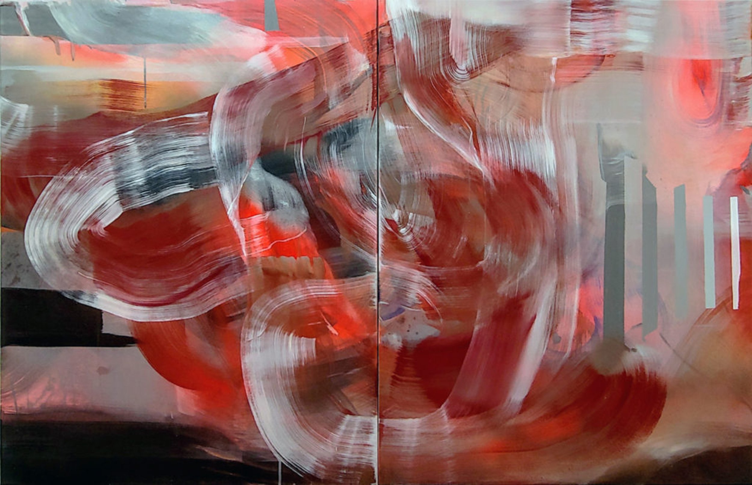
www.alexgingrow.com
Image List
1. We Broke Me, 2021, oil, acrylic, ink, watercolor, graphite, colored pencil on Duralar, 40 x 53.75 in.
2. Keep My Hair Out Your Mouth, 2021, oil, acrylic, ink, and gesso on paper, 25.5 x 40 in.
3. You Pluck Rotting Teeth From Your Caustic Mouth As Casually As I Weed The Winter Garden, 2021, oil, acrylic, and ink on Duralar, 24 x 36 in.
4. I Am In Your Skin, 2022, oil, ink, graphite, and gesso on paper, 26 x 39.75 in.
5. I Would Have Ruined Everything For You, 2021, oil, acrylic, ink, and gesso on paper, 38.75 x 39 in.
6. I Would Have Ruined Everything For You, (detail)
7. Those Camberley Nights Were Fresh Electric Like A Naked Wire In Spilt Milk, 2021, collage, ink, and graphite on paper, 8.5 x 7.25 in.
8. This House Was Not Made To Be My Home, 2018, gesso, ink, watercolor, charcoal, pastel on paper, 48 x 50.5 in.
9. I Needed You To Be There When I Looked Back, 2019, gesso, ink, watercolor, charcoal, pastel on paper, 37 x 50 in.
10. Just War, 2018, flashe, ink, and graphite on paper, 22 x 30 in.
11. Still Pretty Though, 2018, ink, gesso, and graphite on paper, 22 x 30 in.
12. I Did Try And Fuck Her, 2017, ink and gesso on paper, 7.25 x 6.5 in.
13. Oh It Looks Good, 2017, ink and gesso on paper, 7.25 x 6.5 in.
14. I Moved On Her Like a Bitch, 2017, ink and gesso on paper, 7.25 x 6.5 in.
15. With Skin So Sour and Pulp So Sweet, 2017, watercolor, graphite, and gesso on paper, 7.25 x 8.5 in.
16. You Used To Smile in Pictures. I Used to Shave My Legs, 2017, watercolor, graphite, and gesso on paper, 7.25 x 8.5 in.
17. Barbie Wrecked the Fucking Convertible, 2017, watercolor, graphite, and gesso on paper, 7.25 x 8.5 in.
18. 04.10.13, 2013-present, graphite, ink, and acrylic on paper, 15 x 15 in.
19. 04.03.13, 2013-present, graphite, ink, and acrylic on paper, 15 x 15 in.
20. 04.21.13, 2013-present, graphite, ink, and acrylic on paper, 15 x 15 in.
21. Nothing like kicking the bucket to boost the sale, 2010, graphite and ink on paper, 22 x 30 in.
22. Hirst is no Warhol. I mean, maybe after he’s dead. But he’s not there yet., 2012, graphite and acrylic on paper, 22 x 30 in.
23. Well all the money IS in the label, you know., 2008, ink, graphite, and gouache on paper, 22 x 30 in.
24. Which one was damaged? The unsold one? Oh, that’s fine. Nobody cares about that one anyway, 2010, graphite and acrylic on paper, 22 x 30 in.
25. The artist and her daughter Scout.
26. The artist in her studio.
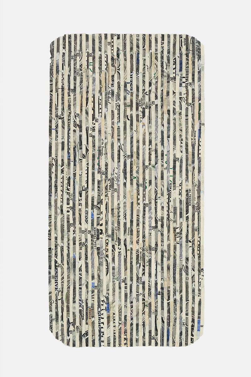
Shanti Grumbine
Shanti Grumbine is a multimedia artist whose intimate relationship with materials, along with her broad conceptual investigations, brings her work somewhere between craft and conceptual art. Which is appropriate, given that she’s drawn toward aspects of both. Her work interrupts the value systems that we live by, while questioning the role of art as another commodity in a bloated capitalist system. In one series, Grumbine collects discarded objects that she finds on the side of the road and brings them back to her studio, where she recreates them as scaled-up versions. Like the original object, which is often a mere fragment, her sculptures are unidentifiable, like that section of a broken arm of a pair of sunglasses that wraps around your ear. Grumbine treats these nameless ‘things’ with a sort of reverence, as they point to a value system beyond any conceivable market value, and indeed beyond even their own usefulness. Her work has a devotional aspect, as it brings our attention to the overlooked but sacred world that is simply everywhere, if only we could see it. Grumbine affords us the opportunity not only to see but to engage with those aspects of our culture that are marginalized and invisible. A great compassion emanates from her work quietly and unexpectedly, as she pulls back the curtain and lets us see and experience the sacredness in everything. In the process of translating insignificant objects into a lofty visual language, Grumbine urges us to question our entrenched value systems, and maybe try harder to see the beauty in every little thing.
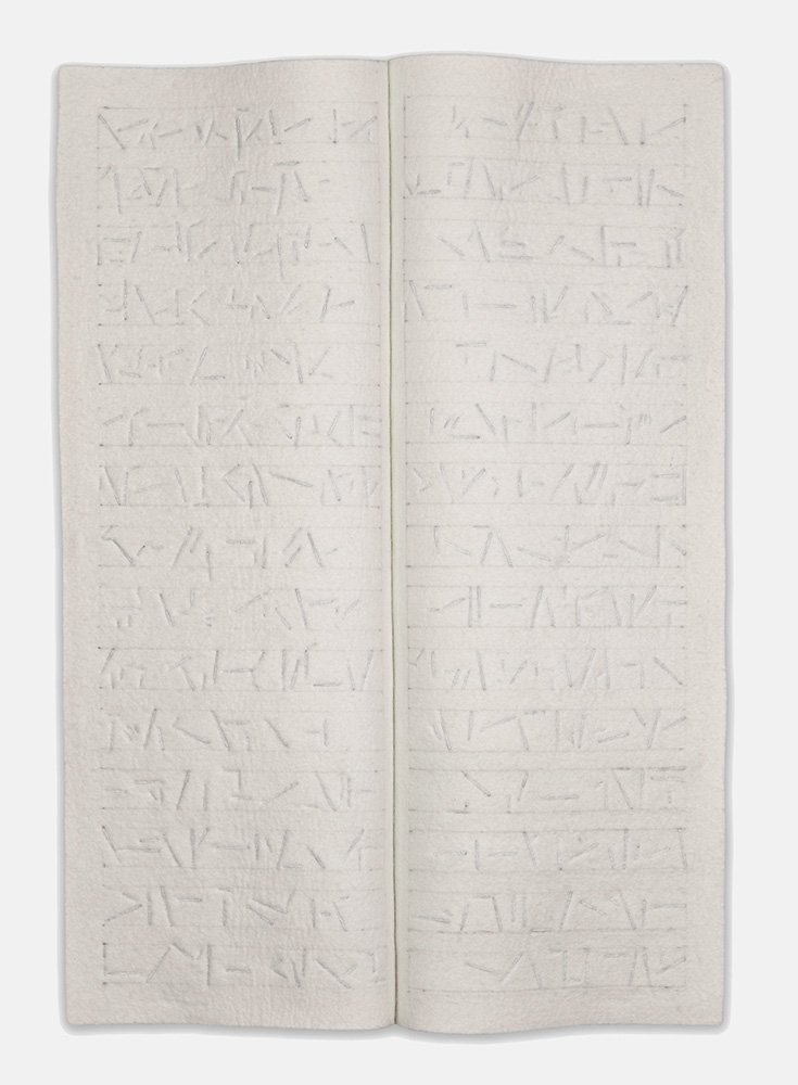
MH: It’s hard to label your work because you work in many mediums, and you seem to work in series as well. Are you good with not being categorized as this or that type of artist?
SG: It’s something that I struggle with. My tendency is to move through different media and projects as my location or life situation shifts. My hands and mind are digressive and when I get an idea, I have to see it through. It can feel unwieldy at times, and yet the unwieldiness is exciting to me.
MH: Do you ever have issues with being categorized as an artist in general? I’m wondering if you prefer “artisan”, which is sort of ‘artist light’, and has fewer expectations around it.
SG: Ann Hamilton refers to herself as a maker, and I love that term. It has breath and space in it, and it also feels very grounded and humble. It has that sense of going into something that starts as nothing, and then becomes something as you engage with it, whether it’s with your hands or a conceptual process. And there’s the craft element, and something magical too, to make something exist that wasn’t there before.
MH: A lot of your materials come from the tradition of craft: weaving, dry felting, form sculpting. What is your relationship to the craft world?
SG: I’m interested in things that are beautiful and well made, and that’s what I attempt to achieve in my work. There’s a kind of generosity and authenticity when something is well made, and that’s meaningful to me. The materials, like wool and thread and felt, are also very grounding, and they’re not bloated with art history. Craft taps into a different kind of history that’s oriented toward function rather than market value. I also think a lot about the Industrial Revolution, when there was a shift in value systems and skill was traded in for profitability.
MH: Not too long ago, craft was officially embraced as “fine art”, which everyone agrees is well deserved, but it also has a cringe aspect. It implies that crafters everywhere were pining to have their work recognized by the art world, because they couldn’t possibly be satisfied by sitting at their loom or potter’s wheel and making things. Do you find the acceptance of craft into the art canon to be presumptuous?
SG: I think what you’re pointing to is a specific value system of the craft tradition and its relationship to the value system of the art world, which is more market-driven. This brings up a core interest of mine, which is an investigation of value systems and how they came about, who maintains them, and what it takes to dismantle them. Maybe by inviting the craft world into the fine art world, we’re starting to embrace alternative value systems.
MH: Do you think that when the art world invited the craft world in, like a big cattle call, the art world had more to gain than the craft world? Like the art world needed something from the craft world to bring it down to earth?
SG: I imagine so. I know that I have. Craft brings with it a respect for the material world, with an acknowledgment of material agency. It decenters us along with our notions of genius and will and that is important. And it acknowledges lineages of making that are not white or male-centric.
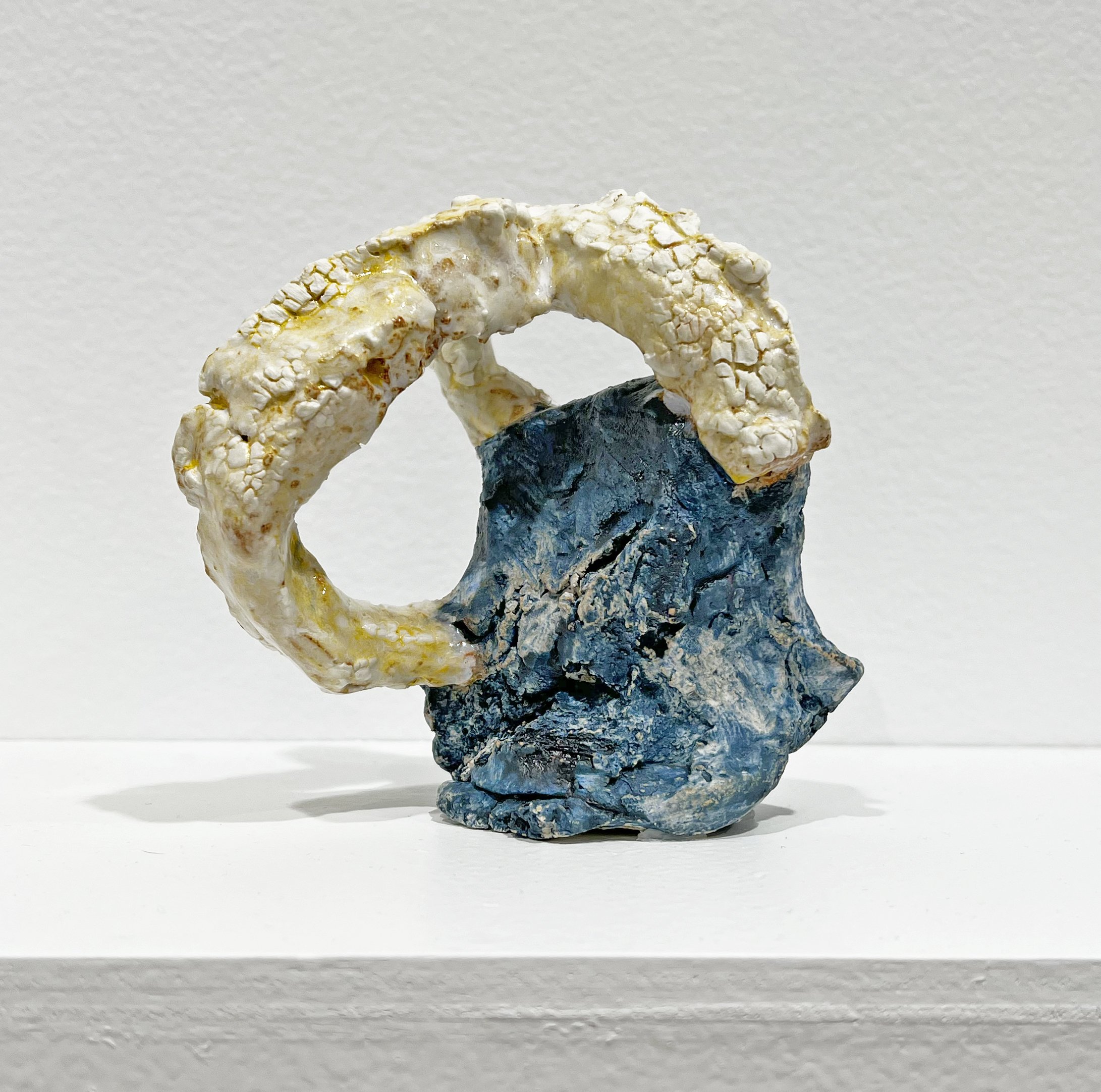
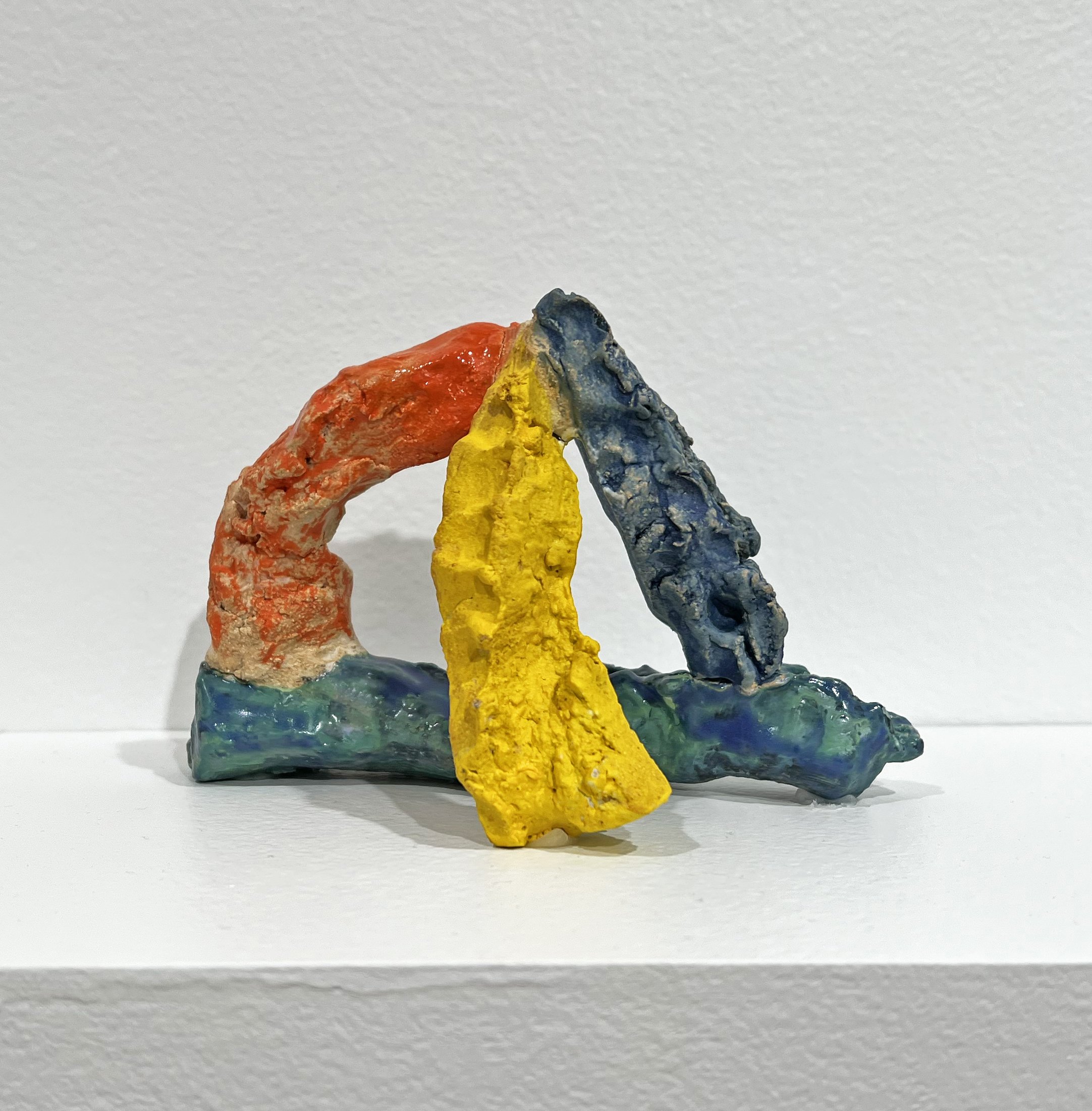
MH: Back to your use of mediums. I see you as a materials-oriented artist, and it seems that you love the journey of experimentation. Is the diversity of materials intentional? Does it keep the work fresh, and does it help in avoiding categorization?
SG: It’s interesting that you ask if I’m trying to avoid categorization, when I’m desperately trying to be categorized! (haha) But it’s nice to view it as a strength rather than this thing that I’m always entangled with. I struggle with not being categorizable because it’s not lucrative. It’s harder for people to pin me down, curate me into a show, create a collector base. But I love working with diverse materials and sometimes my work is the material investigation itself. And then there’s this conceptual investigation happening at the same time. I like the parallel investigations, the back and forth between the hand and the mind.
MH: How do you feel about “branding”? The B word. I feel like it’s a gated community for creativity. What’s your take?
SG: I’m never going to be able to do that. Like if someone were to look at my work and say, “That’s a Shanti Grumbine”, that’s a game that I can’t play. I mean I literally don’t know how to do it.
MH: Do you think most artists know how to do it? I think they don’t.
SG: I’ve been asking myself these kinds of questions, partly because I’m a single mom and I need to make money. When I was doing my series with newspapers, there was this moment when suddenly, that’s who I was. I had a brand, and I felt so boxed in! And invisible. It’s like going through life with the tip of your pinky showing and nothing else, and people only know you as the tip of your pinky. I needed to shift gears, and I needed the time to do it, so I did a year-long residency in Roswell, New Mexico. I was looking at other models of art making, and I saw that there are project-based artists that respond to various environments or situations. This was something I wanted to embrace and aspire to. It was a big realization, and a relief in some way.
MH: Isn’t being a project-based artist antithetical to branding? With branding you have a style, and that’s who you are.
SG: Right. Branding requires a different temperament than what I have.
MH: A common thread that weaves through your work is transformation. You find and collect “mundane objects that exist in the margins of our lives” (your words), and in one way or another transform them into something else. What is it about the transformation that appeals to you?
SG: There’s something sacred about paying attention to an object that has been overlooked, and I think that attention is the source of transformation. There are two things that are happening: there’s the visual transformation of the object when I notice it, then there’s the transformation that happens in my interaction with the material as I make it. But then I’m also transformed by the engagement. The process allows me to see the world around me and engage with it differently.
MH: So you’re out for a walk, you spot a nondescript object on the side of the road, something about it draws your interest so you bring it back to your studio, and then create a scaled-up version of the object. What have I left out of the process? What are some other considerations?
SG: That was a specific project that I started when I was in Roswell. I was dealing with pain from chronic Lyme, so I had to walk to alleviate the pain, and it became part of my studio practice. Walking along this specific route became my daily pilgrimage, and I started paying attention to what was along the side of the road. I started collecting these objects that had been transformed by exposure and use. They were no longer categorizable because they had left their old value system and entered into a new realm that felt full of possibility. I experienced these objects as relics and began to read about the history of walking and pilgrimage. I witnessed the pilgrimage that happens once a year to El Santuario de Chimayo, in Northern New Mexico. The destination chapel holds a well of blessed dirt, a base element made holy through attention and devotion. I also thought about reliquaries and pilgrimage sites I experienced as a child on a family trip to Europe when my mother was teaching about the Crusades. And I thought about the bones of saints housed within cathedral altars. We choose who and what is sacred.
MH: You told me that you don’t know what the found object is; you don’t want to know. Why not? Would knowing its purpose and history affect your process?
SG: Sometimes I know, like one of my sculptures, Column, is modeled after a worn piece of a pair of sunglasses. I like knowing and not knowing what it is; it exists on this precipice between the sunglasses and this other magical, bone-like existence. It’s a liminal space between what it was and what it’s becoming. There are other artists who have enlarged the things that clutter our lives, like Claes Oldenburg, who enlarged these fetishized objects in our culture. I find objects after they’ve shifted into this other state; I’ve found them in their thingness. They’re no longer what they were. It’s a different approach, a different investigation.
MH: What do you mean by thingness?
SG: Bill Brown writes about the concept of “Thing Theory”, which says that an object becomes a thing when it can no longer serve its common function. An object disappears into its use value: I pick up a glass, I drink, I don’t think about the glass. But if that same glass breaks, there’s a stutter in that experience, and it becomes a thing. So thing theory is about the ways in which the things in our lives affect and transform us. Bill Brown also talks about our bodies as objects and the way that physical injury disrupts our performance, our objectness. This theory resonates with me on a deep level due to the way chronic illness interrupted the functionality of my own body, shifting my sense of self. Illness turned me into a "thing among things".
MH: I find it interesting that when reproducing the thing, you’re not making it different than what it is. You enlarge it and in doing so you magnify its ordinariness. What is it that you would like us to see? What do you see?
SG: When I have this moment of visceral connection with a thing that has no value, it interrupts the value systems that I live by, that I’m burdened by. My engagement with the thing gives me the agency to interrupt the capitalist, market-driven value system with something that has a very different type of value. I don't think I enlarge it to magnify its ordinariness, I magnify the ways it feels extraordinary to me. And I enlarge it to occupy the physical scale of my body.
MH: I see in your work a Zen-like quality that places value on the ordinary and unadorned. The sacred isn’t something to be sought after like a shiny talisman, but in whatever presents itself in your daily, repetitive routine. Is this something you think about in your studio and in life?
SG: Since I’ve been chronically sick for ten years, there’s been a narrowness in my experience. Art has been the doorway that lets me learn anything and everything from whatever happens to be nearby.
MH: Is the sacred aspect of the piece inherent in the object itself? Or does your process of transformation make it sacred? You talked about translation during my studio visit, and it’s interesting to think about how a nameless object becomes sacred as you translate it into another visual language.
SG: What I’m really interested in is how we encounter the objects in our world, and how we encounter each other. We choose our value system, and we choose through our attention what is sacred. By transforming these nameless things into devotional objects, I’m exercising my choice by giving it my attention, which challenges market-driven value systems.
MH: All spiritual teachers will tell you that everything is sacred. The object that you pick up on the side of the road is just as sacred as the object that you didn’t pick up, so the reason you choose one over the other is more a matter of aesthetics.
SG: Yes, and I’m curious about that. What is desire? Why am I drawn to this and not that? I experimented with that in my earlier work, when I was looking at these luxury items in the newspaper and extracting them from their context to understand what is desirable and why. I was investigating how our desires have been formed by advertising, and why we’re drawn to certain shapes.
MH: Maybe translating the unremarkable object into a different visual language makes it desirable, not sacred. Because in theory, it’s already sacred.
SG: Yes. I’m also curious about what makes a shape desirable. The object on the side of the road had a specificity to it, but I couldn’t place it. There would be a lighter, and it had been out so long that the plastic had transformed into something almost marble-like, where the surface has this gorgeous feel to it. I thought that if I were to recreate it, I’d be touching into what it’s pointing to, that liminal space that I’m so drawn to.
MH: So it’s not just the object you’re interested in, but what’s happened to the object.
SG: What it’s pointing toward. Each object was different but had a suggestive power to it.
MH: That’s interesting. I can understand that the object has a history, but you’re saying that it also has a future?
SG: Yes! You buy a souvenir that points back to a nostalgic point in time, right? But these objects are like souvenirs that point forward to some possibility of value.
MH: Souvenirs of the future! How do you suppose they’ll have value in the future? To me they’re spent; I think of them as dead. What value could they have?
SG: They point toward a different value system than the one they’d previously been engaged in.
MH: How important is viewer engagement? Could you say that the viewer transforms the object into something sacred just by seeing it? I’m wondering at what point a mundane object becomes something extraordinary. Does it happen the moment that you pick it up from the ground? Or is recognition required from an audience?
SG: The viewer doesn’t have to see it as sacred. But the attention and generosity of showing them both the object and the enlarged version allows them into the process, and I think it’s palpable, if I’ve been successful. For me, engagement is important because it slows me down. Our culture is very fast, we take things in very quickly, and we’re not always aware of what our reactions are. When I was cutting newspapers, the engagement slowed me down. Cutting into the newspaper, removing the words, I became aware of its structure and the engagement and translation slowed me down.
MH: You also talk about the value of repetition. Could you elaborate on that?
SG: I’m always thinking about repetition. It came up in a recent project called “Laps(e)”, which is a video piece, a weaving, and a text. The video is of me swimming laps, and I’m wearing a GoPro, so you see what I see as I’m swimming. The back and forth of my laps parallels the back and forth of the weaving and the back and forth of writing. I’m interested in this type of repetition that Gertrude Stein refers to as insistence. She writes that when human beings do something over and over, it’s a type of insistence. As a single mom I’m constantly doing repetitive things, but if I think of it as an insistence, it feels celebratory and strengthening. And when I think of mass-produced objects turning into a singular state through repetitive use, that’s a kind of insistence as well.
MH: What do you mean by insistence? How is weaving a kind of insistence?
SG: When you do something over and over, it’s not just a mindless repetition, but there’s a shift in emphasis. Regardless of intention or will, there is growth or strengthening. Like weaving isn’t just repetition, it grows. The skill accrues, the collaboration with the material shifts. And swimming laps, the muscles start to develop. Something is being transformed.
MH: It sounds like insistence is like repetition with a will. Or with an agenda.
SG: I don’t think there’s even an agenda. Something grows, something is transformed, something shifts. Even if there’s no agency, there’s a rhythm. Even if I have no goal, transformation and shift happens.
MH: Is insistence built into the whole human experience?
SG: Yes, I think so. But repetition is necessary for any type of value to accrue. I think that’s why rituals are important, and mantras, and why politics and advertising are successful, and why we have to be careful.
MH: I was recently asked by a non-artist why making art was important to me. I had a hard time explaining! How would you respond to the question?
SG: It’s important to me because it gives me access to an alternative value system that makes me slow down and pay attention, rather than allowing everything in my life to disappear into usefulness. The studio provides an opportunity to engage with my hands in a way that I don’t have anywhere else. It feels like a sacred practice, like going to synagogue or temple or church. It's a sacred space.
www.shantigrumbine.com
Shanti Grumbine’s solo show "In Formation", curated by Matthew Lopez Jensen, is up through March 1.
575 Madison, NYC Open 24/7