Susan English is a New York-based painter who applies paint by pouring tinted polymer onto panels, then manipulating the panel to achieve subtle variations in color. Inspired by the ever-shifting light outside her studio in the Hudson Valley, she uses her technique to achieve atmospheric paintings with barely perceptible shifts in color and light. She sometimes refers to her paintings as “warm minimalism”, and at other times as abstract landscapes. The interaction of color and the bold use of tertiaries create satisfying color relationships, but her paintings should not be regarded as simply “calm”. Indeed, they provide deep, sometimes dark glimpses into a complex artist.
MH: Describe your process to me. I know it’s all about the “pour”. How did you arrive at this style of working? Do you refer to them as paintings?
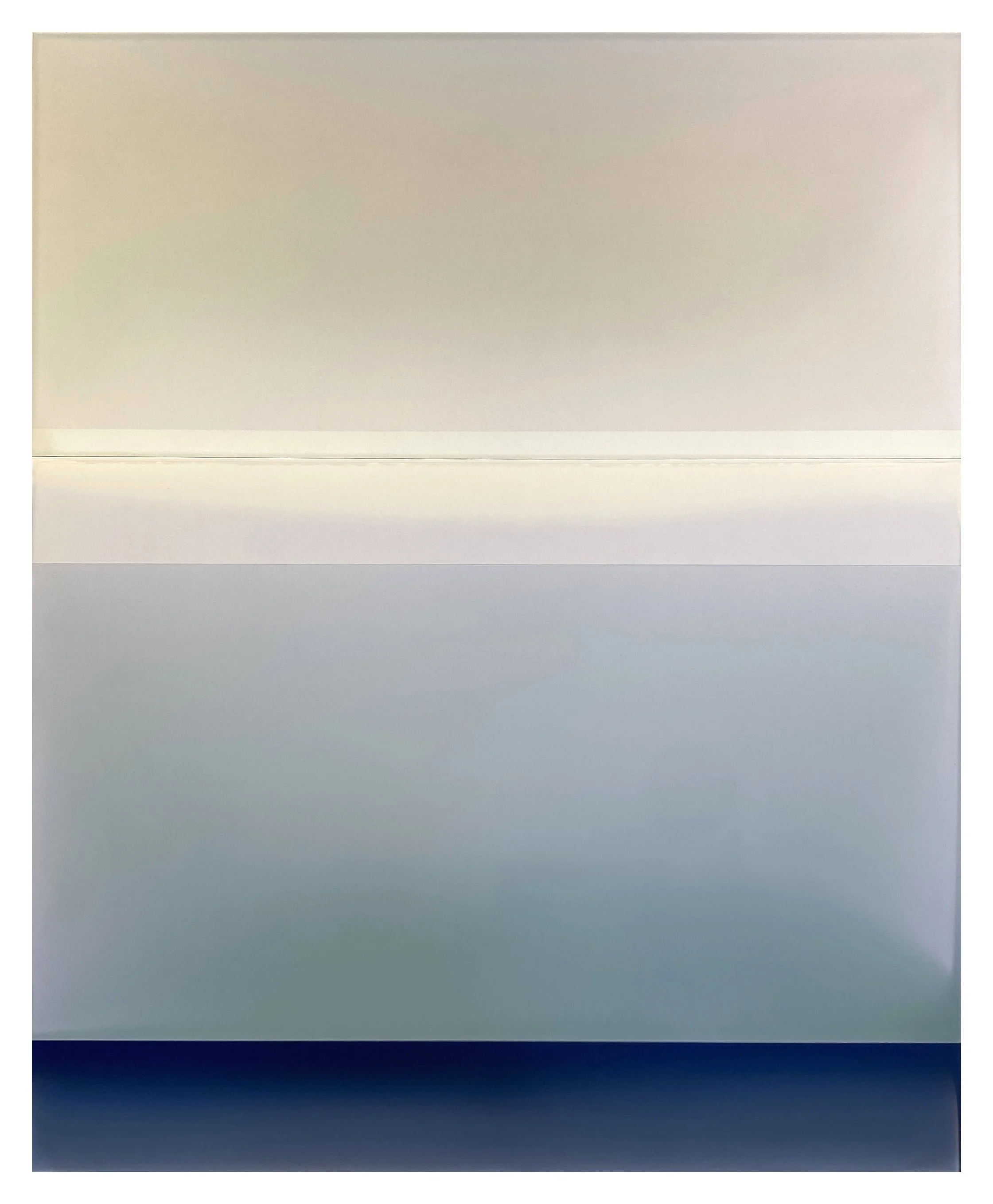
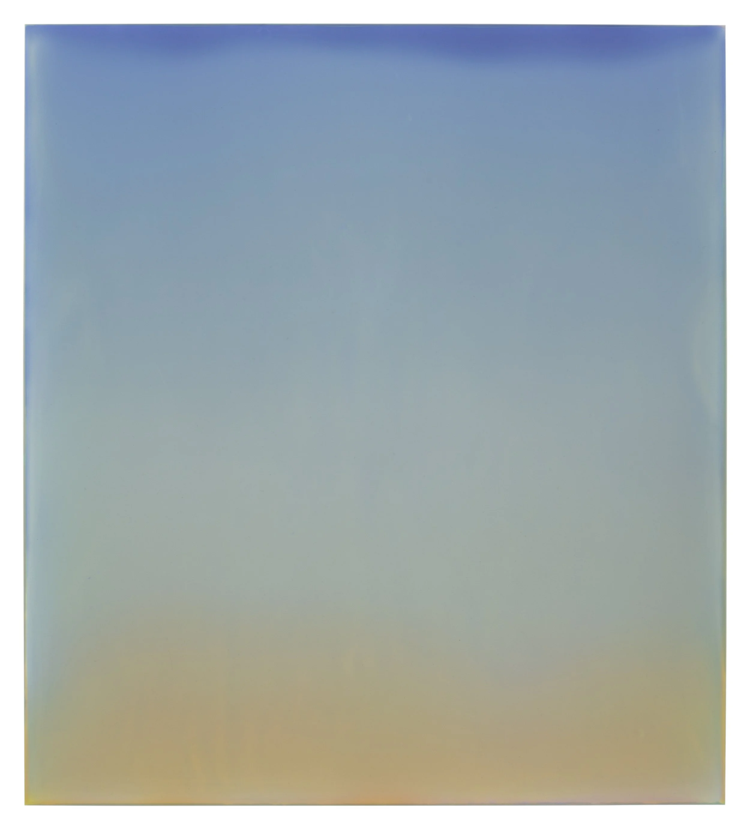
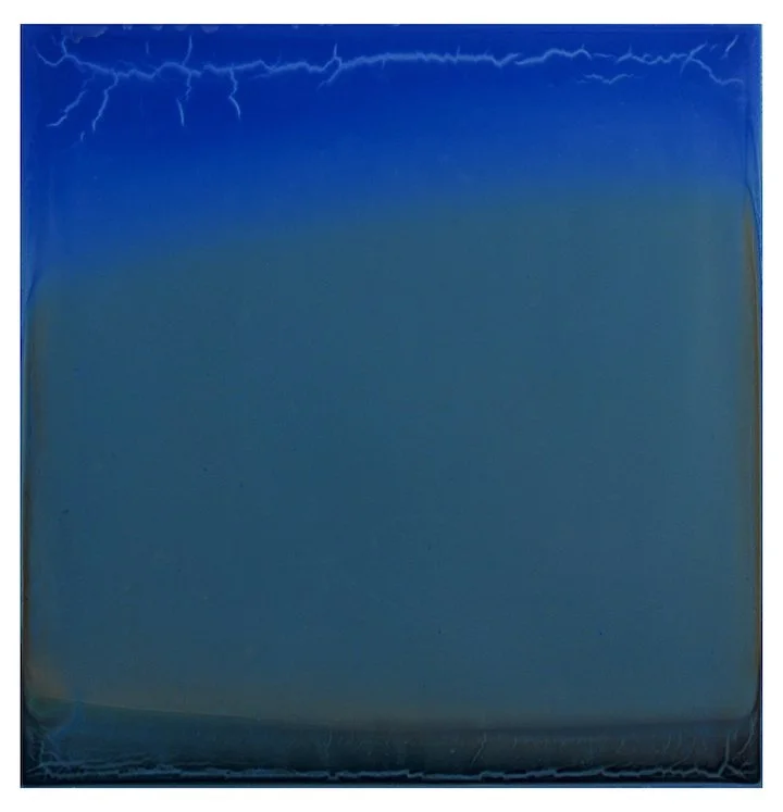
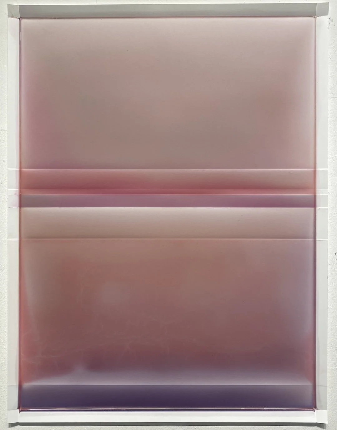
SE: Around 2009 I realized that the way I was making paintings, which was traditional oil painting, felt limited to me, and I wanted to find a different way to use color. I was playing with materials in my studio and came up with the idea of pouring the paint. I drizzled tinted polymer on some of my works and liked the effect, so I poured a series of small panels, and I’ve been pouring ever since. This way of working has evolved over time, and it continues to be a process of discovery. I build up the color with layers – there can be as many as 10-15 transparent layers of color on a panel, and there are several panels, or “sequences”, per finished painting. Part of my process is moving the panels around and trying different combinations of sequences. I call them paintings, even though the process is unconventional. I think like a painter, and the pours are like gestures. My hand is in the process in that I manipulate the pour, tilt the panel, observe the material, and then arrest the pour at a certain point and leave it to dry. For me this all correlates as gesture.
MH: Your work is most readily interpreted as landscape. Does this feel limiting? Would you prefer a less specific reading?
SE: I’m not opposed to someone reading them as landscape, but I consider them to be completely abstract paintings. Whenever you divide a rectangle by a horizontal line, it’s going to be read as landscape. But the way these function spatially are not like traditional landscape. I think of them more as light atmospheres that capture the experience of space at a given moment. I sometimes refer to them as “warm minimalism” because they’re very much about feeling and emotion. I would hope that color interactions and the experience of space would evoke an emotional response in the viewer.
MH: How do you know that the style in which you’re working is the best one for you? How does an artist have confidence that the style she’s working in is right for her?
SE: I would say that it’s about my level of engagement. If I feel excited about what I’m doing, and stimulated by it, then that feels like a good place to be. But it’s not like I’m always sure that I’m in the right place; my confidence is not unflagging. When I feel that urge to change something, I try to make changes incrementally within what I’m doing. There’s been a natural progression to the work, and I’ve followed it. In this body of work I feel like I’ve hit a deep vein, and I’m still in the middle of it. I also have three different ways of working: the panels, the paper, and the single panel pieces, and they all feel very different. So that’s helpful, since I can explore multiple ways of working, all within this body of work.
MH: How do regard your small watercolor landscapes, which are painted en plein air, in Maine and on Cape Cod? Do they inform your larger works?
SE: Yes, they inform my larger works, partly in the way that I make them. There’s a total immersion in the process of traditional landscape painting, and it’s exhilarating to have that close connection to what I’m looking at. They’re very intense and not always fun to do. After I’ve done a group of them, I bring them into the studio and have them on the wall so that I can reference them. The stripped-down landscape, compressed horizon line, strips of island and sweeping sky – these definitely inform my larger paintings. At the moment I’m really into gray. Tertiaries are fascinating, mysterious colors to work with. The light in my watercolors, as well as the atmospheric light outside my studio window, influence my color combinations.
MH: How do you know when a work is finished?
SE: I spend time sitting and looking at works as they’re in progress, and I notice all the things that bother me. The colors have to cohere in a way that is an internal, visceral feeling. If something is bothering me, I feel it physically, and I have to keep working on it. So basically, I just keep working on something until it doesn’t bug me anymore.
MH: Do you ever suffer from self-doubt in the studio?
MH and SE: Bahahahahaha!
SE: No…never! (More laughter…) It’s just part and parcel of being an artist.
MH: How do you negotiate it?
SE: I just push on. It helps to know that all artists face self-doubt. There’s something about the act of creating that brings up self-doubt, including feelings of, “Who am I to be creating this? What gives me the right?” But I’m passionate about art! I truly love looking at it and creating it.
MH: Then you think that art is relevant? Even when the world is such a mess?
SE: I really do. I think the experience of looking at art, whether or not it’s beautiful, is important. It’s essential, like love. It’s not quantifiable; there’s no data to show its importance, but human beings have always made art, and it was always connected to spirituality.
MH: When you’re lost or stuck in your studio practice, how do you continue?
SE: An artist friend once told me that when you’re stuck, you need to walk to the wall. Just go to your painting and do something, and the work will speak back to you. Or not! But either way, you have to keep walking to the wall. It’s really painful sometimes, like going to your studio is painful sometimes. But you have to keep at it if you want to get unstuck.
MH: What do you think makes a work of art “great”? We know that it’s not content, or style, or medium, or even talent. So what is it, then?
SE: It’s often determined by consensus. A lot of art is being made all the time, and some of that rises to the top and people agree that it’s “great”. It’s subjective, and can be trendy, or more about personality than the work. For me personally, if I’m spontaneously moved by something and have a strong experience while I’m looking at that work, then I consider that great art. The Guston show moved me to tears, a Mondrian show years ago was a sublime experience. It’s a certain receptivity that you have in a given moment that allows you to experience that greatness. I also think there’s some magic that happens when a painting coheres and becomes greater than the sum of its parts. And isn’t this why we make art? Isn’t it because we want to have that experience ourselves, of creating a work of art that rises to that level?
MH: How closely do you pay attention to the New York art world? Does it have relevance in your studio practice, or affect you in any way?
SE: I try to stay connected and see the shows. I’d like to keep up more, but I’m definitely part of this greater art community of New York, and I like being part of the conversation. I can’t imagine living anywhere else.
MH: What is something about your work that you’d like people to know?
SE: My work is darker than most people realize. The paintings have a tautness about them, an underpinning that has a darker resonance than is immediately apparent. The color relationships are very specific and hard won, and it’s hard work to get there. It’s emotional work, too, and this doesn’t necessarily show up in my paintings. The most frequent comment I get about my work is that it’s calm. I understand the comment, but it surprises me because I’m not a particularly calm person, and my work is deeper than that.
1. Anatomy of Hope, tinted polymer on dibond, 78 x 72 in.
2. Anatomy of Morning, tinted polymer on dibond, 59 x 48 in.
3. Outland No. 6, tinted polymer on dibond, 40 x 36 in.
4. Verge, tinted polymer on dibond, 34 x 36 in.
5. Translated World, tinted polymer on dibond, 17 x 16 in.
6. Outland No. 23, tinted polymer on dibond, 40 x 36 in.
7. Three Sides of Gray, tinted polymer on dibond, 59 x 48 in.
8. Cascading Folds No. 2, tinted polymer on 14lb Yupo paper, 26 x 20 in.
9. Cascading Folds No. 15, tinted polymer on 14lb Yupo paper, 33 x 26 in.
10. Bar Island in Fog Bank, watercolor on paper, 9 x 12 in.
11. From the Porch, Mid-Morning, Seal Cover, watercolor on paper, 12 x 14 in.
12. Lieutenant’s Island, watercolor on paper, 9 x 12 in.
13. The artist in her studio.
14. Video courtesy of Kathryn Markel Gallery.


